So Figma has noodled into the AI space. The company has rolled out a bunch of AI-powered features to make designing faster, easier, and more fun.
Sounds great! Except that every new thing blurs the line between expert and beginner. In one way or another, you’ll have to start from scratch. Even if it’s AI.
But that’s ok. You need to understand before you can explore, explore before you can adapt, and adapt before it can become your thing. (Full disclosure: We’re still getting our fingers accustomed to Figma’s keyboard, Creator Micro.)
Our designers are currently heavily into Figma AI. The team has started utilizing the features on client projects as well. So, for us, it’s safe to say this baby has teethed.
In this blog post, we will walk you through some of the latest AI updates in Figma. We’ll talk about their use cases and also share some feature-specific tips to help you navigate the interface and leverage the features with success. (Note that the latest features are available in limited Beta.)
Ease up, this is going to be fun!
- The ‘Make designs’ Feature
- Auto-naming Layers
- Content Rewrite
- Interactive Prototype
- Visual Search
- Multilingual Translation
- What We Think of Figma AI
1. The ‘Make designs’ Feature
Yes, they pulled it. Figma was accused of having trained the Make designs feature on existing apps. The company has denied the accusation. But Dylan Field, the CEO of Figma, notified that the feature has been currently disabled. Their design team will re-enable it after a thorough quality assessment test.
Unfortunately, we couldn’t use the Make designs feature. Based on a first glimpse, it seemed that the feature works similarly to most AI design tools. You enter a prompt, select from a list of relevant suggestions, and generate designs.
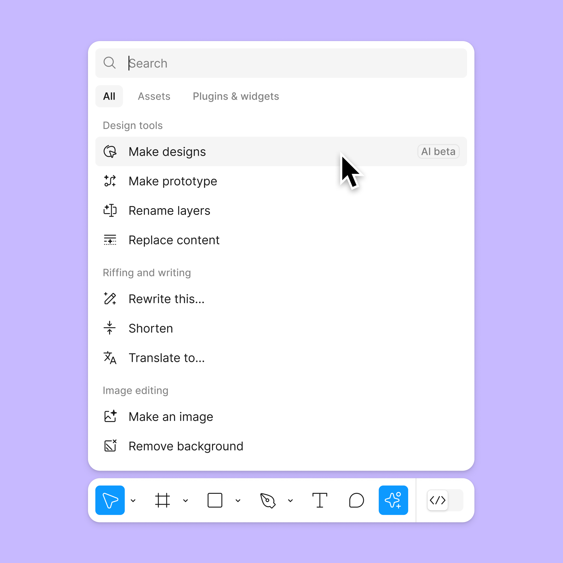
Source: Figma
The only difference is that the tool doesn’t understand generic design prompts. It is trained on design patterns of websites, landing pages, and mobile apps.
The new version of Make designs is still awaited. Since it has been disabled owing to perceived similarities in the interface, Figma might reskin how the feature looks while keeping the underlying functionalities unchanged. But we’ll have to wait and watch.
Pro Tip: If you’re new to generative AI, take a cue from the multiple prompt ideas already available on the interface. As per Figma’s recommendations, the archetypal prompt framework should include the product type, use case, and description.
Read More: Top 4 AI tools for personalized and high converting cold email
2. Auto-naming Layers
Figma has made it possible for designers to auto-name or -rename layers. Previously, layer names would be set to default in the form of lexico-numerical combinations. And then you had to manually rename, say, over 150 layers!
But the new feature generates the right names for the right layers. So buttons are called ‘buttons’, backgrounds are ‘backgrounds,’ headers are named ‘headers,’ and so on. That means more time designing, less time naming.
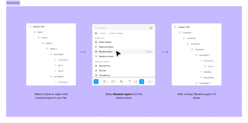
This has made collaboration and hand-offs so much easier.
If a designer on your team wants to access a project and make edits, they can spot the relevant layer in no time. Again, if your client requests a change in a particular tile, you can look it up on the side-board and find it by its name.
Pro Tip: Establish a meaningful naming convention for your assets so that when Figma AI renames layers it makes sense to the current viewer and editor.
3. Content Rewrite
If you need to rewrite a text description in a particular asset, you can have AI do it for you in seconds. It will tailor the tone of your copy according to your target audience.

The Shorten text feature also allows you to rewrite content more concisely.
Pro Tip: As in the case of most standard generative AI tools, you may not want to take content outputs for granted. Figma AI can only give you a head start, but you should still consider tweaking the output to exactly match your brand persona.
4. Interactive Prototype
The Make prototype feature eliminates manual noodling. You just select Make prototype and Figma will prototype the multiple screens.
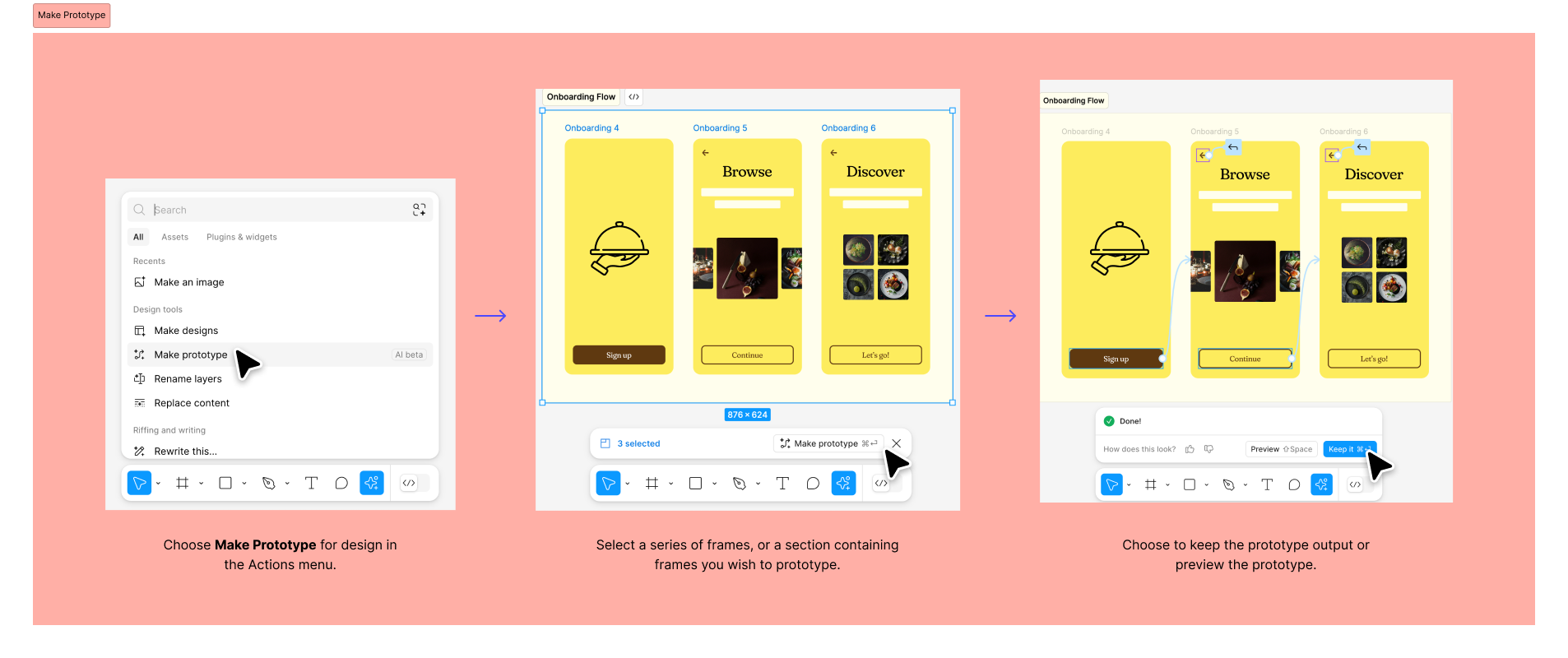
Importantly, despite the name, Figma doesn’t automatically create prototypes from scratch. It only saves the initial setup time by generating basic connections between frames. Don’t expect the feature to generate complex prototype flows or animations.
But it’s still a major update, considering that typing is much easier and faster than dragging your mouse to connect frames. From now on, you don’t have to painfully squint at the screen, trying to connect the right frames across a protracted dot pitch (during which time, you might lose the mouse hold several times and have to start again…)
Pro Tip: Name your screens and assets properly. What appears intuitive to you may not appear so to the machine. For instance, if you want to trigger a back action on all the back buttons, you should name the asset “Back button” so that Figma can derive the logical connection between the asset and its corresponding action.
5. Visual Search
Another interesting feature, Visual search allows you to find the right asset by uploading the relevant image, instead of having to look for it manually.
For instance, if you have a large design library and you need to access a particular design asset file, you can take a screenshot of the live asset and upload it on Figma and the system will redirect you to that particular editable asset in the library.
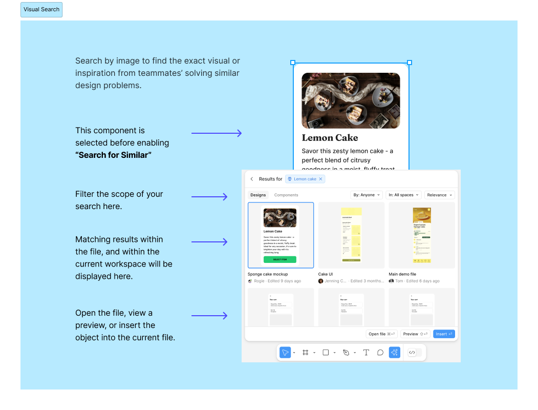
This again simplifies and quickens hand-offs. You don’t have to reach out to individual designers to access files anymore. The file is made available at a tap. This is particularly useful for companies with large design libraries.
Pro Tip: Upload high-quality, well-cropped images for precise Figma AI Visual Search results.
Read more: 8 Email Experts Share Time-Saving AI Secrets for Perfect On-Brand Email Templates
6. Multilingual Translation
Figma has also made AI translation available.
So if you want to share your design file with multiple stakeholders of different languages, you can have AI translate your text in no time.
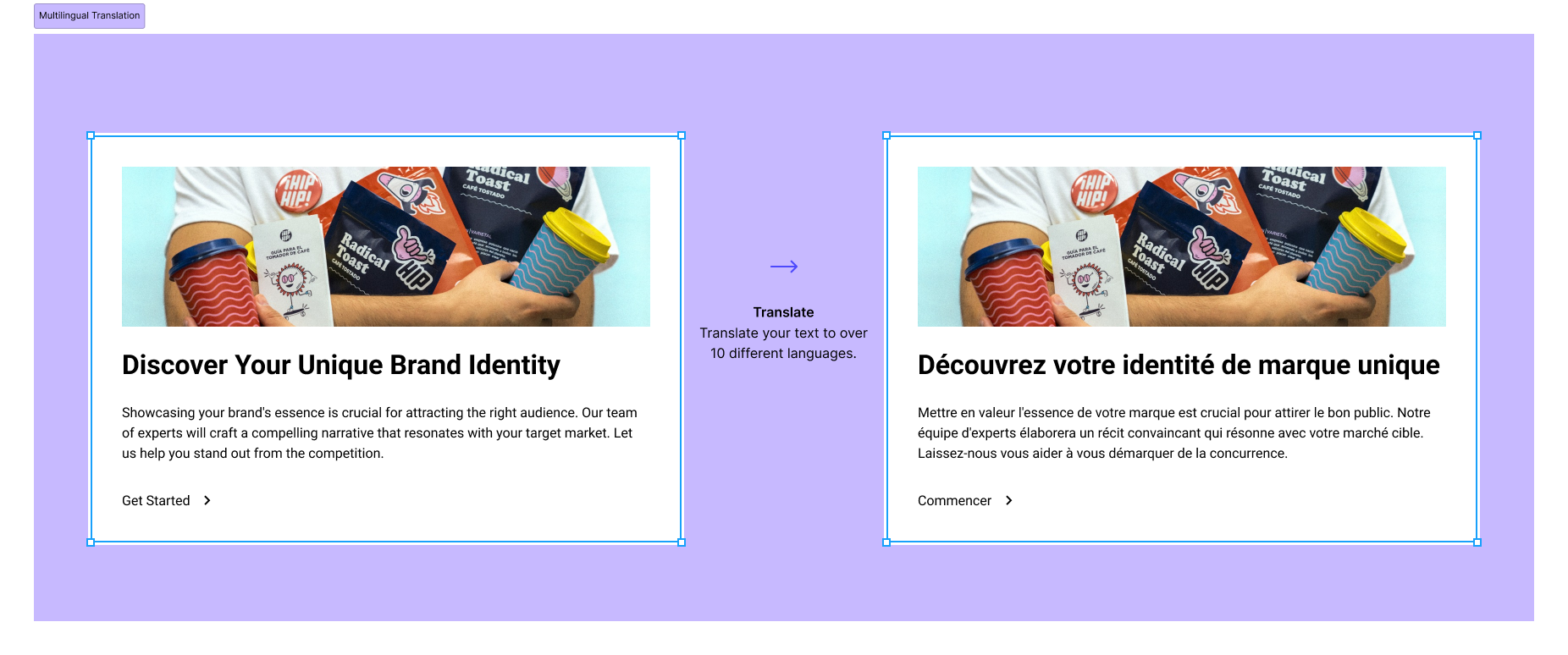
Pro Tip: Figma AI doesn’t flip design assets for languages that use the right-to-left script. It will translate the text alright, but it’s up to you to realign the appearance of the script.
What We Think of Figma AI
Here’s what our design team thinks of Figma AI.
Pros:
- Accelerated prototyping & iteration
- Enhanced collaboration through AI-generated variations
- Potential for improved accessibility in designs
- Automated design system creation with AI
Cons:
- Need more granular control over AI-generated designs
- AI struggles to fully understand design intent
- Requires addressing potential biases and ethical implications
Design Freer, Design Faster with Figma AI!
Figma has been our go-to tool for all things design. As a pro-AI agency, our teams have received extensive training in generative AI, allowing us to quickly master Figma AI.
Our design team is now utilizing Figma AI in client projects. We’re already one of the fastest template creators, delivering over 3,000 templates each month. Need email templates that convert? Get in touch with our team!




UTSAV KHAMBHATI
Utsav is a UX/UI and Graphics Design Manager passionate about crafting exceptional user experiences. Combining design expertise with leadership skills, Utsav delivers impactful solutions that resonate with users and drive business success.
Susmit Panda
A realist at heart and an idealist at head, Susmit is a content writer at Email Uplers. He has been in the digital marketing industry for half a decade. When not writing, he can be seen squinting at his Kindle, awestruck.
Inside Litmus Builder: Optimize Your Design & Development Workflow
What is Predictive Content in Marketo?