When most designers juggle through placing various components on a single page, they face one of the most pestering problems, creating equal height in the layout. To fix this hassle, Uplers walk you through some of the landing page disputes and how to fix them by these landing page tips. Let’s get started.
Landing Page Tips:
#Equal Height using Flex CSS:
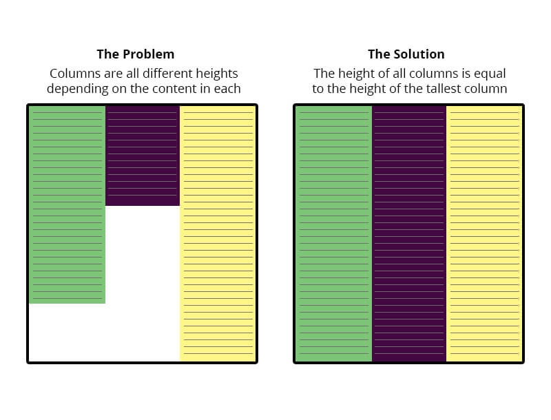
The Flexbox Layout module was designed to solve the problems of displaying equal height using CSS. It is an efficient and flexible way to manage probably all types of layouts. It provides almost no time gap between initially wrong and correctly laid out layout look. In the case of JavaScript solution, the document downloading takes time, after that download the corresponding JS file if there are any, and download images in the blocks.
Flexbox on the other hand is instant as JavaScript takes seconds. Though this JavaScript case is appropriate for those who use browsers that do not support Flexbox. However, Flexbox kills the necessity of selecting specific content type, restricting the number of words, cut sentences of mid flow, etc. Flexbox comes with the benefit of providing flexibility of content as it calculates the space available inside its containers.
This works flawlessly in the latest versions of Chrome, Android, Safari, Opera, Firefox, and Internet Explorer 10+.
#Equal Height using Margin & Padding:
Achieving equal height columns with just CSS is such a common scenario with a few simple solutions. In projects that follow a standard content-sidebar layout, helps to have both of the containers seemingly stretch to the bottom of the page.
This method uses margins, paddings, and overflow to force the columns to be equal heights. The methodology entails setting a big enough padding at the bottom of each floated element, and countering it with an equal negative margin at the bottom of the same elements. The trick is to set the overflow on the parent container to hidden. This works perfectly in the latest versions of Chrome, Android, Safari, Opera, Firefox, and Internet Explorer 9+.

#Vertical Align Middle using Flexbox:
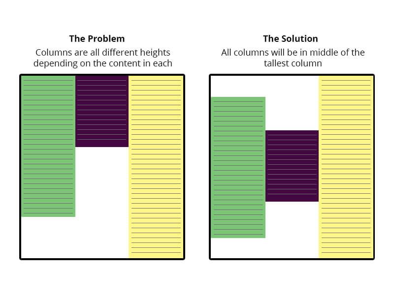
The lack of good ways to vertically center elements in CSS has been a dark blemish on its reputation for pretty much its entire existence.
What makes the matter worse is the techniques that do work for vertical centering are obscure and unintuitive, while the obvious choices (like, vertical-align:middle) never seem to work when you need them.
The current landscape of vertical center ranges from negative margins to display:table-cell to ridiculous hacks involving full-height pseudo-elements. Though these techniques sometimes get the job done, but they don’t seem to work in every situation. What if the things you want to center is of unknown dimensions and isn’t the only child of its parent? What if you could use the pseudo-element hack, but you need those pseudo-elements for something else?
With Flexbox, you can stop worrying. You can align anything (vertically or horizontally) quite painlessly with the align-items, align-self, and justify-content properties.
#Vertical Align Middle using Table cell:
CSS tables might be fine for you or it might not as tables do render a bit differently than just a regular block-level div does. For instance the 100% width thing, a table will only stretch to be as wide as it needs to for the content inside it; whereas by default a block level element will expand to the width of its parent automatically.
If we set up a “ghost” element inside the parent that is 100% height, then we vertical-align: middle both and the element to be centered will attain the same effect.
Since the vertical-align property works with table cells we set the parent div to be a CSS table and we set the child div as a table cell. We can then safely use vertical-align: middle to vertically center the contents of the child div.
This method works with multiple lines of text and the container div will grow dynamically with the content. Unfortunately it doesn’t work with IE6 or IE7 without a fix.

The alignment and setting height of your landing page will be easeful after the implication of these solutions.
However, if you’re juggling through more landing page related issues, then Uplers can help you design & code beautiful landing pages. Visit our order page today and get blessed with flawless landing pages.


Kevin George
Latest posts by Kevin George (see all)
5 Mother's Day Email Ideas to Boost your Conversion Rate
The Anatomy of a Heavenly Email Newsletter Design