Many digital marketers overlook an essential component in optimizing their advertising campaigns — that the post-click experience is just as important as the pre-click experience. Ignoring the post-click experience is detrimental to conversion goals and largely contributes to the alarming 70-90% landing page bounce rate.
Prospects can be persuaded to click through on your optimized ad but what convinces them to convert is a dedicated page with the right landing page elements. That’s because the landing page is where the conversion happens with a new process called post-click optimization.
What is post-click optimization?
Post-click optimization is the process of ensuring that the ad click leads to a conversion by directing visitors to a landing page that matches the ad’s message. By optimizing the post-click experience, you’re encouraging the prospect to complete the intended action by clicking your landing page CTA button.
Multiple landing page components can help with this, but before we discuss each of those, let’s first compare an optimized post-click experience with a poor one.
First, Agency Platform’s landing page:
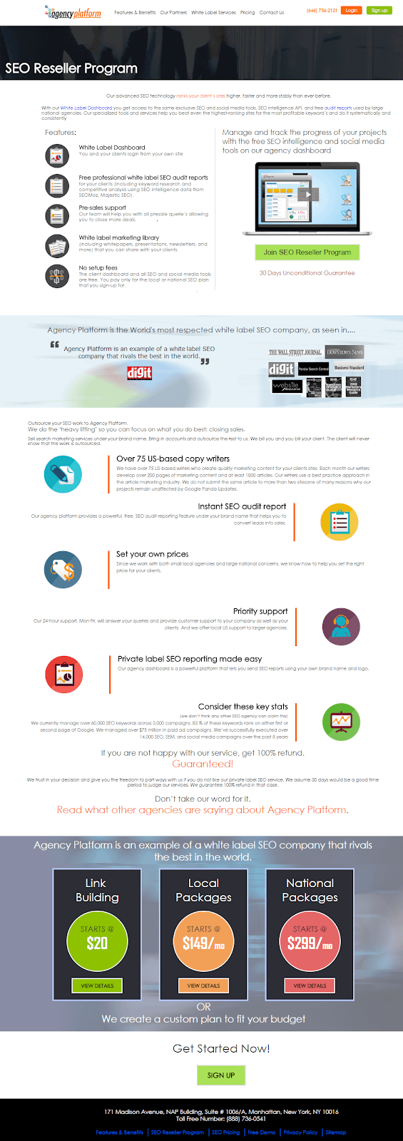
- The abundance of copy will likely overwhelm visitors and cause them to leave the page without evaluating the offer.
- Minimal white space makes the page look busy, cluttered, and difficult to navigate.
- Many exit links in the header and footer make it too easy for prospects to leave the page before converting.
- The CTA buttons don’t stand out because they are too small, the colors don’t contrast, there are competing calls-to-action, and the copy is vague.
Second, this one from Blue Apron:
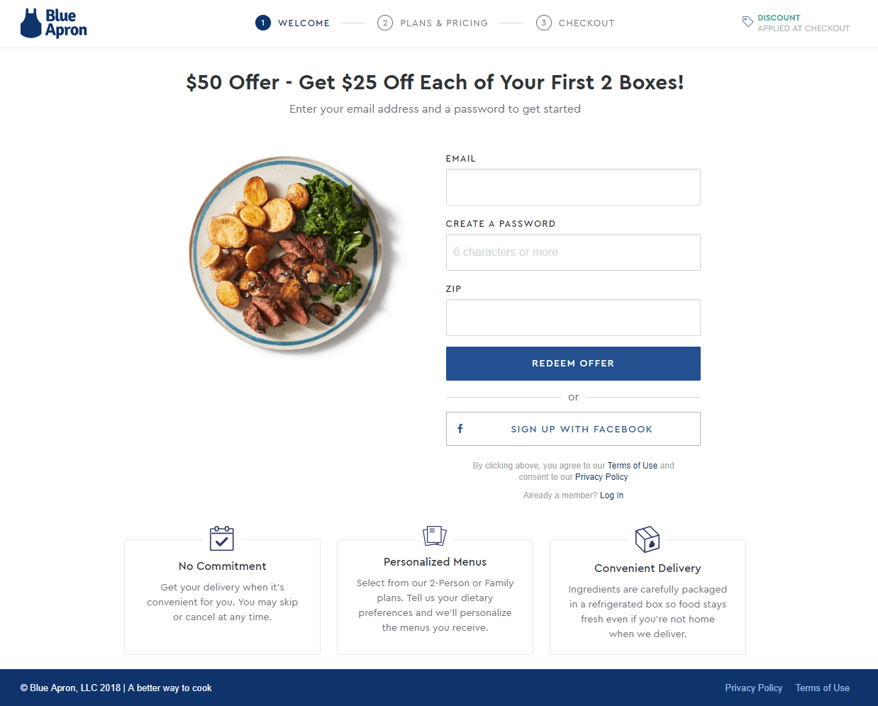
- The multi-step form broken up into shorter steps helps reduce friction on the page.
- The sign up with Facebook option offers a faster, alternate method to sign up fro Blue Apron using your Facebook profile credentials.
- Iconography, bold formatting, and minimal copy allows visitors to learn about Blue Apron’s benefits without reading through a bunch of text.
That said, let’s understand how you can enhance the post-click experience.
5 landing page elements that optimize the post-click experience
1. No navigation links
Since a landing page is a standalone page designed to promote a single offer, there shouldn’t be any other clickable elements aside from your CTA button. All landing pages must maintain a 1:1 conversion ratio — one clickable element to complete one conversion goal.
Pages with multiple clickable elements distract people from the conversion goal, and allow them to click away from your page before converting. Ultimately, this re-routes the customer journey and decreases your conversion rate.
Advertising Specialty Institute’s email landing page is a great example of a page with a 1:1 conversion ratio. First the email ad, then the landing page:
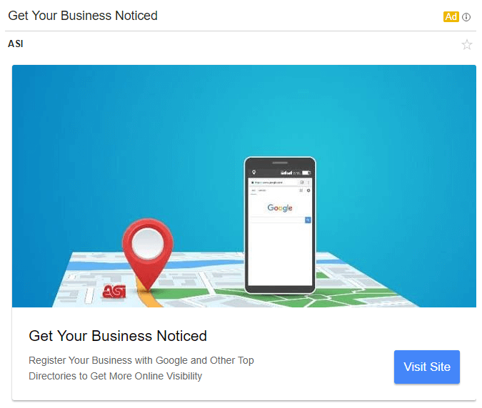
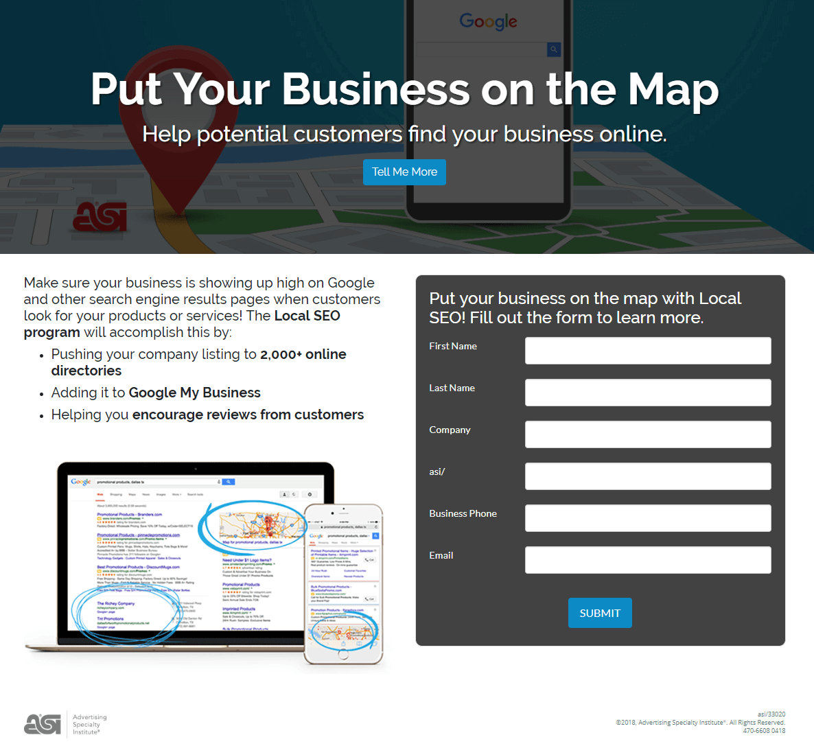
- The ASI logo at the bottom of the page isn’t hyperlinked, not even to the homepage.
- No header or footer navigations keep visitors focused on the page.
- The blue CTA buttons are the only clickable elements on the page — the “Tell Me More” anchor tag improves the user experience, and the “Submit” button for prospects to fulfill the conversion goal.
Take a cue from this page and keep visitors focused on your offer by maintaining a 1:1 conversion ratio by eliminating the header, footer, and any extraneous links.
2. Message matching
Message matching is the process of matching your ad’s primary message to that of the corresponding landing page. That includes the email and landing page headline, imagery, primary branding colors, and of course, the promoted offer.
To demonstrate, Adapt’s email ad and landing page maintain message match, motivating visitors to click the CTA button. First the email ad, then the corresponding landing page:
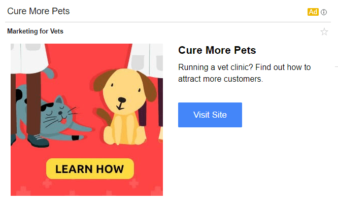
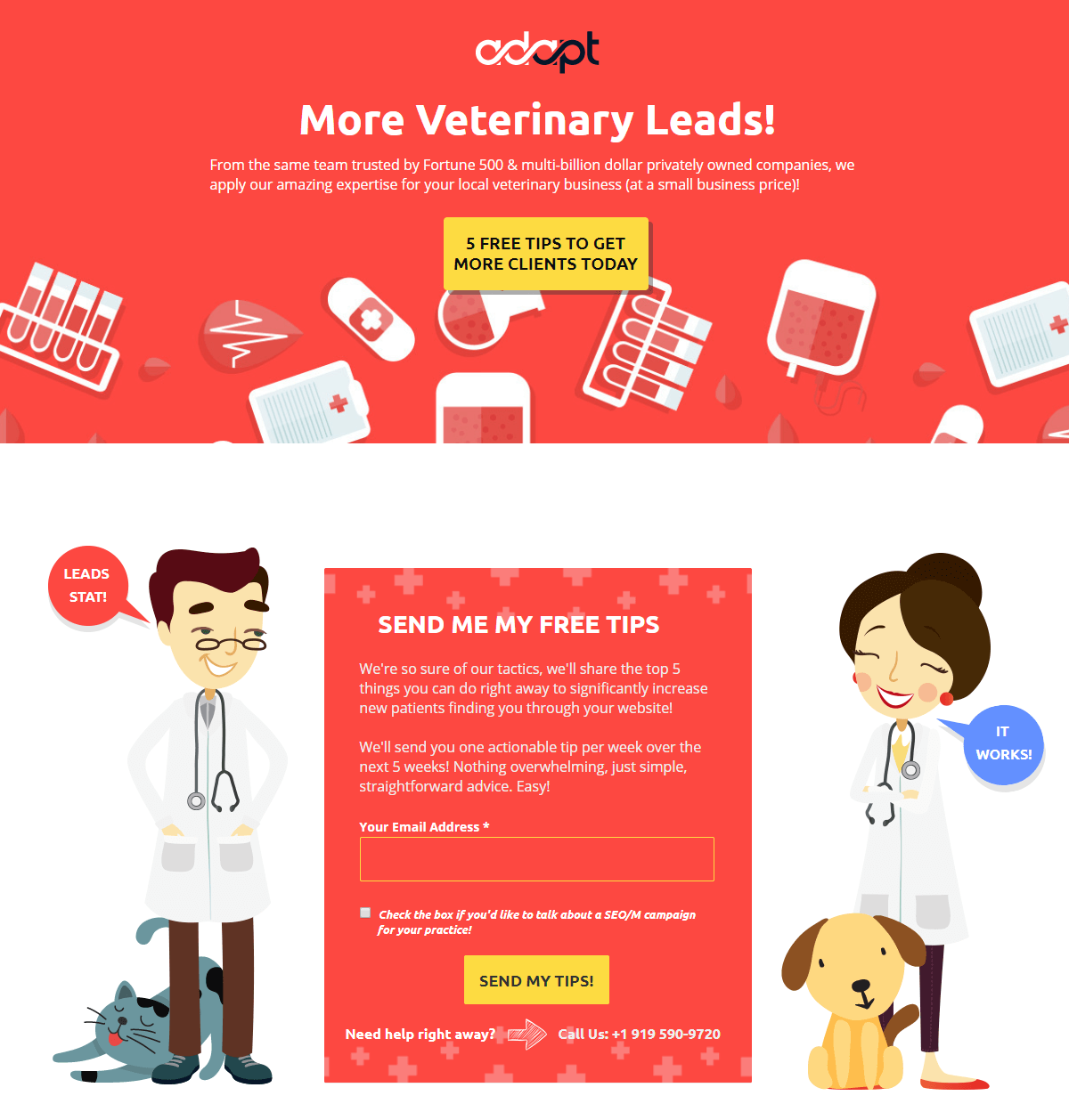
- The brand colors (red and yellow) are used on the email ad and the landing page.
- The images are the same on the email and landing page.
- The offer is the same in both places: Learn how to attract more customers and generate more leads with 5 free tips.
By maintaining message match from email to landing page, you satisfy user expectations that initiated with the ad click. This plays a significant role in optimizing the post-click experience, and therefore, makes it easier to generate conversions.
3. Retargeting
Industry averages report that only about 3% of website visitors complete the contact form on websites. Digital marketers can do better than that, though. By retargeting the other 97% with personalized ads and landing pages, you can increase your chances of converting them.
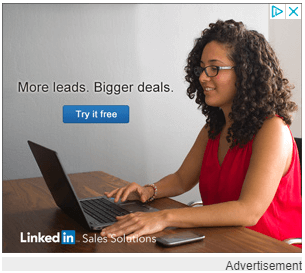
After reading various LinkedIn Sponsored Content articles, I was retargeted with these LinkedIn banner and skyscraper ads on two different websites, Business Insider and Weather.com, respectively:
 Both ads lead to the same personalized landing page:
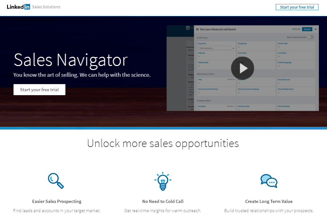
- “More leads” is great for capturing attention in this retargeting ad campaign, since I was reading articles about Sponsored Content designed to generate more leads.
- The color scheme is the same from ad to landing page, using LinkedIn’s branding colors — blues, greys, white, and black.
- First and second-person copy on the landing page makes the offer more personalized and compelling.
Combining those suggestions with other landing page best practices can help you capture the attention of the 97% of website visitors who leave without converting. And retargeting makes it all happen with personalized ads and post-click landing pages.
4. White space
White space, also referred to as negative space or blank space, is the empty area between and around landing page elements. This space is used to draw attention to the most important landing page elements, such as the CTA button.
It is worth noting that this empty space doesn’t have to be white. It can be any color as long as it helps improve the post-click experience by:
- Reducing clutter
- Focusing the user’s attention
- Increasing breathing room between page elements
- Improving comprehension
To demonstrate white space, take a look at Scorpion‘s landing page:
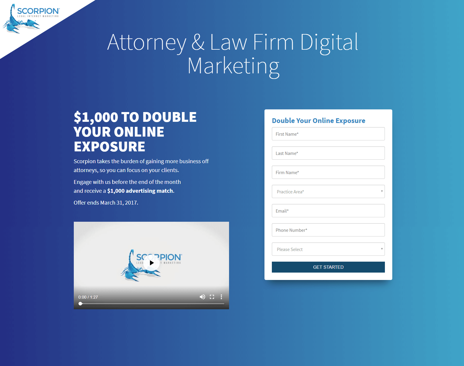 Notice how all the empty space along the outside helps each element shine:
- The headline immediately lets visitors know what digital marketing areas Scorpion specializes in.
- The subheadline (bolded) stands out better since it has breathing room from the primary headline.
- The video does not get lost at the bottom of the page near any links or page footer.
- The form contrasts with the page background drawing attention.
Turn visitors’ attention to your most important landing page elements by surrounding them with white space and persuading them to convert.
5. Contrasting CTA button
Getting prospects to convert all comes down to your CTA button, how visible it is and how optimized it is for conversions. Although there is no one universal CTA button to use across all of your pages, there are best practices to keep in mind.
At minimum, the CTA button color must contrast with the rest of the page because if people can’t find it, you can’t expect them to complete the action. Some other tips include:
- Making it large enough to stand out above all other elements
- Crafting personalized and persuasive copy
- Adding visual cues to draw even more attention
See how Celtic Bank’s CTA button contrasts nicely with the rest of the page leaving no doubt what the end goal is for this landing page:
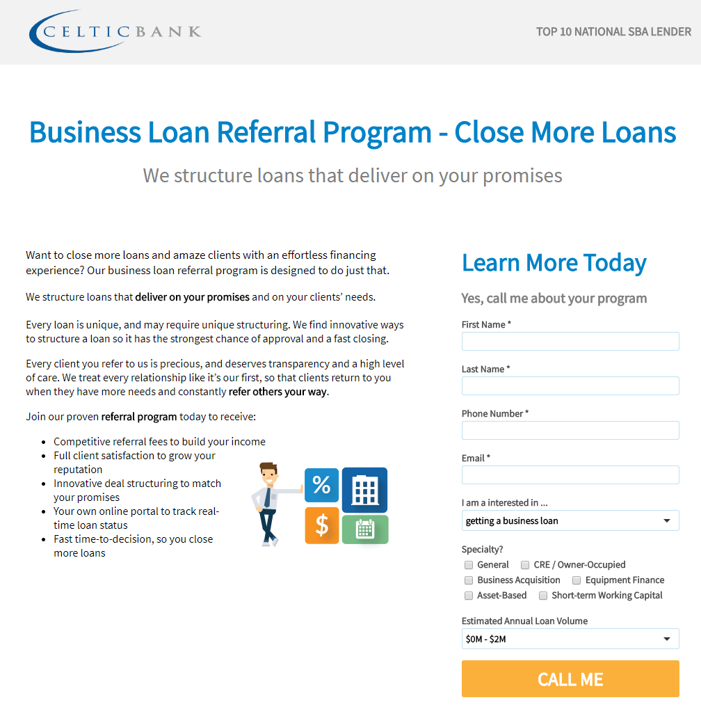
- The orange button contrasts well with everything else including white background, and blue and black copy.
- The button is one of the largest elements on the page, helping it stand out.
- The CTA button copy is personalized and compelling because it is written in first-person.
Capture visitors’ attention and persuade them to click your CTA button by designing it in a contrasting color that looks aesthetically pleasing on the page. Use other visual cues such as size, arrows, and white space to complement the color contrast, and help it stand out even more.
Improve conversion rates with an optimized post-click experience
Email marketing messages and their design are not the only factors impacting your conversion rates, because optimizing prospects’ post-click experience is just as important as the pre-click stage.
Be sure to optimize the post-click experience by designing landing page elements that don’t prematurely remove visitors from the page, match the message of your email, and help draw attention to the details that matter most in fulfilling your conversion goal.
About the author:Tyson Quick is the Founder and CEO of Instapage, the leader in post-click optimization. He founded Instapage in 2012 after seeing how performance and growth marketers were losing money in underperforming advertising campaigns. Since then his vision has been to create a suite of post-click optimization products that maximize returns through advertising personalization. |




Guest Writer
Latest posts by Guest Writer (see all)
How to Use Suppression List Management to Drive Email Performance
Cart Abandonment Emails: Why a Series is Better than a One-off Email?