Creating a landing page with keeping some crucial design trends in mind is helpful in conversion of visitors. This blog discusses what is a landing page design trend and why it matters to a business while driving customers to buy products or services. Then, you will learn which out of dozens of emerging trends, the designers are most likely to consider in 2022 to create landing pages.
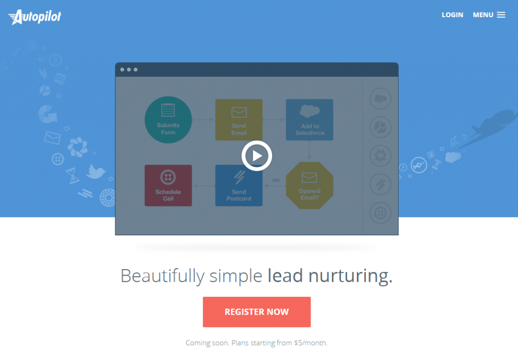
A landing page is a webpage that a potential customer first sees after clicking on a business link. The purpose of this page is to convert the visitor into a customer. It is a stand-alone page, so a minimal landing page design is important. But it is also a ‘click-through page’ that visitors use to go to another page of the website.
In fact, landing pages can be categorized as website offer page, tools pages, sales page, slash page, click-through page, squeeze page, and viral landing page. All of these pages serve the same purpose: to open the door to a website. But landing page design must stand out to help visitors make a buying decision.
The significance of a landing page design
A landing page is not just to compel visitors to click on a button to take the desired action. Of course, that is the primary job of the page. But the page serves a lot of other purposes as well. Responsive and trendy landing pages convert more users into customers!
Here are some of the advantages of a trendy landing page design for a business
Collect email addresses
A long list of email addresses is helpful for a business to market its products or services. Once you have the emails of people interested in your offerings, you can then send them emails of your messages to convert them into your loyal customers.
Landing pages are excellent sources of getting email addresses when people provide their contact information. Collected email contacts are the most important & reliable source to build a great email marketing campaign!
Know how visitors interact with your business

Your landing page, if set correctly, can be a tool to find out how people are interacting with your business. Your sales team can analyze the data generated by that interaction and see who you should target to give your sales calls.
Keep your visitors away from distractions
Website pages have many elements such as colors, images, illustrations, text, navigation options, etc. But a landing page is usually a simple page with few design elements. Everything is short and sweet on this page, so the chances of a visitor being distracted are almost nil. Help visitors make a decision.
Making a buying decision is not easy for people when they have many options around. A well-thought-out landing page is a minimalist design that gives no other options to the visitors other than to click on the CTA button. So, because of no ambiguity, the visitor can immediately take the sole decision.
Landing Page Trends that will make waves in 2022
Organic Shapes
Landing pages typically come in standard shapes such as squares, rectangles, circles, etc. In 2022, landing page designers are likely to experiment with different shapes. They may be using organic shapes and shapes that appear fluid.
The designers will use such new shapes to make landing pages visually appealing to the eye. Such shapes look soft and are capable of conveying friendliness.
An otherwise typical landing page enlivens up and transforms into something interacting and engaging with subtle organic shapes.
Custom illustrations
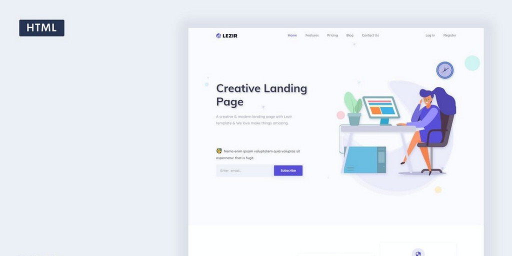
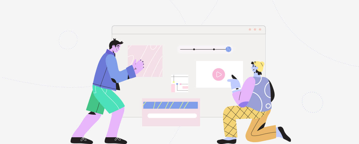
Landing pages have to catch the eye instantly with something unique. So, more and more landing pages have custom illustrations which people like to see as a fun element. Illustrations make a page interesting, engaging, and put an extra dimension to it.
The landing page designers now see custom illustrations to interact with visitors and entice them into taking the intended action.
Video in the background
If you add a nice little video in the background of your landing page, it will break away from being a boring static page. People will have some moving images that they can relate to, and the video will also result in more engagement with visitors.

However, make sure that you do not overdo your background video. Do not incorporate an overwhelming video that takes away the focus from the intended CTA on the page, and the focus should still be on your main value proposition.
Make sure that you have optimized the video. This means that the file size of the video should be smaller in between 7 to 10 MB. Also, the video should flow smoothly, and it should never be jerky or have many cuts.
Most importantly, upload only a high-quality video to make a good impression on viewers.
Large typography
One of the tricks that landing page designers are coming up with is creating the pages in large typography. The brand’s message appears above the fold on the page in big letters so that visitors notice it immediately.
Another reason the larger typography trend has gained momentum is that it helps keep visitors focused, avoiding distractions. People’s reading behavior online has changed a lot as they tend to skip a more significant chunk of text.
So, business landing pages want to drive potential customers’ attention to a message in big font sizes. Large typography is already being used extensively in graphic designs, from logo design to building a brand identity. A new business must also have a unique logo to impact the visitor and get your brand message across.
Minimalist design

A landing page design should be such that it does not overwhelm the viewers with clutter. If multiple elements are scattered around the page, it will lead to confusion for the visitors. Sometimes, such a design is a cause of visitors leaving it without taking action.
But minimalist landing page design is not just about keeping things simple for the visitors. Instead, the purpose of the design trend is to optimize the page loading speed, which leads to better conversion rates. It is also suggested by experts that a minimalist logo design, is also important, as it is the most important element of your website or business.
With a minimalist design, visitors can instantly grasp the information they are looking for on the page. This will help them make the decision fast.
Live Chat feature

Landing pages are now coming up with a live chat feature, proving highly useful for visitors and customers. For example, if a visitor has not yet decided on buying a product or service and wants to ask some questions, they can get the answers in real-time. This helps in building trust for your business.
Moreover, as a business owner, you can get a sense of customers’ problems and doubts about your offerings. When you know the customers’ pain points through live chat, you can optimize your content accordingly to resolve the issues.
Use of animation to tell a story
Another useful feature that has become part of a landing page design is animated storytelling. The page designers use animation to add some fun elements to engage the visitors. But animation is also a great way to tell a brand story.

Your visitors do not have to think hard about your brand when they see the story and message unfolding through animation.
Inclusion of product visuals
A landing page design trend that is fast picking up is giving a glimpse of products and services. When visitors see faces of happy people with the offerings of a business right when they are on the page, they are more likely to make a buying decision.
So, the product visuals become a way to entice visitors into buying or taking the intended action.
Multi-step form
When a landing page design requires visitors to fill a form with some essential details, visitors do not want to be overwhelmed with one large form; they may leave the page.
To resolve this, the page designers now divide the form into some easy steps and put one step of the form to complete, and then the other step is revealed. Visitors can manually navigate to the next step.
Testimonials
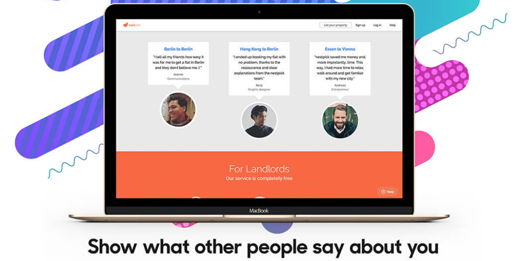
A landing page with testimonials from satisfied customers is much more assuring to the visitors than anything else. They can make a quick buying decision based on the recommendations from the previous users of products or services.

To assure visitors, even more, put testimonials in videos so that visitors can see what actual users say about the offerings. Most of such videos address the pain points of customers and how the product or service resolves it.
The conversational style of copy
Marketers today understand the importance of making a rapport with the audience to treat them as normal humans and not just buyers. So, a landing page now has a copy that is written in a more conversational style than just formally sharing information.
The trend of business websites doing away with a formal copy and shifting towards a conversational writing style is not new. In landing pages, however, this trend is comparatively new and picking up fast.
So, these are the major landing page trends that you should keep in mind while designing the page for your business website in 2022.
Wrapping Up
The landing page design has come a long way from a static and formal page to a modern, engaging page with helpful features for visitors. Many new design trends come up each year and for 2022, we see custom illustrations, highlighting of CTA, background videos, large typography, live chat, minimalist design, animated storytelling, and display of product visuals.


Henny Kel
Latest posts by Henny Kel (see all)
B2C Email Marketing Tips For Standout Success
How to Power Up Your Customer Engagement Goals with Salesforce Marketing Cloud