Everyone loves to say a ‘lot’ in the online space, but space as such has always been a constraint. But if you can do it, you win! One of the crucial reasons why Twitter became popular is because it realized the very notion of communicating your thoughts in 280 characters. Have you though how can you implement the same theory in emails? Accordion in emails can change the game!
As a sixth part of the popular Mailable Microsite series, Uplers enlighten you on how you can dramatically reduce the email length without compromising on the email copy using Accordion effect. Just like the musical instrument accordion, the use of interactive design element – Accordion helps collapse and expand sections of the email based on user interaction.
Pair the expand-collapse effect in Accordion with a relevant animation and you have an email that motivates your subscriber to explore all the sections.
Let’s understand how Microsoft experimented with implementing Accordion effect in their promotional email, and how Microsoft can implement accordion effect in some more emails as in Newsletters.
How Microsoft Email Implemented Accordion Effect for Their Promotional Email
Ideally, an email should only be 2 scrolls long. Any longer than this will discourage the subscriber to proceed till the end. Microsoft implemented Accordion effect in one of their promotional emails to promote their ‘Surface’ range of products.
Here, as you can see in the below email, they have segmented their products into different sections when implementing the Accordion effect.It’s only when they click any of the arrows, do the subscribers experience the magic.
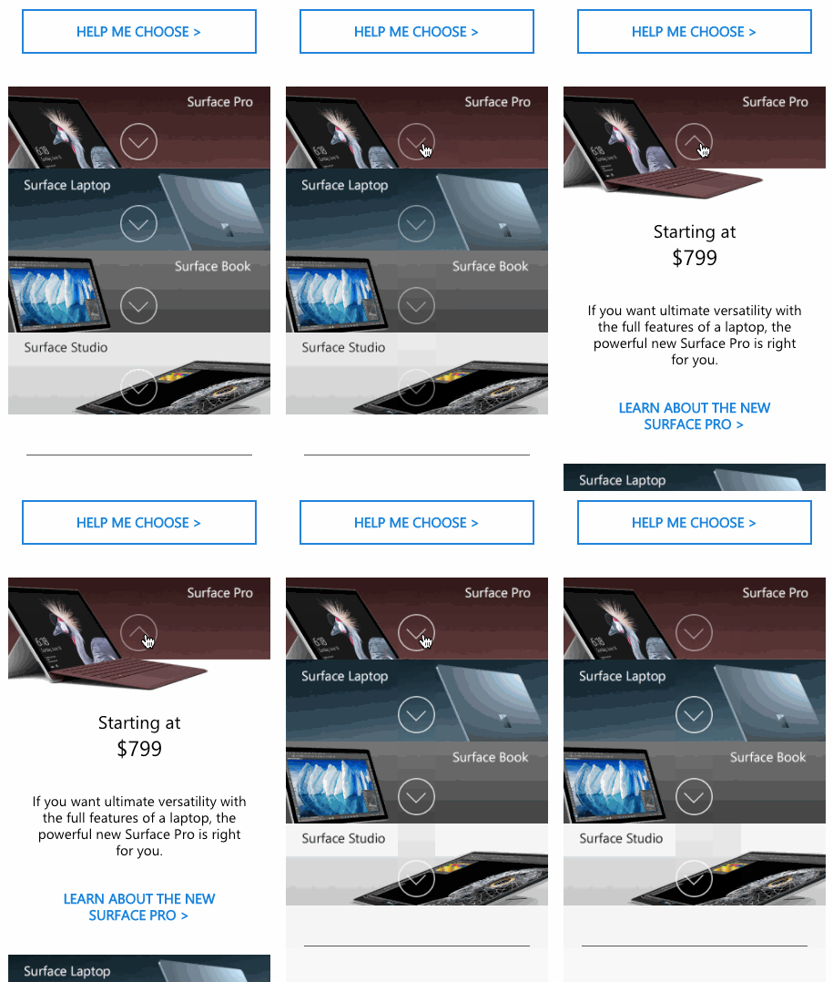
Details about each product is revealed and a relevant CTA is shown in each section. Moreover, only when the section is expanded, the complete product image is revealed which adds to the visual appeal. This way, each product gets individual attention and owing to expand-collapse feature, the overall email length is not affected by the content.
While this email from Microsoft was a visual wonder that implemented accordion effect very well, it received a lot of flak from email developer community. This interactive email from Microsoft was not compatible in any of email clients from Microsoft except Outlook for Mac.
Accordion effect is compatible across Gmail (desktop and mobile), Apple Mail, iOS Mail and Thunderbird, so roughly 80% of the popular email clients will support the email.
How Microsoft Can Include Accordion in More Emails
In the following newsletter email, Microsoft promoting the features of their latest operating system, Windows 10. What if they created an Accordion effect for this email!
From our email template production experience of designing and coding emails for our 65,000+ customers worldwide, we realized this email can be converted into an Accordion and have suggested some design suggestions. In fact, Uplers couldn’t resist exploring the impact and fun, using interactivity like Accordion could have made to Microsoft’s existing newsletter template below:
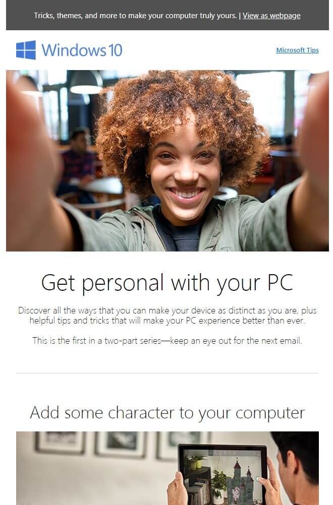
Click on the image to view the full email
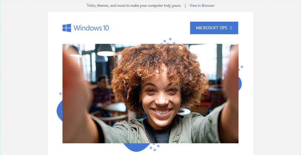
Uplers Visualization on Accordion CSS in this email is:

Click on this image to experience the email
Suggestion #1: CTA button at first fold.
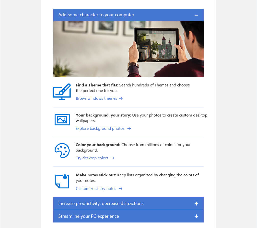
Suggestion #2: Segment into sections
Suggestion #3: Improved Footer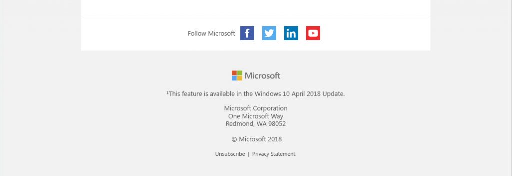
Advantages of Using Accordion in Emails
- The email looks visually organized and better legible.
- Even though each section has significant amount of description; in an accordion email, since the sections are stacked and only one section remains open at time, the overall length of the email is not affected.
- Each section has an individual CTA and using heatmaps you can track the CTA in which section delivers the most clicks compared to others. This way you can analyze and create better strategies for your next campaigns.
Want to send an Accordion in email?
Have you tried sending an Accordion in email to your subscribers? If not, then grab the opportunity now!!!




Kevin George
Latest posts by Kevin George (see all)
How to Design an Email Campaign that Meets Brand Guidelines
INTERVIEWING Kath Pay: Email Metrics Analysis & How to Create Better Campaigns