In 2007, Apple took the mobile device industry by the storm by introducing the 1st generation iPhone. Even though Blackberry was already popular for supporting push email in their devices, Apple iPhone added the much needed l
everage in making email responsive.
In 2011, Apple’s 4th Generation iPhone i.e. iPhone 4S was introduced with a Retina display and the need for catering high definition images on all fronts became the industry standard. In a domain where images actually speak more than words, email marketers effortlessly adopted the best practice of having every image in their emails be retina compliant. You can check out our infographics on the best practices for Retina ready emails.
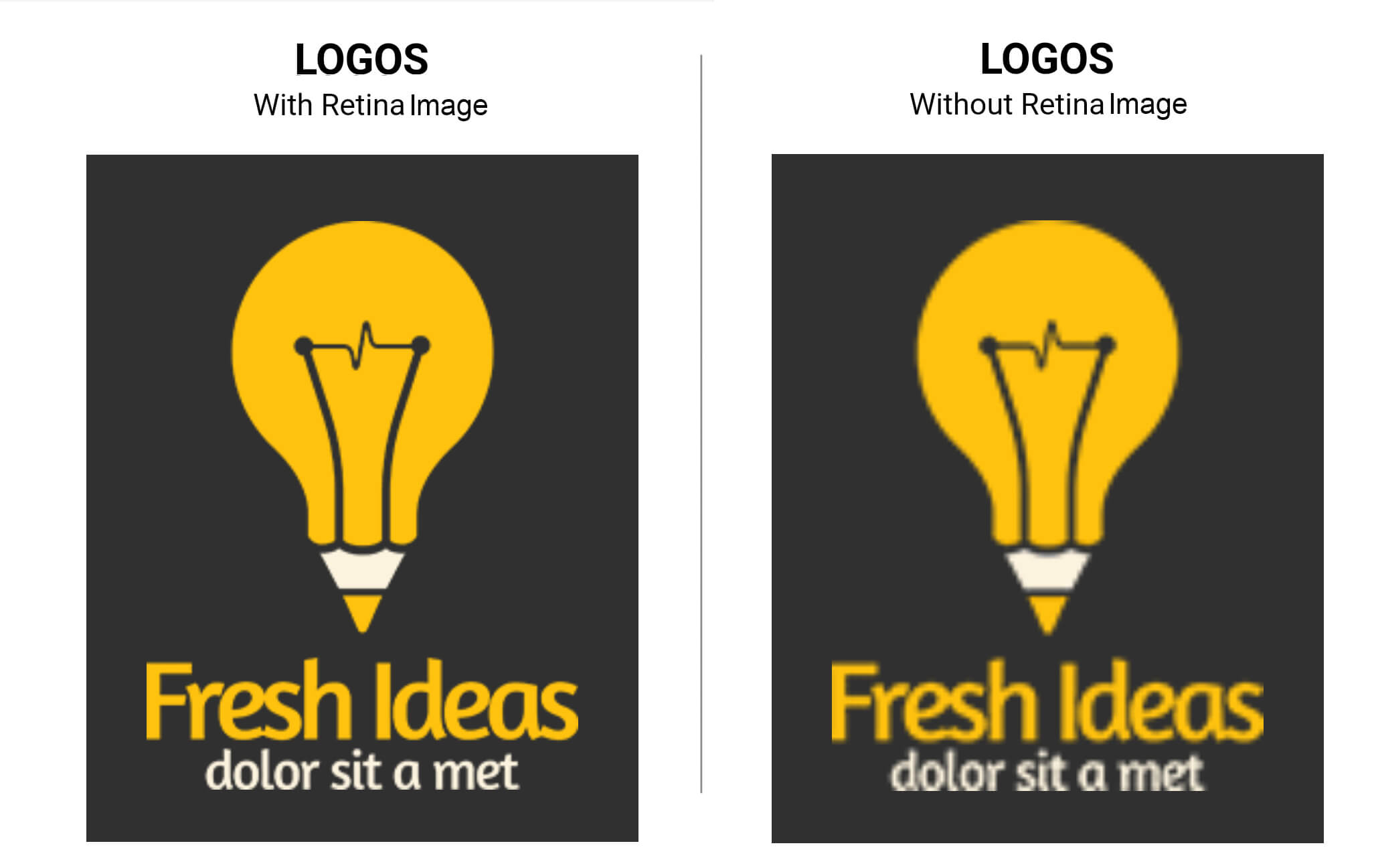
With more and more people making use of the Master Templates to send different types of emails from one single skeleton template, image replacement is one of the major deal breakers. Unfortunately, MailChimp’s Editor poses certain roadblocks when it comes to editing and replacing retina ready Mailchimp image size within an email template or Master Template.
How to edit images in Mailchimp?
In any email template that can be edited in Mailchimp, it is important to specify which sections in the email can be edited by using the tag ‘mc:edit’.
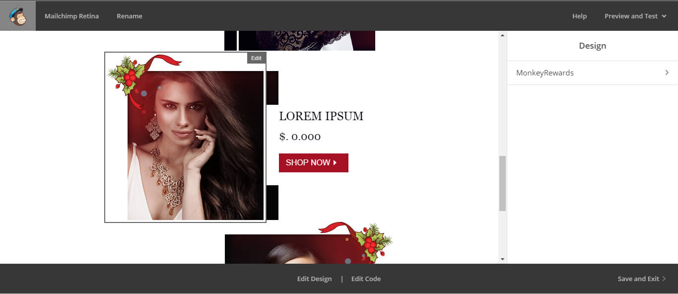
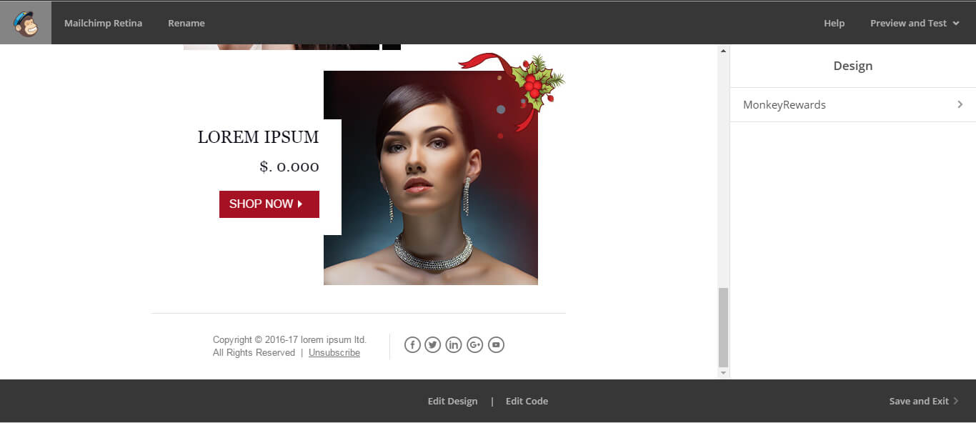
To edit as a text or as an image?
As most of the emails are coded in a table layout, most of the sections are as below
<tr>
          <td valign="top" align="center">
<img class="em_img" src="xyz.jpg" width="700" height="416" alt="Alt Text" style="display:block;font-family:Arial, sans-serif; font-size:16px; line-height:18px; color:#000000; max-width:700px;" border="0" />
 	</td>
</tr>
Now depending on where you place ‘mc:edit’ tag, Mailchimp offers a different editor.
- Place it within <td> tag and Mailchimp identifies it as a text and provides the text editor option.
 tags" ><td valign="top" align="center" mc:edit="image_9">
<img class="em_img" src="images/img_01.jpg" width="307" height="319" alt="" style="display:block; max-width:307px;" border="0" />
</td>
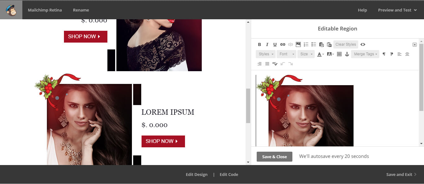
Now, in this case, you can replace the image but since retina images are twice the resolution of an ordinary image, there is a chance that your image shall be cropped or won’t stay bound within the width of <td> tag. - Place the ‘mc:edit’ within the image source.
<tr>
          <td valign="top" align="center">
<img class="em_img" mc:edit="image_8" src="images/banner.jpg" width="700" height="416" alt="WITH 25% OFF on All JEWELLERY" style="display:block;font-family:Arial, sans-serif; font-size:16px; line-height:18px; color:#000000; max-width:700px;" border="0" />
</td>
</tr>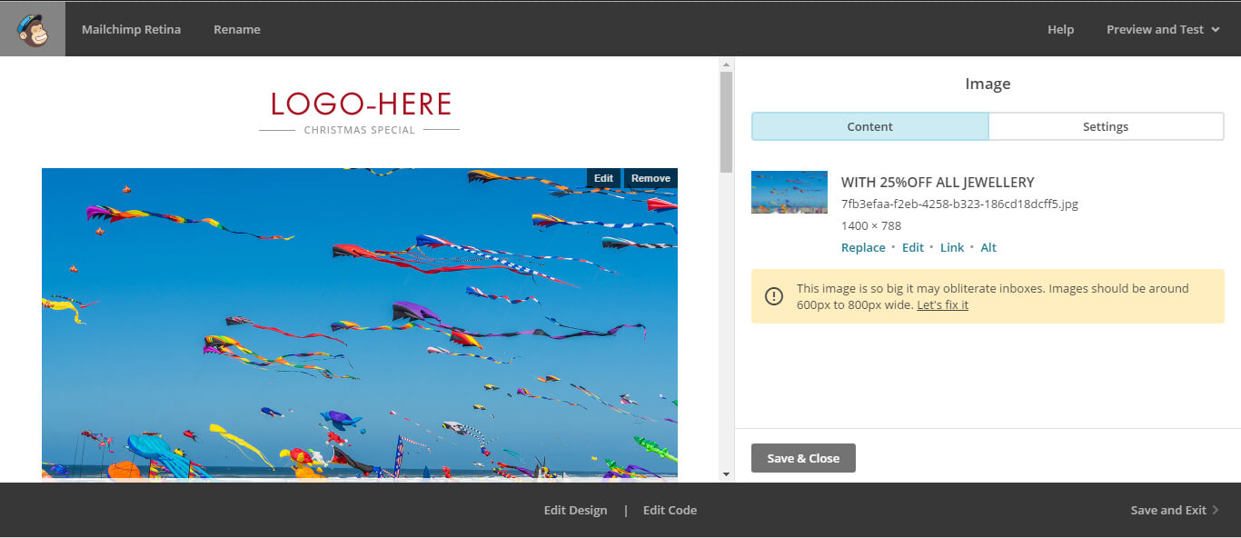
In this case, Mailchimp identifies the section to be an image and provides an image editor.
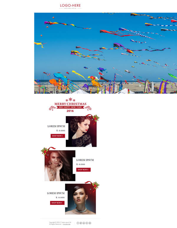
But as you can observe, the image resolution causes Mailchimp to show a warning that images of this size can be problematic. And when the image is replaced, it goes out of the bounds.
Solution in both scenarios
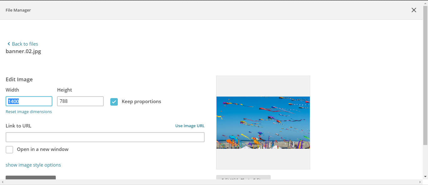
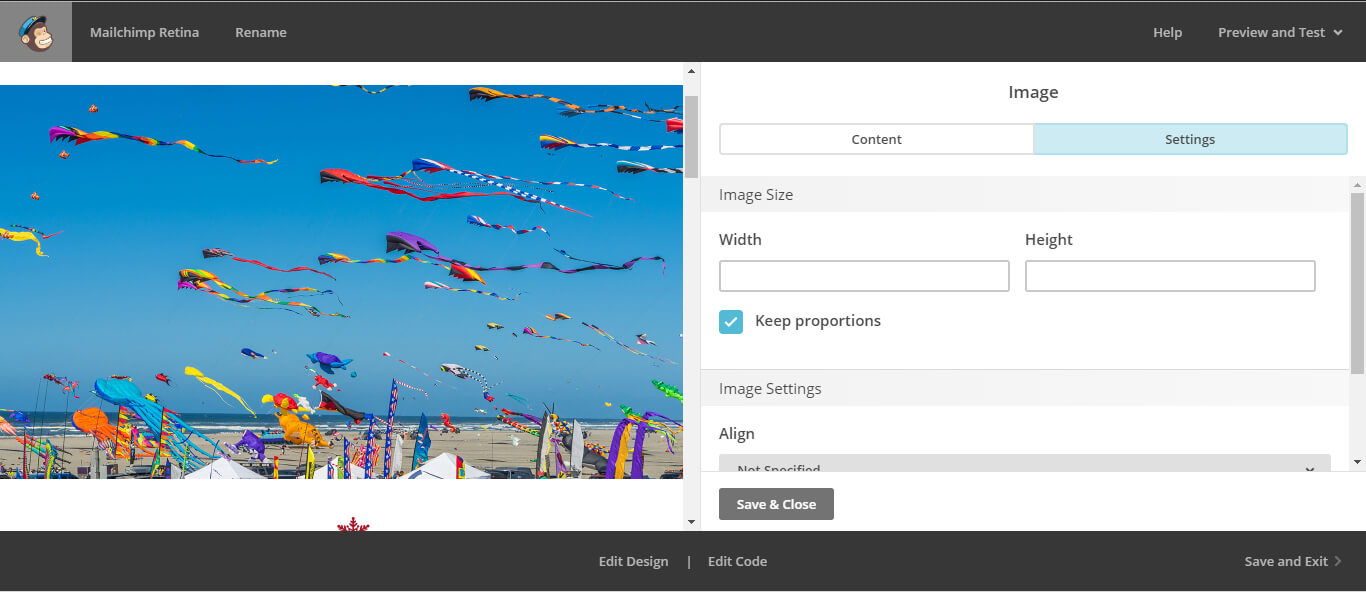
You need to provide a max-width by going to settings and specifying the width. Enable the ‘Keep proportions’ checked and the image height is adjusted accordingly.
Please Note: This is not supported by the custom editor. So it is better that you provide ‘mc:edit’ alongwith the image when you upload the template.
Wrapping Up
With more and more devices flooding the market with HD, FHD, 2K, 4K and other numerological K resolutions, it is important for the images you use in your emails to be very sharp and crisp. For DIY email marketers all around the world, it should not be the end of the road if they find it difficult dealing with replacing retina images. Have you come across any similar tweaks? Spark the conversation in the comments below.



Kevin George
Latest posts by Kevin George (see all)
Mailable Microsites III – How Burberry Impeccably Slid ‘Sliders in Emails’
Background Image now supported in Windows 10 Mail & Live Mail