Inventing a game is one thing; implementing it in email, another. This is because:
- Developing a game is costly and time-consuming.
- Email gamification is not everyone’s cup of tea, so it may lead to a kind of analysis paralysis mid-project, causing limbo.
- Client compatibility may be the biggest challenge.
- Mobile accessibility can be quite tricky to pull off.
Therefore, if you want to gamify an email, you need more than expertise. You need experience, intuition, and a competent team.
Gamification being one of our strong suits, our developers know what exactly goes into creating fully-functioning games for email. In this guide, we show how we built our latest Thanksgiving game for our subscribers. Let’s go!
How the Thanksgiving Game Works
Our Thanksgiving game features Oliver and his cat, Whiskers, who is missing. As Oliver, you need to find the right kitchen cupboard to get a turkey and use it to lure Whiskers back so you can celebrate Thanksgiving together.
We recommend that you play the game yourself first.
Before diving into how we built the game, let’s first review the key CSS properties used to manage visuals, presentations, and animations. These are:
- Opacity
- Visibility
- Keyframes
- Labels
Let’s understand each of these in some detail.
1. Opacity
The opacity property manages an element’s transparency.
Set to opacity: 0;, the element becomes fully invisible while remaining part of the layout and interactive.
This property is particularly useful for creating fade effects.
.transparent-element   {
opacity: 0; /* Element is invisible but still clickable */
}
2. Visibility
The visibility property hides an element without removing it from the layout.
When set to visibility: hidden;, the element becomes invisible and non-interactive but continues to occupy space.
.hidden-element   {
visibility: hidden; /* Element is hidden and non-interactable */
}
3. Keyframes
Keyframes enable you to define the intermediate stages of an animation, specifying the start, middle, and end states.
This allows for smooth transitions of properties such as opacity.
/* Define the fade-in animation */
@keyframes fade-in02 {
 0% {
 opacity: 0;          /* Fully transparent */
 visibility: hidden;  /* Hidden from layout */
}
 100% {
 opacity: 1;          /* Fully visible */
 visibility: visible; /* Visible in layout */
4. Labels
Labels in HTML interactive emails are essential for boosting engagement.
Often paired with form elements like checkboxes, radio buttons, and input fields, they facilitate actions such as toggling content visibility, revealing hidden sections, or enabling in-email navigation. By linking a label’s for attribute to the corresponding form element’s id, labels become clickable, enhancing accessibility and interactivity. When used creatively, labels can create dynamic email layouts, including collapsible menus, content revealers, and surveys—all without relying on external scripts, ensuring broad compatibility across email clients.
<! - - Checkbox to toggle visibility (invisible) - - >
<input type= “checkbox”   id=“showContent”   style=“display:none;”>
<! - - Label that triggers the checkbox - - >
<label for=“showContent”>Click here to reveal hidden content in table</label>
Let’s now understand the entire game in detail.
Diving into the Nitty-gritty!
Here’s the preview of our Thanksgiving game.

Labels and Page Transitions
- Checkbox:
The checkbox <input type=”checkbox” id=”redirect-checkbox”> is hidden using display: none;. It serves as the trigger for the transition. - Label:
The <label for=”redirect-checkbox”> is styled to resemble a button. Clicking the label toggles the hidden checkbox. - CSS Logic:
- The <a> link is initially hidden using display: none;.
- When the checkbox is checked (#redirect-checkbox:checked), CSS makes the link visible.
4. Redirection:
The user clicks the label to reveal the link, and clicking the link redirects them to the next page.
<form>
    <input type="checkbox" name="Help Oliver" id="em_help" style="display:none;" />
    <input type="checkbox" name="Game Story" id="em_enter" style="display:none;" />
    <input type="checkbox" name="living" id="em_living_room" style="display:none;" />
    <input type="radio" name="turkey" id="em_click_turkey" style="display:none;" />
    <input type="checkbox" name="kitchen" id="em_back_kitchen" style="display:none;" />
    <input type="radio" name="door" id="em_left_door" style="display:none;">
    <input type="radio" name="door" id="em_right_door" style="display:none;">
    <input type="checkbox" name="room" id="em_back_living_room" style="display:none;" />
    <input type="reset" name="reset" id="reset" style="display:none;" />
Frame 1
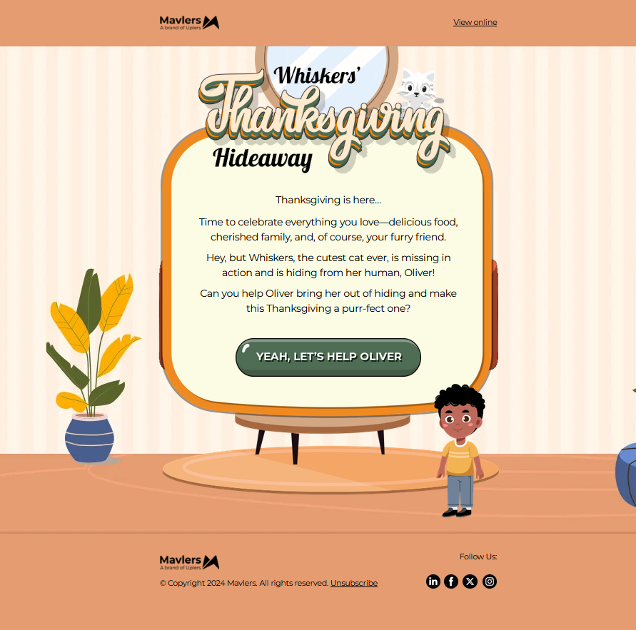
We assigned the label name em_help to define the interactive area for the click event. The label is associated with an input element (checkbox or radio) via the for attribute and wraps a clickable image. The image serves as a visually engaging call-to-action (CTA) element, styled with properties like width, height, and alt text to ensure accessibility and responsiveness.
When the label is clicked, it toggles the hidden input element with the ID em_help, which can be further styled or linked using CSS rules or HTML logic to perform a redirection or trigger an action to the second page. This approach combines functionality, interactivity, and visual appeal to create an intuitive user experience.
<tr>
  <td align="center" valign="top" class="em_f1_ctaimg01">
    <label for="em_help">
      <img
        src="https://2700725.fs1.hubspotusercontent-na1.net/hubfs/2700725/Thanksgiving_2024/cta_01.png"
        width="346"
        height="72"
        alt="YEAH, LET'S HELP OLIVER"
        style="display: block;
               font-family: Arial, sans-serif;
               font-size: 14px;
               line-height: 18px;
               color: #000000;
               max-width: 346px;"
        border="0"
      />
    </label>
  </td>
</tr>
Frame 2
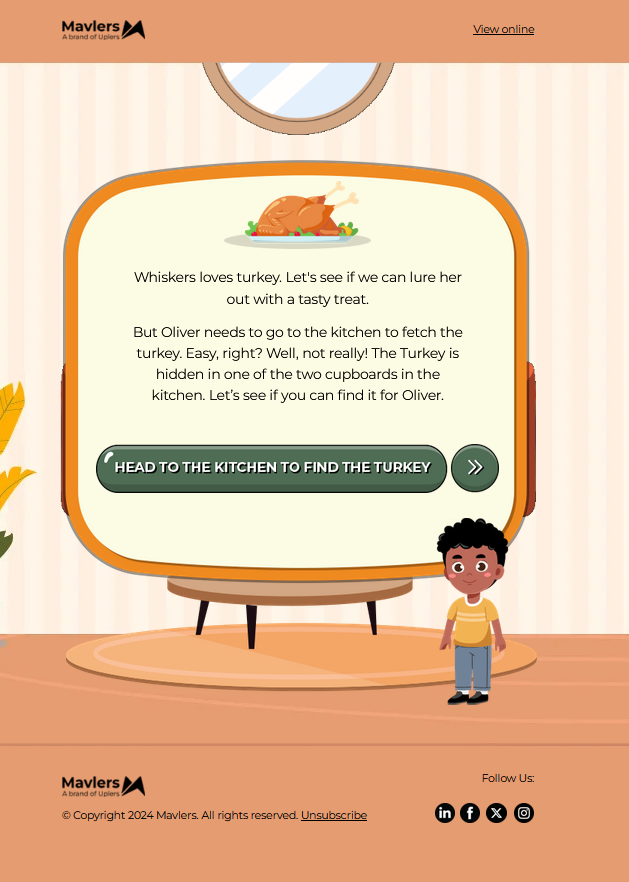
When the label is checked, Frame 2 becomes visible with a smooth and dynamic animation. This animation sequence first reveals Whisker (the cat) and Oliver (the boy), followed by the appearance of the second frame pop-up after a 1-second delay. The keyframe animation slide-in-elliptic-top-fwd is responsible for this effect. Initially, the element starts off-screen, positioned at translateY(-600px), with a rotation on the X-axis and scaled down to 0. This creates an effect of the element “flying in” from the top while rotating slightly. As the animation progresses, the element smoothly moves to its final position (translateY(0)) with no rotation or scaling, gradually becoming fully visible with an opacity transition from 0 to 1.
The animation has a 1-second delay (animation-delay: 1s), ensuring that the content appears after the label is checked, allowing for a smooth, timed transition. The use of visibility: visible and opacity: 1 makes the element fully appear on screen, while visibility: hidden ensures it is not displayed before the animation starts. This creates a visually engaging and polished effect that enhances the user experience by allowing content to appear in a coordinated and aesthetically pleasing way.
/* Frame 2 Comes after Some Delay */
#em_help:checked~table .slide-in-elliptic-top-fwd {
	-webkit-animation: slide-in-elliptic-top-fwd 1s ease-in both;
	animation: slide-in-elliptic-top-fwd 1s ease-in both;
	animation-delay: 1s;
	-webkit-animation-delay: 1s;
	opacity: 0;
	visibility: hidden;
}
 @-webkit-keyframes slide-in-elliptic-top-fwd {
 0% {
 -webkit-transform: translateY(-600px) rotateX(-30deg) scale(0);
 transform: translateY(-600px) rotateX(-30deg) scale(0);
 -webkit-transform-origin: 50% 100%;
 transform-origin: 50% 100%;
}
 100% {
 -webkit-transform: translateY(0) rotateX(0) scale(1);
 transform: translateY(0) rotateX(0) scale(1);
 -webkit-transform-origin: 50% 1400px;
 transform-origin: 50% 1400px;
 opacity: 1;
 visibility: visible;
}
}
 @keyframes slide-in-elliptic-top-fwd {
 0% {
 -webkit-transform: translateY(-600px) rotateX(-30deg) scale(0);
 transform: translateY(-600px) rotateX(-30deg) scale(0);
 -webkit-transform-origin: 50% 100%;
 transform-origin: 50% 100%;
Frames 3 & 4
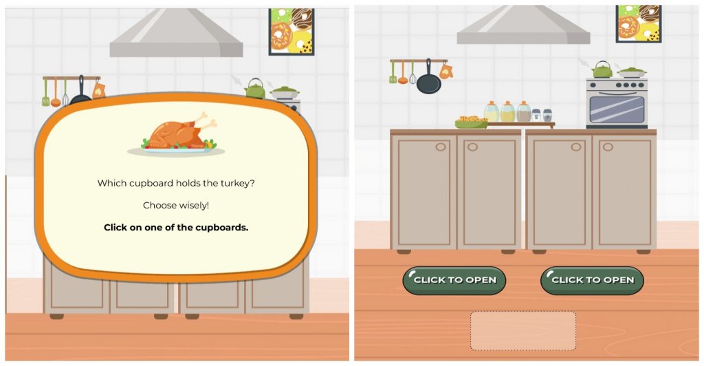
After the second frame appears, clicking a button triggers the redirection to the third frame. The 3rd frame will fade in using the fade-in keyframe animation, remain visible for a few seconds, and then fade out using the fade-out keyframe animation, smoothly transitioning to the 4th frame. This sequence is activated when the associated label is checked, triggering the animations.
The fade-in keyframe animation gradually increases the opacity of the third frame, making it visible, while the fade-out keyframe animation decreases the opacity, causing the frame to disappear.
#em_enter:checked~table .em_frame3 {
	-webkit-animation: fade-in-out 5s ease-in-out both;
	animation: fade-in-out 5s ease-in-out both;

}
 @-webkit-keyframes fade-in-out {
 0% {
 opacity: 0;
}
 20% {
 opacity: 1;
}
 80% {
 opacity: 1;
}
 100% {
 opacity: 0;
}
}
 @keyframes fade-in-out {
 0% {
 opacity: 0;
}
 20% {
 opacity: 1;
}
 80% {
 opacity: 1;
}
 100% {
 opacity: 0;
}
#em_enter:checked~table .em_frame4 {
	-webkit-animation: fade-in02 3s ease-in both;
	animation: fade-in02 3s ease-in both;
	animation-delay: 4s;
	-webkit-animation-delay: 4s;
}
 @-webkit-keyframes fade-in02 {
 0% {
 opacity: 0;
 visibility: hidden;
}
 100% {
 opacity: 1;
 visibility: visible;
}
}
 @keyframes fade-in02 {
 0% {
 opacity: 0;
 visibility: hidden;
}
 100% {
 opacity: 1;
 visibility: visible;
}
}
#em_enter:checked~table .em_frame4 {
	opacity: 0;
	visibility: hidden;
Frames 5 & 6
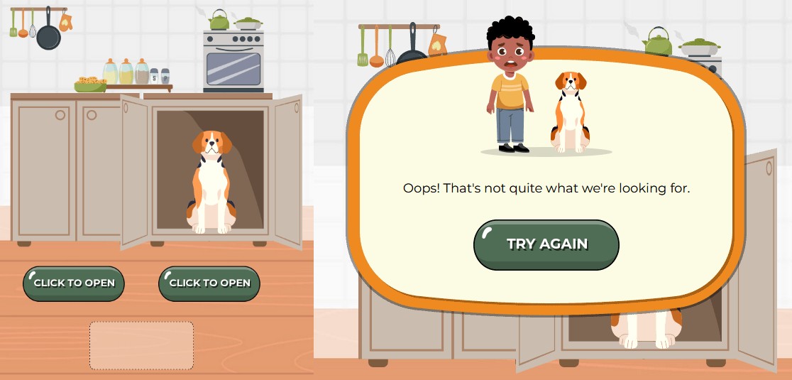
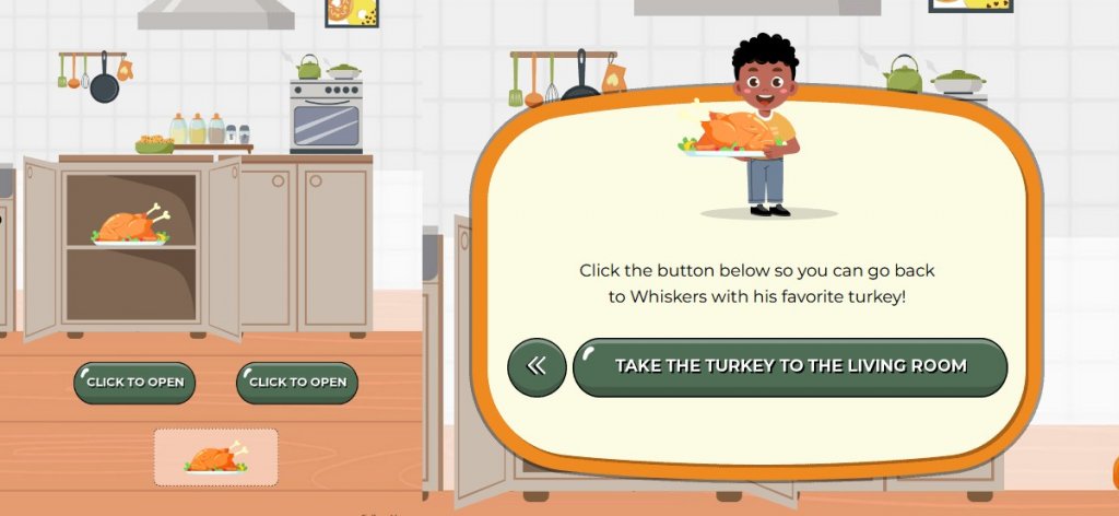
In the kitchen scene, a cupboard and two interactive buttons are presented. When a user clicks a button, the cupboard opens to reveal different items based on the selection. Clicking the left button reveals a turkey inside the cupboard, while the right button displays a dog. This interactive element adds dynamism, allowing the user’s choice to influence the outcome.
Once the item (turkey or dog) is revealed, the scene transitions smoothly to the next frame, continuing the gamified flow. The timed transition ensures the content progresses seamlessly after a brief interaction, enhancing the overall user experience.
/*Frame 5 CSS*/
#em_left_door:checked~table .em_left_door {
	background: url(https://2700725.fs1.hubspotusercontent-na1.net/hubfs/2700725/Thanksgiving_2024/cup_left_open.png) left top no-repeat;
	width: 368px;
	height: 320px;
}
#em_right_door:checked~table .em_right_door {
	background: url(https://2700725.fs1.hubspotusercontent-na1.net/hubfs/2700725/Thanksgiving_2024/cup_right_open.png) right top no-repeat;
	width: 368px;
	height: 320px;
}
#em_left_door:checked~table .turkey_img_show {
	display: block !important;
}
#em_left_door:checked~table .f5_em_opacity {
	background-color: rgba(250, 213, 194, 0.8) !important;
}
#em_right_door:checked~table .em_left_door {
	display: none !important;
}
#em_left_door:checked~table .em_right_door {
	display: none !important;
}
/* After Enter Left Door */
#em_left_door:checked~table .em_frame6 {
	z-index: 999 !important;
	-webkit-animation: fade-in02 1s ease-in both;
	animation: fade-in02 1s ease-in both;
	animation-delay: 1s;
	-webkit-animation-delay: 1s;
}
 @-webkit-keyframes fade-in02 {
 0% {
 opacity: 0;
 visibility: hidden;
}
 100% {
 opacity: 1;
 visibility: visible;
}
}
 @keyframes fade-in02 {
 0% {
 opacity: 0;
 visibility: hidden;
}
 100% {
 opacity: 1;
 visibility: visible;
}
}
/* After Enter Right Door */
#em_right_door:checked~table .em_frame5 {
	z-index: 999 !important;
	-webkit-animation: fade-in02 1s ease-in both;
	animation: fade-in02 1s ease-in both;
	animation-delay: 2s;
	-webkit-animation-delay: 2s;
}
 @-webkit-keyframes fade-in02 {
 0% {
 opacity: 0;
 visibility: hidden;
}
 100% {
 opacity: 1;
 visibility: visible;
}
}
 @keyframes fade-in02 {
 0% {
 opacity: 0;
 visibility: hidden;
}
 100% {
 opacity: 1;
 visibility: visible;
}
}
Frame 7
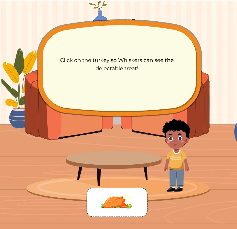
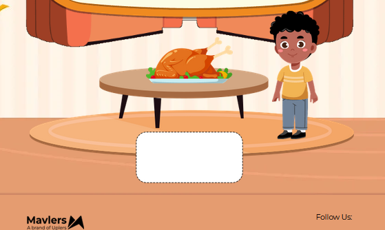
Clicking on the white box moves the turkey onto the table. When the checkbox with the ID em_click_turkey is checked, the turkey element (.em_turkeyin) becomes visible and animates with a bounce-table effect, moving from the bottom position, creating the appearance of the turkey bouncing onto the table.
/* Click On Turkey */
#em_click_turkey:checked~table .em_turkeyin {
	position: absolute;
	visibility: visible !important;
	opacity: 1 !important;
	-webkit-animation: bounce-table 1s ease-out forwards;
	animation: bounce-table 1s ease-out forwards;
}
 @-webkit-keyframes bounce-table {
 0% {
 bottom: 26px;
}
 100% {
 bottom: 215px;
}
}
 @keyframes bounce-table {
 0% {
 bottom: 26px;
}
 100% {
 bottom: 215px;
}
}
#em_click_turkey:checked~table .em_f11_imgt {
	background: url(https://2700725.fs1.hubspotusercontent-na1.net/hubfs/2700725/Thanksgiving_2024/turkey_image_03.png) center top no-repeat !important;
	background-size: contain !important;
}
#em_living_room:checked~table .em_fadeout {
	-webkit-animation: fade-out 1s ease-in both;
	animation: fade-out 1s ease-in both;
	animation-delay: 7s;
	-webkit-animation-delay: 7s;
}
 @-webkit-keyframes fade-out {
 0% {
 opacity: 1;
 visibility: visible;
}
 100% {
 opacity: 0;
 visibility: hidden;
}
}
 @keyframes fade-out {
 0% {
 opacity: 1;
 visibility: visible;
}
 100% {
 opacity: 0;
 visibility: hidden;
}
}
#em_living_room:checked~table .turkey-button-in {
	-webkit-animation: fade-in07 1s ease-in both;
	animation: fade-in07 1s ease-in both;

}
 @-webkit-keyframes fade-in07 {
 0% {
 opacity: 0;
 visibility: hidden;
}
 100% {
 opacity: 1;
 visibility: visible;
}
}
 @keyframes fade-in07 {
 0% {
 opacity: 0;
 visibility: hidden;
}
 100% {
 opacity: 1;
 visibility: visible;
}
}
Frame 8
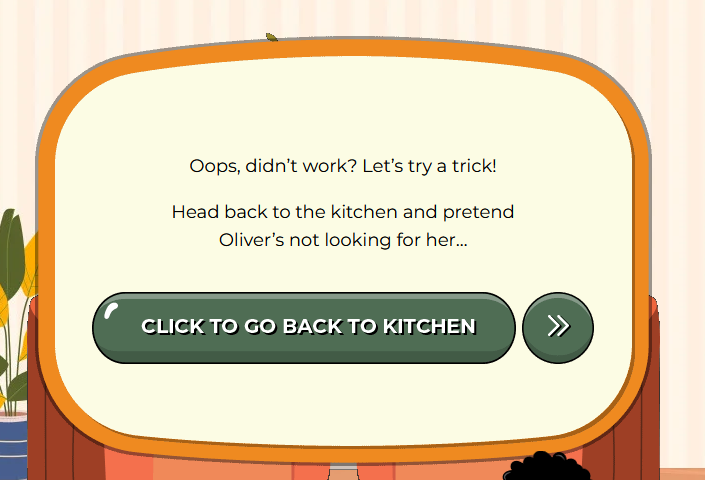
Clicking on the turkey triggers a transition to the next frame. When the checkbox with the ID em_click_turkey is checked, the background of the element .em_f11_imgt is updated to display a new turkey image, ensuring a smooth visual transition.
#em_click_turkey:checked~table .em_frame8 {
	-webkit-animation: fade-in04 1s ease-in both;
	animation: fade-in04 1s ease-in both;
	animation-delay: 1s;
	-webkit-animation-delay: 1s;
}
 @-webkit-keyframes fade-in04 {
 0% {
 opacity: 0;
 visibility: hidden;
}
 100% {
 opacity: 1;
 visibility: visible;
}
}
 @keyframes fade-in04 {
 0% {
 opacity: 0;
 visibility: hidden;
}
 100% {
 opacity: 1;
 visibility: visible;
Frames 9 & 10
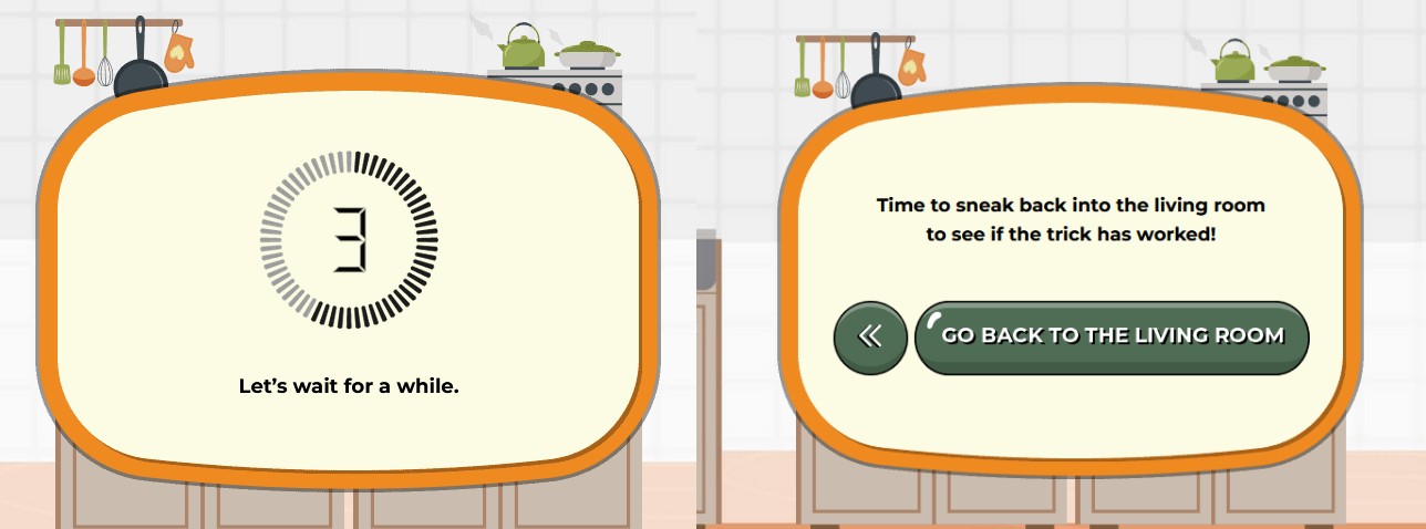
Clicking the “Back to Kitchen” button triggers the next frame, and after a few seconds, Frame 9, which contains a timer, appears. When the checkbox with the ID em_back_kitchen is checked, the background of the element .em_frames_bg01 updates to show the kitchen counter image, creating a visual cue for the next part of the sequence.
The timer effect is achieved using the timer01 keyframe animation. The animation shifts the background position from top to bottom, simulating the countdown or progression of time. As the background moves, it visually indicates that the timer is running, enhancing the interactive experience.
Once the timer ends, Frame 10 transitions to reveal a CTA (call-to-action) button, allowing the user to move back to the living room.
Clicking the “Go Back to the Living Room” button triggers the display of the next frame, which contains a CTA featuring a Twitter share link.
/* Timer Running Out  */

#em_back_kitchen:checked~table .em_frames_bg01 {
	animation: timer01 steps(4) 5s backwards;
	-webkit-animation: timer01 steps(4) 5s backwards;
}
#em_back_kitchen:checked~table .em_frames_bg01 {
	background: url(https://2700725.fs1.hubspotusercontent-na1.net/hubfs/2700725/Thanksgiving_2024/Counter.png) center bottom no-repeat;
	background-size: 100%;
}
 @-webkit-keyframes timer01 {
 0% {
 background-position: top;
}
 100% {
 background-position: bottom;
}
}
 @keyframes timer01 {
 0% {
 background-position: top;
}
 100% {
 background-position: bottom;
}
}
#em_back_kitchen:checked~table .em_hide_game {
	z-index: -999 !important;
	-webkit-animation: time-out 0.5s both;
	animation: time-out 0.5s both;
	animation-delay: 6s;
	-webkit-animation-delay: 6s;
}
 @-webkit-keyframes time-out {
 from {
 opacity: 1;
 visibility: visible;
}
 10% {
 opacity: 0;
 visibility: hidden;
}
to {
	opacity: 0;
	visibility: hidden;
}
}
 @keyframes time-out {
 from {
 opacity: 1;
 visibility: visible;
}
 10% {
 opacity: 0;
 visibility: hidden;
}
to {
	opacity: 0;
	visibility: hidden;
}
}
#em_back_kitchen:checked~table .em_frame10 {
	z-index: 999 !important;
	-webkit-animation: fade-in05 1s ease-in both;
	animation: fade-in05 1s ease-in both;
	animation-delay: 6.5s;
	-webkit-animation-delay: 6.5s;
}
 @-webkit-keyframes fade-in05 {
 0% {
 opacity: 0;
 visibility: hidden;
}
 100% {
 opacity: 1;
 visibility: visible;
}
}
 @keyframes fade-in05 {
 0% {
 opacity: 0;
 visibility: hidden;
}
 100% {
 opacity: 1;
 visibility: visible;
}
}
The Final Frame
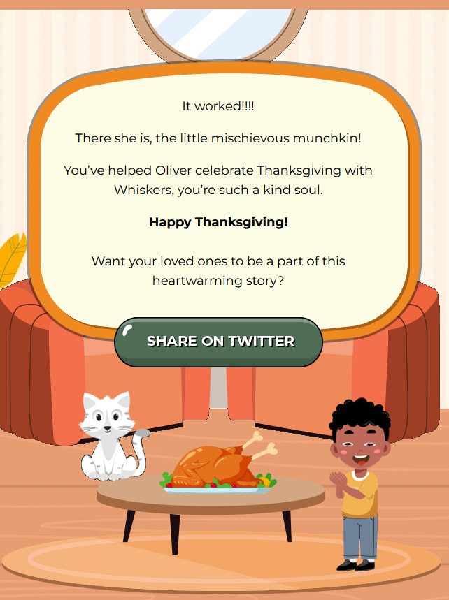
/* Final Screen */
#em_back_living_room:checked~table td.em_room {
	background: url(https://2700725.fs1.hubspotusercontent-na1.net/hubfs/2700725/Thanksgiving_2024/background_image02.jpg) center top no-repeat !important;
	background-size: cover !important;
}
#em_back_living_room:checked~table .em_share {
	z-index: 999 !important;
	-webkit-animation: fade-in06 1s ease-in both;
	animation: fade-in06 1s ease-in both;
	animation-delay: 1s;
	-webkit-animation-delay: 1s;
}
 @-webkit-keyframes fade-in06 {
 0% {
 opacity: 0;
 visibility: hidden;
}
 100% {
 opacity: 1;
 visibility: visible;
}
}
 @keyframes fade-in06 {
 0% {
 opacity: 0;
 visibility: hidden;
}
 100% {
 opacity: 1;
 visibility: visible;
}
}
#em_back_living_room:checked~table .em_kitchen {
	display: none;
Fallback Version
For email clients that do not support HTML5 and CSS3, it is necessary to create an alternative block of code that replicates the layout of the interactive content.
This block will maintain the visual appearance of the email’s mechanics but without interactivity, ensuring that users still have a consistent and visually appealing experience. While the interactive elements (like buttons and animations) won’t function in these clients, users can still engage with the content by clicking on the elements, which will redirect them to the web version of the email.
This ensures that the functionality and full experience of the email are preserved across all platforms, even when advanced features are not supported.
/* Fallback code Start */
		.em_fallback {
			display: none;
		}

		.em_herosec {
			display: block !important;
		}

		#MessageViewBody .em_fallback,
		body.MsgBody .em_fallback {
			display: block !important;
		}

		.& .yahoo-hide {
			display: none !important;
		}

		.& .yahoo-show {
			display: block !important;
		}

		.& .em_fallback {
			display: block !important;
		}

		[class="x_em_fallback"] {
			display: block !important;
		}

		[id="x_hide-outlook"] {
			display: none !important;
		}

		[id="x_hide-gmail"] {
			display: none !important;
		}

		[id="x_hide-yahoo"] {
			display: none !important;
		}

		[id="x_show-outlook"] {
			display: block !important;
		}

		u+.em_body .gmail-hide {
			display: none !important;
		}

		u+.em_body .gmail-show {
			display: block !important;
Wrapping Up!
Interactive emails revolutionize the way brands engage with their audiences.
Unlike static emails, interactive emails allow users to interact directly within the email by clicking buttons, playing games, filling out forms, or navigating carousels. These dynamic elements not only make the email experience more enjoyable but also significantly boost engagement, click-through rates, and conversions.
Curious to check out more such games? Play our latest:



Priyanka C
With three years of experience as an HTML developer at Uplers, Priyanka specializes in email template development, combining technical expertise with creativity. Outside of work, she enjoys reading and staying updated with the latest technological trends to inspire her passion for innovation.
Susmit Panda
A realist at heart and an idealist at head, Susmit is a content writer at Email Uplers. He has been in the digital marketing industry for half a decade. When not writing, he can be seen squinting at his Kindle, awestruck.
Riketa Butani
Riketa is a seasoned Email Developer with over 9 years of experience in the industry. She possesses a keen eye for detail and a deep understanding of coding best practices, particularly in email development. Her expertise includes HTML, CSS, and a variety of Email Service Providers (ESPs), ensuring that every email not only looks great but also functions seamlessly across all devices and platforms.
Yagnik Bhalodia
A results-driven email development professional with over 8 years of experience, Yagnik Bhalodia has excelled in roles at Email Uplers. His expertise includes team leadership, project management, and advanced email coding. Passionate about innovation, he specializes in automation and dynamic content. He enjoys reading and staying updated on new tech trends to continuously enhance his skills.
Beyond Curb Appeal: 7 Real Estate Email Newsletter Templates to Inspire Your Next Campaigns
Your Concise Guide to Holiday Email Ideas