
Whether or not your brand is relevant to Thanksgiving, seasonal marketing must be part of how you get the word out and customers in. Coming up with offers, discounts, and giveaways is the easy bit. You face the sphinx when it comes to contextualizing your message, hanging it on the wall where the light is falling.
For instance, if you’re an automotive company, how do you create email content around turkeys? If you’re a B2B, where do you park the cornucopia?
These are questions we’ve often had to ask ourselves. Seasonality is hard to crack. It’s not always a straight line from incentivizing to marketing.
The best way to figure it out is by starting to explore how others are doing it. And if you can see it all in one place, you’re all set.
Here is such a place. Our expertly curated Thanksgiving emails will help you get started on your Thanksgiving email campaigns in 2024.
1. Olight
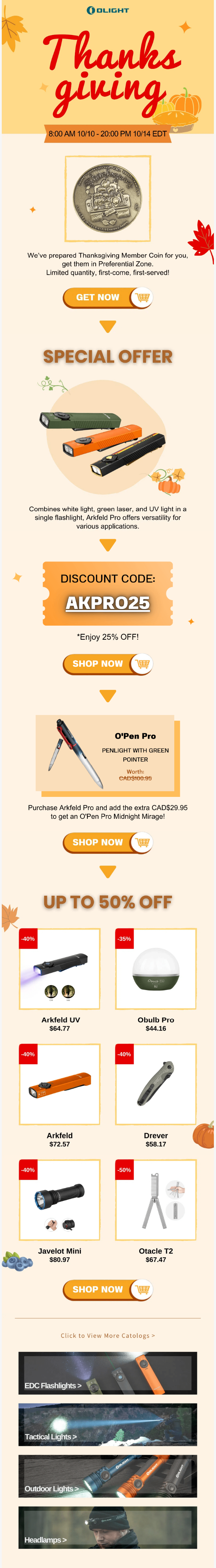
Olight’s Thanksgiving email, with its use of multiple shades and tints of orange, captures the fall vibes right away. From borders to drop shadows to products, the color scheme is wonderfully consistent, leading to a uniform viewing experience.
We also love Olight’s CTAs with the icon insets. They’re stand-out.
The downward-pointing arrows act as a nice navigational guide, encouraging the subscriber to keep scrolling.
That’s a tidy move on the designer’s part. If you got great content below the fold, you can use pointers to make that clear. People like scrolling endlessly on social media, but not necessarily while viewing emails, especially if they’re long.
2. The Butcher Shoppe
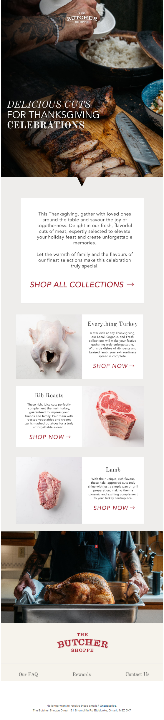
This Thanksgiving email example is right on the money with its brilliantly-shot hero image, S-curve product showcase, and button-less CTAs. The HTML text in the hero image is in three different typefaces, compelling the typical skimmer to pause.
We just love how the last banner, where the turkey is ready-to-serve, completes the first where the sides are being added.
3. Juliska
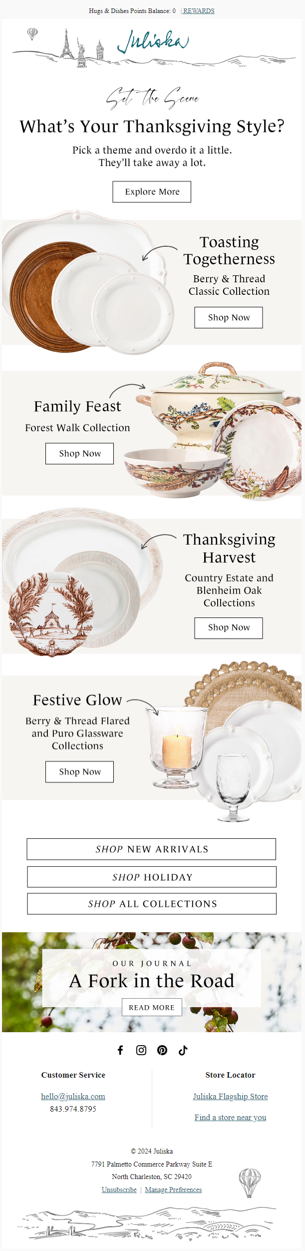
Beautiful, elegant, and elite – sums up Juliska’s Thanksgiving email template!
Kicking off with a well-designed header and ending with an equally well-designed footer, this email delights with its Z-pattern layout, nice product images, and serif typeface, which complements the suave vibe of the template.
The content blocks are neatly stacked up in stair-step fashion. We’re also falling for those curly arrows that give a feeling of movement to the email.
4. Adùn
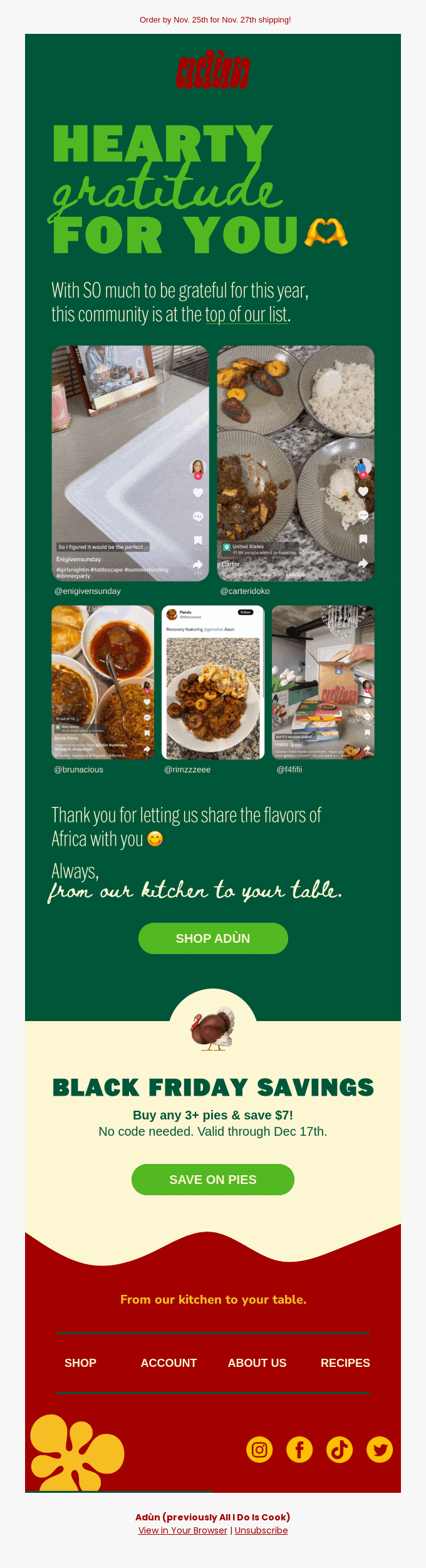
One of the best ways to thank your audience is to leverage user-generated content. That’s what Adùn has done with their Thanksgiving email template.
In terms of design, this email rocks with its bold typography and dark shades. The color combinations are perfect. From the wavy divider to the emojis to the balance between text and image, this Thanksgiving email is stop-blinking beautiful.
5. Artifact Uprising
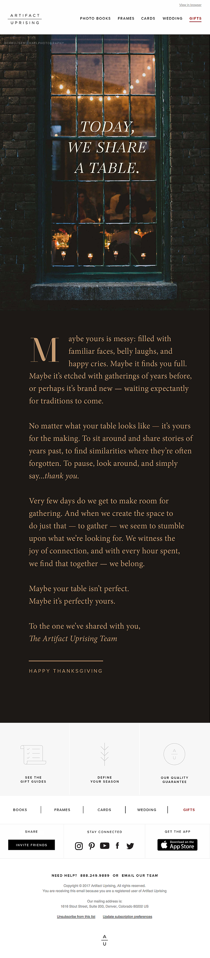
During Thanksgiving, a heartfelt letter can go a long way. And if it’s designed like Artifact’s, you’re golden.
Keeping the navbars and the recovery module intact (after all, every email is a sales-op), the Artifact Uprising Team devotes the entire space to come up with a truly heartfelt Thanksgiving letter. With a spot-on hero image, sans serif font, and umber background, this Thanksgiving email belongs in your memory box.
6. Huel
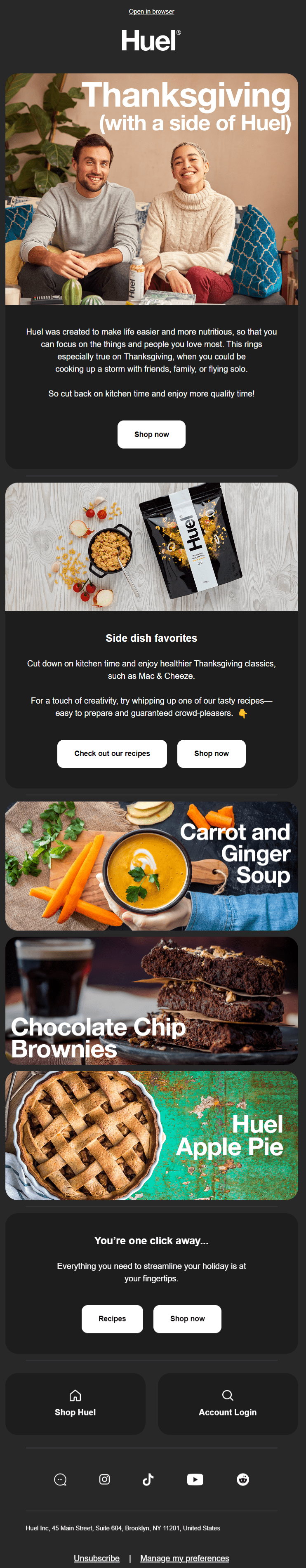
Image source: Inbox
Huel’s Dark-Mode, full-screen Thanksgiving email template swiftly locks you in with its flow of rounded banners and CTA buttons.
If you weren’t aware before, rounded corners:
- Make the interface more visually appealing
- Focus your attention inward, drawing you to the content inside
- Reduce the risk of accidental clicks
- Are psychologically associated with reliability and user-friendliness
Those are universal benefits of round edges, but do test them out before sending.
The inverted pyramid flow is applied to the first two content blocks, guiding the viewer to the relevant CTAs. The recovery module features high-quality images, pixeled to drive visitors to the relevant product pages.
7. Adornmonde
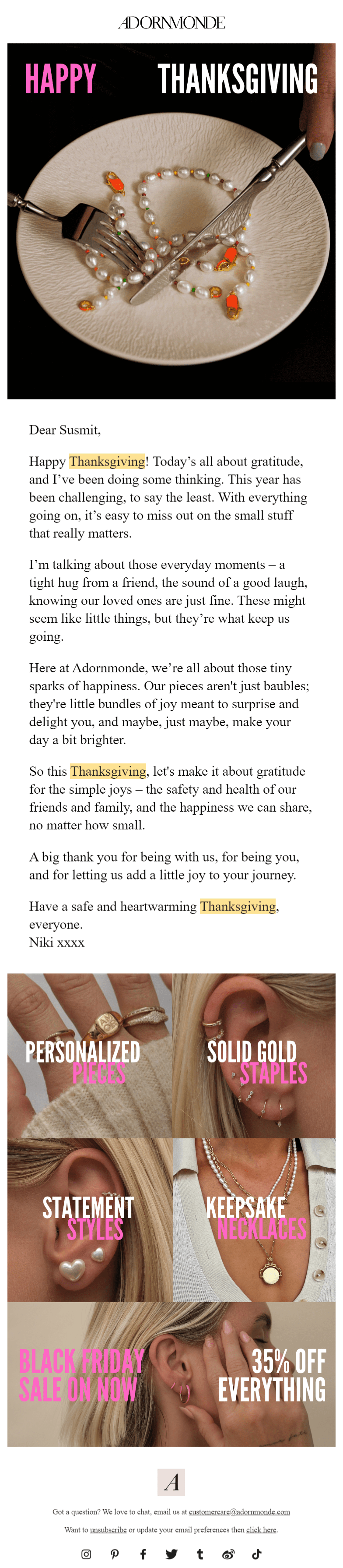
Image source: Inbox
With their ad rem hero image, Adornmonde shows how to be relevant. It’s creative, funny, and very convincing. Plus, as we said before, a personal note is always welcome during Thanksgiving and the holiday season at large. With a clean footer and pictorial recovery module, this email combines aesthetics and functionality.
Keep in mind that email clients such as Gmail may clip long messages, particularly at the recovery module if they contain images. It’s a good idea to test these emails, and if the recovery module is cut off, stick to text-only navbars. The recovery module is important sales-wise, so ensure it is displayed with the rest of the email.
8. Fishwife
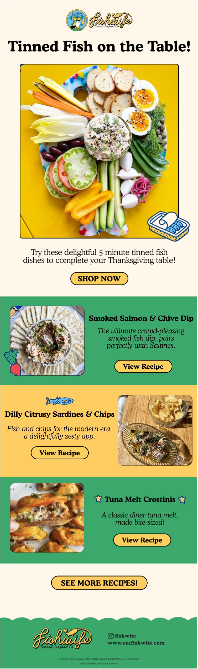
Image source: Inbox
Here’s a delightful piece of Thanksgiving email template from Fishwife. Short, bright, and colorful, this email is a nice example of leveraging iconography in email.
From the tinned fish to the baking gloves to the product-facing sardine, Fishwife’s use of icons serves the following functions:
- They’re immediately recognizable and encapsulate critical information
- The icons save space in design, executing multiple functions at once
- They also, and this is the most important bit, reflect the brand identity
But apart from the icons, we also love Fishwife’s use of bold serif typeface. The text really stands out. Full points also to the rounded banners and CTAs. The use of dark borders draws the eye inward, so the viewer can focus on the content within.
9. Douglas
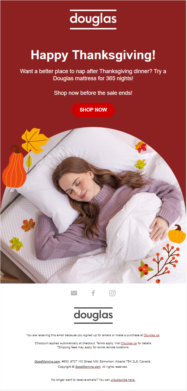
Here’s yet another Thanksgiving email template with a successful crack at relevance.
With a perfect copy and use of Thanksgiving symbols, Douglas keeps it short and urgent. Loving those maple leaves on the mattress, too.
The entire email is a masterpiece in minimalist aesthetics.
“Maximize the ‘signal’, that is the number of elements with high informational value – labels with high information scent, plain language, high-resolution images, clear signifiers, or helper text,” says Therese Fessenden, Senior UX Specialist at Nielsen Norman Group, while expounding on minimalist design.
10. Carter’s
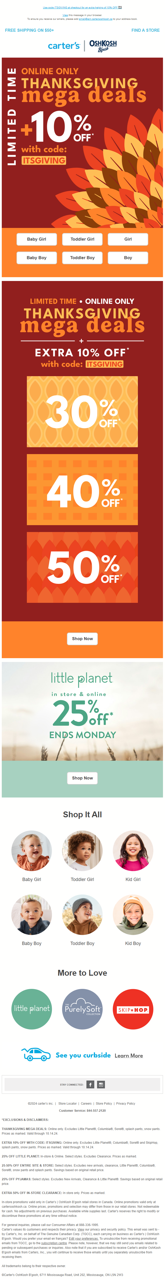
Our last Thanksgiving email example from Carter’s is yet another instance of being relevant seasonally. With a hero image featuring turkey feathers and the entire email washed in traditional autumn hues, this is Thanksgiving marketing at its best. We love the horizontal and vertical stacking, it’s the classic inverted pyramid flow.
Interestingly, nearly three-fourths of the email is navbars, starting right at the start of the email, all the way to the pre-footer space.
Now that’s quite a substantial number of click opportunities.
The use of large, bold HTML text heightens the urgency of the offer. The footer as well as the header is chock-a-block with information.
Every pixel is geared to sales and wired to Thanksgiving.
Our Favorite Top 15 Thanksgiving Email Subject Lines
Here’s our all-time favorite Thanksgiving email subject lines:
- Help bring Thanksgiving to the Camp Fire evacuees (Good Eggs)
- Stop cooking!!!! (Graza)
- I can’t thank you enough (LIV Swiss Watches)
- Remember when raccoons were a Thanksgiving meal? (Atlas Obscura)
- It’s a Thanksgiving miracle! 🙌 (Ugmonk)
- Are you hosting this Thanksgiving? (Laura)
- Resy’s tips for Thanksgiving. (Resy)
- Feelin’ hearty (Adùn)
- Your Thanksgiving toast is ready 🥂 (8 AM Creative)
- Make Thanksgiving more than a meal 🦃 (Meetup)
- Fixing Up a Feast? Here’s Your Final Checklist. (Land O’Lakes)
- Did You Run Today? (Tracksmith)
- Are you and your dog ready for Thanksgiving? (Rover)
- Let’s give them something to Gobble about (Ibotta)
- Flying to the feast? ✈️ (Uber)
Get Started on Your Thanksgiving Campaign with Email Uplers!
Give yourself more reasons to be thankful.🍗
Enjoy 10% off all email template orders this holiday season. Get in touch with our email template production team today!
Susmit Panda
Latest posts by Susmit Panda (see all)
11 Black Friday/Cyber Monday Email Inspirations for 2024
Understanding the Impact of Apple iOS 18 on Email Marketing