“A picture is worth a thousand words”, when Arthur first used this phrase in one of his newspaper’s articles, he didn’t know that he is constructing a channel for email marketers to communicate to their subscribers in a subtle way. According to an observation, images with copy in an email get 94% more views than the emails without images.
That said; images are an essential part of an email and adding the element of motion with GIF in email can make it stand out in your subscriber’s inbox. Many companies have chanted this mantra and it worked best for them.
Allow Uplers to share the 10 best GIF in Email Inspirations that can work wonders for you.
1. Nike
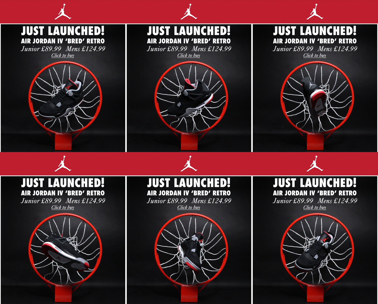
Wonderfully designed email by Nike. The email is completely glued to the brand and the colors and GIF in email make it more expressive. Features a clear CTA – what’s not to like?
2. ModCloth
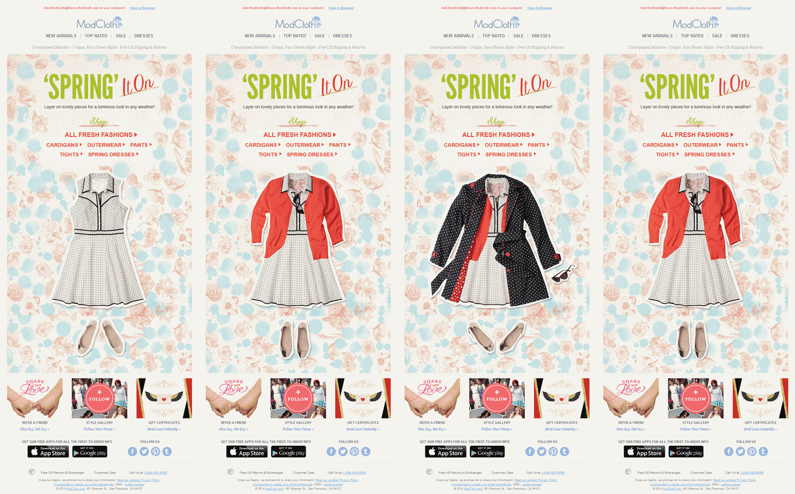
Sophisticated yet chic email by ModCloth with a great use of GIF. The email perfectly goes with the copy and the CTAs just make it hard to ignore.
3. Express
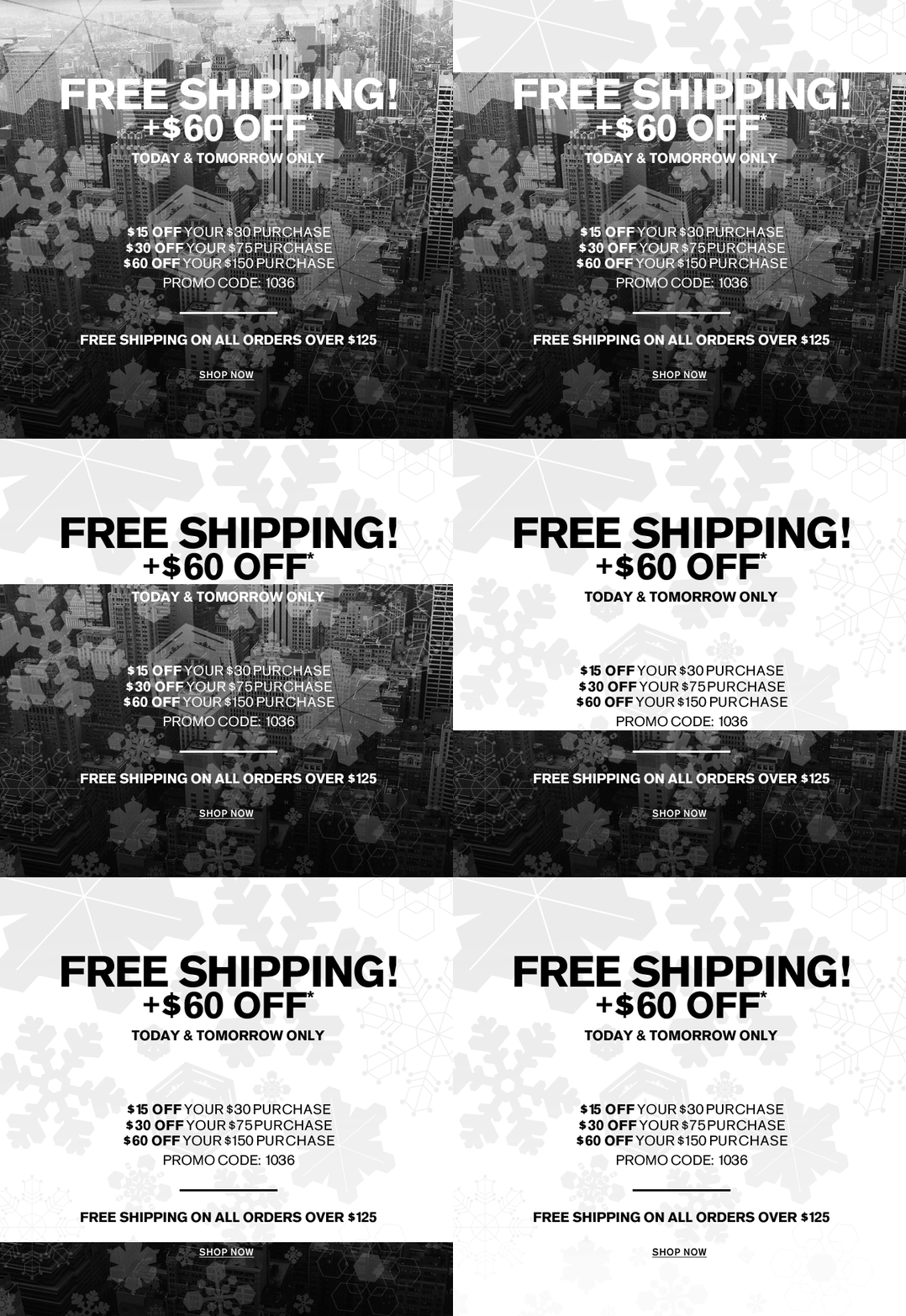
Express has blended black & white colors very artistically in their email. CTA is clear enough and the design is appealing enough to grab the attention in one blink.
4. Little Woods

This great email by Little Woods is outstanding and bring the warm feeling of being appreciated. Subtle colors, great copy, beautiful animation, specific CTA are just what a great email needs.
5. Nike
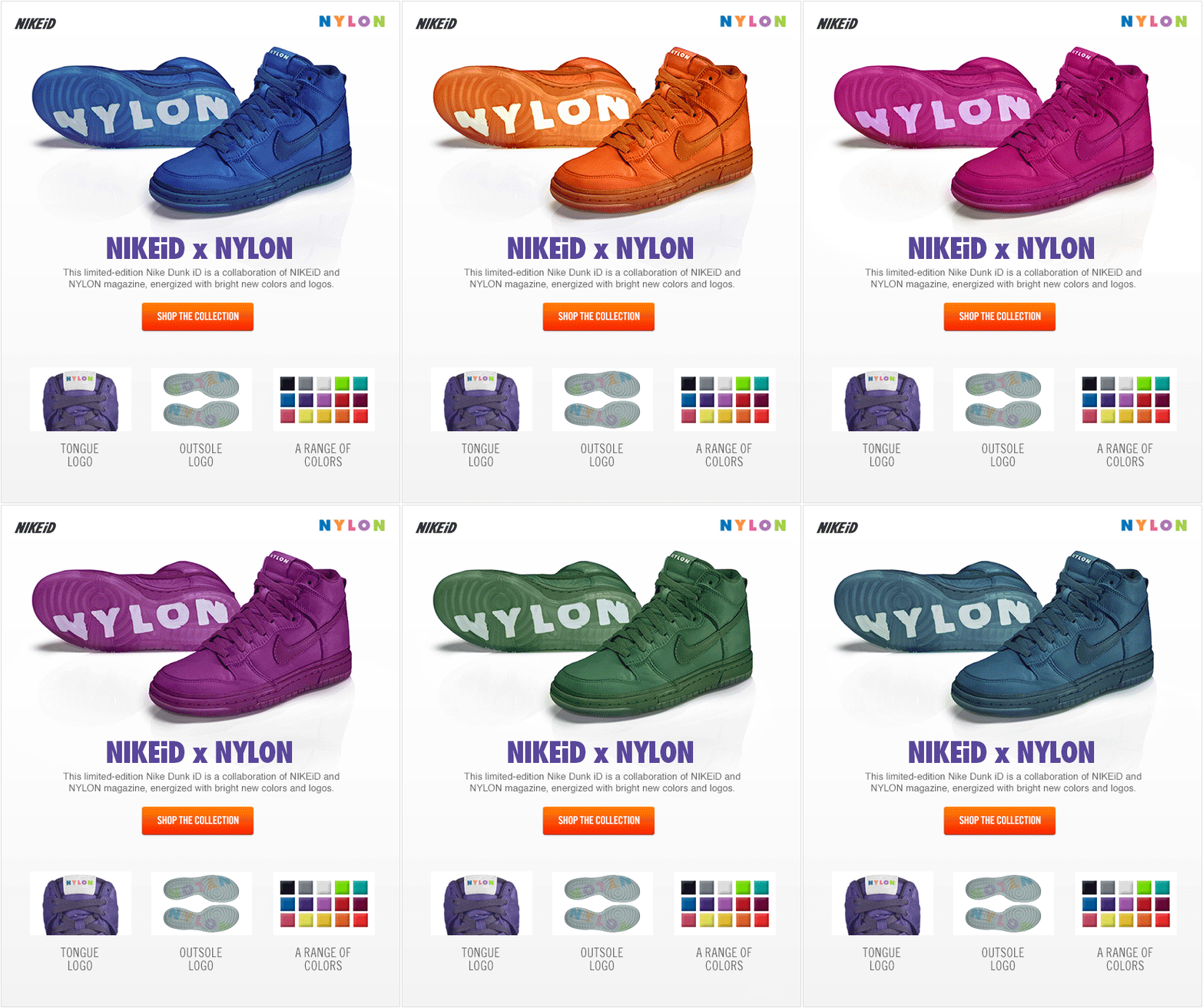
Great use of white space with juxtaposed colors in the email of Nike. GIF makes the product hard to resist and the loud & clear CTA is there to fetch your attention.
6. Boden
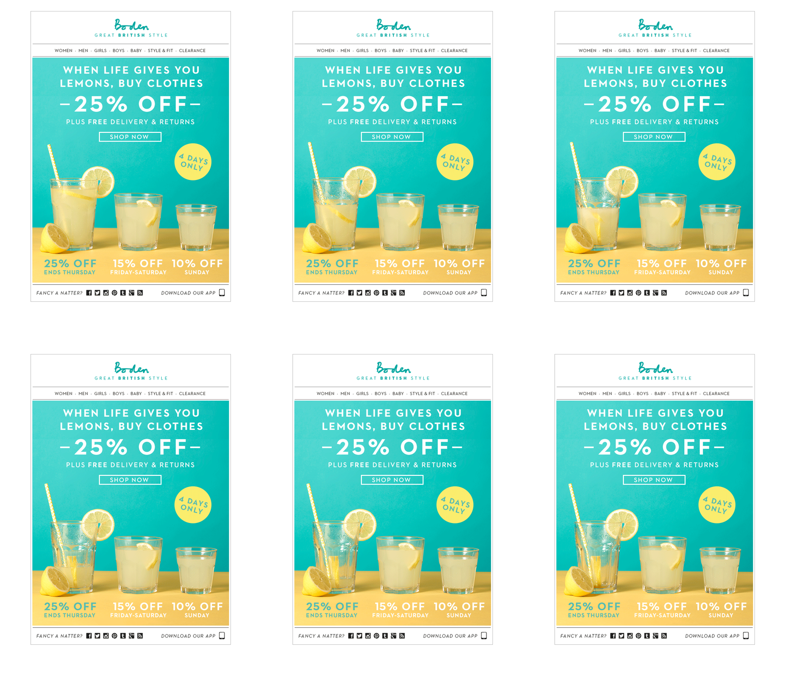
Boden’s email efficiently shows the exclusivity of the offer. Good use of GIF to make the offer tempting and the copy with a bold CTA is sure to attain clicks.
7. Kate Spade
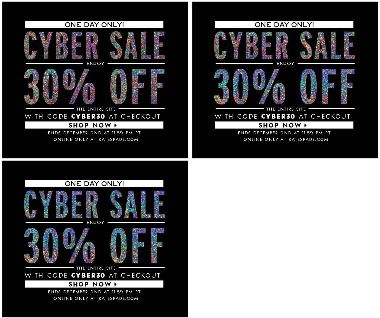
This GIF alone from Kate Spade grabs all the required attention and the CTA just makes it hard to resist. The sparkle successfully brings on the sale effect.
8. Virgin America
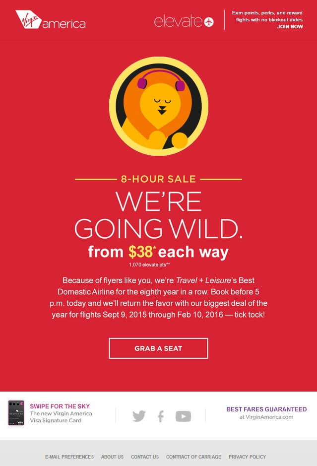
Virgin America’s email is a perfect example of creativity & copy. The CTA is clear & unique and the GIF amazingly grabs the attention. Glued to brand this email is crisp, innovative, and interesting.
9. Burton
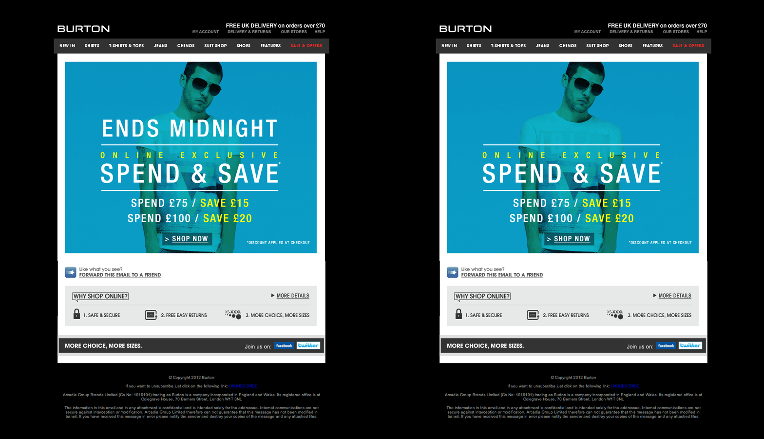
Burton’s email is a great example of a classy & simple email. Designed to grab the attention instantly and the animated offer with crisp CTA make the offer more irresistible.
10. Redbox
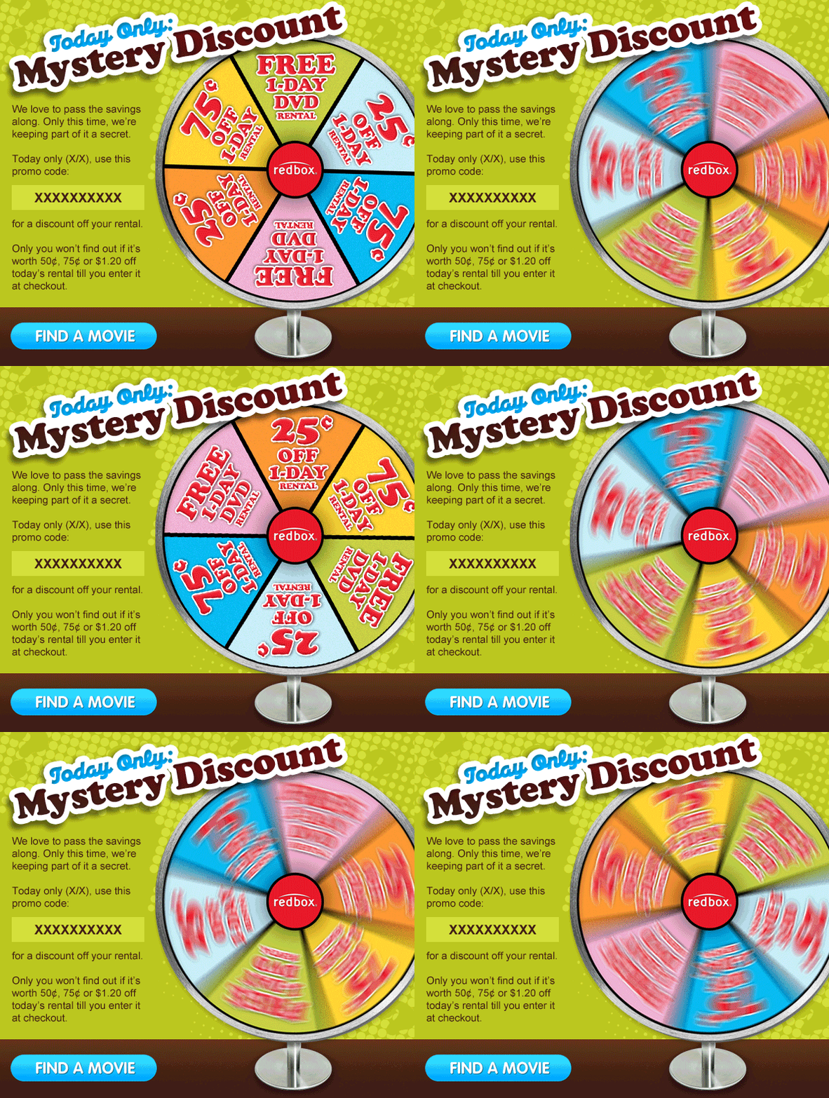
Redbox used a spinning wheel to display the offers which successfully steals the attention. Stuck to brand, compelling copy, juxtaposed CTA are the perfect ingredients to make this email unavoidable.
Adding a GIF in email will need some smart work as far as the designing and coding is concerned. Let the Uplers make this task easier for you.





Kevin George
Latest posts by Kevin George (see all)
Defeating Gmail with Responsive Code - Hybrid & Spongy comes as a savior!
Email marketing metrics – What to track beyond CTR and Opens?