Obscurity is oblivion. Horse sense, right? And yet, most racehorses fail to raise dust. In other words, most marketers are guilty of keeping their audience in the dark about product launches, in-house changes, special opportunities, upcoming events, and so on.
Take product launches: did you know that the majority of product launches fail?
“Companies are so focused on designing and manufacturing new products that they postpone the hard work of getting ready to market them until too late in the game,” argue Joan Schneider and Julia Hall.
Too late in the game — you don’t want to be that racehorse! So, if you have something great or new to offer, you want to make it known.
Announcements could be about anything. Product and feature announcement emails have the highest CTR. Whatever it is, the point is to get the message across successfully.
In this post, we have curated some of the best announcement email templates for your business needs. We tell you what we love and why we love it.
So, let’s begin!
1. Collaboration Announcement Email
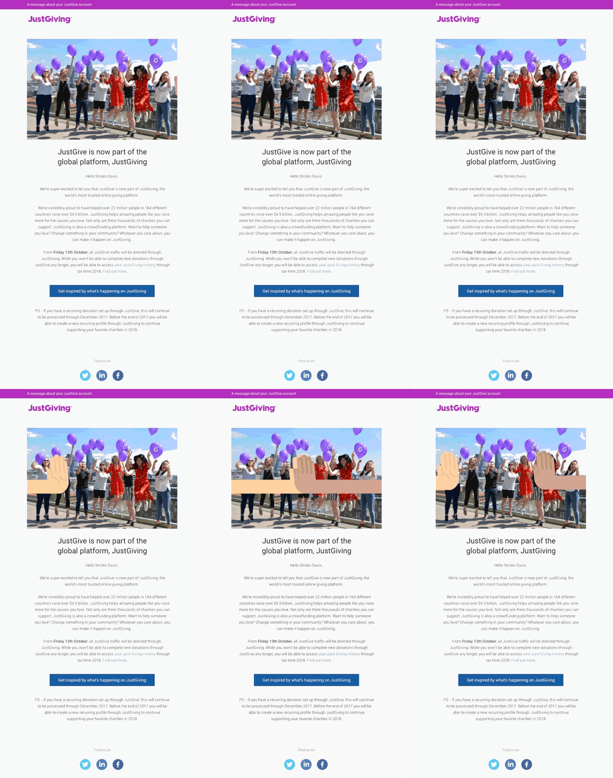
Our first announcement email sample is from JustGiving, the world’s largest fundraising organization.
The email announces a collaboration. There are two main reasons why we love it.
First, the minimal use of animation for maximal effect: the two hands coming together to join across the template communicates succinctly the whole point of the message.
Second, the template does not stint on information. Because it is a major announcement, subscribers expect to be apprised of the particulars. The email provides all the necessary details regarding the collaboration. Plus, the three calls to action prompt immediate engagement with the new reality.
2. Newsletter Announcement Email
The typical newsletter is more educational than promotional, as this Mailchimp sample shows.
Minimal design is key in a newsletter announcement email. There should be plenty of white space. If the newsletter is being viewed on a mobile device, white space will make it easy for the user to click on the right links.
Because the email is aiming to direct the user to the main content, the copy should be as concise as possible.
In the template above, Mailchimp reveals no more than what the main content is about. After all, you want your subscriber to read the full content elsewhere. Having updated the subscribers on the latest articles published on their website, Mailchimp has announced an event at the very end of the email.
Why at the end? Because Mailchimp is following the 80-20 rule. So, the newsletter is 80% educational and 20% promotional.
The majority of the newsletter is in the interest of the subscriber. The email is gently leading the viewer to the promotional part. The positioning is important: you don’t want to be seen pushing subscribers into clicking on a promotional CTA button. Instead, let the email show that you look out for your audience and it’s not just about shaking the money-tree.
Note also the use of retro pink. It brings a kind of old-school, paper-esque vibe to the design.
3. Product Launch Announcement Email
Our third announcement email is from Havenly, an online interior design and home decorating company.
There is no looking away from this email, right? The copy is peppy, dripping with suspense, and earnest in its announcement. It has an impish vibe about it, which is seductive without being too obviously so.
Note the brevity of the announcement. Seen outside the confines of a brand, the message is the archetypal announcement. The hurriedness of it is its chief appeal: it’s almost literally passing by, fading away, as it were. You can’t help but take notice and remember.
4. Discount Announcement Email
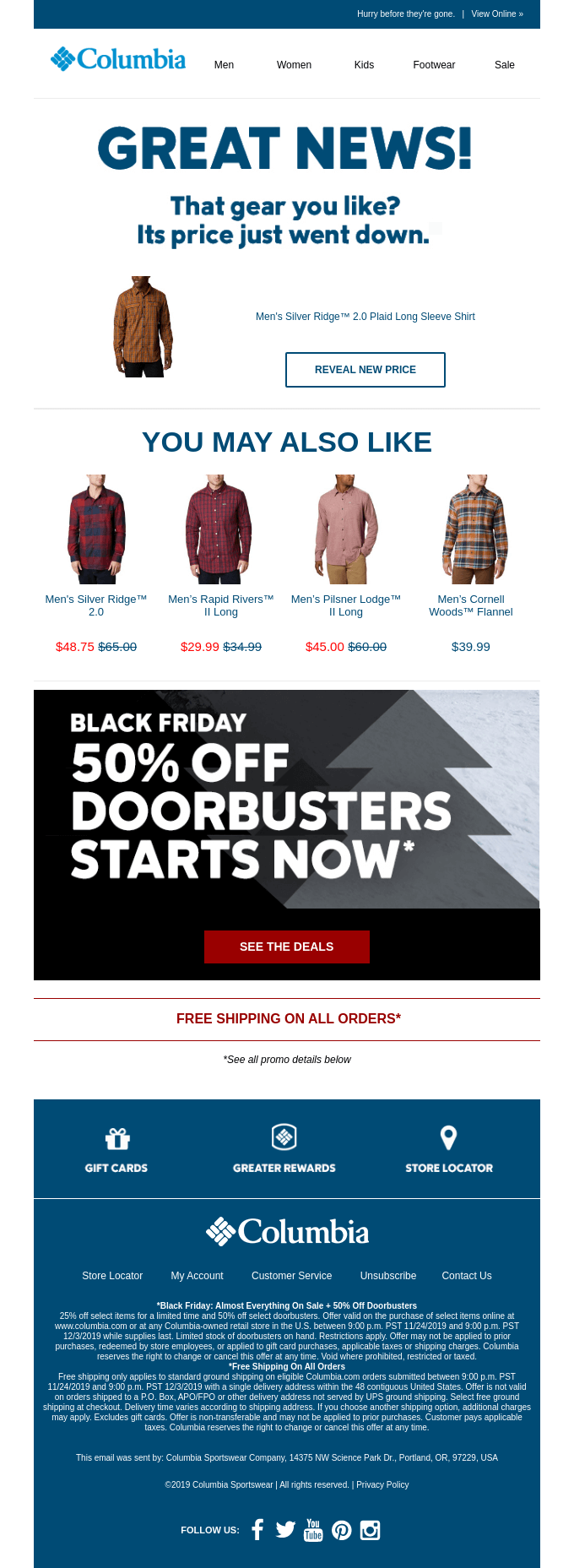
Our next announcement email template is from Columbia Sportswear Company, a leading sportswear company based in Portland, Oregon, United States.
Right away, the copy and the first call to action, “Reveal New Price” pack quite a punch. The headlines effortlessly connect on a personal level with the viewer. Informal, chummy, and urgent, the copy captures the exact tone of something newsy.
The CTA button, in particular, is point-black in its message. It does not leave the viewer guessing as to where their next click will lead them. The Black Friday offer, the main part of the message, comes out vividly against the dark backdrop.
5. Holiday Sale Announcement Email
This sober, mauve-colored announcement email from Orangewood hits all the notes right when it comes to announcing a holiday sale via email.
To begin with, the image plays up the holiday mood: the acoustic guitar is placed against a Christmas tree which is surrounded by gift boxes. Subscribers will surely find it relatable.
Christmas is said to be the most magical time of the year. The line “Gift the Magic of Music” successfully captures the association of Christmas with magic and wonder.
Finally, the CTA button tickles the saving nerve. It could easily have been another harmless “Click Here” or “Go To Website”. But “Save Now” hits the bull’s eye! It’s classy as well as practical.
6. Contest Announcement Email
Did you know that contest CTAs have a 3.73% higher conversion rate than other CTAs? Such is the appeal of contest announcements.
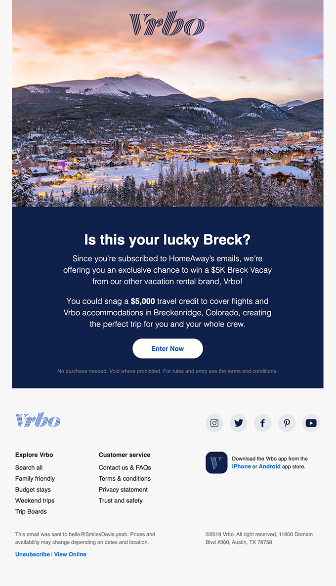
This announcement email from Vrbo, a Texas-based vacation rental company, begins on a note of humor. The word-play is not contrived. Indeed, few headlines can condense an entire message in just five words.
In addition, the snowy expanse of Breckenridge amplifies the pull of the announcement. The CTA is matter-of-fact. Because the announcement is creatively begun, it must be soberly ended. That’s how the template maintains balance.
7. Anniversary Announcement Email
This announcement email from Uber kicks off with the perfect line for such a message.
Anniversary emails are a part of the email personalization strategy. In the above example, Uber maps out the customer’s journey with precision. The email provides the date of the first trip and the very first comment the customer received.
These details reinforce intimacy with the customer. In fact, Uber has gone beyond the conventional use of first names to establish a personal connection with the customer. The customer is assured that they are not just another swimmer in the pool. In fact, the brand cares for them – that’s the message.
8. Product Update Announcement Email
Our next announcement email template is from Pitch, a platform for creating and sharing presentations.
When it comes to announcing product or feature updates, you want to keep your message short, sweet, and clear. A great product update email goes beyond informing its subscribers — it engages. Pitch does that with style.
Take a look at the main copy where Pitch gives the details of the updates. It is very informative and very funny. Notice the CTA copy too: the use of the word ‘Tour’ is winning. It magnifies the potential impact of the newest features. The word sells experience. Could it get better than that?
9. Legal Update Announcement Email
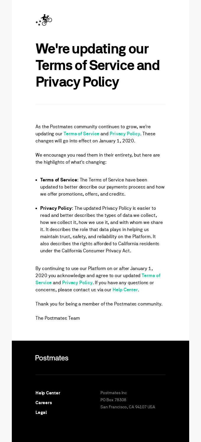
Our penultimate announcement email is from Postmates, a food delivery service based in California, United States.
When it comes to legal announcements, your email should be formal, clear, and focused. That’s what Postmates does.
First, the most relevant terms, Terms and Conditions and Privacy Policy, are hyperlinked in the opening sentence. Second, to make it easier for the subscriber, the email provides two significant highlights from the overall update. This is both to prompt and prepare the reader.
Toward the end, both Terms and Conditions and Privacy Policy are hyperlinked once again. No frills, no creative stunts – this announcement email template does justice to its message.
10. Back In Stock Announcement Email
Our final template comes from UGG, the celebrated fashion company based in California.
Fashion is visual-intensive. Any fashion email aims at helping subscribers visualize themselves in the brands’ outfits. In addition, maintaining brand identity while making an announcement is crucial.
UGG ticks all the boxes. Note the use of “The Wait Is Over”: since the message is visuals-focused, the text is likely to be overshadowed. Hence the use of a time-honored copy.
The Free Shipping option is placed at the head of the template, highlighting urgency, and goading the customer to action.
Wrapping Up!
So those were some of our favorite announcement email samples. To summarize, an announcement email must contain three things: the announcement details, winning visuals, and a clear call to action. All the samples we listed above more than satisfy the three requirements. They sure raise dust!
Which one is your favorite? Let us know in the comments!








Susmit Panda
Latest posts by Susmit Panda (see all)
Expert Interview Series: Part 10
Step By Step Guide To Successfully Integrating Salesforce CRM With Adobe Marketo