
[This post was originally published on 17th May 2022. It has been updated on 19th March 2024.]
A decade ago, if you would have told someone that a few years down the line, they would be able to access emails on their wristwatches, they would have probably clutched on to their sides, rolling on the floor in a fit of laughter.
Well, look who’s had the last laugh! Desktops, mobiles, tablets, smartwatches— now, we’re able to consume emails across all these devices. But, this scenario also presents businesses with a conundrum—that of figuring out the ideal email template size. There are no two ways about it; cracking the email template size code is crucial for determining the success of your campaigns.
The size of your email template is dictated by myriad factors: template width, template height, file size, header height, and footer height, to name a few. In this article, we’ll turn the spotlight on each of these components.
But, before that, another topic demands our attention.
Responsive Email Templates- Why Are They So Important?
Responsive emails refer to those that render optimally across all devices. And in 2024, if your templates aren’t responsive, you are not even running the same race as your competitors, let alone beating them.
Over the years, email marketing has become largely consumer-centric. Today, what you share with your subscribers isn’t the only factor that draws them to you; how you do so plays an equally pivotal role.
In fact, as many as 79% of subscribers admit they would delete an email if they are unable to consume it on a mobile device. With the number of mobile email users growing exponentially with every passing day, failing to design responsive templates can deal a body blow to your overall reach and visibility.
So, how do responsive emails work? They use CSS media queries that make images and fixed-width tables on desktops compatible with smaller mobile screens. They do so by first monitoring the screen size in which the email is currently opened and then disabling different sets of rules accordingly.
Let us take a look at two essential responsive email best practices.
- Using single-column layouts: With single-column layouts, you eliminate the risk of overlapping columns, overflowing text, shifting of images, and other rendering issues that you are likely to encounter with a multi-column layout. Not just that, single-column layouts are advantageous from an email accessibility perspective as well. How? Most HTML emails across the globe are coded using tables. Specifying the right content order becomes highly critical in this arrangement. If your content sequence doesn’t adhere to the standard left to right and top to bottom reading order, subscribers using assistive technologies like screen readers won’t be able to read your emails properly.
- Prioritizing content for mobile display: Content-heavy emails don’t make for a good viewing experience on mobile screens. Therefore, for your mobile layout, prioritize the content you absolutely want your subscribers to see and hide the rest.
Now that we have discussed the significance of using responsive emails, let us get into the specifics of every constituent dimension of an email template.
Email Width
The golden number that email designers are typically advised to stick to while specifying the template width is 600 pixels. Even popular marketing services such as Mailchimp and Klaviyo give templates whose default width is 600 px. That said, it is not really a hard and fast benchmark; you are allowed to go a little over up to 700 and 800 px. Earlier, Gmail used to block the background colors for email templates exceeding 640 px. However, that’s not the case anymore. So, if you feel that a wider (even beyond 800 px) template better suits your requirements and you want to go ahead with it, you are free to do so. Just make sure to run it across different email preview tools to get clarity regarding how it will appear to your readers.
Email Height
When it comes to email height, there are no set benchmarks as such. That doesn’t mean you get to exercise a free hand. Keep the following tips in mind:
- A longer email allows you to convey more information, of course, but you also have to make sure that your reader doesn’t get exhausted in the process. Hence, going beyond 3000 px is generally advised against. Most experts recommend 1500-2500 px as the ideal range.
- Remember, the objective of your email is to hook in your subscriber the moment they open it. This can either be a visual element or the kernel of your email’s message. Whatever it is, make sure it occupies the first 350 pixels of your template, which is roughly the area that remains above the fold. Keep in mind that many email clients block images by default. So, if you are using a picture for this section, test your email thoroughly before delivering.
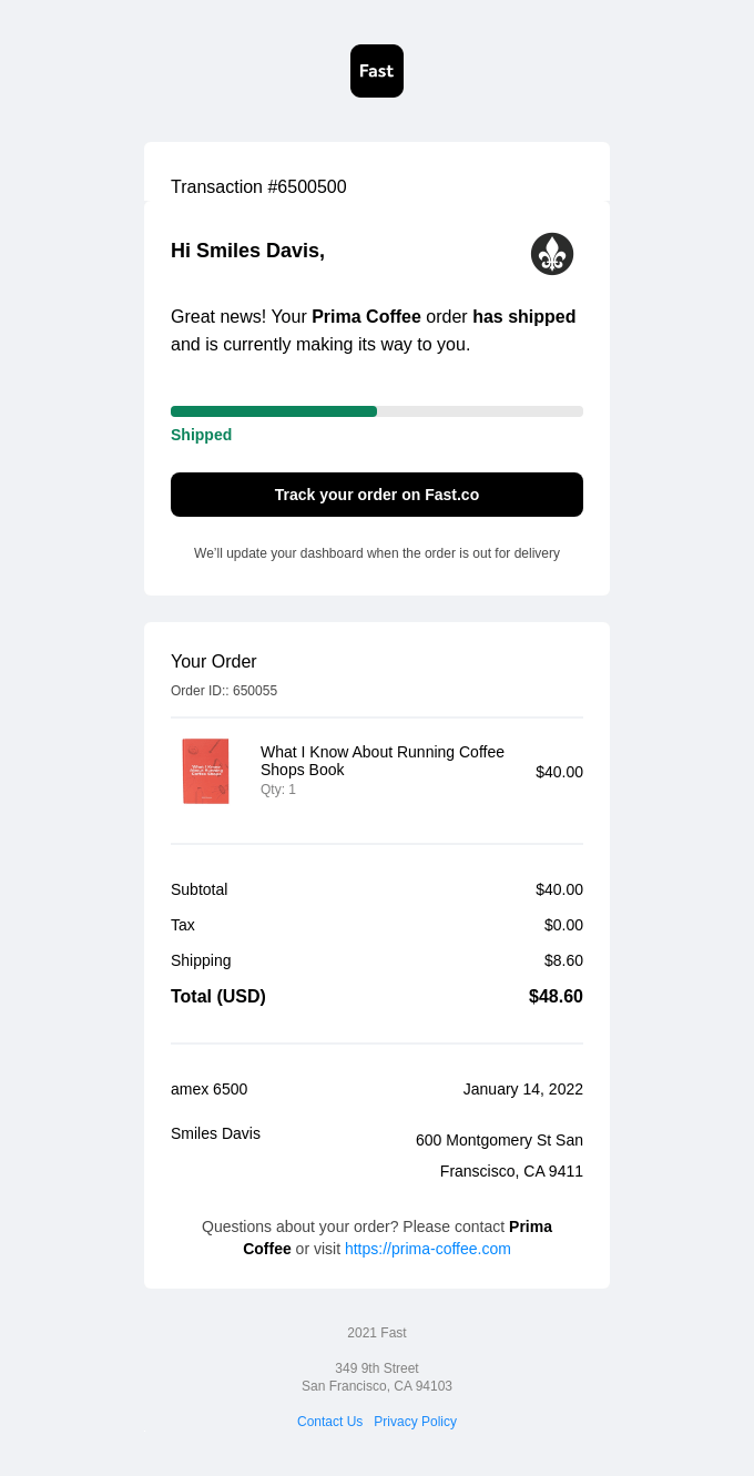
- Your email type is an important factor that shapes its height. For instance, if it is a simple transactional email, the only content it will have is a brief thank you message followed by the recipient’s order details. For this, you don’t need to design a template that is 2000 pixels long. On the other hand, if it is a newsletter, it can easily occupy anywhere between 2500-3000 px. But, as mentioned earlier, if you are making your emails lengthy, make certain that it packs enough substance to effectively hold the attention of your readers.
For instance, take a look at the length of this transactional email from Fast.
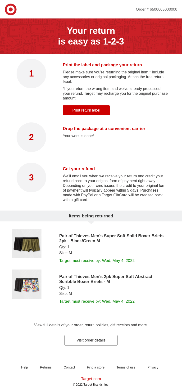
Compare that with this transactional email from Target.

Email File Size
With marketing emails and newsletters that usually span between 2500-3000 px and contain a fair deal of information, you have to keep two main things in mind:
1. The quality of the content.
2. The email file size.
Should your file size cross 102 KB, it will be automatically clipped by Gmail. Subsequently, this degrades your recipient’s viewing experience to a certain degree. While no other client exhibits this behavior, we’d still advise you to keep your template size below 102 KB. Given Gmail’s huge market share, it is only wise to do so. Listed below are a few tips you can follow to keep your email size in check:
- Be judicious with your use of images. While they, no doubt, amplify your email’s appeal, too many high-quality images in your email will cause its file size to go through the roof. This extends to other visual elements as well, such as GIFs and animations.
- Avoid including large attachments in your email. The best course of action is to publish the same on your website and direct traffic to it using emails.
- Minimize dependency on custom fonts. They are weighty by nature and, when used in excess, can considerably increase your email’s file size.
Email Header Height
Your email headers essentially tell your subscribers who they are receiving the email from. It should contain your business name and logo, at the very least. Some brands even prefer to add a product menu. With all these things, the height of your email header should ideally be under 200 pixels.
Take a look at Uncommon Goods’ email header.

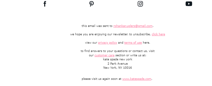
Email Footer Height
Your email footer contains your email signature, which typically holds your legal details, contact information, company address, social media icons, and unsubscribe links, among other things. The rule of thumb is to keep its height within 100 pixels.
Here’s what Kate Spade’s footer looks like.
Wrapping It Up
The size of your email template goes a long way toward determining not only your interaction and engagement but deliverability as well. Hence, it should be one of your primary concerns when you sit down to chalk out your campaigns. We hope that the insights and best practices shared above have been able to provide you with the answers you were looking for!
Rohan Kar
Latest posts by Rohan Kar (see all)
10 Tips to Review And Maintain Salesforce Data Hygiene
How to Implement Cart Abandonment Journey in SFMC?