“Curiosity got the cat” or in the marketing world the adage is “Curiosity gets the customer”. Human tendency dictates people to worry about the two birds in the bush than the bird in hand. By leveraging this emotion, brands create suspense to boost sales especially during product launch. Thanks to the reach of an email, curiosity can be better created through product launch emails. By sending cryptic messages or sneak peeks in their emails, email marketers tend to create the hype in their product launch emails.
Pre-requisites to a Product launch email
As stated, a product launch email needs to create a hype around the release of a product and so needs to raise questions within the minds of the subscribers. The email copy i.e. subject line, preheader, and the body content, needs to raise the interest of the subscribers.

In the above email by ‘The Vitamin Shoppe‘, the subject line gives a clear indication about new products in the email.
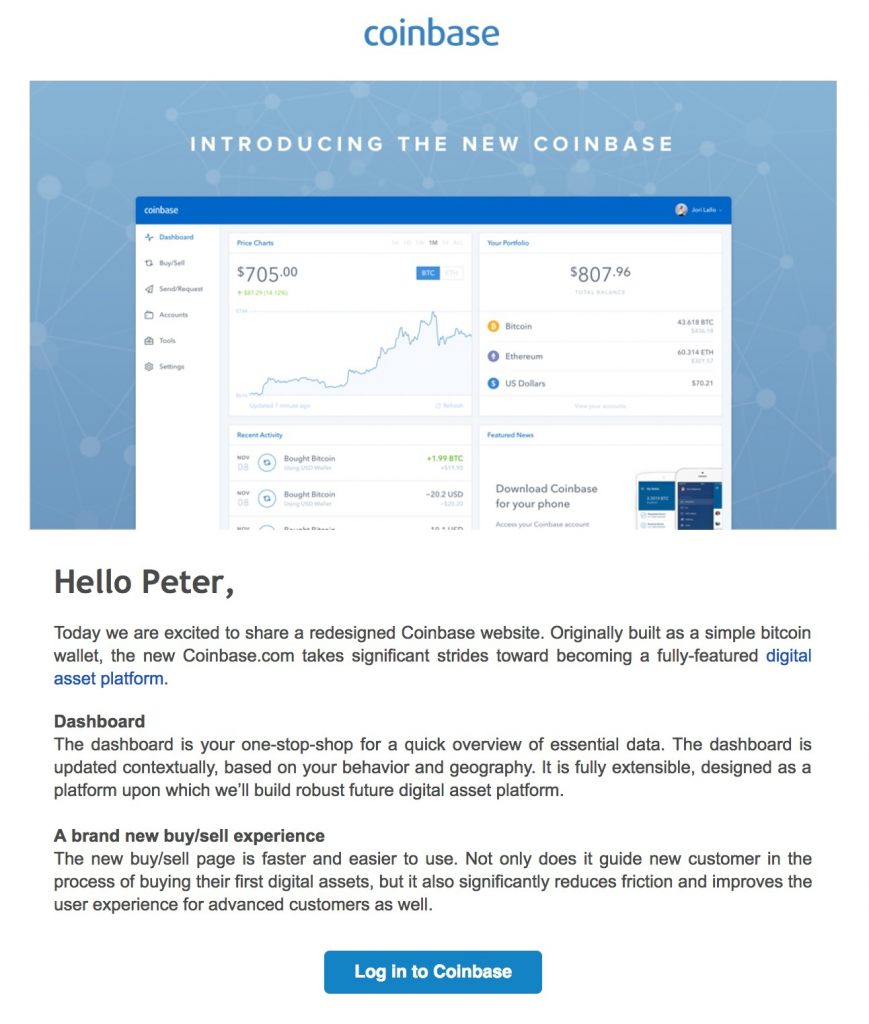
Additionally, you need to have supporting images in conjunction to the body copy to increase the hype. A screenshot of the new product (like Coinbase email below) or the product itself will be the first thing your subscriber will see when they open the email and then read a small description about what to expect.
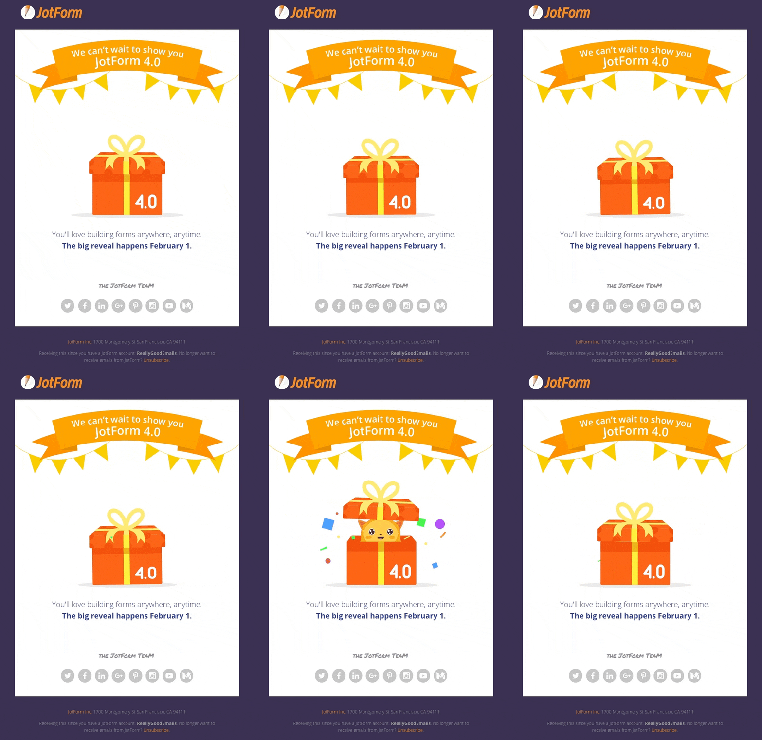
Sometimes by hinting the reveal with a date, like Jotform has done in their email, you are actually not showing anything, yet the subscriber will be on the edge of the seat.
So, the pre-requisites while creating your product launch emails are:
- Launch Date
- Images of product
- Description for the product
What to show and what to keep secret
The goal of a product launch email is that it should raise the following questions in your subscriber’s mind and answer them:
- What is the product?
- How can this product help me?
- How is it different from others?
- How do I get it?
Let’s learn how your email can answer the questions by studying the following Apple email.
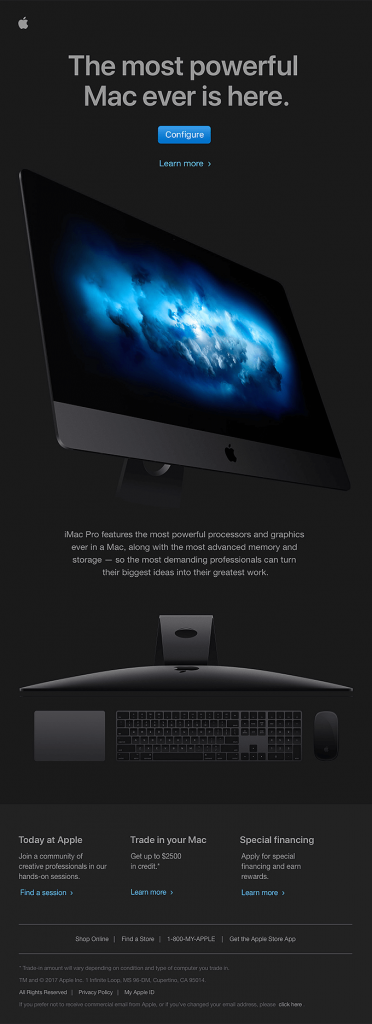
In a glance, the email is a very minimalistic design but manages to attract subscribers with the sharp design and crisp email copy. The headline is a statement in itself, that answers “What is the product?”
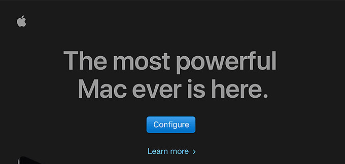
In the top portion, they have a text CTA below the actual CTA button for anyone who wishes to learn more about the product.
 Additionally, they have added a small description about the product to answer, “How the product helps?” as well as “How it is different from others?” within a single paragraph.

By now, the subscriber is already intrigued about the product and is just one push away from converting. So, right above the footer, Apple provides links to 3 different pages that will provide different information based on the subscribers’ queries. All three sections have the answer to “Where can I buy one?”.
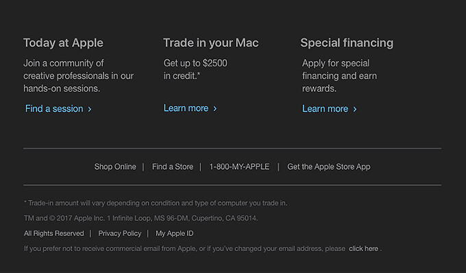
Revealing all information in your product launch email is like putting all your eggs in a single basket. As you must have observed in the above email, Apple gave vital information in the email itself without revealing much. With the help of relevant CTA links, interested subscribers can be directed to relevant landing page where they can be catered well.
Plan to generate curiosity for your product
For maximum conversions from your product launch email, you will need to generate curiosity around your product. Litmus did so by creating a 3-email series in which they involved their subscribers to participate to further spread the curiosity on social media.
Step – 1: Prelaunch curiosity
As stated earlier, your email copy needs to spike curiosity and that is exactly what Litmus did in their first email. Going ahead with the subject line “The way you make email is about to change”, they made the subscribers open the email. As soon as they opened the email, this cryptic message (see below) welcomed them along with a CTA inviting them to start a rumor about what new they expect from Litmus.
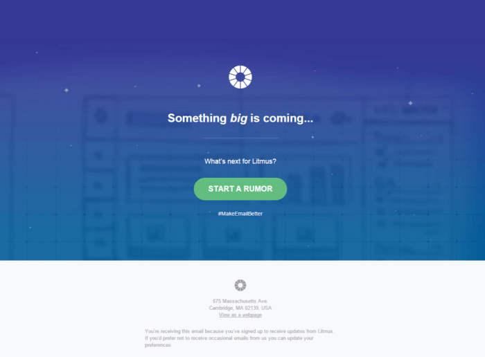
This way they made sure that their visibility is greatly increased via social media and forced others to take part by tapping on their curiosity instinct.
Step – 2: Maintain Buildup
In the second email, they maintained the buildup even after announcing how they are revamping their services. They displayed a blurred out their new layout and explained the core features without actually “letting the cat out of the bag” figuratively.
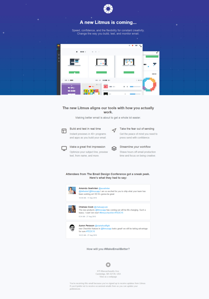
Additionally, they featured some of the tweets from attendees of Email Design Conference who got a sneak peek of it, thereby cross promoting their annual event.
Step – 3: The Reveal
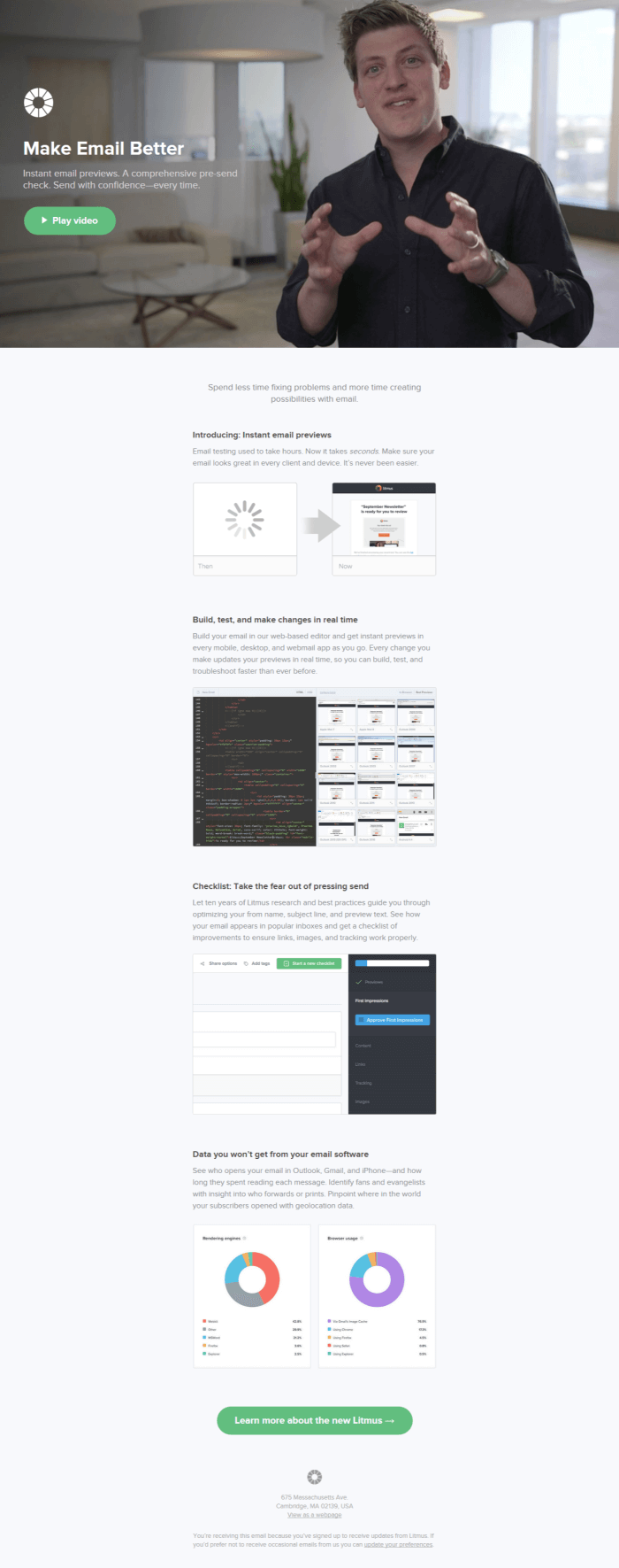
The final email in the series, the 3rd email finally revealed the new and improved Litmus to their subscribers. A link to the video tutorial in the first fold will drive those who are ready to convert, and the second portion explains the features for those subscribers who are on the fence.
As an Easter egg, clicking the ‘View as webpage’ switches between different backgrounds for the first fold. This way, user experience was further improved by the web functionality.
(This case study was originally published on beefree.io and has been showcased here to explain how an email series can greatly help in product launches)
Final Thoughts
Product launches are all about the propaganda and when executed well in your emails, it can boost your conversions greatly.
Ever been on the edge of the seat to know about a specific ‘product launch’ email? Share your views in the comments below.


Kevin George
Latest posts by Kevin George (see all)
Keeping the Freshness in Email Marketing Alive
How to Create the Perfect Landing Page for your Email Marketing Campaign?