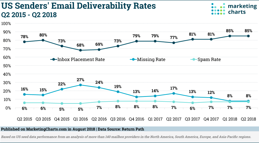
With 50% of customers preferring to hear from brands through emails, and 85% of promotional emails reaching the customer’s inbox now, it has become imperative for businesses to design an email campaign that not only resonate with the subscribers but has the capability to drive traffic and conversions too. Sure, open and click-through rates are important but, if it doesn’t entice the subscriber to convert and buy further, it is of very little or no value.
Consequently, it is important to take care of where your subscribers land once they receive your email and click on the call-to-action (CTA). Chances are that it will take them to an email landing page, you have specifically designed for an offer, product, promotion etc.
So, make sure your landing page has the capability to get hold of the customer’s attention. Remember, the longer your subscribers stay on your landing page, the higher are their chances of conversions. Hence, create a perfect landing page and give your subscribers a good reason to stay and convert. Here’s how you can do it.
1. Clarity is the key
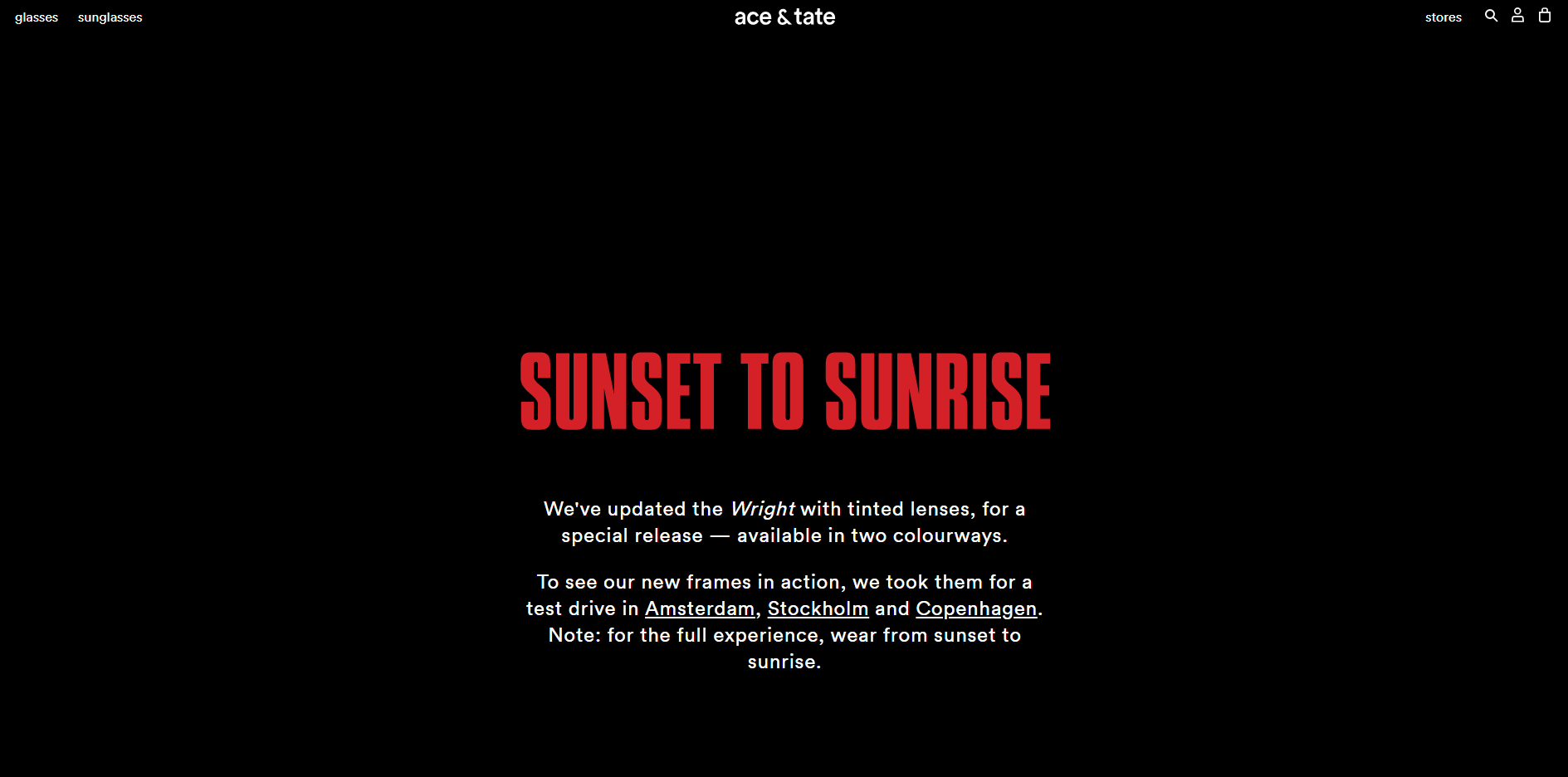
The first and foremost step for creating an impeccable landing page is being clear in your approach. You have designed your landing page for a product or offer. So, make sure your landing page serves the purpose and gives your subscribers a clear idea regarding what your email is offering. To put it in other words, it should be simple and easy to comprehend. You can do this by including brief, precise and strictly necessary information within your landing page just the way ace & tate does. Its email and landing page are absolutely in sync.

Here’s the landing page for this email.
Pro-tip: You can make use of bullet points for increasing the clarity and thereby, attracting the customer’s attention instantly.
2. Make it visually engaging
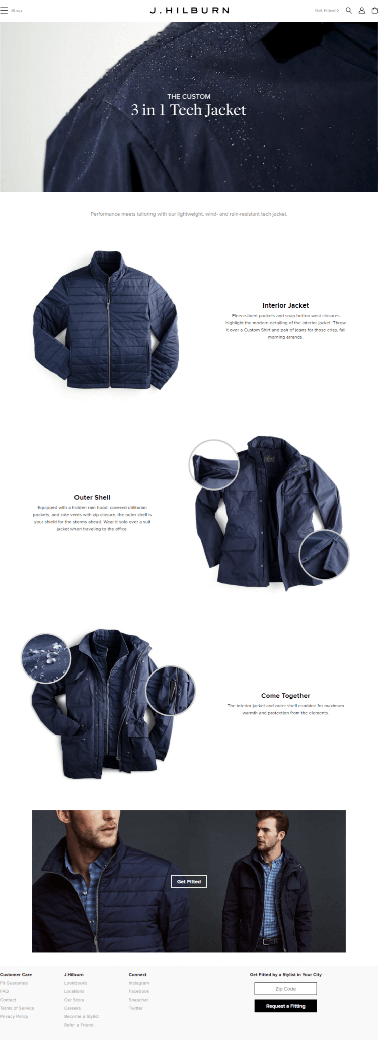
Landing pages are a great way of engaging your subscribers visually and driving conversions. You can start by including relevant images and videos that best describes your product or service. However, make sure you don’t overdo it. It might distract the subscribers and shift their attention from the goal.
J. Hilburn has a visually impressive landing page for its email promoting their 3 in 1 Tech Jacket.
3. Stick to a compelling and single call to action
Your call to action should be compelling enough to drive conversions. So, make it strong and to the point that encourages people to take the necessary action. You can use CTAs like “buy now”, “join free”, “sign-up”, “learn more” etc. These are few of the highest converting call-to-actions.
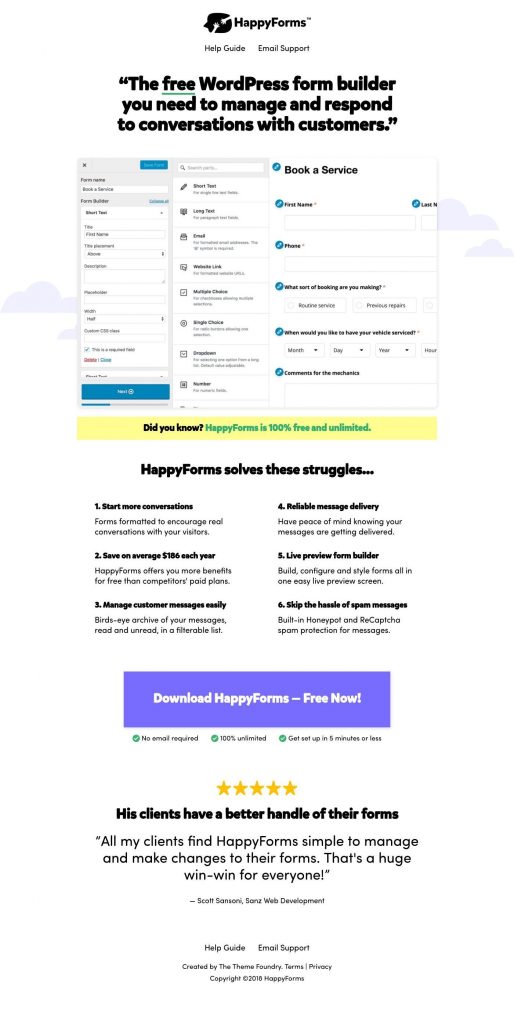
In addition, you also need to stick to a single call-to-action to draw the subscriber’s attention and thereby, have better click and conversion rates. Do you know having a singular call-to-action enhances click-through and sales by 371% and 1617% respectively? This happens because of their uninterrupted focus on that one CTA. A good way of making your CTA the center of attraction is by making it easy to read and easy to spot. You can do this by keeping its size large and highlighting it with a color that’s not used anywhere else on the landing page.
Have a look at the landing page by HappyForms and the prominent CTA placed towards the bottom.
4. Keep your email and landing page coordinated
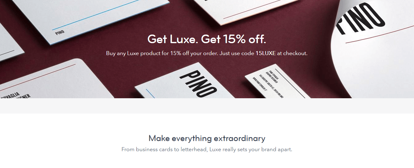
Make sure your email marketing campaign and landing page are well coordinated. If this isn’t the case, the email subscriber might get confused and probably suspect your email for a scam or phishing link. Hence, to avoid any such confusion, sync your email campaign and landing page properly. It can be done by maintaining the same aesthetic style such as color, font, logo etc. from your email campaign to your landing page.
Also, if you are mentioning any offer in your email campaign, make it a point to repeat it in your landing page too. It can serve as a great opportunity for driving conversions.
Check out MOO’s email.
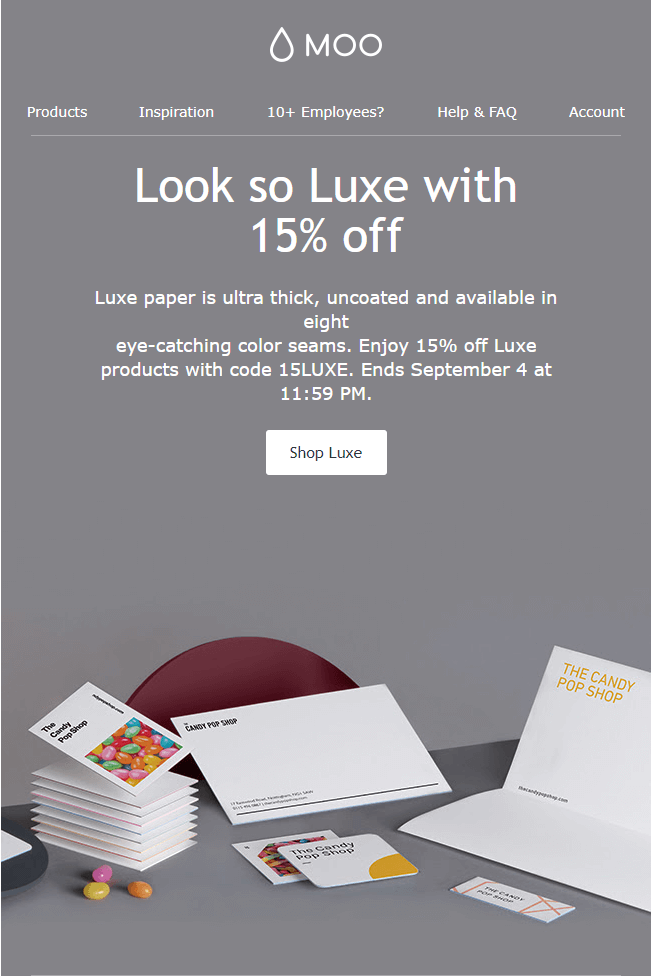
See how it perfectly syncs with its landing page that the prospects visit:
5. Don’t include typical website navigation
If you want your landing page to deliver great results, avoid including typical website navigation such as header, footer, social media buttons, support links etc. In short, don’t give your prospective customers an opportunity to escape by clicking away on other links. You want them to take immediate action. Thus, give them the reason to not get distracted and keep their focus intact.
Zero to Radio Ready has an awesome landing page in its kitty where there are no distractions of any website navigation and ample white space.
6. Highlight your privacy policy
Highlighting your privacy policy is an important aspect of any email landing page. It is needed to help you build a trustworthy relationship with your prospects. Remember, they are sharing their confidential information with you. So, it is critical to give them the assurance that your company is worth trusting. You can do it by making them aware of your privacy policy and terms and conditions. Include it at the bottom of the landing page or as a pop-up window to avoid any sort of cluttering.
7. Evaluate and test
Testing is another critical aspect of a successful landing page. Therefore, make sure you do A/B test of your landing page. You can make use of Google Website Optimizer for carrying out this test. A/B tests are a great way of knowing what works best for your landing page. From analyzing graphics, fonts and headlines to call to actions and background colors, it lets you know how to drive conversions effortlessly.
Final thoughts
Grabbing the prospective customer’s attention is a tedious task. In fact, even if your email marketing campaign does that successfully, what matters is driving conversions. This is when email landing pages can come in handy. However, as mentioned earlier, it will only help if it is perfectly designed. So, it’s high time you make use of the above-mentioned tips and create a landing page that turns out to be your greatest marketing asset.


Kevin George
Latest posts by Kevin George (see all)
How to Create Hype using Product Launch Emails
Why Email Marketing Calendar is an important part of your Campaign Suite