
Your landing page analytics shows consistently high open rates, click-through rates, and engagement. In fact, your subscribers are spending a good amount of time on the product pages you’re promoting in your emails. Still, conversions are few and far between.
Your email program, too, seems to be flourishing, but there’s no business success as such. What are you doing wrong?
Now, the gap between email success and business success is something we’ve had to deal with for many of our clients. They’re perked up about opens and CTRs, but seem mystified by, and often disappointed with, either their customers or email marketing at large.
Well, if you’re in the same boat, don’t jump off just yet. In this post, we’ll learn what constitutes business success in the context of email marketing. By and by, we’ll also share what we judge are high-converting e-commerce landing page templates and email templates.
- Good Design vs. Consistent Design
- 5 Common Mistakes in Landing Page & Email Design
- Tips to Ace Email Template Design for Ecommerce
Good Design vs. Consistent Design
It’s the design that’s chiefly responsible for whether or not your emails and landing pages generate revenue.
Here’s why: unless you offer subscribers a smooth transition from email to landing page, you’re not going to see much use of either. And what determines a “smooth” transition? Design. Fundamentally.
80% of our e-commerce clients, who know email marketing like the back of their hand, fail at just this one point: their focus is on good templates, and not on establishing consistency.
Mind you, we’re not talking about brand consistency here, though that’s important too. We’re emphasizing design consistency between an email and its corresponding landing page. That’s the whole gamut of subscriber experience.
So, the fewer the speed bumps in subscriber experience, the higher the chance of conversions.
5 Common Mistakes in E-commerce Email Templates & Landing Page Templates
The idea that if you could only capture the essence of the best e-commerce email templates and replicate it, you can make it — is false and dangerous. Let’s lead with that.
1. You’re Prioritizing Aesthetics over User Convenience
When you’re designing emails and landing pages, ask yourself the following questions:
- Who am I designing for? Myself or the customer?
- What’s the pillar design element, besides the brand logo, should the customer see immediately when they click through to a landing page?
- Is the color of the pillar element consistent between the email and the landing page?
- Is the product grid consistent between the email and the landing page?
- Does the landing page display the same navigation bar as the email?
If you’re asking these questions, you’re on track. Otherwise, if all you’re concerned with is how to create “stunning templates,” you’re misleading yourself, the customer, and the business you’re working for.
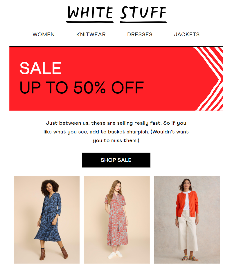
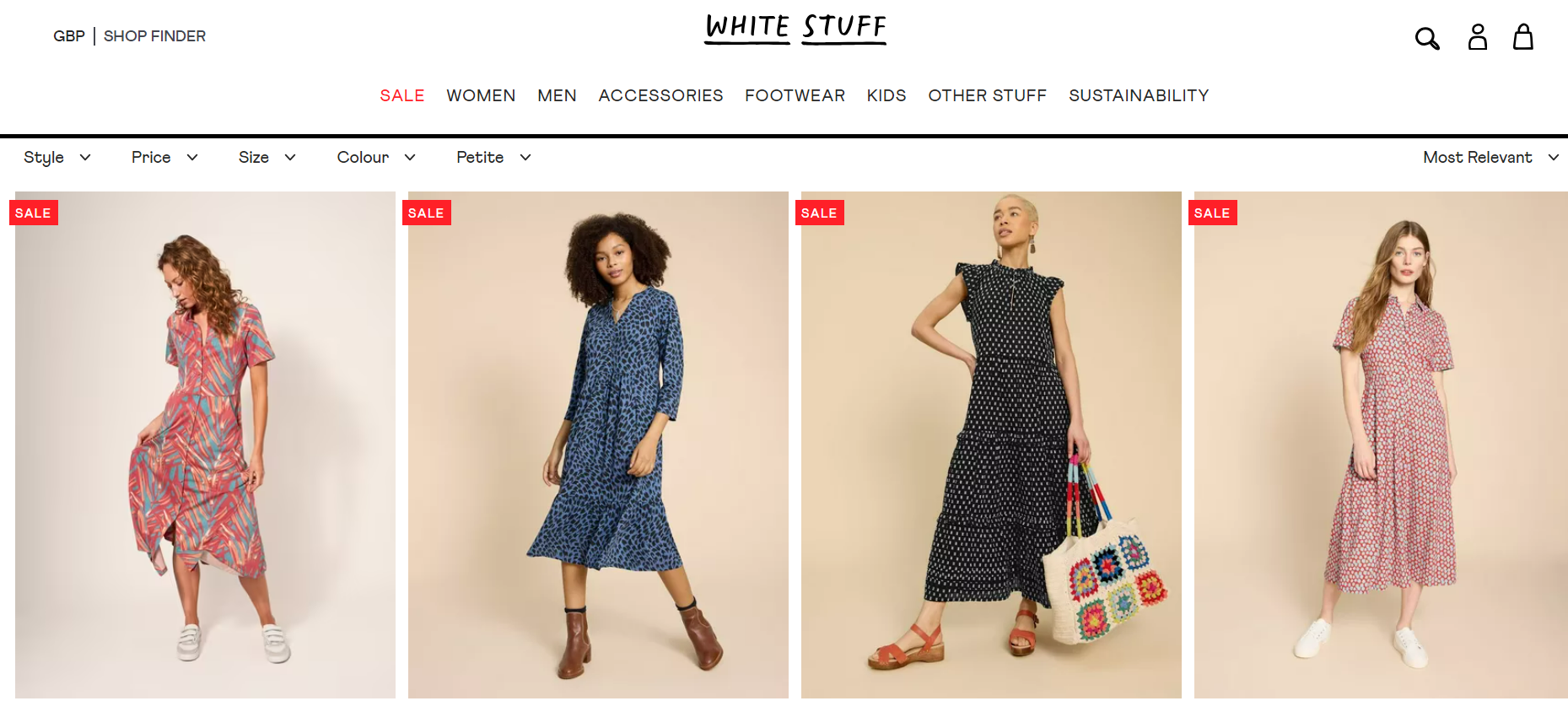
Below is an example of what design consistency looks like. White Stuff’s email and landing page are strikingly consistent by virtue of the same pillar design element, product grid, model images, and navigation bar.
2. You’re Making The Subscriber Search The Product
If your products are prominent in your email, they should be equally prominent on the product page. If the customer has to look for it on the landing page, chances are they will abandon the search after a few seconds.
Now here’s where you get to see the difference between how different channels are perceived and engaged with by customers.
People will happily scroll through a promotional, product-dense email because that’s what they expect from an email: To explore, not buy (unless you’re sending out AMP-powered emails which, by the way, are yet to catch on among marketers and customers alike).
The moment they land on a web page, they want to buy. Either feature the product(s) prominently on the landing page or include the product names in your email so that subscribers can search for it in the site-wide search box.
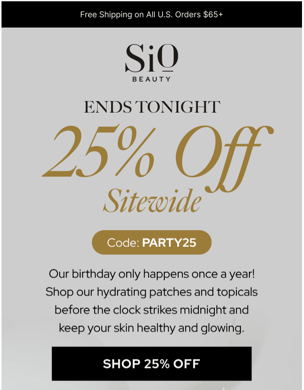
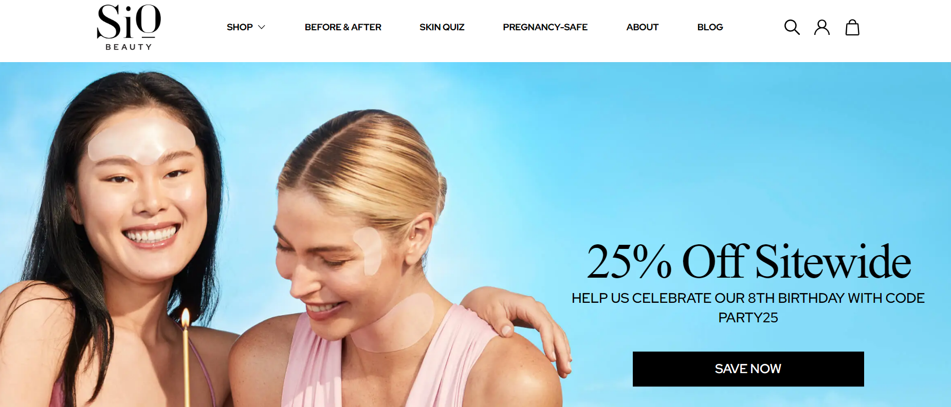
Take a cue from Sio Beauty below. The discount and code are prominently displayed on both the landing page and the email. The CTA button in both cases is black and unrounded.
3. You’re Not Designing Campaign-specific Landing Pages
If you’ve launched a campaign and direct subscribers to a page that seems to have no bearing on that particular campaign, you’re again disrupting the subscriber experience.
For example, if you’re running a holiday campaign but lack a holiday-specific landing page and instead direct visitors to your home page, it won’t align with the campaign.
Make no mistake, you might still clinch a few conversions alright, but in the long term, low subscriber lifetime value (SLV) will affect your business negatively.
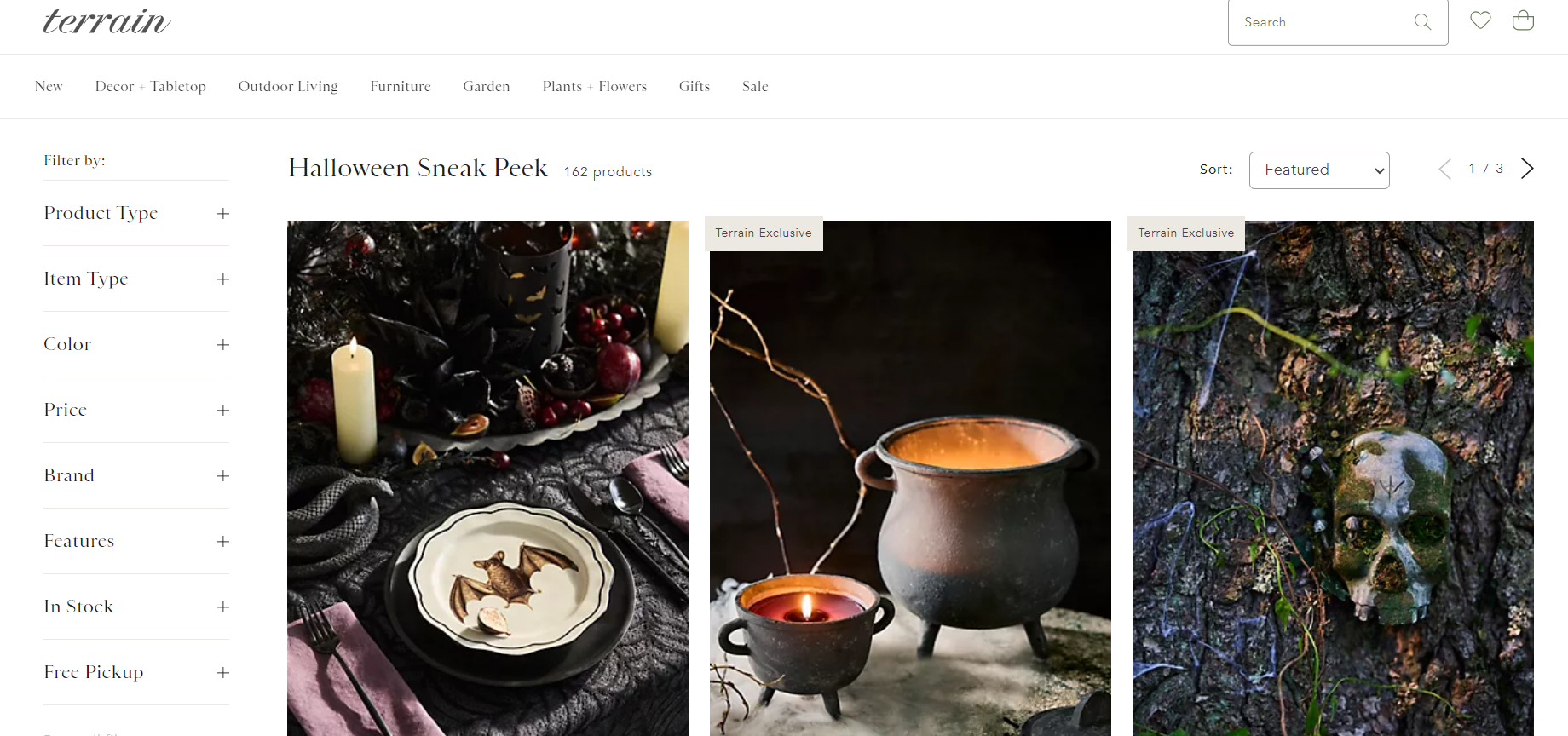
The following pre-Halloween email from Terrain establishes the connection between it and the corresponding landing page.


4. You’re Not Paying Attention to Landing Page Rendering
If you want to create the best landing pages for lead generation, ensure that the pages look good and function properly across devices.
In a scenario where your email is mobile-friendly but its associated landing page isn’t, you’re still setting up your customers for disappointment. It’s not an either/or case. Given that mobile opens account for the majority of views, neglecting the rendering of the landing page can be costly.
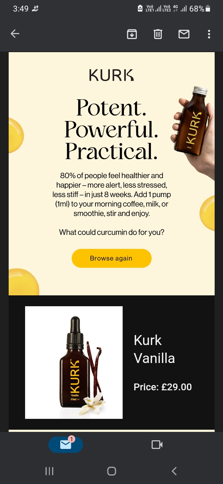
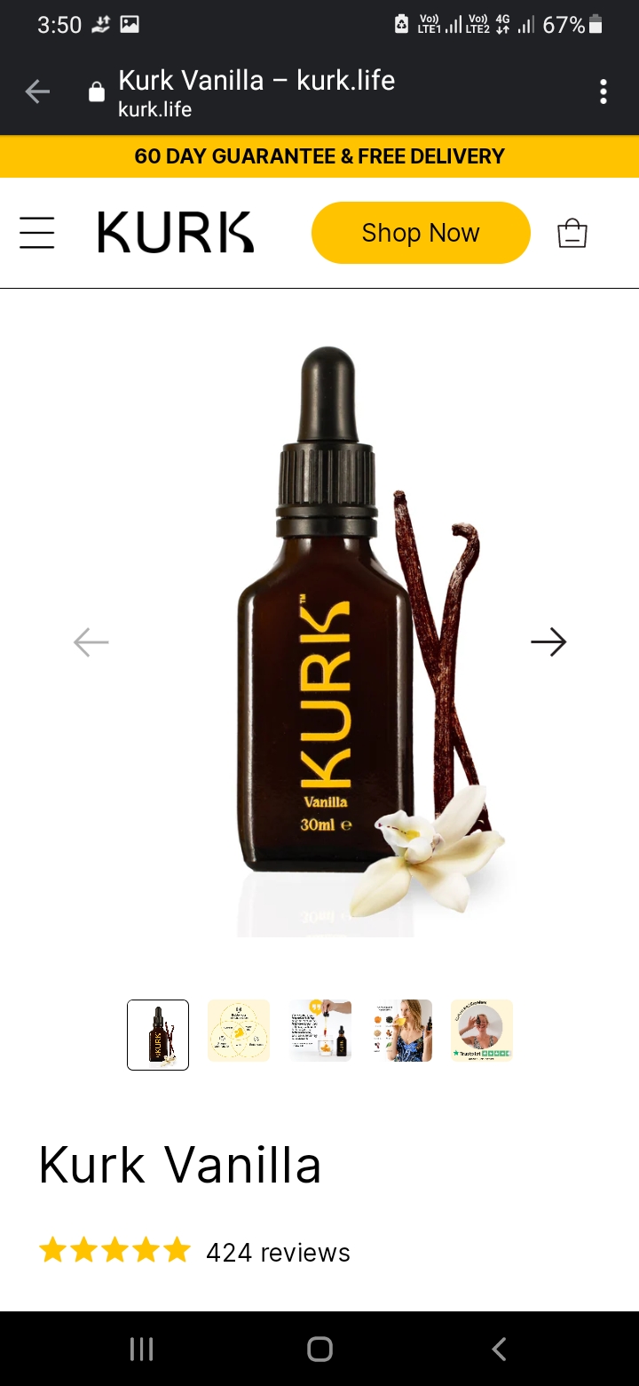
Here’s an example of a mobile-optimized email and landing page from Kurk. (Note the visual similarities between the two. The transition from one to the other is smooth.)
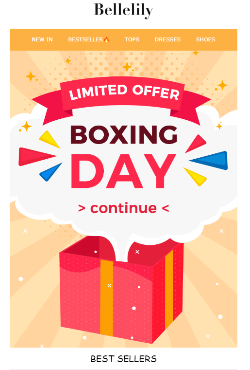
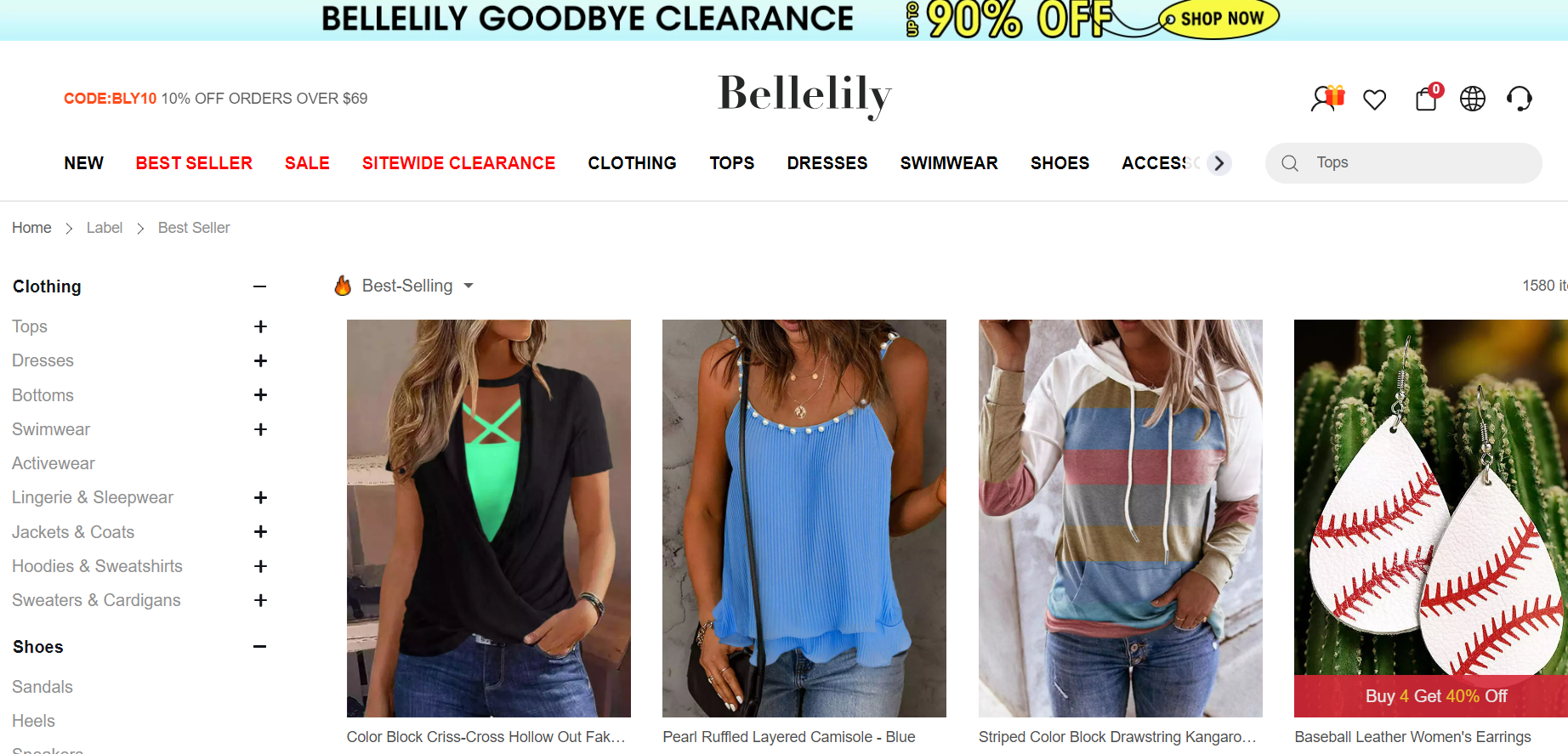
5. You May Be Directing Customers to Dead-end Pages
The usual tendency among most ecommerce brands is to remove one-off landing pages as soon as the event/sale/season is over.
At first glance, it does seem to be a reasonable thing to do. That’s what ‘one-off’ means, right? The landing page had been designed for a particular campaign/sale event. Once the event is over, you pull it down.
Well, not so fast.
Subscribers who missed the date will still click through to your past emails out of curiosity. If they end up on a dead-end page, it will frustrate them.
The FOMO strategy hinges on customers’ aversion to missing out on cool stuff. It works because the immediate relief of realizing they haven’t actually missed out—since the product is still available—mitigates the initial fear. However, with an empty page, no such reassurance exists, and the customer may actually feel the loss more strongly.
Read More: Infographics-Best Landing Page Design Trends
So a better way is this: If you need to remove a one-off landing page, consider an alternative destination for subscribers to click through to. You can direct them to your regular product page where you display a message saying the sale is over. Or you can suggest other pages they could visit.
This Boxing Day email from Bellelily is a year old, but the CTA redirects the subscriber to the product page, not a ‘404 Not Found’ dead end.
Tips to Ace Email & Landing Page Design for E-commerce
- The design, copy, and CTA – all should align seamlessly with the e-commerce marketing campaign. Above all, they need to be focused on driving sales.
- Your CTAs should be prominent and clickable. The buttons should be identical in color, shape, padding, and position. (If the first CTA in the email appears above the fold, the landing page should also feature the same CTA above the fold.)
- The page should be organized to allow subscribers to easily access information and make informed decisions. Additionally, the text and images should make the page compelling.
- A/B test both emails and their landing pages. Make sure to test CTA buttons, page layout, navigation, copy, checkout process, promotions, offers, scrolling, links, load time, etc.
Customer-centric, Sales-focused Design
You’re not designing for yourself; you’re not designing to finish another task for the day; you’re not designing even for the brand; you’re designing for the customer.
As a result, you want to design emails and landing pages that are useful as well as beautiful. That’s always been our approach. Our designers understand business, not design only.
We’re consistently delivering over 3000 email templates every month, along with dedicated landing page templates. Need help with both? Get in touch with our design team, and let’s get on a scrum call!
Susmit Panda
Latest posts by Susmit Panda (see all)
Responsive Email Designs: Let’s Get Back to the Basics
Inside Litmus Builder: Optimize Your Design & Development Workflow