In his acclaimed book, Marketing Management, marketing expert Philip Kotler draws our attention to a sign at L.L. Bean Inc., the famous retail store, which explains in short bullet points what a customer is. One of the points says, “We are not doing a favor by serving him — he is doing us a favor by giving us the opportunity to do so.”
Customer service is fundamentally different from what it used to be only a decade ago. So naturally, customer expectations have evolved in tune with the latest technological advancements. Today, customer service is as much about preemptive resolution as it is about responding to a customer-identified crisis.
This dynamic would figure in your customer service email templates as well. In this post, we will look at both kinds, specifically in terms of email design. We will study preemptive customer service emails as well as responses to customer queries.
Meanwhile, if you need help with designing responsive templates for customer service-related emails, feel free to get in touch with us. Our experts bring intuition and experience to the game, transforming your vision into a dollar-green reality.
1. Memberhub
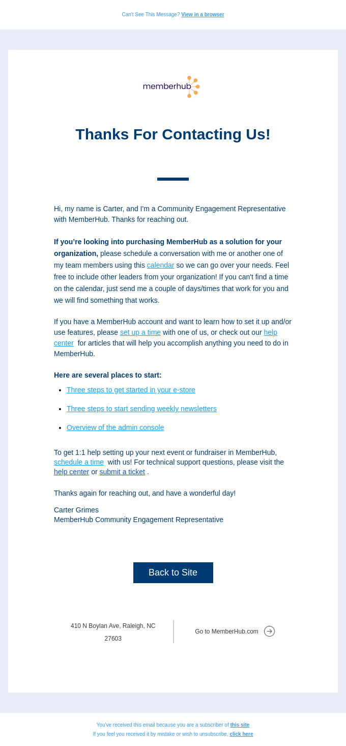
The typical customer service email is minimal, text-dense, and only perceptibly differentiated by brand aesthetics. This is exactly what Memberhub’s email looks like.
Apart from the logo and the various shades of cerulean blue used in the text, there is not much going on in terms of design.
Usually, support emails are informational, so they are under-designed, so to speak. But the approach may vary depending on the brand’s taste. This brings us to our next customer service email example.
2. Typeform
Typeform’s service email is an instance of preemptive reaching-out. Unlike traditional support emails, it is well-designed, starting from the light sea-green banner to the blue footer.
The email also maintains structural integrity. It is neatly divided into three sections. The middle section employs the Z-pattern to increase readability. One of the most eye-catching things about this email is that it contains the headshots of the support team.
Note also that no two CTAs share the same color. It may be because each call to action serves a unique purpose. It’s a minimal, yet effective way of distinguishing the buttons.
3. Canyon
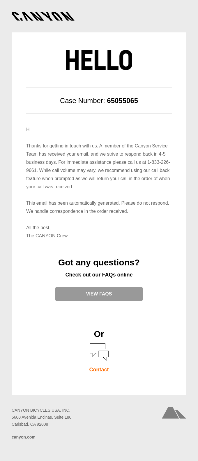
Canyon’s customer service template is unfussy. At first glance, the email might seem too clinical, if not tedious. However, black, silver, and orange are Canyon’s brand colors. We like how the designer has limited the use of orange to just one call to action, managing to include the entire corporate palette in a largely informational email.
The font style is equally brand-consistent. According to their own specifications, Trebuchet (normal and bold) and Tahoma (normal and bold) are Canyon’s dominant fonts.
4. Cometeer
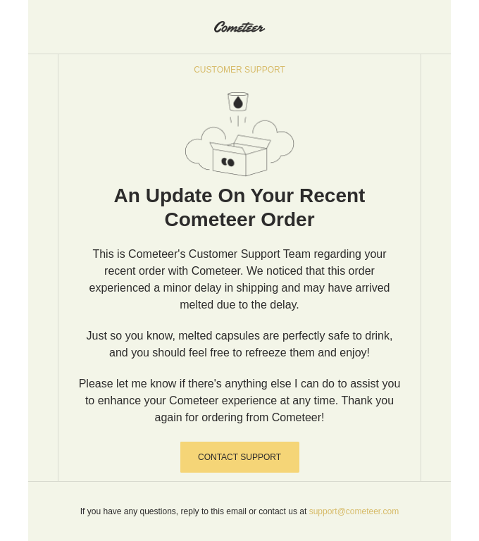
Cometeer’s customer service email template is a classic instance of preemptive resolution. This is an urgent, unforeseen email, hence the priority of information over design.
But once again, the design is not outside the scope of Cometeer’s palette. There is a consistency between their email and their official website. The light, coffee-colored CTA buttons are no accident.
Notably, it was quite clever on the designer’s part to not bold the CTA text against the lighter background. Because the email is predominantly gray, which is a light color, the coffee-shaded CTA automatically draws the viewer’s attention to itself.
We can’t help but appreciate the content of the email as well. Just go over the message once – it’s a perfect application of the bullet point we talked about at the start of this post.
5. Invision
Invision’s customer support email template is a study in the use of contrast in design. The email indicates an awareness of how online users view content. The purple tones play beautifully against the white-and-gray demeanor of the template.
The template is divided into three blocks, each progressively bigger than the other. The smallest block deals with the urgent query. The small size emphasizes the terseness of the content inside the block.
The next block is dedicated to self-help resources. (Incidentally, 67% of customers prefer self-help over talking to customer representatives.) The last block is chiefly promotional. Freehand is Invision’s own workspace app.
Evidently, Invision has gone beyond what a traditional support email looks like. Where most brands would confine their support emails to the first block, Invision has gone the extra mile. It’s a good way of keeping the subscriber engaged while help is en route.
6. Roman
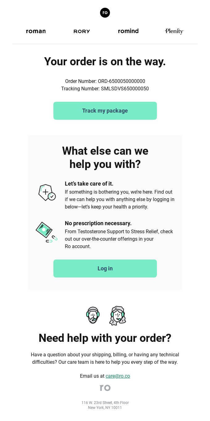
Our final customer service email example by Roman is a support and transactional email in one. This is yet another instance of reaching out to customers instead of waiting for an issue to emerge.
The design is simple. The duotone tenor is quite popular these days. The sans serif font is widely known for increasing readability. The CTA buttons are rounded, which makes for a more visually appealing look compared to square buttons.
Note also that rounded buttons minimize the risk of accidental clicks, facilitating more user-friendly interactions. In fact, it’s the only brand on our list that uses rounded buttons.
Wrapping up
Traditionally, customer service emails are under-designed. The urgency triumphs over aesthetics. But you can still manage to extend a purely support-related email to include other services, thereby allowing for more design opportunities, should the need arise.
The key takeaway? You want your support emails to be informational and concise. Depending on your brand identity, you may incorporate humor in your content. If you want to experiment with colors, do so in a way that is not too obvious. Your aesthetic choices should click into the functional focus of the email.






Susmit Panda
Latest posts by Susmit Panda (see all)
How to Add GIFs to Your Email Signature (Yes, Even in Outlook!)
Salesforce Marketing Cloud in 2024: Projections And Insights