Good design is one of the chief components of a smashing email template. Irrespective of how original and insightful your content is, at the end of the day, if your presentation is not up to the mark, your campaigns won’t be able to charm your audiences in the manner you wish them to. Designing an email template is a nuanced affair, and to get it spot on, one must factor multiple aspects into consideration. New to the game? Worry not, we have got you all covered! In this blog, we will be walking you through the ins and outs of email template design. Excited? Well, dive in!
Table of Contents:
- Why is Email Design Important?
- Evergreen Email Design Trends You Ought to Take Stock of
- Critical Design Components of an Email Template
- Mobile-friendly Design- Why You Should Embrace it Now
- Tricks Email Designers Can Pick from the Book of Web Developers
- Wrapping It Up
Why is Email Design Important?
Whether it’s a small or mid-sized business or a multinational conglomerate, almost everyone out there uses email. So, what can you do to set your campaigns a touch above the rest? Establish a unique visual identity for yourself. Of course, that’s not the sole parameter. You also need to focus on regularly churning out compelling content, pruning your contact list, and measuring your performance. However, these efforts will bear fruit only if you have a distinguishable and attractive brand identity to begin with.
The points listed below illustrate how good HTML email design helps your business.
- It enhances the appeal of your email content. Imagine you are given two emails- one is composed in plain text, and the other is laced pleasingly with images, illustrations, and GIFs. Which would attract your attention sooner? The answer is rather obvious, isn’t it? Subsequently, emails with stunning design are able o invite greater interaction and engagement, paving the path for increased conversions.
- By helping you create a strong brand identity, email design, in essence, opens the doors to building strong and lasting relationships with your customers. As a result, they become highly responsive to your communications and voluntarily spread the word about your brand. This, in turn, goes a long way toward consolidating your position as a figure of authority within your domain.
- It lets you track your performance effectively. With plain-text emails, you don’t get the scope of monitoring key metrics such as clicks, unsubscribe rate, list growth, conversions, email forwarding numbers, and the like. You can only do so with HTML emails.
- The presence of design and visual elements helps reduce the cognitive load of your readers. Parsing through big chunks of texts is quite an exhausting task. However, if the same text is interspersed with visual elements at regular intervals, going through it becomes a breeze all of a sudden. Of course, we would never recommend you to write a lengthy email copy in the first place. But suppose you have, good design will increase the probability of your recipients going through the entirety of it.
Evergreen Email Design Trends You Ought to Take Stock of
Email marketing is a constantly evolving landscape. Every year brings with it a slew of new and exciting design trends. However, there are certain trends that remain ageless and timeless. Let’s take a look at some of them over here.
Minimalism
“Less is more” has been the go-to motto of designers for a long while now. It was only a matter of time before minimalism took the email world by a storm, and over the last few years, it certainly has. In this age of information overload, it is enabling brands to put out neat and ultra-focused emails, thereby keeping them ahead of the curve. In a minimalist email, your message shines bright and is conveyed with absolute clarity to your audience. All the elements present in your email have ample breathing space, allowing you to deliver a splendid user experience.
Minimalism fosters improved navigation as well. Lastly, since minimalist emails have few elements, they tend to have small file sizes. As a result, they have excellent loading times.
Looking for some inspiration? These delightful minimalist emails will certainly help.
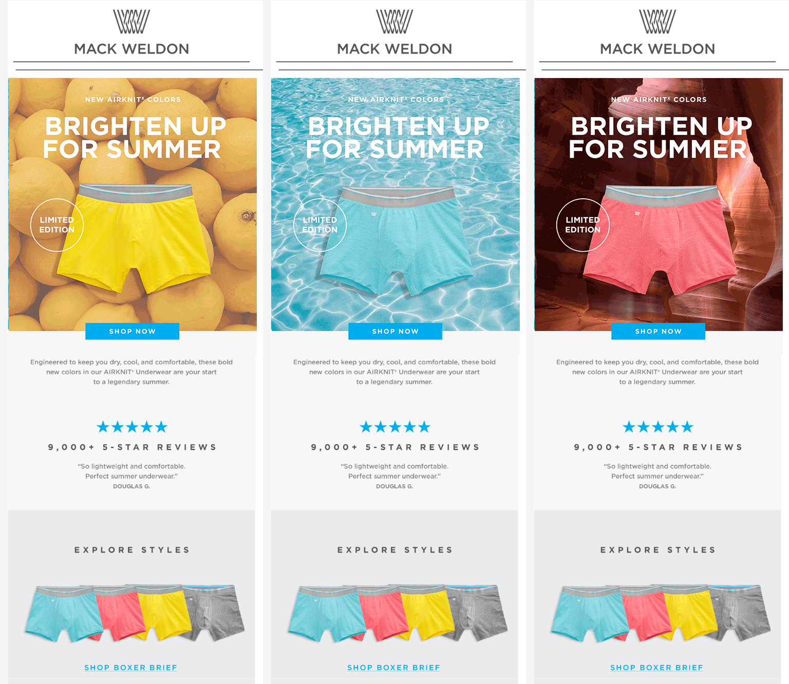
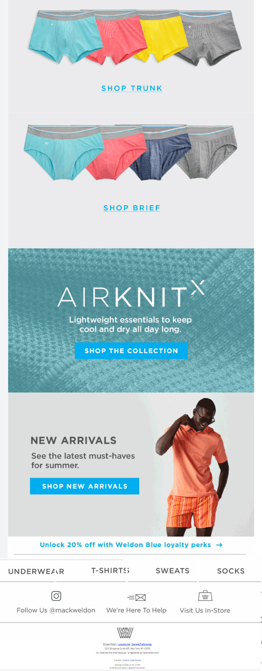
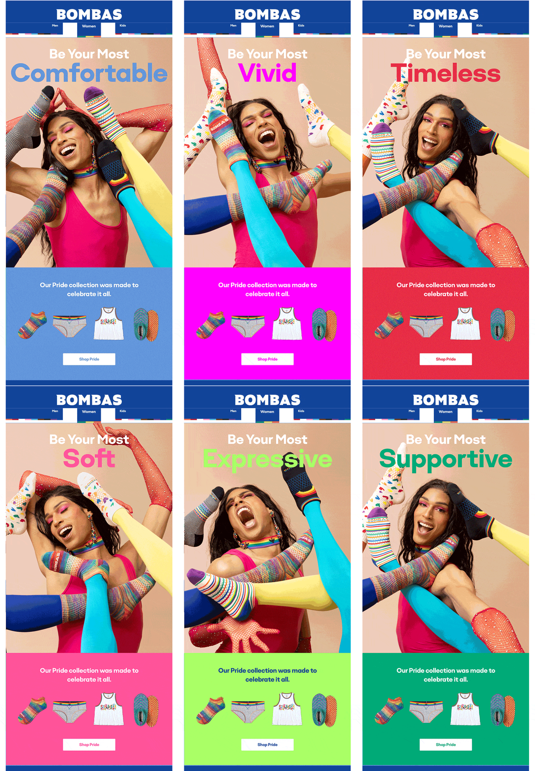
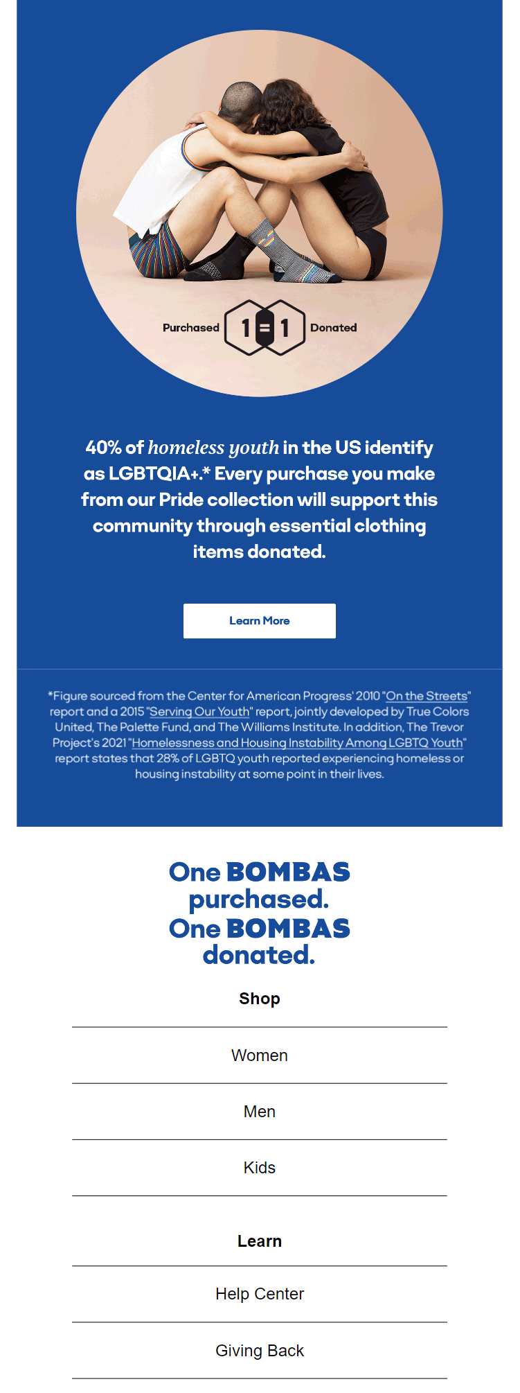
Dark Mode
From making your email templates aesthetically pleasing to promoting greater readability, the dark mode has a long list of virtues. It is no surprise, thus, that it is among the most popular email design trends. With major email clients like Gmail, Apple Mail, Yahoo Mail, and Outlook embracing this state, it has now become pretty much imperative for businesses to design two variants of their emails- one for the light mode and another for the dark mode.
That said, not every email client extends the same degree of support to dark mode. It’s best that you prepare yourself for the following three scenarios.
1. Your email remains as it is- This takes place with clients (Mos who offer absolutely no support to dark mode. Even when the user turns on dark mode on their device, these clients effect no change to your email’s design. Except in cases where your email has a light or white background, this scenario is pretty manageable.
2. The colors in your email get inverted- This is the scenario that comprises the nightmares of email designers. Here, the client attempts to make a dark mode version of your original design by simply inverting the colors of your email background, fonts, CTA button, and other elements. Depending on the client, the inversion might be partial or full.
3. You get to specify a custom dark mode- Goes without saying, this is the best case scenario one can hope for. Clients such as Apple Mail which offer full support to dark mode, allow email marketers to add custom CSS to have separate versions of their campaigns for light and dark modes.
With that covered, let us take a look at a few things one should keep in mind while designing for the dark mode.
- Always try to use image file formats that support transparency, i.e., PNGs and GIFs. They take up background colors when inverted by the email client, preventing your design from getting compromised.
- If your image has text, add an outline- a stroke, a glow, a soft shadow, or anything similar- to it so that it remains accessible and legible when consumed in the dark mode.
- Always ensure that there’s ample contrast between your text and background. You don’t have to do it manually. Take the help of Contrast Ratio, Monsido, Contrast Finder, Coolors, and many such tools available online.
- Use a font size that is a few points greater than what you are using for your light mode designs.
Animation
What can you use to communicate expressions that transcend words, emoticons, and images? Animation! A surefire way of electrifying your emails, animation lets you unleash your creativity to its fullest. Emails with animated elements- be it the hero image, the text, or the CTA button- capture the imagination of readers without skipping a beat.
Showcasing your offerings ingeniously, breaking down a complex idea, livening up your product descriptions, and representing customer data in an attractive and accessible fashion- the use cases for animation are plenty!
Given below are the three kinds of animated elements that are typically used in emails.
1. GIFs: Hands down the most popular as well as the tried and tested option out there, GIFs have been a darling among email marketers for a long time now. Since they are so thoroughly engaging, they contribute towards improving your click throughs and conversions, reducing your bounces in the process. Keep in mind that GIFs are made up of multiple frames. And the greater the number of frames, the more will be your email file size. Large file sizes hamper loading times, hence the best course of action is to compose your animated GIF using as few frames as possible. Additionally, certain email clients, such as Outlook, don’t support GIFs. Subscribers opening their emails on Outlook will only be able to see the first frame of your GIF. So, always try to design your GIFs in such a manner that the first frame itself conveys the most crucial bit of your message.
2. CSS3: CSS3 lets your craft responsive email templates with ease. This is because, with CSS3, developers are spared from writing different codes for different platforms. Using CSS3, you can elevate your backgrounds, add captivating borders and images, and spruce up the overall visual aesthetic of your campaigns. However, because multiple email clients don’t support it, CSS3 animation is yet to be used at large.
3. APNGs: Animated PNGs or APNGs are, conceptually, similar to GIFs- a sequence of images. But, with APNGs, the images are exclusively in the PNG format. And that makes all the difference. GIFs generally permit up to 8 bits per pixel. This means you can have 256 colors at best. In the case of APNGs, however, you can exhibit millions of colors, thanks to the PNG-24 format. Therefore, APNGs tend to be visually richer than GIFs.
Additionally, APNGs are more dark-mode friendly as well. Why? Because they comprise PNGs which, as we have discussed earlier, support transparency. What’s more, APNGs are supported by a host of major email clients, too, including Apple Mail, Samsung Mail, iOS, Outlook.com, AOL, and Yahoo. Across Gmail, Gmail app, and Outlook (Windows), you will be able to see just the first frame.
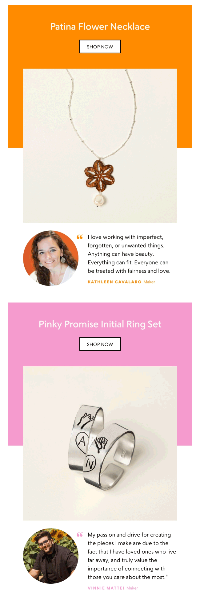
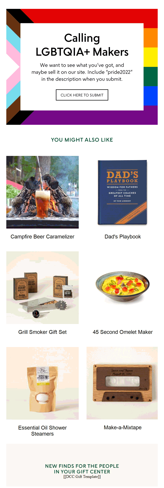
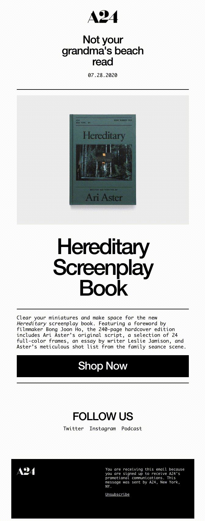
Here are a few email examples where brands have made masterful use of animation.


Illustrations
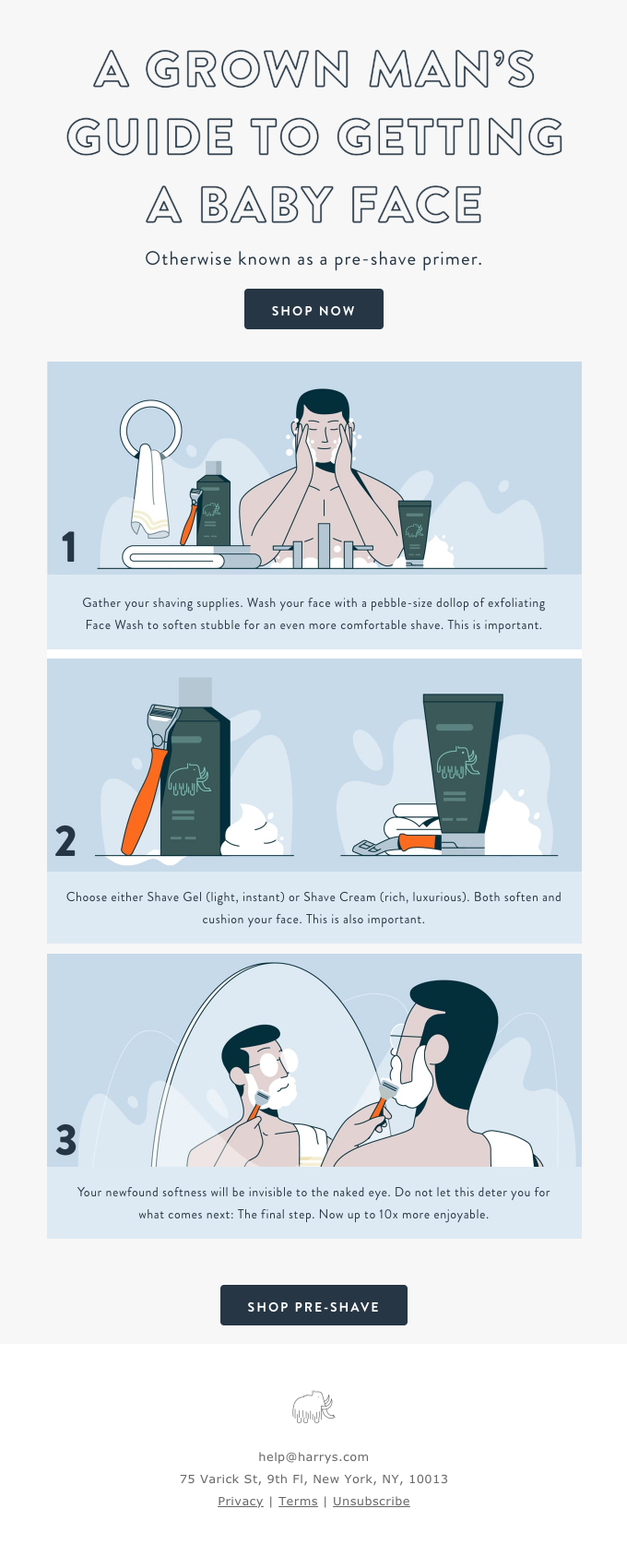
Email design isn’t just about dialing up the visual appeal of your emails. It is also about amplifying your storytelling. This is where illustrations come in handy. They are excellent for communicating abstract and conceptual ideas. As they have an element of imperfection about them, they are effective at disarming your subscribers’ defenses. And we all know that customers warming up to your communication always augurs well for your brand reputation.
There are various ways in which you can use illustrations in your emails. Take a look.
- Spot illustrations: Spot illustrations refer to small drawing without backgrounds and borders. Typically, they serve to supplement your copy and visualize your message, giving your email a quirky and playful look. Brands prefer making use of spot illustrations to highlight the salient features of their products or services. For offerings that are non-tangible in nature, spot illustrations prove to be downright invaluable.
- In animated GIFs: Animated GIFs are already a potent tool by themselves. Can you imagine how much more striking they would be if their constituent frames were illustrations? Well, don’t just sit wondering. Try it out in your next campaign!
- With photographs: Using illustrations in conjunction with photographs can help you etch a lasting impression on your audience’s minds. With this technique, you can establish a novel visual brand for your business.
- With typography: By combining illustrations with typography, you can lace your emails with wonderful illustrated text. Don’t have any offerings to promote and yet want to spark a visual interest among your readers? Use this technique without sparing a second thought. Illustrated text also goes very well with image-heavy emails.
- As a divider: Facilitating smooth navigation for your readers include ensuring that the transition between the different content sections in your email is not visually jarring. Using illustrations to break content is a great ploy to both, improve readability as well as add a lively touch.
Take a look at these examples to get your creative juices flowing.
.

Gradients
The gradual blending of two or more colors or of various shades of one color is called a gradient. Immensely versatile in nature, gradients lend depth to your design. Emails that have gradients as backgrounds are incredibly eye-catching, calling readers attentions effectively to the message they hold. Want to include an element of visual intrigue in your email template? Look no further than gradients!
Interactivity
Introducing interactivity into your emails is a surefire way of inviting audience engagement. The greatest virtue of interactive elements, possibly, lies in the fact that it lets your subscribers complete certain actions without quitting their inboxes. Examples include making purchases, RSVPing to events, booking appointments, and rating products or services. For high traffic times of the year, such as the holiday season, many brands embrace gamification- including a simple, interactive game in their emails. Goes without saying, such campaigns fetch them tremendous results.
The only caution that you need to exercise while dealing with interactive elements is this: Ensure that you aren’t implementing interactivity simply for the sensationalism aspect of it. They must be in tune with your overall message, and more importantly, offer value to your audience.
Critical Design Components of an Email Template
A standard email template consists of multiple constituent parts. In order to craft a pixel-perfect specimen, you have to ace the design of every single component. Let us take a closer look at them.
Header
Your email header is the first thing that readers notice upon opening your email. Want to effortlessly familiarize audiences with your visual identity? Hit all the right notes with your header.
The following points illustrate how you can go about it.
- Ensure your logo is prominent in your email header. Among other things, the header informs the reader about the email sender. A clear logo, thus, essentially brands your email, earning the trust of your subscribers in the process. Along with the logo, a few brands also prefer to add an introductory line or two in their header to further consolidate their branding.
- Be mindful of your header size. Ideally, it should be under 200 pixels. Take a look at these headers, for example.


- Insert a “view in web browser” link in your header. Emails that are heavy on images, animated GIFs, and interactive elements might occasionally fail to render properly. In such scenarios, the view online link gives subscribers the choice of opening the email outside their email client, on a web browser, where they can successfully view all the email elements.
- If your business is running any special offers or promotional codes, you can include the link of the same in your email header to increase their visibility.
- While it’s not absolutely mandatory, we’d recommend that you include a simple navigation menu in your header. This way, you can prioritise the content you want your recipients to see. To make your menu tabs attractive, you can write them using custom fonts.
- Design different headers for the holiday season. Maybe put a Christmas cap on your logo for Christmas, an illustrated shamrock for St. Patrick’s, orange-colored confetti for Halloween, or animated eggs for Easter- you get the gist, don’t you? After all, if the entire population is dressed in ceaseless fervor, why should your email headers be any different?
Preheader
If your subject line gives readers a sneak peek into your email, the preheader builds upon it, providing additional context to your subscribers.
Here are some things you should keep in mind to craft a winning preheader.
- Your preheader should be crisp. The ideal range for preheaders is 40-130 characters, which translates to 5-8 words. So, draft it accordingly.
- Do not convey any independent or new idea with your preheader. It must be related to your subject line and extend upon the idea that you have teased there.
- Including a call-to-action in your preheader is a good way to spur your readers into action.
Logo and Colors
Your logo and color scheme are both an integral component of your brand identity. Listed below are some best practices you should take into account while dealing with them.
- As discussed earlier, dark mode, at present has been adopted by all popular email clients out there. Therefore, you must design two versions of your logo- one each for the light and dark modes.
- Try to create your logo in the PNG format. This will allow you to work with transparency, which will make matters convenient for you while dealing with the dark mode.
- Familiar yourself with color psychology prior to chalking out your brand’s color scheme. Different colors convey different emotions- green is associated with tranquility, blue with security, yellow with creativity, purple with royalty, black with authority, red with passion (as well as urgency), and the like. Hence, pick your color scheme carefully because it goes a long way towards shaping people’s perception of your brand.
- As mentioned earlier, to foster accessibility, make use of contrasting colors for your email’s foreground and background elements.
Images
Every marketer out there loves punctuating their emails with images, and well, why wouldn’t they? They infuse an incomparable energy into campaigns, help create an emotional connect with readers, and enhance your copy’s appeal (among other things).
That said, one must keep the following things in mind while using images.
- Always use high-quality images in your emails.
- Try to maintain a ratio of 80:20- 80% text and 20% images. Failing to comply with this will earn you the suspicion of spam filters.
- Make sure that the images you use are relevant to both your brand image as well as your email copy.
- Write descriptive alt texts. People using assistive technologies such as screen readers rely on them to interpret your images.
Copy
The manner in which you present your copy goes a long way toward shaping your engagement and interaction. Implement the following techniques to get best results.
- Never write your copy in chunky paragraphs. It instantly puts off your readers. Preferably, your content should either be laid out in short paragraphs, each consisting of 2-3 lines, or in bullet points. Additionally, to improve structure, use headings and subheadings wherever necessary.
- Be conscious of your font size. No one would want to squint hard at their screens to read your emails. For desktop emails, the ideal font size is between 10-12px, and for mobile emails, it is 16-18px.
- Make your sentences short and crisp. Long, winding sentences will discourage subscribers from engaging with your message.
Call-to-action
The CTA button of your email is arguably its most crucial component. And designing a high-performing CTA is a task and a half. Keep the following pointers handy to ensure smooth sailing.
- Pay attention to the placement of your CTA button. If you want readers to take action against it, you have to first make certain that they are able to spot it without difficulties, right? What we would recommend is keeping your primary CTA above the fold itself. That way, your subscribers will be able to see it immediately opening the email (and without having to scroll down). Additionally, if you have multiple content sections, you can consider keeping a separate CTA for each.
- Another thing that contributes towards making your CTA button prominent is its color. Choose such a shade that it contrasts sharply against the remaining elements in your email.
- Preferably the size of your CTA button should be between 45-55 pixels at least. This way, it will be accessible for both desktop and mobile users.
Footer
Sure, the email footer might be the last component of your template, but it is just as important as the rest. A meticulously designed email footer secures your credibility, helping you cast a positive impression in your audience’s minds.
Here are a few things you can do to make your email footer eye-catching.
- Make sure that the footer contains all important information pertaining to your brand, such as contact information, postal address, website link, and, of course, the company logo.
- Your footer should contain an update preferences or unsubscribe link. Allowing people to opt out of your communications is as important as adding new contacts to your list with their explicit consent.
- While including the icons of your social media platforms in our footer, look into it that their design aligns with your email’s overall design language.
Mobile-friendly Design- Why You Should Embrace it Now
With nearly half of all emails being accessed from a mobile device at present, failing to make your communication mobile-friendly will significantly hamper the reach and visibility of your campaigns.
So, how can you optimize your emails for mobile? By taking stock of the following tips and tricks.
- Design your emails in a single-column layout. This will let you steer clear of overflowing text, overlapping columns, shifting of images, and other rendering issues that are typically encountered with multi-column layouts.
- Optimize your subject lines and preheaders.
- Make your CTAs prominent.
- Try to use as few images as possible because most mobile email clients block images by default.
Tricks Email Designers Can Pick from the Book of Web Developers
- Establish a visual hierarchy in your emails. This will make navigation smoother for your readers.
- Use the technique of “progressive disclosure” to deal with text-heavy emails. This practice involves hiding text segments beneath interactive elements.
- Implement heatmaps to understand how subscribers are interacting with your emails.
Wrapping It Up
The next time you sit down to design your email template, we hope that the insights shared above are able to guide you!




Rohan Kar
Latest posts by Rohan Kar (see all)
Email Inspirations To Get Your Ball Rolling For The Back To School Season
Email Design Trends: Adding CSS Animation in Email