Your email subscribers are busy people. That’s pretty evident from the fact that they hardly spend 15-25 seconds reading your email. Moreover, as they are constantly inundated with emails throughout the day, standing out becomes all the more important. Now, what if your emails do not look ‘good’ in the subscriber’s inbox?
What if it looks like this?
It will leave a negative impact on your subscriber’s mind, right?
You obviously would not want that.
So, how do you avoid such a situation and make sure that your emails render well without any broken layout?
The answer is to steer clear from email design mistakes.
Let’s learn about some mistakes that are commonly noticed in email designs.
1. Inconsistency in the email layout
Whenever a subscriber opens your email, it must instantly connect with the subscribers and create a brand recall. Most of the emails have a logo at the top followed by a header image, an interesting copy that matches the purpose of the email, and an actionable CTA. You must make sure that the email design and layout are in alignment with your website, social media, and other marketing channels.
The colors and images you use in emails must be an extension of your brand personality. For example: If you prefer using fluid designs, you must stick to fluid designs. On the other hand, if you like vectors, you must make predominant use of vectors.
2. Multiple and illegible fonts
If you have drafted an interesting copy but it is not readable, all your copywriting and designing efforts will go in vain. It will fail to leave a mark on the subscriber’s mind and ultimately leave them disengaged.
Do not have more than two different fonts in your email. You must stick to the serif and sans-serif font family rather than using fancy fonts. Pick popular and simple fonts like Arial, Tahoma, Times New Roman, and Verdana.
Here are the best practices for the font size .
3. Not adhering to the accessibility guidelines
Now, this one might not be applicable to all your subscribers but that does not make it any less important. Your emails must be accessible to every user. If your email does not have a legible copy, it might not be accessible to visually impaired subscribers.
In case you have included flashy GIFs in your email with flashing rates between 2 Hz and 55 Hz, it will aggravate the condition of photosensitive epilepsy.
Enlisted below are some email accessibility mistakes you must avoid at all times.
- Do not have a center-aligned email copy.
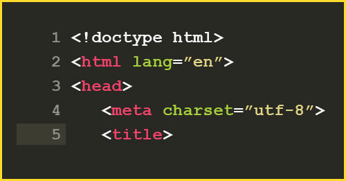
- Not setting the email title with the <title> tag will make the email confusing for people using screen readers.
- Refrain from setting titles on links as the screen readers will not be able to understand the flow of the email.
- Do not forget to use the HTML language attribute.
- Have the right contrast ratio. According to the Web Content Accessibility Guidelines (WCAG) 2.0, 4.5:1 is the minimum contrast ratio that you must have. In other words, the fonts must be easily readable on the background color you have chosen.
Take a look at this screenshot below to understand what this means.

- To make sure that dyslexic patients can easily read your emails, you must follow a logical reading order. It will not only help screen readers but will also facilitate easy communication with the subscribers.
- Design your emails in such a way that the links are easily clickable and accessible. You can use bold fonts to highlight the links or add >> symbol to the link or simply underline it.
4. Missing out on adding Alt-text to the visuals
Adding Alt-text to the visual elements is a must as it will help the subscribers to understand what the visuals are all about, even if the “Display images” option is turned off.
Take a look at this email. Without Alt-text, it will not make any sense if the images are turned off.
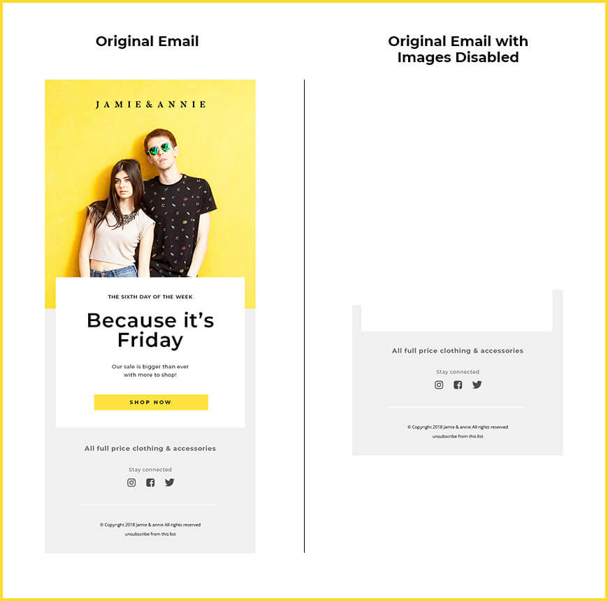
This is also important for making your emails accessible (as discussed in the previous point). In case a screen reader is reading your email, it will give context to the subscriber and make the purpose of the email clear.
5. Not designing a Dark Mode compatible email
Dark Mode compatibility is anticipated to grow into an email design best practice rather than “just another trend”.
Most of your subscribers will switch to Dark Mode in the times to come. Android Authority revealed that 81.9% of users have already started using Dark Mode on their devices.
Therefore, your email must be dark mode compatible, irrespective of the email clients or devices being used by the subscriber.
An email not compatible with Dark Mode will look something like this:
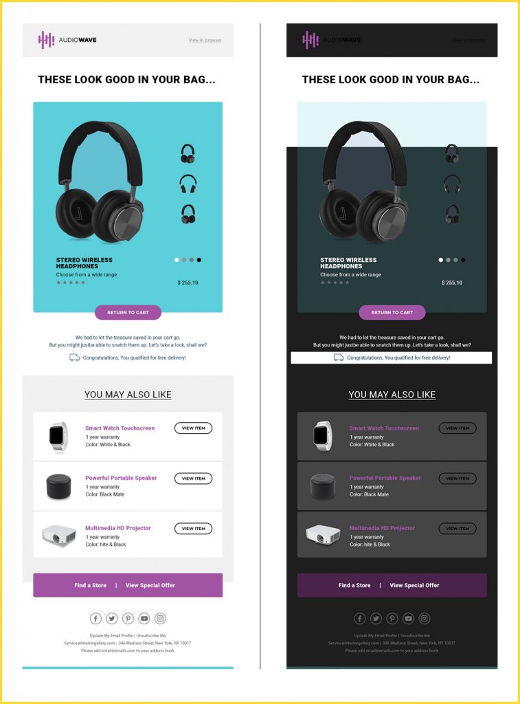
That would, obviously, turn your subscribers off.
6. Slow-loading emails
Your emails must not take too long to load, since your subscribers hate waiting. If you want to add animated images or embed videos in the email, you can surely do so. However, you must remember that it should not hamper the loading speed of the emails.
As a best practice, make sure that you maintain a 80:20 text to image ratio in the emails.
In no case should you send an image-only email, otherwise it will trigger the spam filters. Ultimately, your email will land in the spam folder and so will all your hard work behind designing the email.
7. An unreasonably long email copy
Many brands have too much to say and they want to say it all in a single email. That’s not a cool way to communicate with your subscribers. Instead, you can include some visuals to convey or leverage the landing page to elaborate on the email.
Minimalism is trending in email designs, and so, it is best to go with the flow and design emails that have two or fewer scrolls.
8. Irrelevant header image
Your header image or hero image, as they call it, must be aligned with the email copy and purpose of the email. It would make no sense if your email is talking about “New arrivals for Fall” and the images suggest summer season.
Design the header image in such a way that it instantly lets the subscriber know what the email will be all about. After all, well-begun is half done and if the header image is perfectly designed, it can yield more click-throughs and conversions from the email.
9. Too cluttered email design
Some ecommerce stores have so many products on sale that they display the items all at once in a single email. It will make the email too cluttered. The subscribers will have so many choices that they will prefer to skip making the purchase. It will also create an unnecessary distraction for the reader, thereby killing all motivation to click on the CTA.
10. Hardly visible CTA
In a cluttered email (like the one shared above), the subscriber might not even be able to find the CTA. That’s the worst mistake you could make. Your CTA is the last junction leading to the final purchase. If your CTA is hardly visible, your email recipients will switch to the next email or make the purchase from your competitor.
Take a look at this email. The CTA is hardly visible in the first fold and the crowded images in the last fold fail to make an impact.

11. Gaudy colors
Using too bright or loud colors is a strict no-no if you want your emails to reflect professionalism. Unless it is Holiday season or an email that celebrates a milestone, you must avoid going over the board with flashy shades of red or blue. Another reason why you must avoid such colors is that they will defeat the purpose for people who are accessing your emails in Dark Mode theme.
12. Non-responsive email designs
I know you have heard this time and again. That’s why I have included it almost towards the end. Your emails must be responsive and render well across all email clients and devices. Remember that every email client has a different rendering engine, because of which the emails look different across diverse email clients. You must design and code your emails, taking into consideration all these guidelines and hacks.
13. Overlooking the visual hierarchy
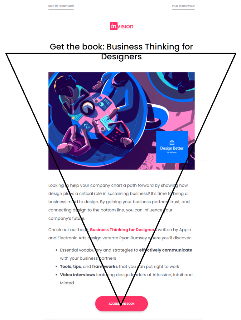
Drawing the subscriber’s attention and keeping them hooked to the email should be two primary purposes of your email. Follow the inverted pyramid model while laying out the email design structure. This goes to say that the header image should catch the reader’s eyeballs, followed by a short copy, and a clear CTA. It must guide the subscriber’s visual flow and prompt them to click on the CTA and go to the landing page.
Here’s an example of an email that follows the principles of visual hierarchy.
14. Failing to test your emails
You must always test your emails before hitting the “Send” button. Check whether the placement of the images, CTAs, and the email copy appears properly across all devices and email clients. If you have used CSS animations or gamification in email, you must double check to be sure whether the email renders, as expected. To be on the safe side, include a “View in Browser” link in all your emails.
Another important point to remember here is to check your emails for accessibility and Dark Mode compatibility. It’s sad to see that many brands are neglecting these two aspects.
15. Not abiding by the email footer design best practices
Your email footer must be designed, considering the anti-spam guidelines like CAN-SPAM and GDPR. Add the physical address and Unsubscribe link in addition to the social sharing buttons and privacy policies. It is advisable to have an email footer template that stays consistent throughout your emails to avoid any mistake.
16. Broken links
Clicking on a CTA only to be redirected to a 404 error page or some irrelevant page will ruin all the efforts it took to make the subscriber click through. It is not a “design” mistake per se but because of this, all your meticulous designing and coding will go down the drain. Always check whether the links are getting redirected to the right page. Also, test how the page renders across the devices and web browsers to avoid any blunders.
In case such a situation comes up, don’t shy away from sending an apology email. It will help you cover up for the mistake.
Wrapping Up
Email designing is not just about dragging and dropping text and visual elements in the DIY email editor. It is about impressing the reader every time and keeping them engaged.
Follow these tips and it will surely help you create professional, relevant, and classy emails in line with the latest trends and technological advancements.
In case you still have any questions lingering on your mind or you want to build an impeccable email design, just get in touch with our email experts.
They will help you out by designing and coding a beautiful email that will delight you and your subscribers alike.


Disha Bhatt (Dave)
Latest posts by Disha Bhatt (Dave) (see all)
The Different Angles to Consider when Hiring an Email Developer
A Deep Dive into ‘SFMC Automation Studio’ - Part 2