Change is the only constant in this world. Since time immemorial, we’ve seen evolution constantly take place around us, be it technology, communication or human behavior. And why not? After all it has helped us get where we are today!
And when it comes to email marketing, marketers have seen ‘emails’ changing and evolving with time. The theory of email evolution began with the first network email way back in 1971, and since then emails have never looked back and never looked the same.
It came as a surprise when studies, sometime back, suggested the demise of emails. I wonder what made them believe a medium so powerful and expanding would be dead?!
As per a recent Radicati study, by the end of 2020 the number of email users worldwide will top 3.0 billion. Nearly half of the worldwide population will be using email by the end of 2020. Fascinating! Right?
The Uplers have been trying very hard to capture the chord of this change. So here, they’ve done a delightful email research of the retail brand ‘MR PORTER’. We’ve tracked their email template evolution from 2014 through 2016.
Let’s take a closer look at the changes they incorporated in their emails to capture attention, increase the opens & clicks and boost their ROI.
To try interactivity in your email, check out our sample here!
![]()
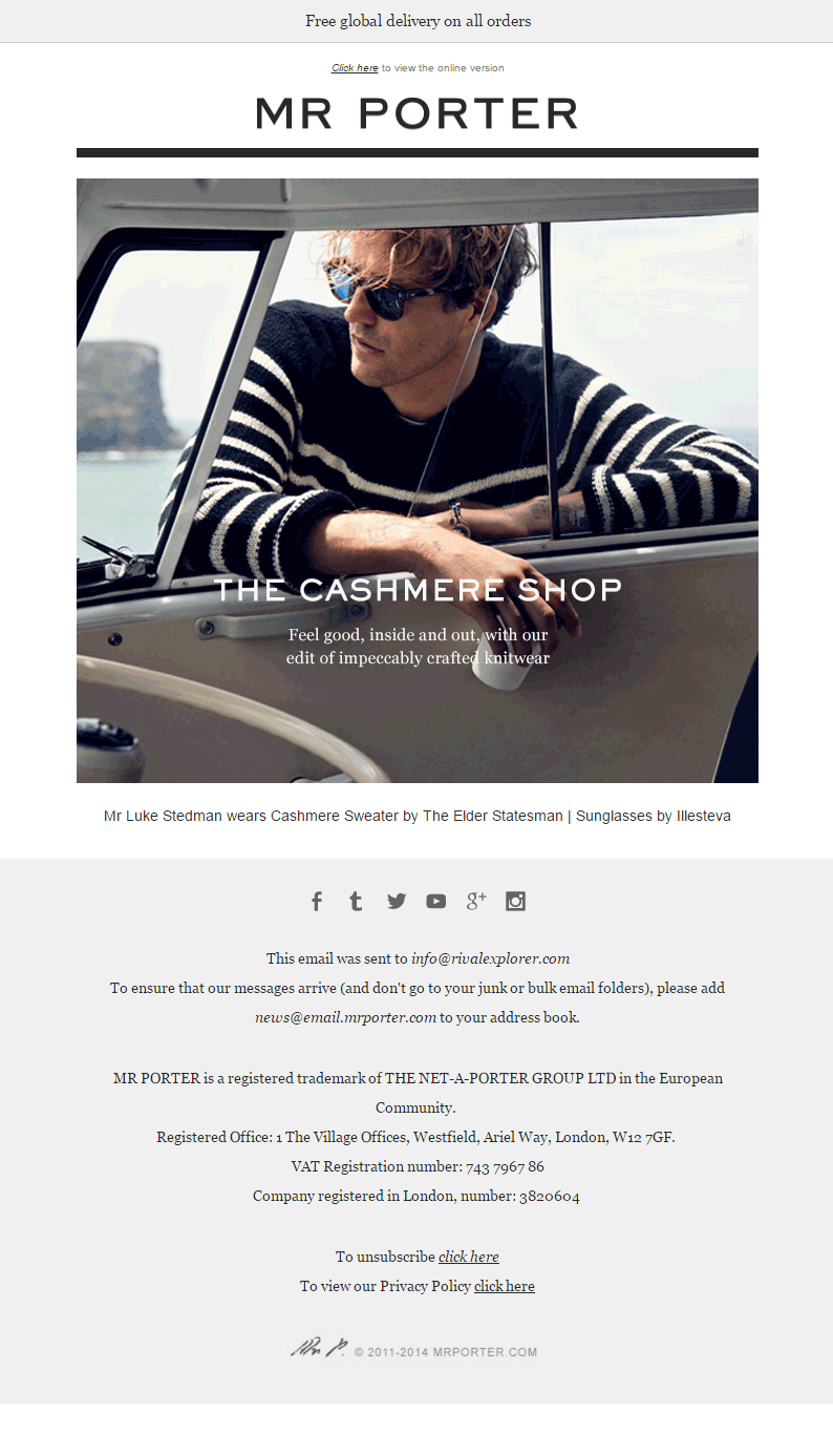
MR PORTER – 2014 EMAIL
- The email is designed without any GIFs or animations.
- The template contained one promotional banner with no CTA. In fact, there is no main CTA provided throughout the template. This is a drawback because it can affect the conversions and might confuse the recipients.
- Social icons, along with the necessary information, are present within the template.
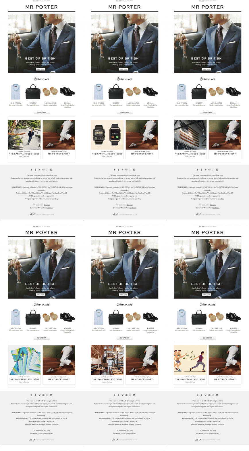
MR PORTER – 2015 EMAIL
- For this email in 2015, the design is updated.
- A CTA button is provided within the first fold along with the promotional banner.
- There’s a GIF incorporated within the email. Though it’s at the end, it’s got some amazing promotional images that catch the eye.
- Along with this, in 2015, the company has started cross selling their products within the email, which was missing in their 2014 email.
- The presence of the social tabs along with the necessary information is appreciable.
MR PORTER – 2016 EMAIL
- For their 2016 email, in addition to adding the CTA within the first fold, the design is updated with an expansion in the number of products displayed in the email (possibly due to a good response).
- The designing and structure of the email is set entirely in a two column layout apart from the hero image.
- They have also hosted an introductory section within the email template to generate curiosity and engage the subscribers.
- The presence of a GIF is prominent at the footer; it grabs the attention.
WRAPPING UP
Emails are changing for the better and ‘interactivity’ in them makes for the spicy topping. Marketers have started adopting interactive elements in emails as a part of their campaigns, and it’s really keeping their customers engaged and enthralled.


Kevin George
Latest posts by Kevin George (see all)
Does Gmail responsive Templates still need Desktop Layout Forced?
Mailchimp Editor's Advantage for Custom Templates