Building an email list takes a lot of effort. Imagine all the sign-up forms you have placed on the website and PPC landing pages, the header on the home page, and social media sponsored ads. Now, what if people visit your website but do not take action? How do you bring them to convert and achieve your sales target? The answer is popup forms.
Popup forms can be of three different types, according to the triggers you set:
1. Time-based delay:
Such popups appear when a visitor has been on your website for a certain amount of time (which you can set).
2. Scroll-based popups
These popups will be displayed when a user will scroll to the middle of the site or the bottom. They are triggered according to the visitor’s activity on your website.
3. Exit-intent popups
When a prospective client is about to leave your site, exit-intent popups will show up.
Through this article, we will focus on exit-intent popups.
We shall talk about their mechanism of action and advantages, and share some inspirations to help you execute this tactic effectively,
Defining Exit-intent Technology
Exit-intent technology tracks the mouse movement of website visitors and identifies when they are going to leave the website without taking action or providing their information.
Exit-intent popups are of three different types:
1. Cart abandonment popups:
Appear when a person is about to leave the items in the cart without taking action
They have an average conversion rate of 17.12%.
2. Feedback popups:
Used to collect user feedback.
They have an average conversion rate of 12.62%.
3. Email signup popups:
Employed to build email lists.
They convert at an average rate of 5.10-7.65%.
Source: Optimonk
Advantages of Exit-intent Popups
1. Once a visitor makes up their mind to click on “close window” (the back button on mobile phones), they are ready to take up the next task. That’s the perfect time to grab their attention with a relevant offer.
2. Showing the visitors an engaging popup free from distractions helps them process the offer faster. If it is relevant, they will be more open to sharing their information or availing of the offer.
3. You can offer something of a higher value in the exit-intent popup. That increases the likelihood of conversion. As a best practice, do not feature the same offer in the popup as your landing page.
4. Exit-intent technology helps in attracting more leads and building the subscriber list.
5. In the eCommerce sector, it assists the cart recovery program and brings back the cart abandoners, encouraging them to complete the purchase.
6. As exit-intent popups increase the time people spend on your website, it enhances your search engine rankings. If you are a content marketing site, you can promote an insightful resource or gated content through the popup.
7. You can use exit-intent popups to promote the special offers during the Holiday season. As people are ready to spend during such days, they will be keener to convert and buy from you.
How to Use Exit-intent Popups?
Exit-intent popups furnish the perfect scaffold to highlight an exclusive offer that is not promoted anywhere else on the landing page. As an instance: Suppose a visitor lands on your eCommerce website through a PPC ad. They browse through the page and then decide to leave. At that exact moment, you can show a popup that says “Oh wait. You are forgetting the 15% Off.” Such exit-intent messages help bring back the customers and contribute to your conversions.
Best Practices for Exit-intent Popups
Of course, there is no “one size fits all” when we talk about such lead-generation tactics. But we surely have some best practices and popular approaches that are most likely to work.
- Highlight the “benefit” with a succinct message
Exit-intent popups are targeted at people leaving your website. So, you have to give them something that will make them stay. Let the readers know what’s in store for them with an engaging copy. If needed, offer some incentive too so that they are compelled to take action. You can even offer them a free trial or demo of your product. Agencies can offer a free consultation to their clients through the popup.
- Ask for necessary details only
You do not ask too many questions in the ice-breaker conversation, do you? The same applies in the world of marketing. Ask for necessary details only in your exit-intent popups. The thing is that the person has already made up their mind to leave and asking too many questions would defeat the purpose of getting action from them.
- Create tailor-made popups for different pages
Just like you customize your personality to suit the kind of person you are speaking to, you must modify the popups according to the pages they are added to. For instance, if you are in the eCommerce sector, you can have different popups for the home page and product pages. You can offer a discount coupon code in the popup and feature your USPs like free shipping and easy returns.
- Incorporate user testimonials
Include user testimonials and address the objections that the customer might have before making a purchase. That’s the best way to gain the visitor’s trust by showing them that users love your products.
- Reinforce your message by creating a sense of urgency
“Last few hours to avail 50% off” — Use such phrases in the exit-intent popup to boost instant conversions by generating a sense of urgency. It will trigger the fear of missing out and drive action from the readers.
- Go the innovative way
Innovation is the only way to win – That’s the best message Steve Jobs has given us. As marketers, you must live by this principle for all the tactics, including exit-intent popups. Experiment with some animations and interactivity in the popups. Try something like “Spin the wheel to unlock your offer” to inspire more people to sign up.
Tools to Create Popups
There are various tools that can be used to build exit-intent popups.
They are:
- Mailchimp
Mailchimp exit-intent popups are easily customizable and can be connected with Shopify, WooCommerce, and PrestaShop.
They can be placed in three different ways, according to your preferences:
a. Default form: Placed in the center of the site. It is also known as a modal or lightbox.
b. Slide-in: Appears like a chat window at the bottom right corner of the website.
c. Fixed or Email bar: Remains at the bottom of the website until someone signs up or clicks the close link.
Once you have created these popups, you can combine them with automated email workflows to send a welcome email and subsequent marketing communications.
- HubSpot
Like Mailchimp, HubSpot’s popup forms are easily customizable with multiple form styles. You can choose the one that perfectly suits your website design.
It enables automatic data entry into your CRM and facilitates personalization using the same. You will get detailed insights into people who viewed versus completed the popup forms. You can set up HubSpot exit-intent popups instantly and embed them onto your website without any technical resources.
- OptinMonster
With the help of OptinMonster’s exit-intent technology, you can convert an additional 2-4% of visitors into email subscribers and paying customers. It allows you to create targeted campaigns like:
a. An invitation to chat with a customer service representative
b. An exclusive discount offer to trigger instant purchases
c. An invitation to download your lead magnet and join the email list
Exit-intent Popups You Can Recreate For Your Website
- Tough Mudder
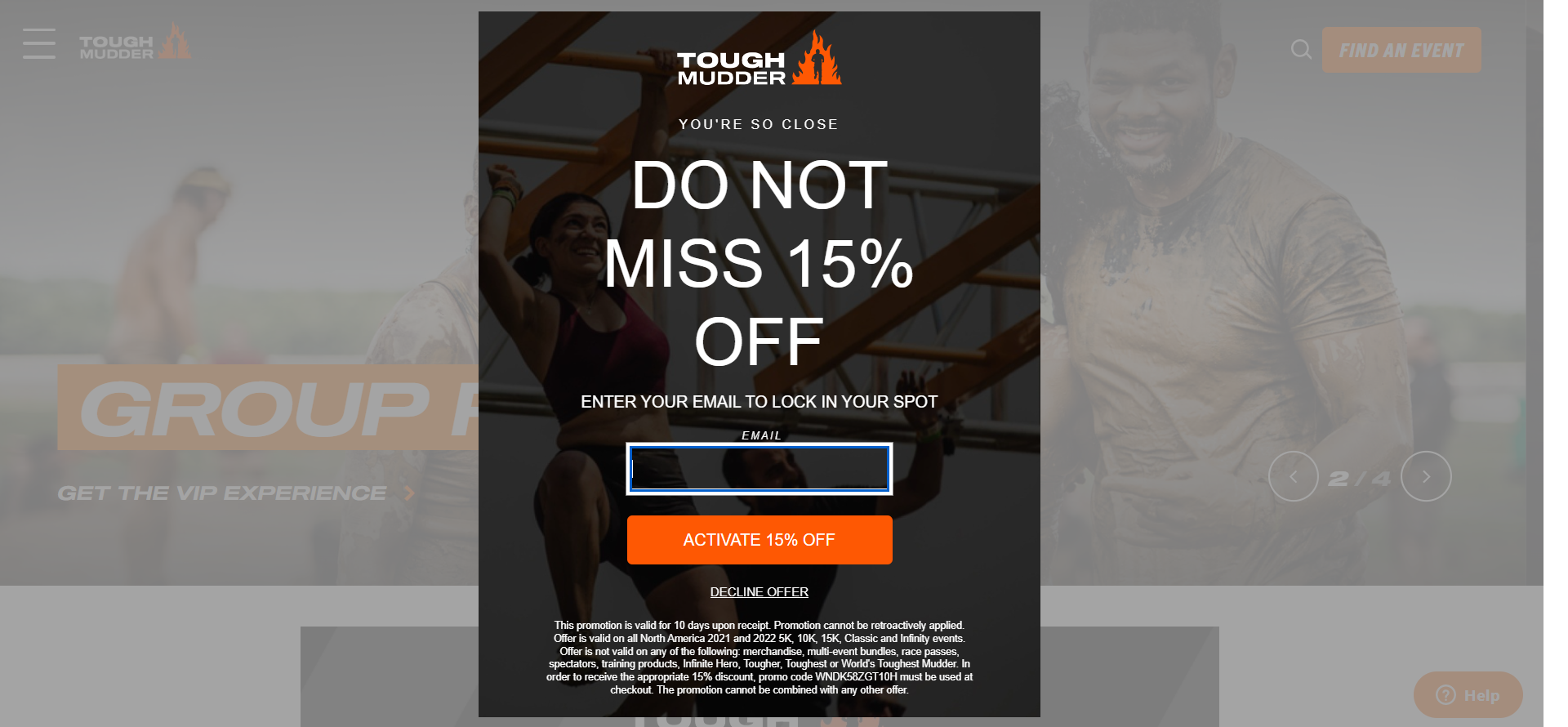
Tough Mudder uses a clever headline: “You’re so close” to let the readers know that they can easily avail the offer of 15% discount. They only need to enter their email address without any additional information. Generally, we are hesitant to “decline” an offer that is in our favor so the CTA “Decline offer” is a smart move. They have created a sense of urgency by mentioning that this offer is available for 10 days only. That further encourages the user to make the purchase before missing out.

- MAC Cosmetics
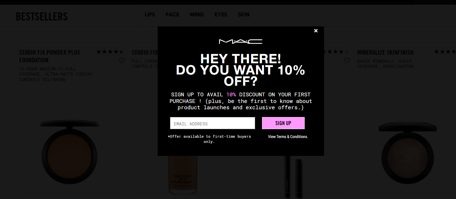
You can target first-time visitors with a popup that features an exclusive offer for them. Here’s how MAC Cosmetics does it by offering 10% Off on the first purchase. It is a good way to build an email list and acquire new customers.

- Macy’s
It is quite likely that people visit your store from a different geographical location. They might not be aware that you ship to their country, so they plan to leave your website.
You can target such subscribers with an exit-intent popup that detects their location.
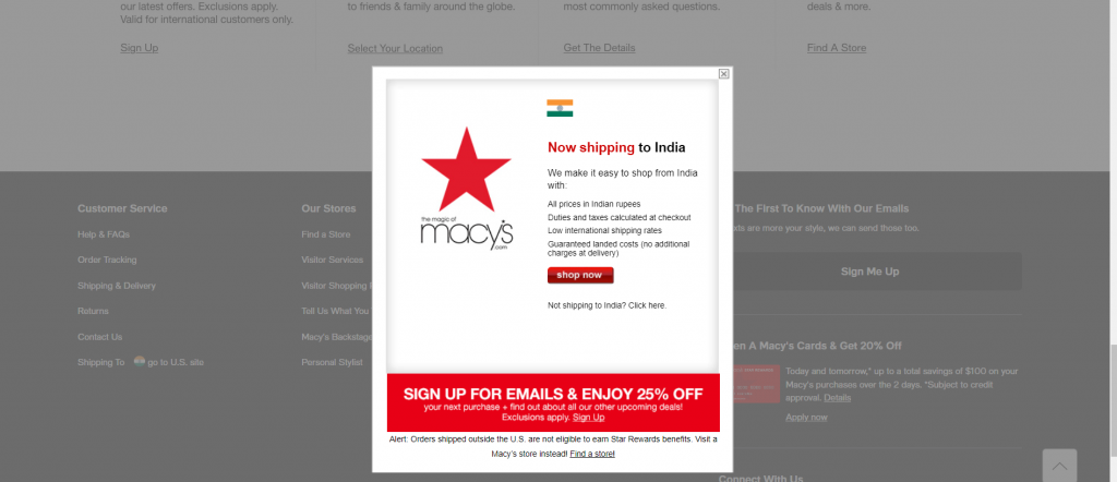
For instance: Macy’s targets the Indian visitors with a popup that lets them know that they ship to India so that they continue shopping. They have addressed all the objections by highlighting the USPs. Moreover, they have also offered 25% off to the people who sign up for their emails.

Wrapping Up
Exit-intent technology helps you eliminate the “would-have-been” and “almost” scenario by taking that one extra chance for conversion. You surely don’t want to regret that a bit of effort from your side would have brought you some more sales, right? That’s exactly why exit-intent popups exist. And of course, they add some qualified leads to your email list too, who are ready to hear from you.
So, are you ready to take the plunge? Do it right away!


Disha Bhatt (Dave)
Latest posts by Disha Bhatt (Dave) (see all)
Landing Page Copy Best Practices To Ramp Up Your Conversions
Email Fatigue - Everything You Need To Know