Designing an email is not all about making it fancy. Good email designs have looks that kill and at the same time are simple, practical, and fulfil the purpose of the campaign in the most efficient way. These are the email designs that make news.
So it’s a good balance of both you should be looking for.
Flat email design has its roots in minimalism; it is simplistic to the core. No no no! It’s not at all drab. It’s awesome. But before we tell you what it is all about, let us tell you what it isn’t.
It’s not skeuomorphic. Styling elements like embossing, drop shadows, gradients, reflections, textures, beveling, etc. that provide the 3D effect and are the basis of skeuomorphism, have nothing to do with it. It focuses on bright colors and unique typography.
Skeuomorphism, of course, has its advantages but flat design is a move towards making things easier for designers as well as marketers. Designers, yes. But marketers? How? Flat design works in tandem with the purpose of the email. The bright colors can help to make important buttons prominent against the backdrop, grab attention, and guide the user’s eye to the most important part of the email.
So let’s discuss in detail about the two factors on which the concept of this trend is based:
The prodigious palette
It’s said that a color is as strong as the impression it creates. And we can thank flat style for bringing bright colors into emails. It’s a canvas for designers, who bring life to emails through vibrant hues. The long overused monochromatic palette is now taking the backseat to make room for shades of green, red and purple!
The right use of colors can be the difference between an enticing email design and a design that puts off your email subscribers.
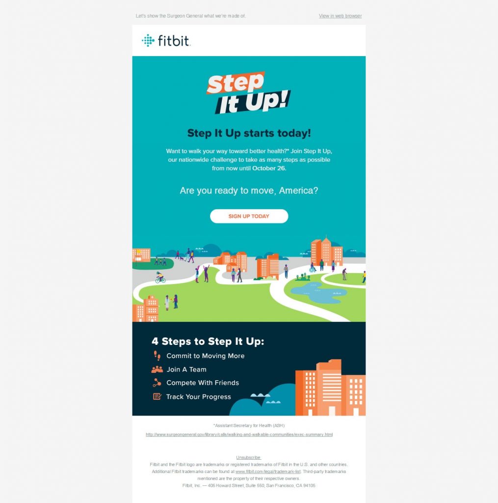
Throwing the old color pairing rules out of the window, flat design is scripting a new story and so is Fitbit, an ardent fan of this style. Look at the array of bright colors they have used to make their flat email template look stunning.

Tantalizing Typography
Typography has never got the attention it deserves. The truth is that good typography has the power to set the tone of your email campaign. From font type and size to color and subtleties like whitespace around the text, typography is everything to do with the look of the email text. Sans all the flare, good typography has great scope in a flat design. Email safe selected fonts are the best bet but you can always experiment a little with Google or custom fonts to create really awesome emails; you have the fallback option, don’t you?
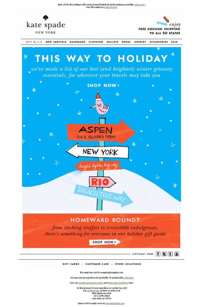
This email by Kate Spade is a perfect blend of flat style and awesome and varied typography. They’ve used vibrant colors as well.

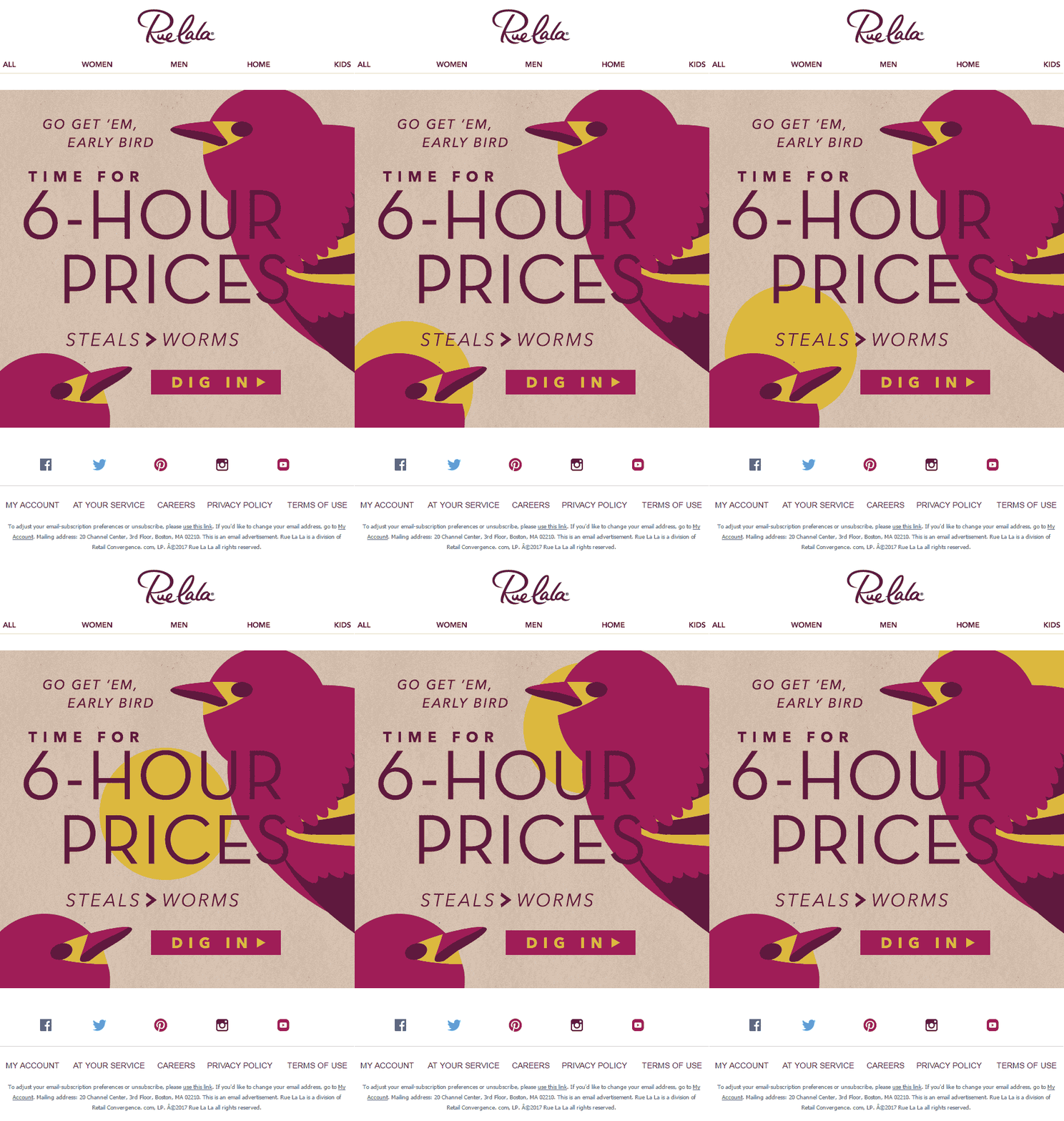
Take a look at this email from RueLaLa. It’s a perfect example of how you can blend an awesome animation into a flat design. The GIF takes away the cake. But there is one glitch. The email heavily depends on the GIF image and the ideal text: image ratio is not maintained.

Best of both the worlds
The simplicity of flat email design is what makes it nice and unique. Flat is good but too flat can sometimes be a spoiler. With no visual clues to guide the user move through an interface, an email campaign can miss its target. This drawback gave birth to a concept called ‘Flat 2.0’.
Flat 2.0 is a perfect medley of flat style and art. On one hand, the design is kept flat and on the other hand, there is a subtle use of layers, shadows, textures, etc. to give the email depth. These elements not only give the design an aesthetic worth but also have functional value.
Making a smart choice
Although flat design in email has all the positives we’ve discussed above, it might not be the right choice for every email campaign. For campaigns that demand portrayal of realism or need an artistic effect to demonstrate something, it is better to stick to skeuomorphic designs. So you need to know what exactly you want to convey through a campaign and nattily make the right choice.
Why you should use flat email design in your campaigns
- It is easy to create and loved by email recipients.
- With websites going the flat way, a flat email design will be consistent with your web design.
- It makes use of one color from your brand guidelines. This makes it easy for designers to customize and use different shades of the brand color or other colors in combination with the brand color to create diverse campaigns for your brand.
- Usage of one color helps to render your email well in most email clients; even when forwarded, the responsive email design appears undisturbed. Problems like white line appearing between colors, customizing in editor, etc. can be kept at bay.
- Use of background image can be minimized by using a color in the backdrop.
Flat email design is a brilliant concept. What is your opinion about this trend? Do you think it is here to stay? Let us know in the comments below.


Kevin George
Latest posts by Kevin George (see all)
Decoding IoT for Email Marketing
Mailable Microsites III – How Burberry Impeccably Slid ‘Sliders in Emails’