TRAVEL… It may mean solitude for one and business to someone else. Some crave adventure, some desire peace, while some set out on a journey to seek knowledge. No matter what motivates anyone to travel, Hotels are an indispensable part of travel.
Based on the different stages of customer interactions, hundreds and thousands of emails from the travel and leisure (Hotel) industry are sent every day to subscribers worldwide – playing a pivotal role in maximizing the business ROI. Email Uplers has cherry-picked the most ‘inspiring’ of them.
Best Hotel Industry Email Inspirations
#1 Marriott
This loyalty Premier Plus membership email from Marriott has a very casual look with a clear message and a prominent call to action button. In addition, it also highlights the benefits of the reward points. They have maintained an optimum text-to-image ratio. Social sharing buttons and ‘View Online’ link is also included in the footer of the email.

#2 Nordic Choice Hotels
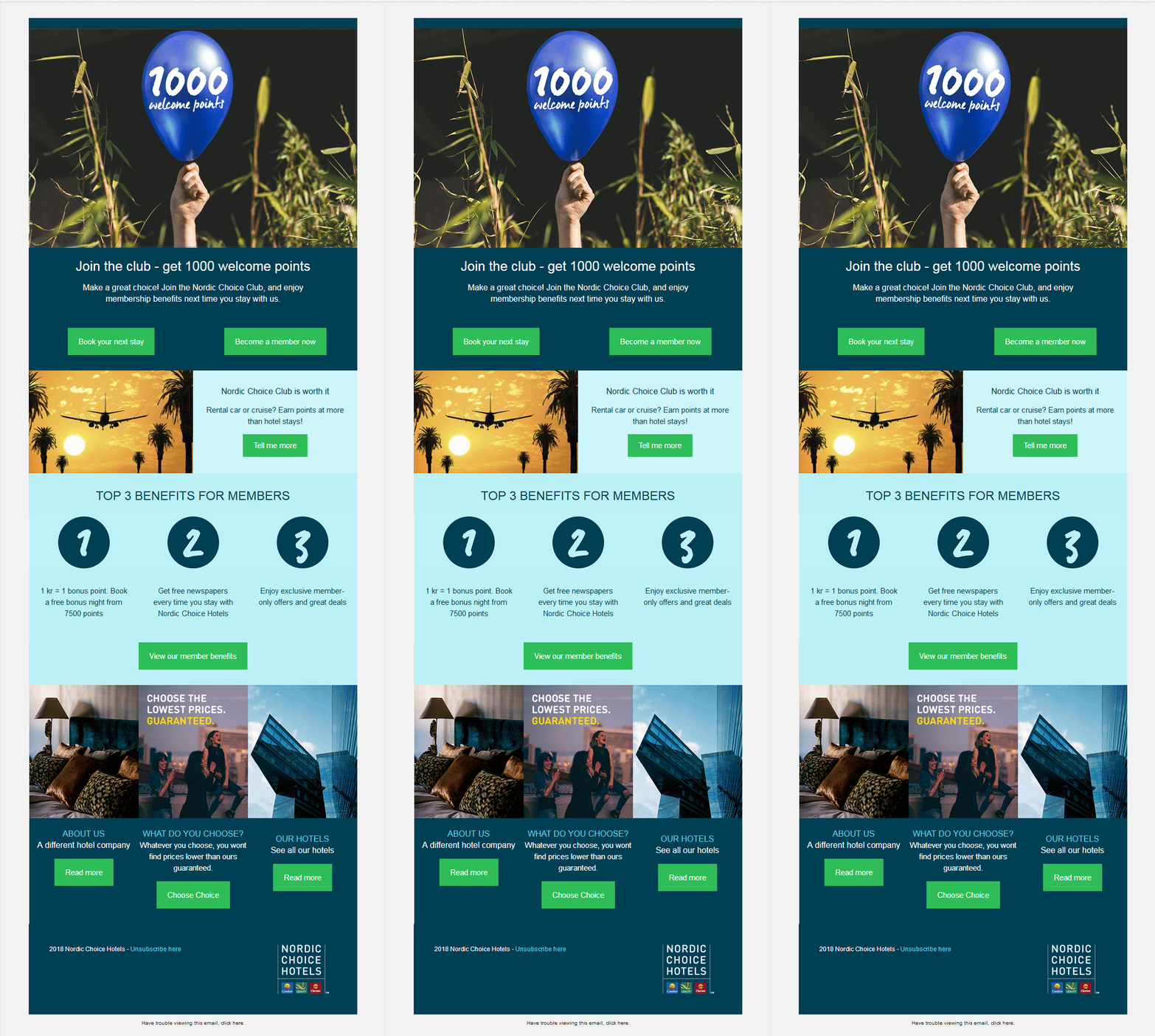
This email by Nordic Choice Hotels has all the attributes to stand out in the inbox.
The header image has an attractive GIF highlighting “1000 welcome points”, that is sure to grab the reader’s attention and add visual appeal to the email.
The CTAs are strategically placed and designed in such a way that they are prominently visible. To help the customers take a quick decision, they have called attention to the top three benefits to the members.
#3 AirBnB
The following email newsletter by AirBnb uses interesting illustrations in the first fold to increase the visual appeal. By adding relevant images in the email, the subscriber can easily associate the text with the image and understand the email copy better.

#4 Ace Hotel
Isn’t this email by Ace Hotel the perfect example of an interactive email? Interactivity is taking the market by storm and what can be better than including a cool cinemagraph in the email. The subtle colors and ample white space make it a pleasant read for the recipient.

#5 Hipmunk
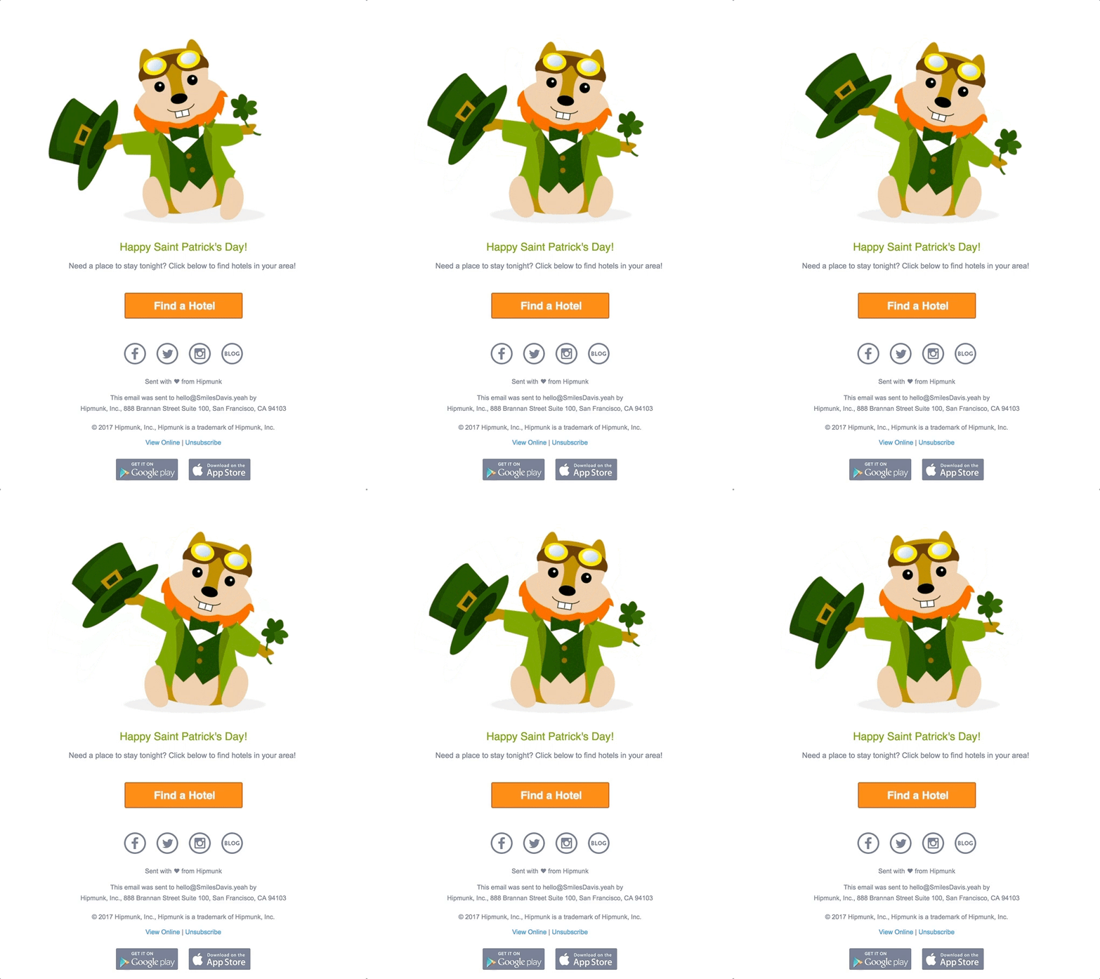
A simple yet catchy email by Hipmunk with a visually attractive GIF. It’s a perfect example of a minimalistic email with a single CTA placed right in the center. The email follows all the email marketing best practices and ends with social sharing buttons, View Online link and Unsubscribe link.
#6 Hotel Drisco Pacific Heights
Here in this email, a confirmation has been sent to the buyer with all the reservation details. Moreover, they have also included the amenities offered in the hotel, places to explore nearby, details on how to get there and the weather of the destination to make the travel easy for the subscriber. It would relieve the recipient of any apprehension related to the unknown.

#7 The Hoxton
Creativity always works well for you and so in email marketing. Look closely to know how The Hoxton has tried to hook their subscriber’s attention with a captivating headline.
They have used humor, a dash of emotional appeal and offered an exciting discount to entice the reader to take Monday off and stay with them.

#8 Millennium Hotels And Resorts
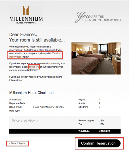
The email sent by Millennium Hotels discreetly draws attention to the abandoned room with a simple headline. The subscriber is provided with an option of confirming the reservation or ‘search again’, in case of any problem.
#9 Omni Hotels & Resorts
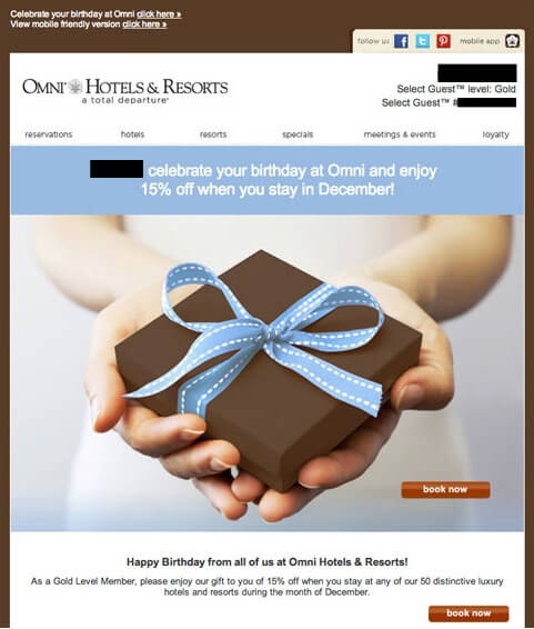
Omni Hotels and Resorts went with a minimalistic email copy with a straightforward headline and a hero image color-coordinated with the brand colors. The CTA placement and design could have been better.
#10 The Inn at Union Square
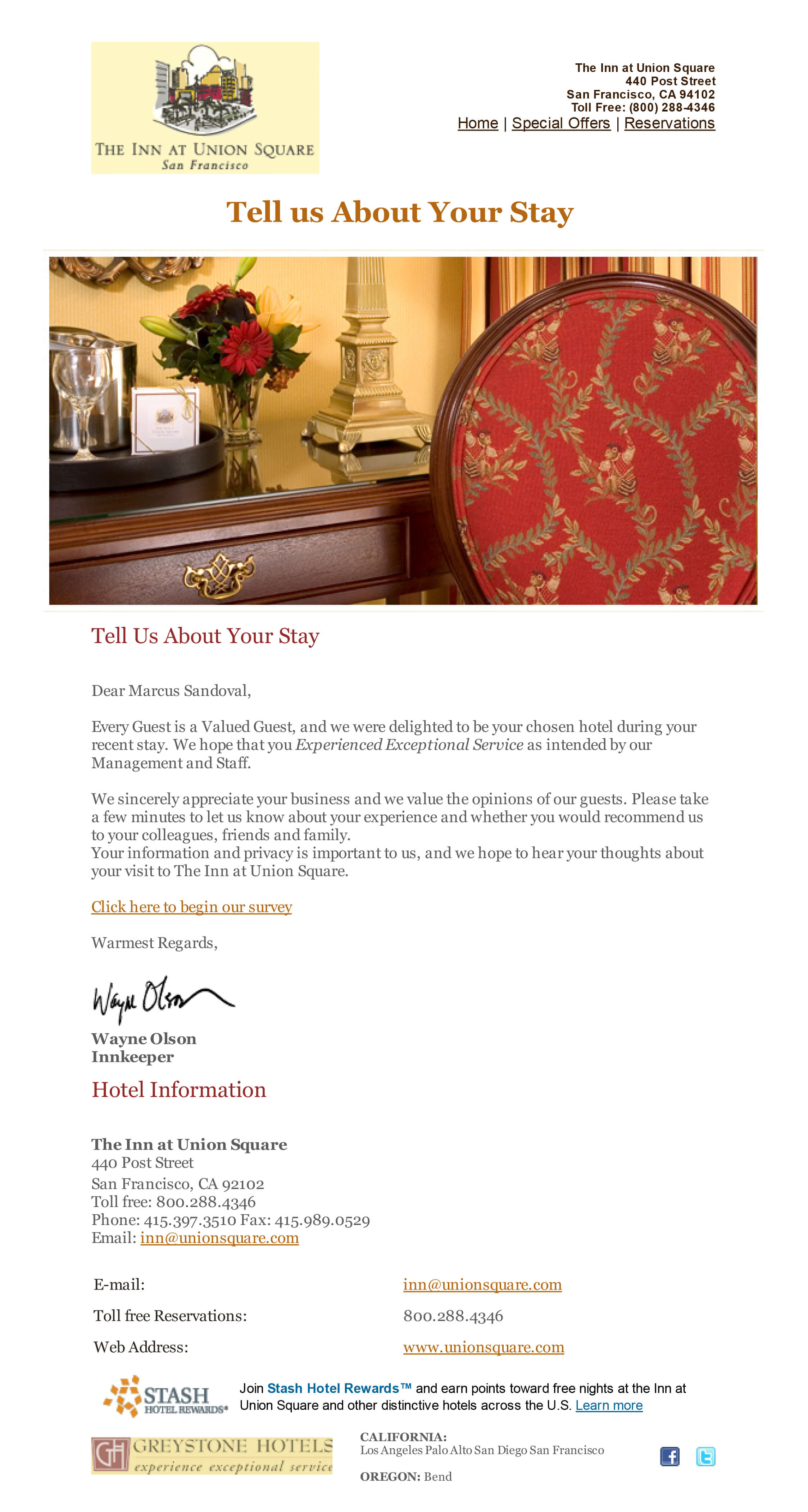
This customer feedback email by The Innkeeper at Union Square, makes optimum use of the white space giving it a cool subtle look. Even though the link could have been replaced with CTA button, the font color does make it distinguishable.
Wrapping up
Are your hotel specific email designs inspiring enough?
With advanced technologies coming every day, it is important that you change your email marketing tactics. If you are running out of ideas for your hotel email campaigns, then worry no more.
Email Uplers has got your back like always.
Contact us NOW.





Kevin George
Latest posts by Kevin George (see all)
Zurb (Foundation): The Framework to Design Better Responsive Emails
How to Get People to Sign Up for Your Email Newsletter