4 billion– that’s the total number of daily email users, at present. That’s roughly half the global population, just to put things into perspective. The long and short of this is, almost everyone with an internet connection uses email. But, its primary use is not with respect to exchanging personal correspondences. It is in professional spheres where its stocks truly glisten. Irrespective of whether you’re plying your trade as an individual or as an organization, email is your go-to channel for communicating with your customers, isn’t it?
On a daily basis, your mailbox chimes with messages from a gazillion brands. However, you don’t really engage with them all, do you? You communicate with a select few, cherrypicked using mostly the following criteria:
- You find it easy to establish a dialogue with them
- You find them credible based on their industry know-how
- You feel your relationship with them is not strictly transactional
- You look up to them as your one-stop solution providers
In a nutshell, the warmer your perception of a brand, the better your engagement with them. Now, this perception isn’t an accidental thing. Brands put in a lot of painstaking yards to curate it. Why? Because this perception is what you’d also refer to as a business’ “Brand Personality” and is the very thing that allows them to stand out from the crowd. In a ubiquitous communication medium like email, its significance can’t possibly be overstated. You can be prolific with your email campaigns, but if your designs don’t have a distinctive brand personality, you’ll have a tough time outshining your competitors.
Wondering how you can ace that? You’re just at the right place, then.
How to maintain brand personality in email
There is a whole slew of techniques that will allow you to maintain brand personality in your email designs. Ready to find out? Let’s proceed.
1. Be Clear About Your Tone
This is, hands down, one of the most crucial components of your brand personality. The tone of your brand is the very voice with which you reach out to your audience. It is a manifestation of your character, a tangible entity belonging to your brand that your customers commit to their memories.
More often than not, brands tend to think in broad strokes while conceptualizing their tone. “Let’s aim for funny,” “We need to be a serious brand,” “Our target is to appeal to teenagers” are examples of the kind of briefs that get floated around during brand tone brainstorming sessions. I’m not saying these briefs are bad, but they’re incredibly vague. If you end up building on these directives, you’ll end up sounding just like your competitors. We don’t want that, of course, do we? So, what can we do? We get really specific while chalking out our brand tone blueprints.
Allow me to share an example so that you and I can get on the same page regarding this discussion.
Below, I’ve shared an email each by TUSHY and Pit Viper.
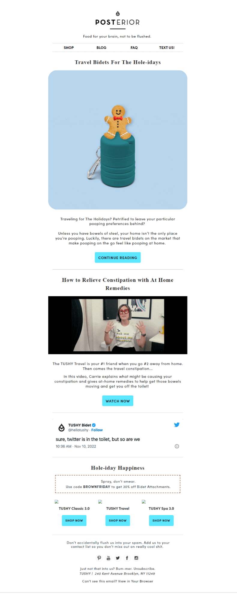
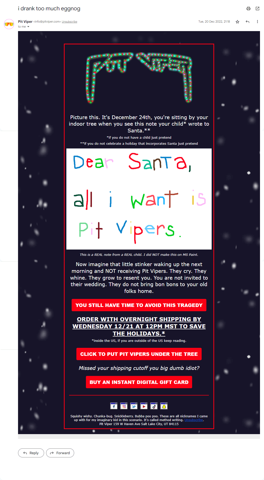
Now, both of them, on the surface, can be classified as funny. But, a close inspection of both would reveal that their brands of humor are somewhat contrasting. In the case of Pit Viper, the humor draws from a vein of irreverence; a sort of planned boorishness even, some might say. With TUSHY, the humor isn’t as off-kilter; it’s observational, witty, and charming. Even though both have humor at the core of their communication, their brand personalities are extremely distinctive, isn’t it?
This is exactly what I’ve been alluding to so far. Don’t just settle with sounding “funny,” “angry,” “silly,” or “formal.” Keep deliberating until you discover the exact strand of a mood you want to weave into their messages.
2. Align Your Design Language With Your Copy
Brand personality is a composite entity, comprising several individual components. To carve a memorable one, thus, you need all of these units to be in absolute sync with one another. Whatever tone you’re going for with your copy- formal, informal, friendly, crazy- make sure your visual elements (viz. pictures, illustrations, and GIFs) suitably complement it.
The following examples will help you wrap your heads neatly around this concept.
Let’s start by looking at an email by Magic Spoon.
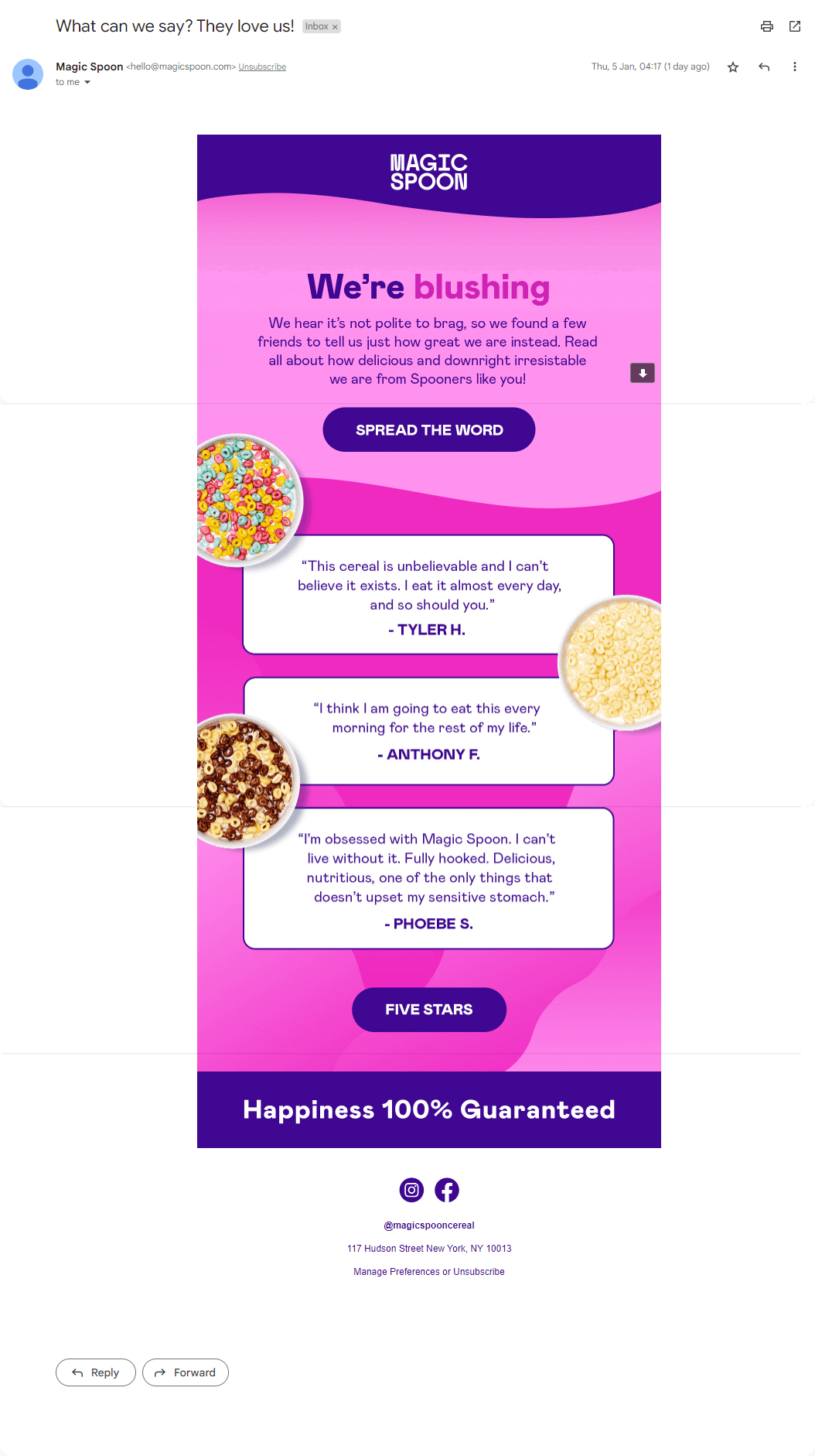
Of course, reading this email’s copy will help you understand how Magic Spoon aims to position itself as a brand- friendly, informal, and reliable. But, here’s the thing- you get all of that information purely from their design language as well. A conscious choice to use vibrant colors, using wavy lines as section demarcations, the purposeful bleeding of images into text, the choice of typeface- all of that is coming together to reinforce the mood of the copy. Imagine the same copy but with much sombre colors, a more formal typeface, and images arranged in a grid-like fashion instead of how they are now. Paints an entirely different picture, doesn’t it?
Next, take a look at this email from Klaviyo.

Makes a formal statement, even when you look past the copy. So, what makes that possible? Right off the bat, the sober shade of mauve that forms the email background. Next, the contents of the image used in the hero section. It’s set in an office setting, with the employees neatly sitting across one another, seemingly engrossed in a discussion. Now, imagine if the same picture would have had shown the employees in a different body language- sitting casually, suppose, their faces clad with ear-to-ear smiles, clearly engaged in banter. Wouldn’t that have undermined the formal vibe of the email? Lastly, the manner in which the content is organized, under distinct headings, in a columnar fashion, does its bit in reinforcing the formal tone too.
3. Ensure Consistency Across Channels
Brand personality is a challenging thing to cultivate; I’m sure you have picked that up on that much by now. Let me add something on top of that. You can’t expect to reap rich dividends if your efforts, no matter how concerted they might be, are directed toward just one channel. Sure, you maybe meticulously rolling out branded email templates, but if the landing pages they direct to seem incongruous with them, all your attempts at carving a formidable brand personality will be in vain. Remember, this is the age of omnichannel marketing, which essentially means that your brand personality is going to be a culmination of your efforts across every channel you’re active on.
Let’s take the example of Uncommon Goods over here.
This is the email they sent to promote their Valentine’s day offerings.

When you click on the first CTA button (titled “Sneak Peek”), you’re led to this page.

The visual language and tone over here are thoroughly consistent with that of their email.
Now, take a look at their Instagram feed.
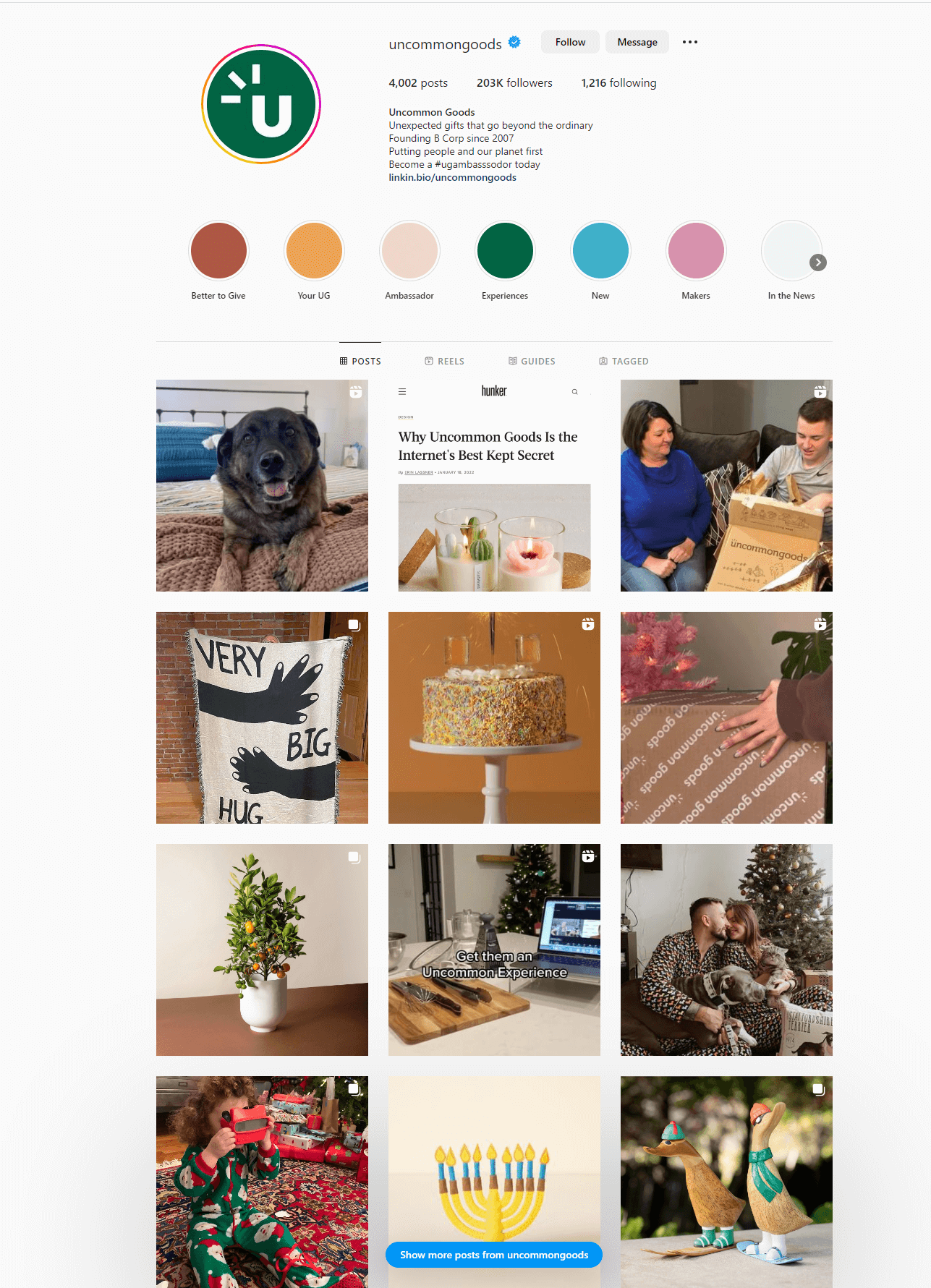
Even if I were to hide the display picture, you’d still end up guessing that this page belongs to Uncommon Goods.
Striving to deliver a unified experience to your audience across all channels is paramount, for it helps enhance your credibility, promotes brand awareness, and improves customer loyalty.
4. Provide Clarity With Your CTAs
Your CTA button is, arguably, the most important part of your email. Everything you do with respect to your email design is consciously (or subconsciously) aimed at getting your subscribers to take action against your CTA.
Previously, we talked about the importance of aligning your design language with your copy. In a similar vein, it is equally vital for your CTAs to resonate with the overall character and personality of your email. What’s even more important is that your CTAs should never fail to offer clarity to your readers. Besides your tone and visual flair, the clarity of your communication also contributes immensely to your brand personality. Hence, curate your CTAs as such so that your audience knows precisely where they’ll be led to upon clicking them.
Take a look at this email by Four Sigmatic to get an idea of what I am talking about.

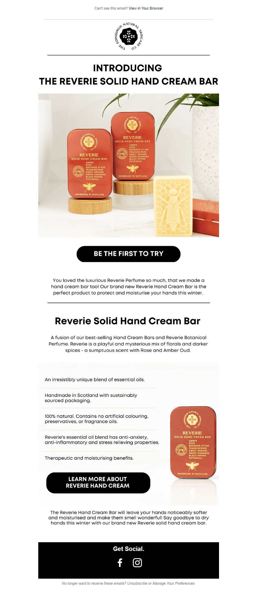
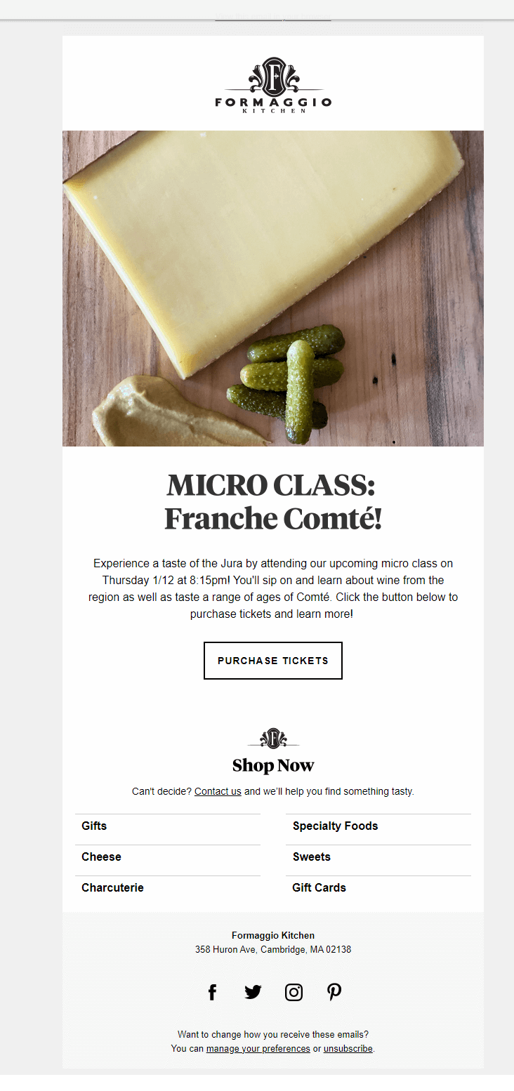
5. Make Your Logo Prominent
Logos are priceless- in your audience’s mental maps, it’s the very thing that they associate with your brand. It wouldn’t be wrong to say, thus, that your logo is the pillar of your brand identity. Given just how priceless this bit of real estate is, it’s only logical that you should always strive to make its presence felt loud and clear in your email designs.
Your logo and its various attributes- shape, color, typography, tone- speak volumes about your brand. It is basically the marker of your brand personality. So, where should you place it in your emails? Right at the very top, much like the best in the business do.
The examples below illustrate what I just mentioned.

Wrapping It Up
Email is an exciting and highly rewarding channel for businesses of every shape and hue, which means that its users will only keep growing in the days to come. And with that, the competition is all set to get much steeper than what it is at present. All this is, of course, not under your control. But, you know what is? Acing your brand personality in your email designs and soaring above your competitors! We hope the tips and tricks shared above will help you with that endeavor.


Rohan Kar
Latest posts by Rohan Kar (see all)
How to Create An Email In Klaviyo? 5 Tips
5 Powerful Reasons to Outsource your SFMC Campaigns in 2023