How do you feel when Google Maps shows you a shorter route to reach your destination faster (that actually worked)? Isn’t it a great feeling? It’s the same with anchor tags or links on landing pages. Anchor links or tags are links on your website or landing page that redirect the visitors to a section on the same page. They let the users jump to different sections on the page while staying on the same page. You can add anchor links as hyperlinks or arrow buttons. They are most suitable for lengthy web pages so that visitors don’t have to scroll too much.
Before we discuss the ways to use anchor links, let’s see all the advantages of using them on your landing pages.
Uses of Anchor Tags on Landing Pages
1. They facilitate the conversion process
As the user can easily navigate through the landing page, it eliminates all the extra effort. So, they are keener to take action.
2. They work like visual cues
Providing visual cues is a best practice if you’re aiming for high-converting landing pages. Having anchor tags serves this purpose and directs people to the key elements that contribute to conversions.
3. Anchor tags make scrolling easier despite the length of the landing page
As anchor tags enable the users to jump to the section of their choice without being redirected to another web page, scrolling becomes much faster. Consequently, it makes the content easy to consume and act upon.
4. They ensure a pleasant customer experience
The overall customer experience drastically improves when you add anchor tags to your landing pages. This is particularly true for people using tablets and mobile phones. It spares them of the horror of clicking through every link and waiting for the page to load, which uses up too much of Internet bandwidth too in addition to time.
How to Make Anchor Tags Visually Appealing?
You can either have static anchor tags or animated ones. Of course, an animated anchor link goes a long way in fetching more eyeballs.
Check the image below. By using the power of animation and white space, you can take the customer experience to the next level and increase conversions.

Where Can You Use Anchor Tags on Landing Pages?
There are several ways in which you can use anchor tags on landing pages. It all boils down to the purpose of the landing page — what you wish to achieve out of it.
Here’s how you can put anchor tags to their best use.
1. Valuable Information
With the help of anchor tags, you can draw attention to the most important information on the landing page. You can use an animated downward arrow, as shown above to encourage the user to scroll through. For instance: Once you have introduced your product, you can add a downward arrow to guide the readers towards its salient features and benefits. The page will quickly scroll for them and present the information that would prompt them to take action.
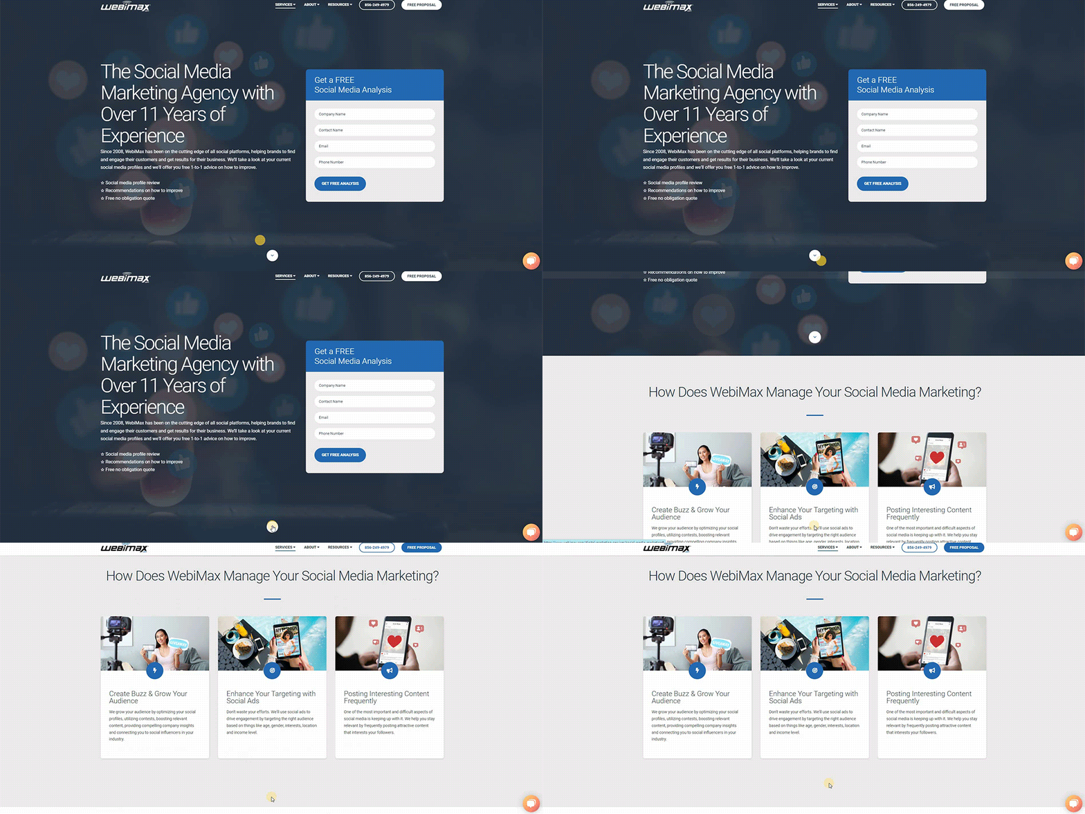
Here’s how WebiMax has driven the users to scroll through their page by adding an arrow. It zooms in as the readers hover over it. That increases the likelihood of users clicking on it and reading further.
2. Table of Contents
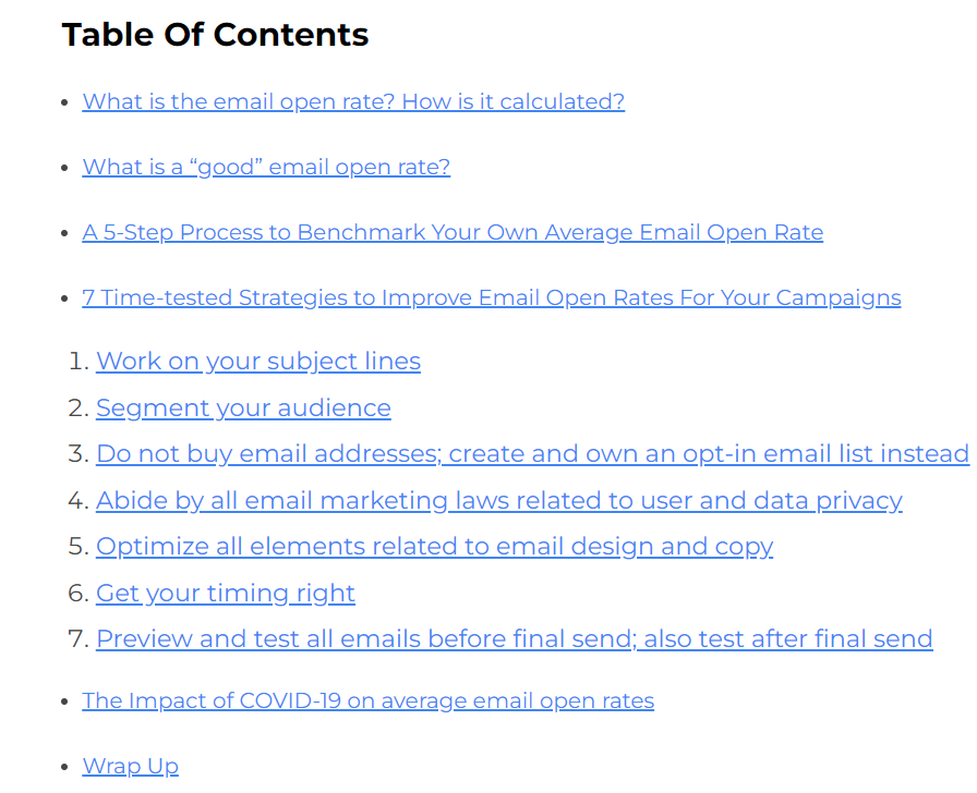
Imagine you have multiple, long sections on your landing page. Anchor links can come in handy here. They can serve as directional cues for the content that is included on the page. For example: If you have a landing page featuring a travel guide: “A backpacking trip to Bali, Indonesia”, you can divide the itinerary into different sections. Highlight them as a table of contents to make the content more engaging for the readers. Include an actionable CTA at the end so that users get keener to book the tickets by the time they finish reading your guide.
Email Uplers uses this tactic in their long-form articles for better readability.
You can use the same tactic in your landing pages like Evelyn has done for their news, music, and other section

3. Customer Reviews and Testimonials
Social proof is an inevitable part of every landing page. You can use anchor tags to bring the users to this section and build their trust in your products. Eventually, it will encourage them to convert. Anchor tags can also be used to direct the readers to the case studies section to reinforce confidence in their minds. Moreover, there are various landing page design services that can help you strategically include relevant customer reviews and testimonials in your landing pages.
4. Lead Capture Forms
Suppose you are running a PPC ad to build your email list and get more subscriptions for your newsletters. The landing page for this ad can include anchor tags at the “Sign up” button. It will work wonders in getting you more subscribers for your emails.
5. CTA Button
More often than not, people avoid clicking on the CTA button just because they don’t want to be redirected to another page. It is too time-consuming. So, anchor tags work as CTA buttons that instantly take the users to the form and help in quick conversion.
6. Anchor Links in Navigation Bar
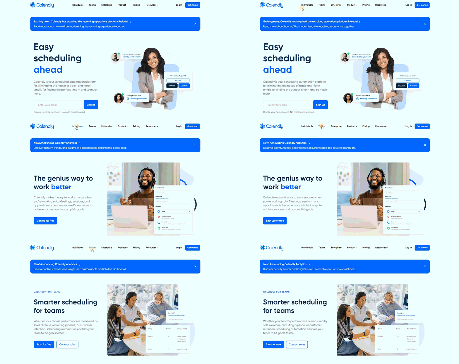
Wouldn’t it be great if you can easily navigate to the different sections like “About us”, “Benefits”, and “Pricing” without waiting for the new page to load? Calendly sets the perfect example of using this tactic to showcase the products that they have for individuals, teams, and their pricing structure.
On clicking the options in the navigation bar, the user will be presented with the respective details. Take a look at the page in action.
7. Scroll to Top Button
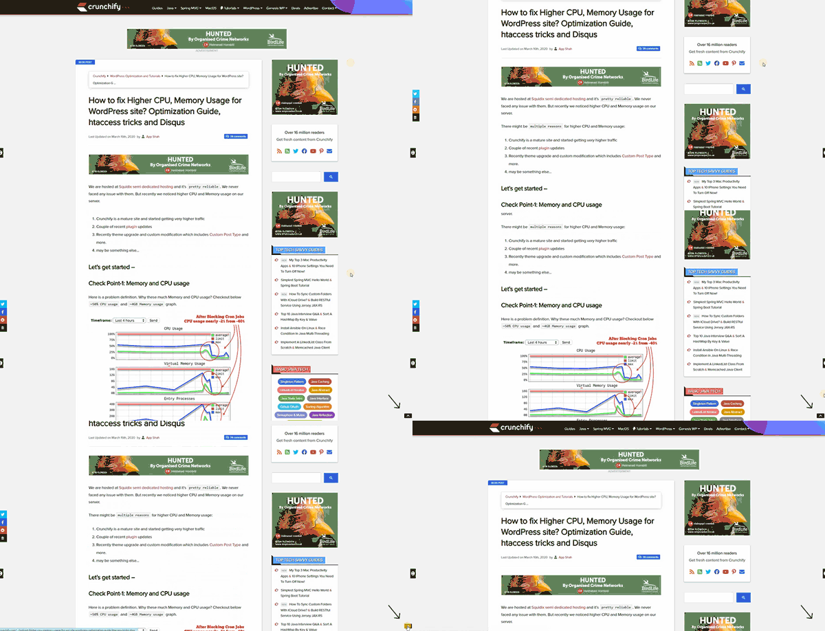
How many times have you scrolled till the end of a long landing page and wished that there was some magical button to take you to the top? On modern desktops and laptops, you have the “Home” button to take you to the top. But what about mobile devices? Mobile users would find it thumb-wrenching to scroll till the end and then again scroll to where they started. That’s where the “scroll to top” button comes into the picture. It imparts a smooth navigation experience to the readers accessing your landing page on devices with small screens.
Here’s how Crunchify employs the “back to top” button with an upward arrow:
Technical Aspects of Adding an Anchor Link
An anchor link has two parts. One is the anchor and another is the actual link. The anchor is the unique identifier that you assign to your page elements. It is presented as id=“unique-id”. The link includes the hash symbol along with the unique id. The final outcome looks like #unique-id.
For example: If you want to link to the “Features” section of a landing page, your unique id can be: #features or #product-features.
Look for the element and then add the unique id to the opening tag.
Subsequently, create a link from the top of the page. When you create the link, mention the anchor along with the hash symbol.
Confused?
Let’s understand it with respect to WordPress (as it is the most popular CMS).
Go to the WordPress editor. Locate the section where you want to assign the anchor. For example: Features of XYZ product.
Add an ID with a unique anchor name.
It will look like this:
<h2 id=”product-features”>Product Features</h2>
This means that “Product features” is assigned the unique id “product-features” and it is in the <h2> tag.
The next step is to link to this anchor.
- Select the text that you want to link and click on the Edit link.
- Include #product-features to redirect the user to the respective section on the landing page.
- Save the changes
Bingo! That’s all… Easy, right? Landing page or website builders also allow you to execute this tactic. They all have different methods to achieve the same.
If you need any help with creating visually aesthetic and technically advanced landing pages that follow all the best practices as well as these latest trends, get in touch with us.
Our landing page maestros would love to hear from you.
Wrapping Up
You are competing with other players in your industry, both big and small. Also, you have to keep the users hooked to your landing page despite the dwindling attention span. There are too many things distracting the visitors coming on your landing page. Anchor links can ensure a delightful user experience while keeping the distractions at bay.




Disha Bhatt (Dave)
Latest posts by Disha Bhatt (Dave) (see all)
5 Proven Ways to Make SFMC Omnichannel Marketing Work for You This Holiday Season
8 Email Template Builders You Need To Take Note Of Right Now!