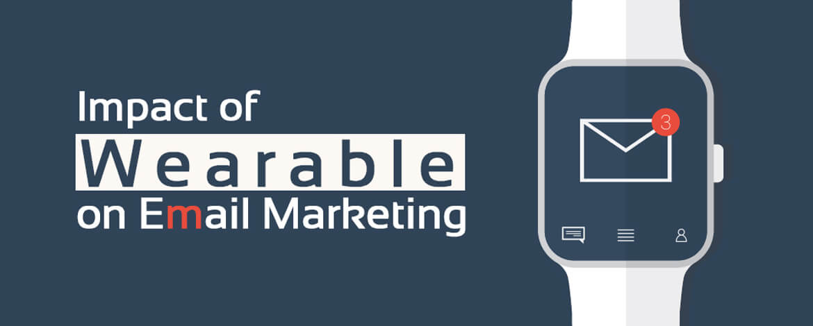
Email marketers have had a bumpy ride in the last 5 years on their way to successful email campaigns. They have witnessed a drastic modification in the email design and coding with the introduction of new devices. The emphasis shifted from desktops & laptops to mobile phones. And today, more than 50% of the emails are being viewed on mobile phones.
Well, marketers might soon witness one more paradigm shift with the new wearable flood in the market. A survey by fortune states that Apple has predicted to sell 22.47 million smart watches in 2015. Well, that’s huge! So, how do you plan to design an email for smart watch users?
The divine study by Uplers on the impact of wearable on email marketing shall relief you from designing and coding challenges.
1) Email – plain text = poor renderability
Looking at the upward trend in smart watch sale, it wouldn’t be wrong to say that the plain text is the rising sun of email marketing. Smart watches do not render the html emails and thus, email marketers are typically advised to send multi-part MIME emails keeping in mind the combination of html and plain text in an email. Android watch renders raw HTML without a text version, whereas Apple watch displays this message “The full version of this message isn’t available, but you can read it on your iPhone”. ask oracle . Furthermore, various formatting tricks like extra spacing for desktop version emails might also not decode well in smart watches.
2) Links are a no for smart watches
A fact to note about smart watches: they do not have a browser. That said; links are disabled in emails and are rendered as plain text links with grayed out text. So, if you are planning to add a CTA in your email for smart watch users, fashion it with a plain text at the top of your email. You may also consider encouraging the users to act through their iPhone or iPad.
On the other hand, you can link your address and phone numbers for your users to call on the provided number or click on the address and track location on maps.
3) Strategical approach for subject lines
Subject line and pre-header text are two most overlooked elements that act as a determinant for the success of email marketing campaign. For wearable devices because of the smaller screen size, the approach has to be tactical. While Apple watches allow 12-20 characters in the subject line, Samsung watches allow 35-40 characters.
Hence, keep your subject line short and crisp. Use rest of the space for displaying the pre-header. Most smart watches pull the first available text from the email after the subject line. As pre-headers are the summary of an email, make sure you are writing an attention grabbing content to make the most of it.
4) Thumbs down to fancy email design
A screen size between 38mm to 50mm doesn’t give you much room to play with the design aesthetics of an email. Don’t fancy “fancy” html emails, they are not supported anyways. Keep the design visually appealing with some vibrant colors. Remember, use of larger fonts backed with a good use of white spaces will work amazingly well for you.
5) 1×1 tracking image isn’t cool
As Apple watch relies on plain text heavily, tracking email open rate would be difficult. This is mainly because most ESPs track emails based on a 1×1 pixel image which is included while sending an email. Now that Apple and other watches don’t prefer image based emails, open rate doesn’t hold true for wearable devices unless there is a sophisticated way to track the pain text open.
6) Try sneaking in through embedded images
This disappointment of not rendering a remote image in smart watch might be running in your head. But wait, there is a possible alternate to it. Smart watches do render the embedded images in an email.
Having said that, even the embedded images are to be managed trickily. Apple watches insert 2px (4px once on the retina screen) transparent border in the image, thus leading the image to distortion. You might consider re-sizing your images for a better display, but that might not work as well.
Some formatting tips
- Use paragraph in the source of your email instead of paragraph tags.
- Use <b> instead of <strong> to increase the font weight.
- Extra spaces are not decoded well in smart watches; avoid indention.
- Don’t host the images on your server, they will not be rendered. Embedded image is an alternate, but they might also get distorted, if possible, avoid images.
- Only left, right, and center alignment are supported in smart watches; code accordingly.


Kevin George
Latest posts by Kevin George (see all)
Urgency in Emails - Countdown Inspirations
Better your email campaigns with email slider