We have seen email marketing evolve over the years, but the pace at which it is accepting and implementing new technology today is remarkable. The new age emails are more fun, more vibrant and most importantly, interactive.
An interactive email uses specific HTML and CSS properties to trigger an action within the same email. So basically, they are small versions of your website – much like microsites that can be explored with the inbox.
Empowering subscribers to explore choices without leaving the inbox is a great way to both engage and delight them. And there are numbers to prove that! Interactive emails have recently shown to increase unique click rates by about 18% and click-to-open rates by around 10%.
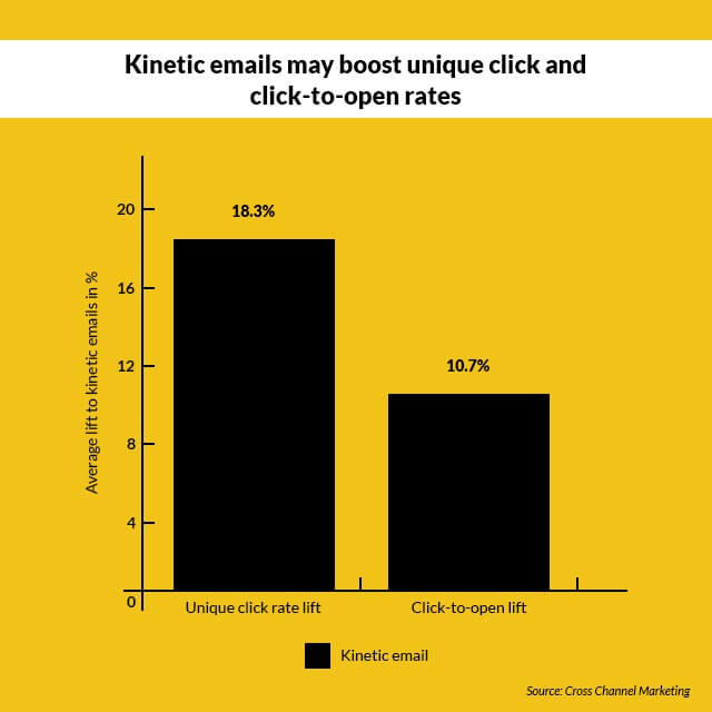
Moreover, a study states that 81% users feel that interactive content engages subscribers more than static content.
However, the varying CSS support from different email clients plays spoilsport. Let’s get the ducks in a row, first!
Firstly, you need to have data about which email clients your subscribers are using. This will help to plan your campaigns.
Secondly, it is important to know which email client supports which interactivity and what fallback strategy you need to adopt in order to take care of the rest who don’t.
Before you jump on the bandwagon called interactive emails, check out this comprehensive table created by the expert Uplers to explore which email clients support and which don’t support interactivity:
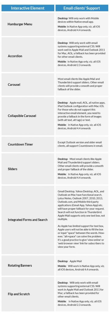
*Note: Sliders, Integrated Forms, Search, Collapsible Carousel are not compatible in MailChimp.
As you can see in the table above, the support is limited. Here are 3 email fallback strategies to handle the non-supportive clients your subscribers may be using.
1. Display different content for Interactive & Non-interactive version (fallback)
This is just like the responsive email design – particular content for desktop version and a different content for mobile version. As interactive elements like Hamburger menu and Accordion are specifically created for mobile version, you can keep them only for the mobile version.
Hide the interactive content by default and display fallback content block in clients that don’t support interactivity. And for email clients that support interactivity, use media queries and CSS selectors in the style block to display interactive block and hide the fallback block.
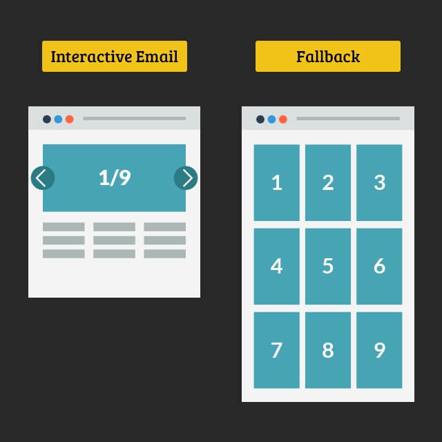
There may be two issues here. One, you may have duplicate content and two, your email fallback may become lengthy.
2. Stacking up content in Non-interactive Layout
This method may be a little more complicated but the email space it helps to save makes it a winner. In email clients that do not support interactivity, the content blocks are shown in a stacked format; whereas on clients that support interactivity, the content is displayed in the form of a carousel.
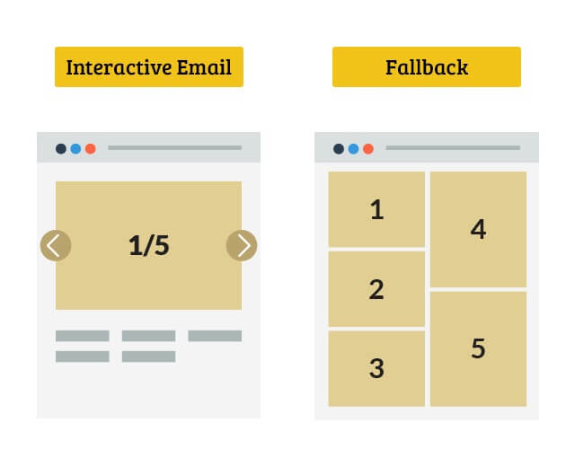
3. Hiding the Interactive Elements
Another easy way (without creating separate block) to provide an email fallback for interactivity in non-supporting email clients is to hide the interactive elements. You can display just one frame from your carousel and hide the thumbnails at the bottom. And in email clients that support interactivity, display the whole carousel (with thumbnails).
And in case you really want to encourage your subscribers to see your interactive email, you can always provide a web-version of your email.
Wrap-up
Interactivity is certainly the next big thing with possibilities galore. They just need to be explored. But while we are getting there, we hope the email clients catch up fast. They will eventually, but for now, this round up of the current situation and how to deal with it should help email geeks!




Kevin George
Latest posts by Kevin George (see all)
Email Marketing Automation for your Small to Medium-Sized Business
Visual Hierarchy in Emails & the Importance of a Hero Image