A landing page is one of the most “mission-critical” elements of your online marketing strategy. Let’s assume that you have been burning the midnight oil and making every effort to design compelling landing pages. Of course, we cannot overlook the conceptualization meetings, creation of wireframes, drafting, discarding, and rewriting persuasive copies, and designing different creatives.
Now, what if even after all these efforts, you do not get the desired results?
Well, amidst all the gloom, there is a silver lining.
You can think out-of-the-box and design unique landing pages that will increase visitor engagement and contribute to higher conversions.
So, what can you do to make the landing page designs unique?
The answer is:- a “visual and interactive marketing strategy”.
Talk to the customer with the help of rich imagery, videos, or other interactive features.
It will take the customer experience to the next level and amplify the performance of your landing pages.
Before we discuss “how” to add interactivity in landing pages, let’s discuss why you must consider creating interactive landing pages.
- Interactive content brings twice the engagement when compared to static content. No wonder, 62% of B2B marketers are already using it.
- Video landing pages can increase conversions by 86%.
- Giphy has revealed that 500 million active users view GIFs for around 11 million hours.
- 64% of customers are more inclined to buy a product after watching a video about it.
- Content Marketing Institute has reported that the top 3 reasons to invest in interactive marketing are engaging the audience, educating them, and building brand awareness.
Don’t these facts sound convincing and exciting?
That’s why most marketers have adopted interactive content to differentiate their brand and grow traffic.
To help you get started, we are here with some tips and tricks to create interactive landing pages that bring results.
1. Add animations to your landing pages.
GIFs and cinemagraphs work wonders for your landing page, making them visually attractive and getting more people to convert.
These animated images can be used to display your products and their features. GIFs work as an autoplay video to show how the products work.
The advantages of using GIFs are that they have a small file size. Therefore, it will not add to the website loading speed.
Here are a couple of examples.
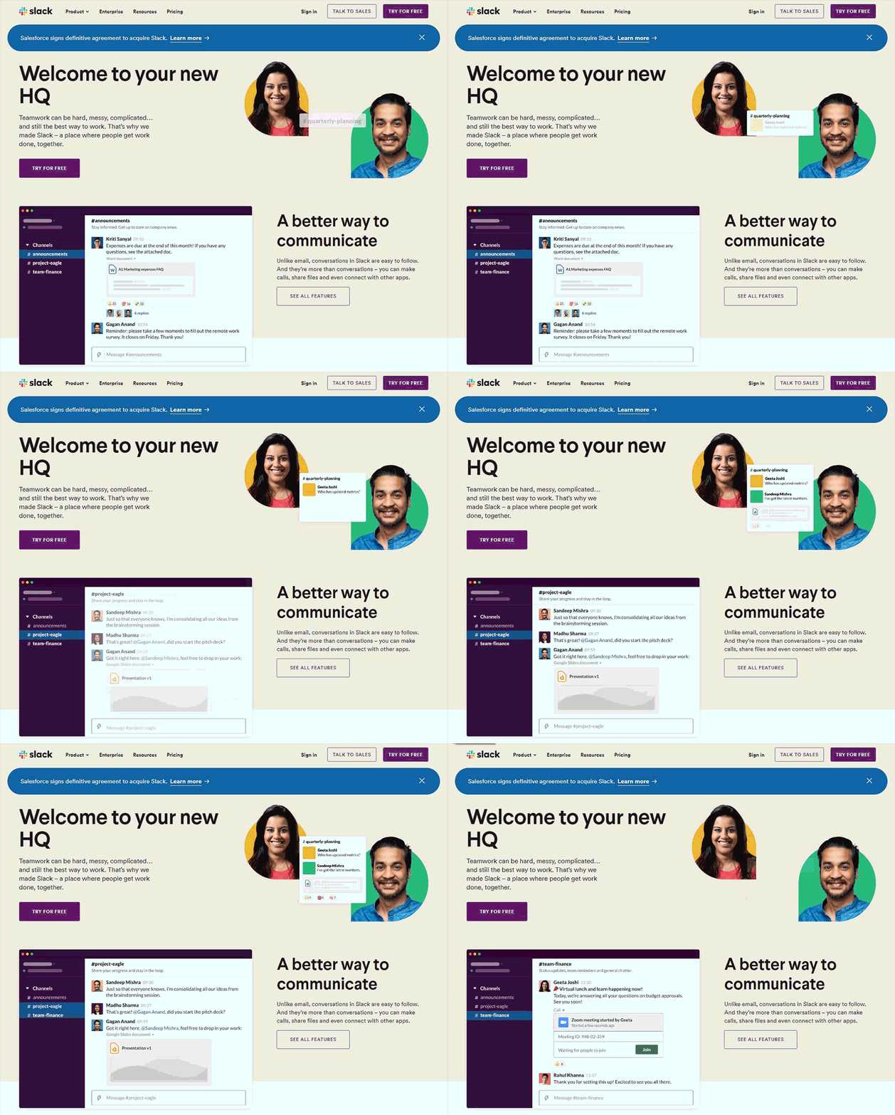
See how Slack has demonstrated the use of their platform with the help of clever animations. These visuals clearly let the visitor know how they can make the most of Slack and enhance communication with the team members.
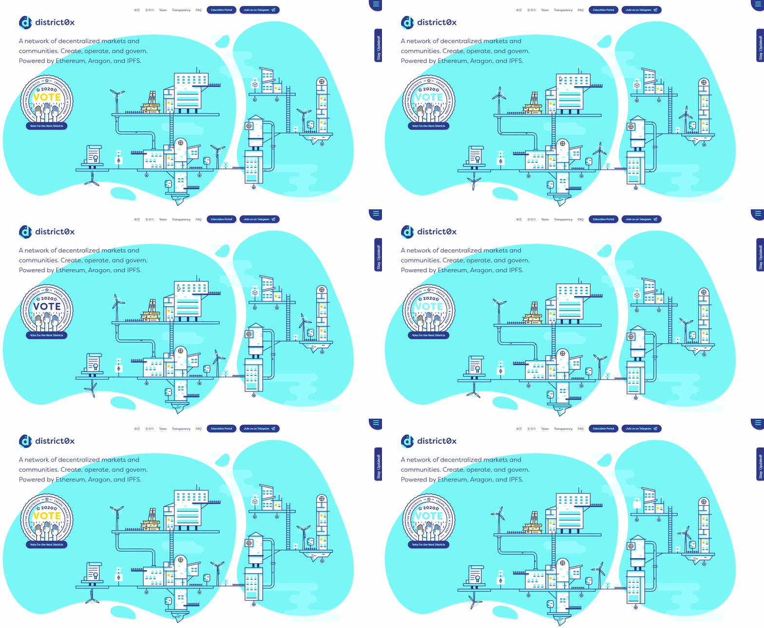
Another variation is illustrative animations. District0x.io has set the perfect example of using animated illustrations to explain their product.
Cinemagraph is a type of GIF animation that shows minor repeated movement, that emulates video clips. In a way, cinemagraphs are the connecting link between photos and videos, with a WOW factor.
Like cinemagraphs can be used in emails, they can be incorporated in landing pages too.
Here’s an example of a landing page by weltrade. They have made the elements come alive by using cinemagraphs. In comparison to GIFs, cinemagraphs can have more colors and leave a clear impression. You might misinterpret it to be a video only to realize that most of the image is static.

2. Make your landing pages more engaging with videos
Adding explainer videos to your landing pages can facilitate communication with the visitor and boost sales. They can help you reach a larger audience while boosting customer loyalty and retention.
Here are a couple of examples that show how powerful videos can be.
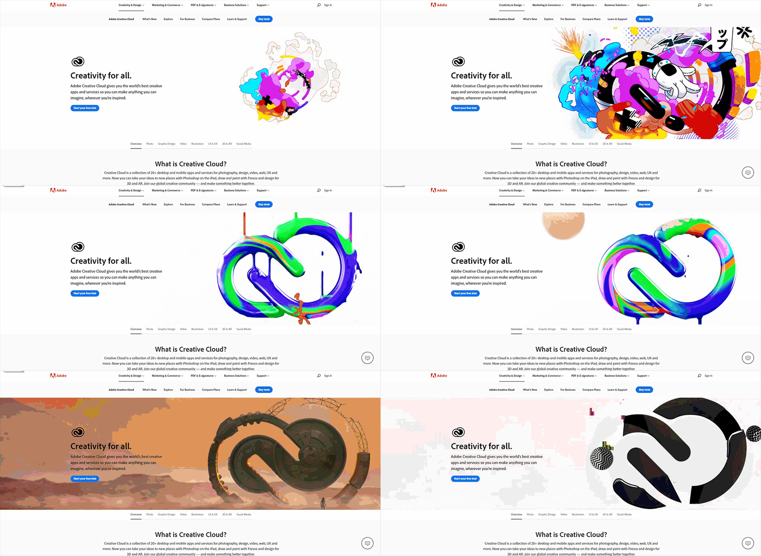
Adobe has used a beautiful video for their product Creative Cloud.
You can even go a step ahead and include personalized videos on landing pages that give a feeling of exclusivity to the reader.
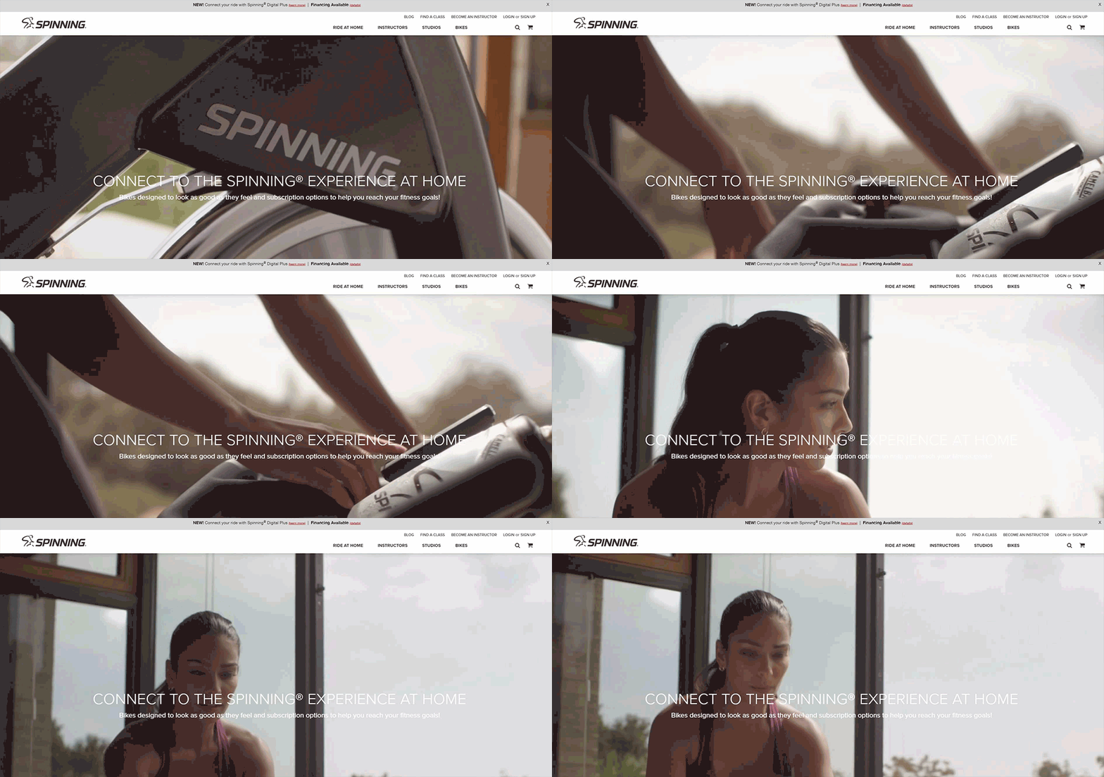
Besides SaaS companies, eCommerce websites can also use videos like Spinning.com has done.
They have explained their product in the background and once the visitor scrolls through, they have another video that explains their apps. The music of the video, as well as visuals, are catchy enough to keep the visitor hooked to the site.
3. Converse with your prospects
Ask questions through your landing pages and let the prospects answer you.
Let me explain.
A/B Tasty has thought out their landing page carefully.
Once someone “requests a demo”, A/B Tasty will show them a landing page asking them about the team they belong to.
Based on the choice they select, they will display relevant copy explaining more about their features.
It will prompt the user to provide his or her details and book the demo call.
You can even include a quiz on your landing page to gather more information about your subscriber and determine how aware he or she is about your niche.
4. Tell a story
This is my favorite part. I love stories. I am sure most of you reading this would be nodding your head on that. Use the same tactic for landing pages. You can add a tint of humor or emotions to your story and close the deal.
Moo just nails the principle of “showing” rather than telling, through their email landing page.
Their email shows a string with a balloon tied to it.
When the email recipient will click on the CTA “Snip the string”, they will be redirected to a landing page that continues the story after snipping the string.
The landing page shows a popped balloon, revealing a 15% discount offer and the coupon code.
Isn’t that a great way to engage the customers? Obviously, the reader will be curious to know what happens after snipping the string. That’s the thought behind designing such an email and landing page.
In addition, you can use chatbots on the landing pages to employ conversational storytelling.
Lego has nailed this strategy with their artificially intelligent chatbot Ralph.
If you are a marketing professional in the finance sector, you can include calculators on your landing page for deposits and loan EMIs.
5. Use interactivity in your holiday marketing campaigns
Occasion-based marketing works well if you make interactive landing pages. During such days, the customer is in a cheerful mood and will respond well to images, GIFs, and videos.
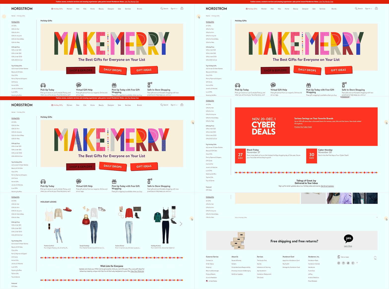
See how Nordstrom has used GIFs to reflect the vibes of Holiday season and Christmas.
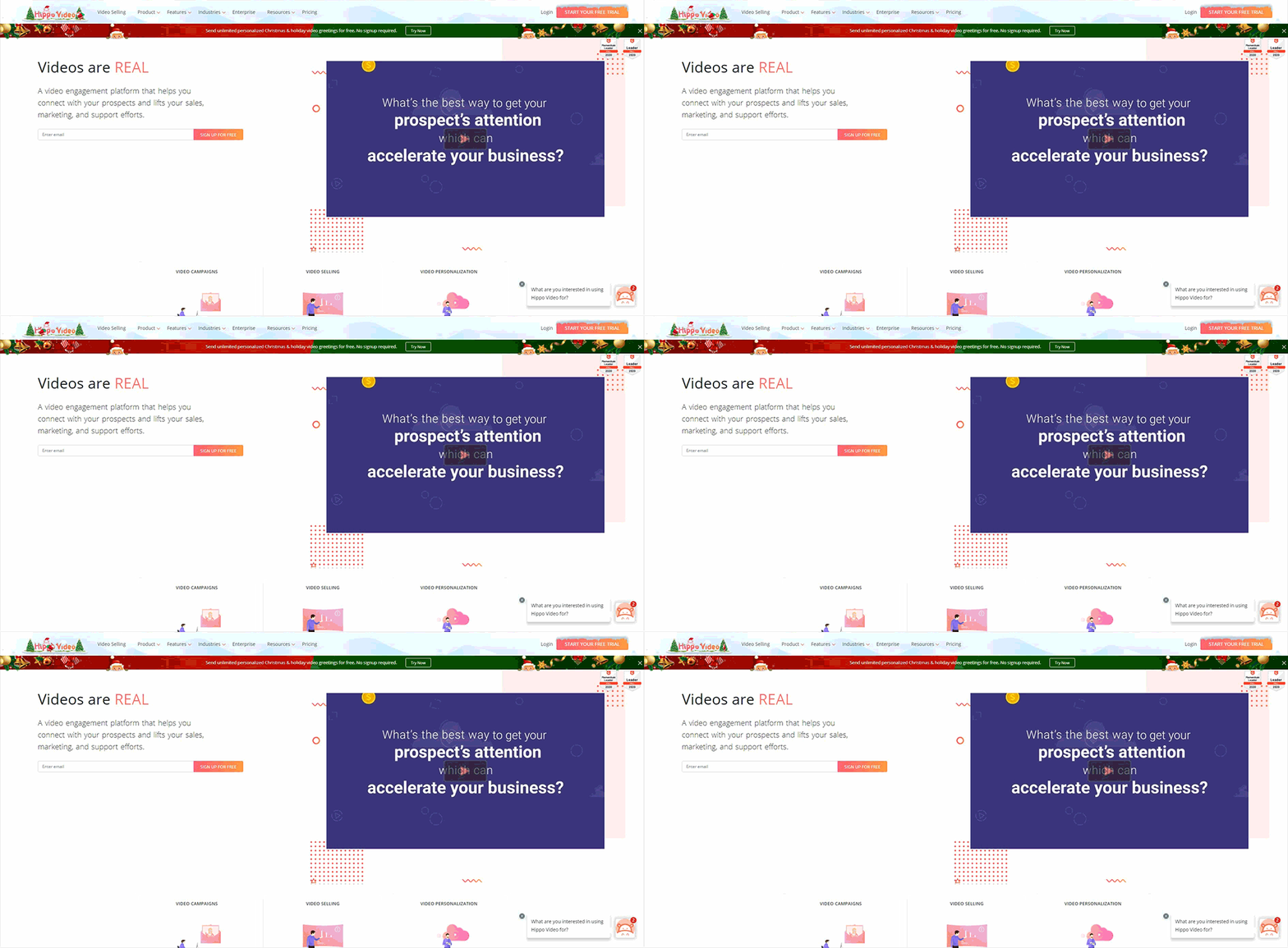
Hippo Video has also revamped its landing page to match the Christmassy mood.
I am tempted to share one more example. (I have also shared it in the article on “Holiday Landing Pages”.)
Stop Aging Now has used a great idea to reveal their discount offer through their email landing page.
Take a look at their email and landing page.
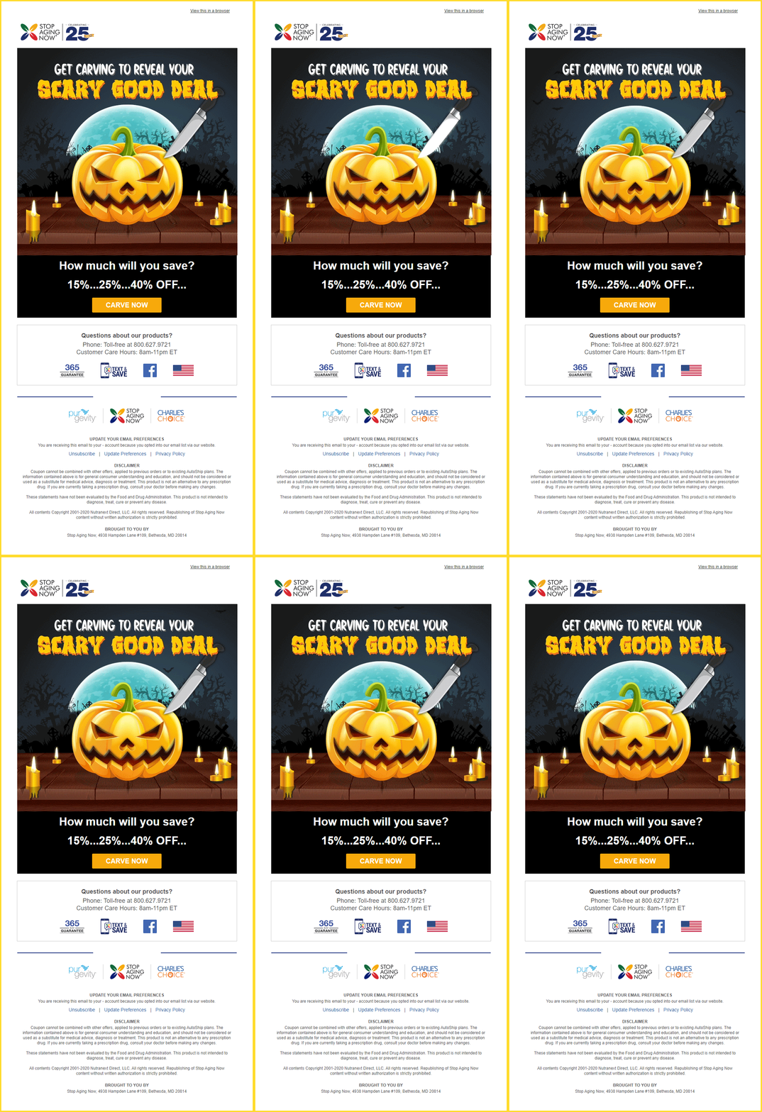
Once you click on Carve Now, you will see this landing page that allows you to reveal your offer.

However, there are some disadvantages that you must bear in mind while adding interactivity to your landing pages.
i. It might lead to a broken layout on mobile devices or smaller screens. You must create responsive pages so that they render well across all devices.
ii. Adding flashy GIFs can cause photoepileptic seizures in patients of photosensitivity. Therefore, it is prudent to refrain from adding animations with flashing rates between 2 Hz to 55 Hz, considering visually impaired users.
iii. Interactivity in landing pages might increase the loading speed of the page and lead to a higher bounce rate. Make sure you test all the web pages, especially the interactive ones, for speed before making them live.
Despite these drawbacks, interactivity is something you should not shy away from using because it can make your landing page come alive.
Wrapping Up
So, did you see how interactive landing pages can significantly enhance the user’s experience?
If you loved the examples we shared and are inspired to design one for your own business, just get in touch with us.
We will design an even better landing page for you.
And of course, we can design interactive emails and banners too, for you.
Just CONTACT US and our experts will help you out.




Disha Bhatt (Dave)
Latest posts by Disha Bhatt (Dave) (see all)
Salesforce Nonprofits: 7 Ways Nonprofits Can Make the Most of Salesforce Marketing Cloud
10-Point Checklist to Create Memorable Email Campaigns with Salesforce Marketing Cloud