Any object’s value is based on its utility in day-to-day situations. When the application of an object surpasses its initially defined purpose, it is called value addition. Value addition is always welcome. A minor tweak in the interaction to simplify the method of information dissipation is one of the values that email needs to satisfy.
As second part of the ongoing Mailable Microsite series, Uplers shall now enlighten you on the simplification Hamburger Menu brings when integrated in an email. In the first part, we had observed how inclusion of carousel effect in the emails helped B&Q in improving information dissipation. With the inclusion of Hamburger menu in emails, brands can hide their navigations on the top when the email is viewed on a mobile device. This way the subscriber will first lay eyes on the email without any distractions.
Let’s understand how adventure gear retailer, REI clothing implemented hamburger menu in their emails over the years.
From a Responsive Email to a Menu Enabled Mailable Microsites
Earlier, emails were largely opened on desktop devices. In 2009, the need for responsive email templates picked up pace as people started opening emails in mobile devices. REI’s 2012 email was a beacon stating their first step into the mobile responsive domain.
In the first example from 2012, on a single look, you observe that REI have a navigation menu on the top of their email. The subscriber was free to click on them to be redirected to corresponding page on the website.
 |
 |
The second example is from 2014, when they increased the amount of elements on the overhead navigation menu, meanwhile making use of the preheader text and shipping announcements at the header itself optimally.
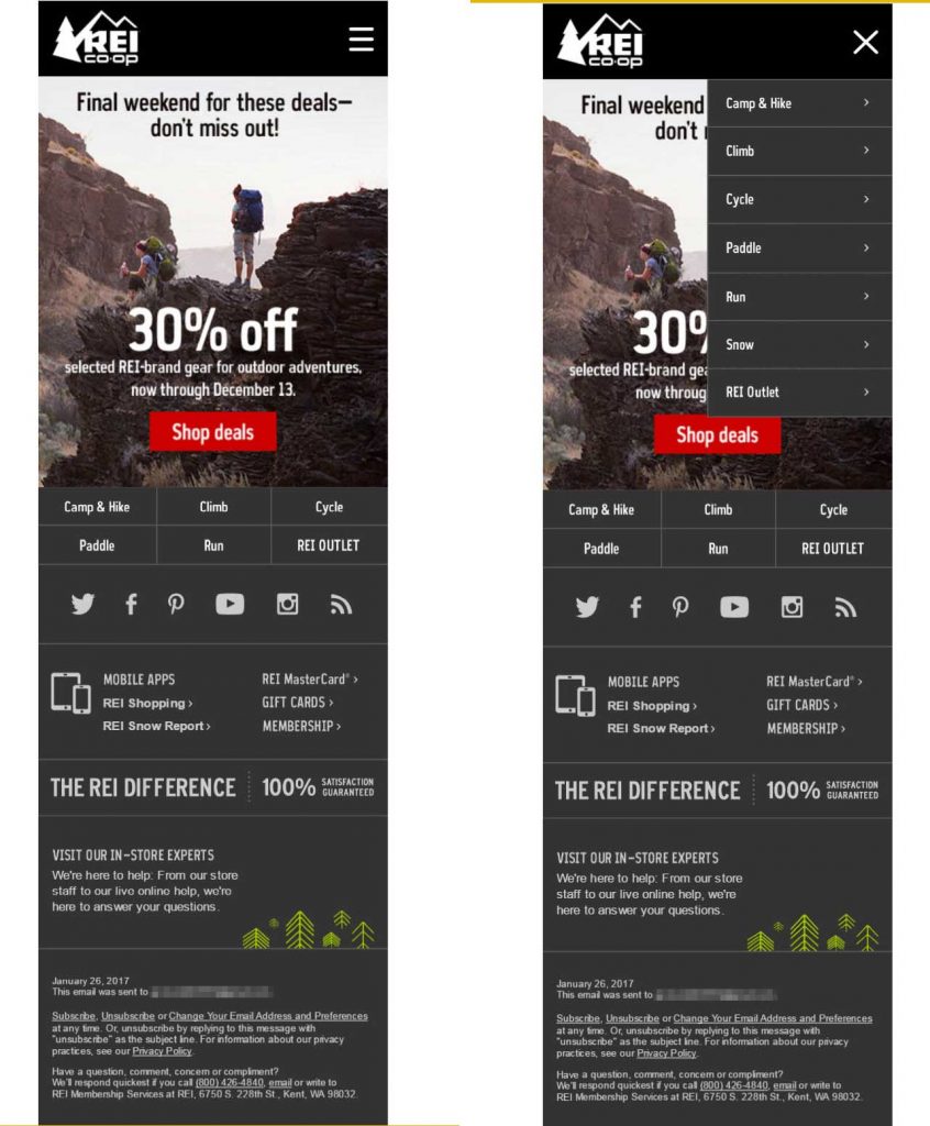
 2015 REI email with Hamburger Menu |
 REI email with Hamburger Menu (Open & Expanded Menu) |
It was from the year 2015 when REI metamorphosed their website as well as their emails to a minimal and cleaner look. By making use of the Hamburger menu in their emails (in example above), the navigation menu was hidden and the user had the freedom to interact with it to be redirected to the required page.
Advantages of Menu in Email
- By including a dropdown menu, REI optimized the email for on-the-go viewers.
- The subscriber is not forced to engage with the navigation menu. Since it is tactfully hidden in plain sight, only those interested shall interact with it.
- With diminishing attention span of an average email user, it is important to convey the intended message as soon as the email is opened. Hamburger menu hides the clutter overhead and the subscribers’ eye scan path is fixated on the bold hero/ focus message.
Talking from the compatibility point of view, it is important to note that currently Windows-based mobile clients don’t support Hamburger Menu. Android and Apple native email clients renders Hamburger menu very well.
Have you tried sending Menus in email for a clean, clutter-free look? If not, then grab the opportunity now.


Kevin George
Latest posts by Kevin George (see all)
Email Typography: An Evolution of Style
Search In Email - Experience Brands First-Hand in Your Inbox!