Taking the Mailable Microsites series further, the Uplers are back with yet another element that creates magic when integrated in an email- Countdown in Email.
There’s a big buzz around real-time email marketing. Basically, it is a strategy that uses real time data to create targeted and timely content in emails to provide the subscriber with a better UX.
To get started with real-time email marketing, Relevency group’s real-time email value ladder (fig. below) comes handy. According to this concept, the basic and easiest way to start with real-time marketing is to add a countdown in emails.
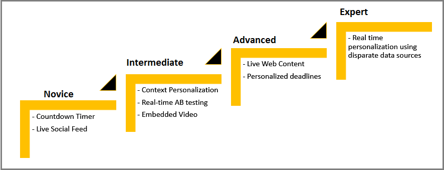
The same report also states that after comparing their clients’ emails with a countdown to those without one, they found a 15-70% increase in click-through rates.
Countdown timers amplify urgency.
But what is it that makes a countdown click for email marketers?
It’s basic human psychology. The feeling of being left out or that you’re running out of time can enhance human response. So whether you apply a countdown to a time-bound sale or registration for some event, you are sure to get better response.
The astute Uplers studied the emails by Travelocity to find out how the travel company has changed its customized email templates over the time to include a COUNTDOWN for creating a sense of urgency in their emails to portray special offers and deals.
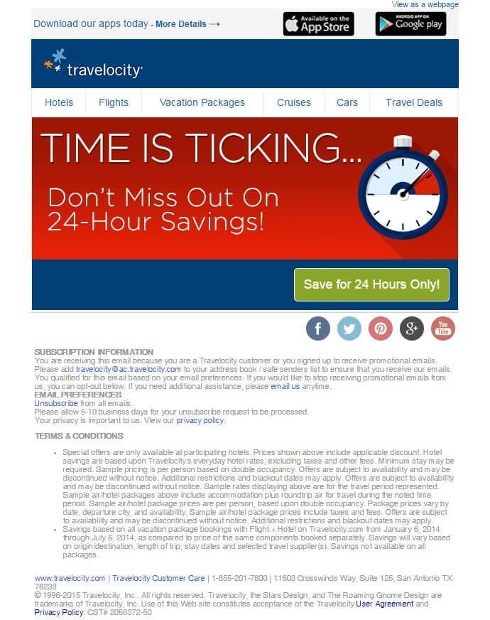
Email sent by Travelocity in 2015
This email from Travelocity is about a deal which is to last for 24-hours only. The red color does attract attention of the reader to the highlighted deal. Also, they have added the picture of a clock to symbolize that time is passing and the subscribers need to hurry up to grab the deal. But the email is not real time. As in, if the subscriber opens your email after a day or two, they may be confused as to when the deal started and when it gets over.
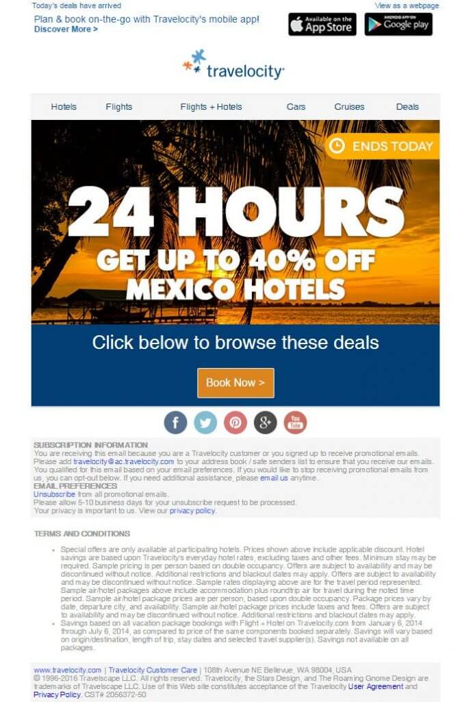
Email sent by Travelocity in 2016
Travelocity changed their strategy a little in the year 2016. The clock is missing but the limelight is on ‘24 Hours’ within which the subscriber can make the most of the deal. Highlighting the deadline often facilitate boost in sales but just a bit.
Email sent by Travelocity in 2017
By using a countdown in their email, that too above the fold, Travelocity did a great job in 2017.
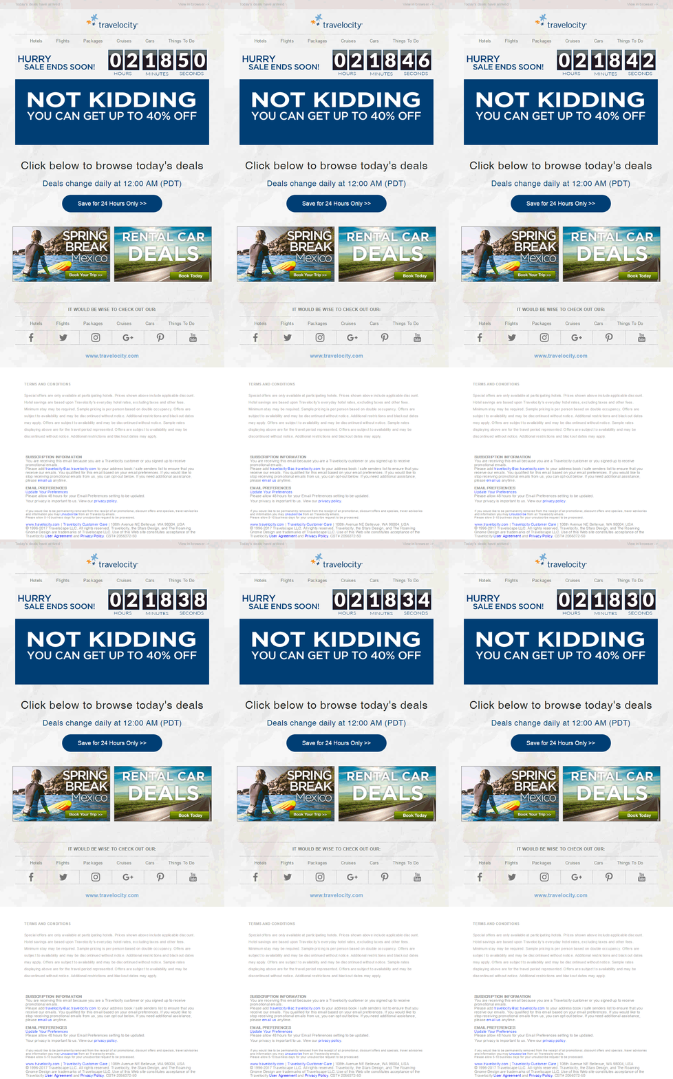
The timer is like a ticking bomb. Every time you watch, you have lost some more time; you now have lesser time to make use of the daily offer. The feeling that time is slipping away, creates the urge to act fast before the opportunity is gone. Bingo!
Benefits of Countdown in Email, in a nutshell
- Creates a sense of urgency through a little drama
- The real time counters in an email give the exact idea about how much time is left for a deal to end.
- Helps increase click-through rates
- Is perfect for limited time offers, new product launches, webinars, events, etc.
- Easy to create and deploy
- Most ESPs and email clients support countdown timers. Only Outlook & Lotus would require a proper fallback support.
Explore our ‘Mailable Microsite Series’ to know about how BIG Brands are using Interactive Elements in emails successfully.
Mailable Microsites I – How B&Q clinched it with Carousel in Email
Mailable Microsites II – How REI ‘Served’ Up Using Hamburger Menu
Mailable Microsites III – How Burberry Impeccably Slid ‘Sliders in Emails’




Kevin George
Latest posts by Kevin George (see all)
Visual Hierarchy in Emails & the Importance of a Hero Image
Leveraging Logos in Emails with Festal Branding