There is a lot of debate on the execution of dark mode in emails. While it is a challenge for email marketers, it is turning out to be an important aspect of accessibility. It changes the color palette of the interface so that the content is displayed in dark background colors and light foreground.
Dark mode is often confused with color inversion. Several themes in the digital marketplace enable color inversion. For most of the apps and ESPs, the different dark modes mean the usage of dark background in white text in contrast to black text in a light background.
Advantages of Dark Mode in Email
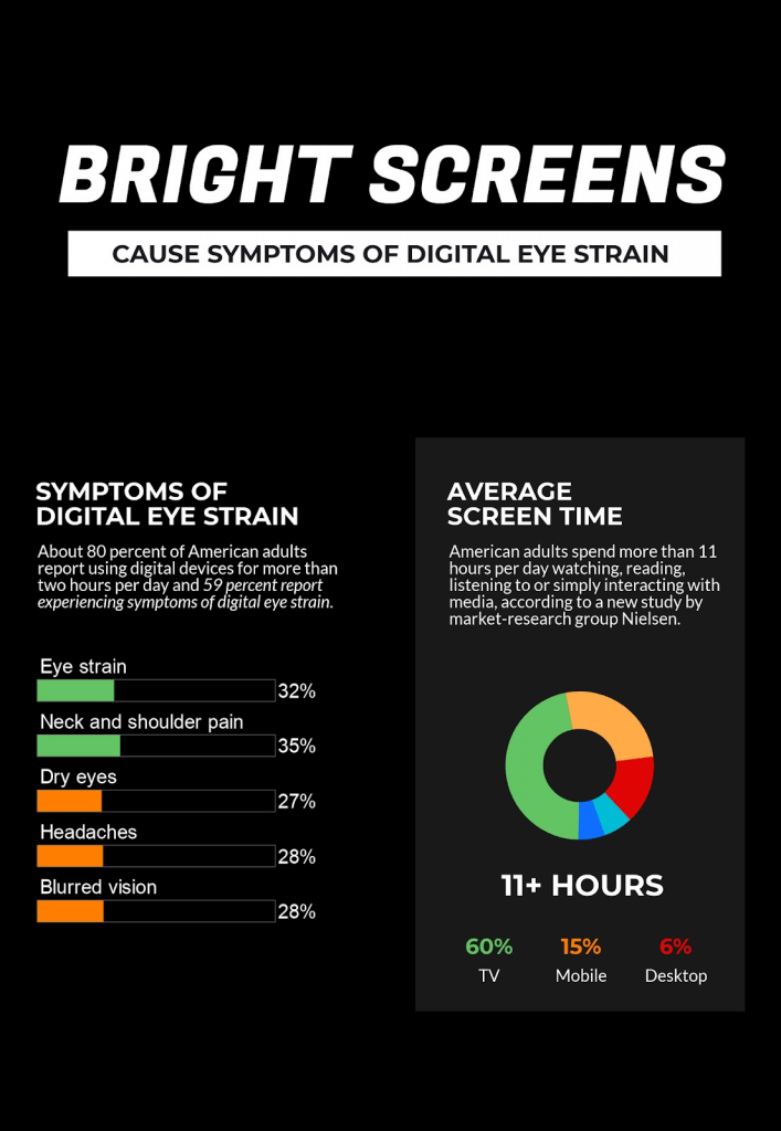
- With 80% American adults using digital devices for more than 120 minutes each day and 67% using more than two devices simultaneously, dark mode got popular as it allows the users to relax their eyes and work with better concentration.
Take a look at the facts below:

- The high-contrast combination in the dark mode reduces the blue light and makes the content more readable for the email subscribers.
- It will diminish the eye strain and fatigue because of staring at digital devices for long hours.
- People with light sensitivity and working hours in the night shift find dark mode in emails particularly valuable as it makes reading a breeze even in a low-light space.
Compatibility of Dark Mode in Emails
Majority of ESPs have started designing “dark” modes that would typically present everything in a black background and text to white color by default, rather than conventional black text.
Apple, Microsoft Outlook and Gmail by Google have introduced dark mode in 2019 that will allow the users to have a dark interface throughout the system.
Apple
Dark mode by Apple is available in iOS 13.0. It is known as MacOS Mojave and uses a darker color palette for the controls, views, menus, and screens. If the users do not want to use the dark mode setting throughout the day, it is possible to choose dark mode when the light around is dim.
Gmail
With the increasing demand for dark theme, Gmail has embraced dark theme and launched it for Android 10 and iOS 13. It is already available for Gmail for Internet browser on select devices.
Outlook
Dark mode is exclusively available in the new Outlook.com and Outlook on the web experience. It changes the default bright background color to a darker color that is relaxing for the eyes. At present, dark mode supports the default blue theme.
The reading pane gets a dark background when dark mode is on. If you want to make it brighter, you can select the (light) button at the top of the reading pane. In case the button is not visible, select the down arrow.

You will be able to see the original message formatting by selecting as shown in the image above.
How to Use Dark Mode Correctly?
Almost every email marketer is well-versed with the email marketing and design best practices for the average inbox. However, when it comes to optimizing emails for dark mode, they often mess up and end up with rendering issues.
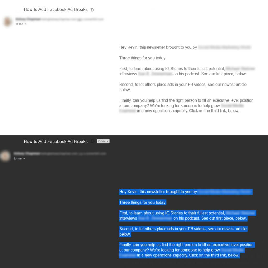
Take a look at the image below.
As you can see, the email is perfect in light mode but gets totally messed up in the dark mode. The reader has to select the text to read it.

Note: These images are for representation purpose only. Anything mentioned in the email does not intend to reflect any brand.
1.Include Transparent Images
At present, ESPs allowing for dark mode settings will change the colors in CSS automatically. This, however, is not true for the colors within images. Therefore, the safest bet is to have transparent backgrounds which will cause the image to change based on the background color set by the theme.
2. Do not mix images and background colors
More often than not, designers combine images and background colors in order to display buttons and design elements. This is not a good practice when it comes to dark and light optimization because background colors might change when you switch between the dark and light modes, but images will not.
3. Have a white stroke around the dark fonts
As far as fonts are concerned, it is recommended that you add a white stroke around the darker fonts. The white stroke will be hardly visible in the lighter settings, but it will make the text more readable in dark mode.

4. Do not forget to test the email before sending
With the introduction of dark mode, it has become imperative to test the emails in dark mode as well as light mode so that the email looks ‘good’ in both these settings. Doing so will give you a clear idea on the tactics that work and the color combinations that look the best.
Wrapping Up
As dark mode is still in the initial adoption phase, trial and error is the best way to figure out how can your emails work well in both the interfaces. The methods discussed above will surely help you to render emails better irrespective of the mode it is opened in.


Kevin George
Latest posts by Kevin George (see all)
Pre and Post-send Deliverability Tools: A Stitch in Time Saves Nine
Email Localization Campaigns - Designing them Right