[This article was originally published on May 2023 and has been updated on Sep 2024]
You pour in copious amounts of hard work, discipline, tenacity, and perseverance into developing or curating a new offering for your business. And so, you would naturally want your subscribers to be all agog to experience it, to be drowning various spaces on the internet with ceaseless chatter surrounding your brand. But, how do you manufacture this excitement? Well, there are quite a few ways to go about it, but one of the most surefire ways, which is also the scope of this article, is crafting an impeccable pre-launch landing page.
As you can perhaps already surmise from the name, pre-launch landing pages are set up prior to the launch of a product or service with the intention of generating buzz around it, as well as capturing new leads and amplifying conversions. You know how a good trailer does wonders for an upcoming movie? That’s exactly what a solid pre-launch landing page does for an upcoming product!
Need help with creating one that hits all the right notes? We’ve got you covered. Today, we’ll talk at length about a host of pre-launch landing page best practices and share with you some stunning pre-launch landing page templates that will help you foster a dialogue with visitors, and help you drive greater engagement. Curious to find out what they are? Let’s dive in, then!
1. Focus on Communicating Your Value Proposition
When it comes to picking a solution that tackles their problem statement, customers have no dearth of choices. The only way you can convince them to gravitate toward your offerings is by effectively putting forth your value proposition.
No, that doesn’t mean filling up endless pages about the various features that your offering packs. Instead, you must tell them how the features are tailor-made to address their specific pain points. Make it about the audience, always. Give them as much clarity as possible regarding the scope of your product or service.
Remember, the more information they have about your offering, the more tempted they will be to put their money against it. Not to mention, that if your value proposition is able to capture your visitor’s imagination, they will take it upon themselves to spread the word of your to-be-released product in their circles.
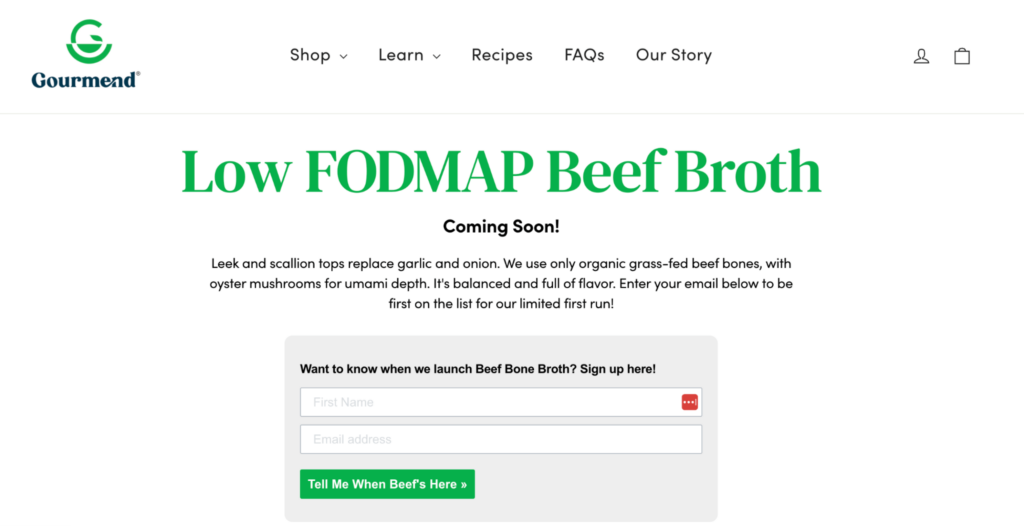
For instance, take a look at this landing page for pre-product launch from Gourmend.
2. Mindfully Design Your Signup Form
Pre-launch landing pages also double up as email capture landing pages. So, it is safe to say that a pre-launch landing page is incomplete without a signup form. Additionally, signup forms also help you identify user intent- if a particular visitor has filled out your pre-launch landing page, you know for sure that they are interested in your offering. As a result, you build an email list that is populated with organic and high-quality leads.
Now, coming to the all-important question: How to create an impactful signup form?
Let’s take a look.
- Don’t overcomplicate it. With signup forms, function takes priority over form (pun, absolutely unintended) on any given day. The copy should be simple, the design, captivating yet not elaborate, and the length, brief. Try to keep as few entry fields as possible. Did you know as many as 85% of forms contain two fields or less? However, there are cases where businesses prefer keeping multiple fields and obtaining more information from visitors, with the end goal of delivering hyper-personalized experiences to them.
- Hook visitors with your headline. It has to be crisp, and at the same time be able to spur visitors quickly into action.
- Consider offering an incentive. Sending exclusive updates, allowing them to pre-book, offering a discount- it could take any shape, really.
- Set clear expectations. Being honest with your visitors is always a win. Be transparent with them regarding what all they can look forward to upon filling out the form.
- Lastly, make sure you only have one signup form. Unlike pre-launch landing pages, which focus mainly on generating leads and creating hype, other kinds of landing pages might have multiple objectives, and hence, it’s alright for them to have multiple signup forms.
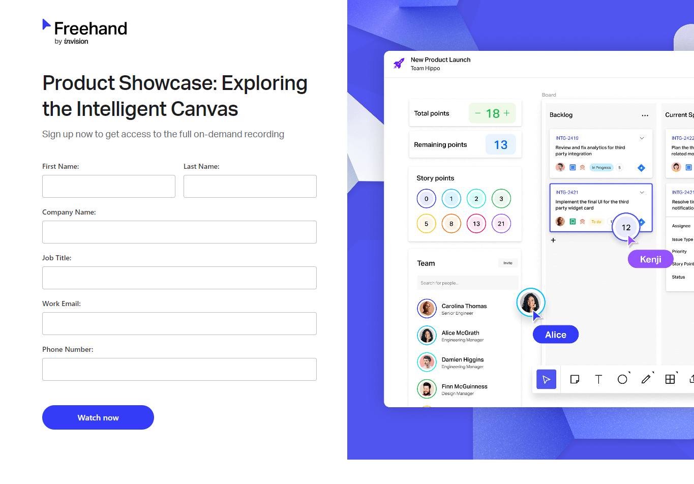
This signup form on Freehand’s pre-launch landing page is a brilliant example.
3. Make Sure Your CTA (call-to-action) Stands Out
Your CTA needs to be catchy and compelling without fail. Should it be inconspicuous or not optimized for mobile (forcing users to squint hard in order to locate it), it will tremendously affect the visitor’s user experience, ultimately hampering your pre-launch landing page’s engagement rates. The best pre-launch landing page templates out there boast of incredibly appealing CTAs.
Listed below are some tips and tricks that will help you nail your CTAs:
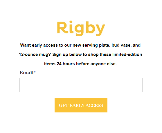
- Don’t be vague. Your CTA should inform your visitors what will happen next once they click on it. Take a look at this pre-launch landing page by Rigby, for instance. The CTA here leaves no room for guesswork, does it?
- Prioritize clarity. While there’s no harm in aiming for witty, humorous, or dramatic, often brands tend to compromise coherence in the pursuit of these qualities. Above anything else, your CTA should tell your visitors what will happen next once they click on it; never lose sight of that.
- Use power words. “Learn”, “Explore”, “Try”, “Find”- these are some examples. The benefit of using such a vocabulary is that it helps you stir an emotional response in your readers’ minds. That, eventually, bodes immensely well for your pre-launch landing page engagement numbers. Another thing that you can do to strike a personal connection with your visitors is to write your CTA in the first person. By directly addressing them, you obviously have a greater shot at grabbing their attention.
- Consider adding an element of interactivity to the CTA button. While this is not necessary by any means, it can go a long way toward enhancing the user experience. And it doesn’t have to be anything complicated, either. Something as simple as the color or the CTA phrase changing upon hovering over it works as well.
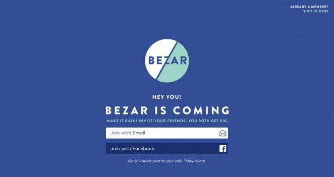
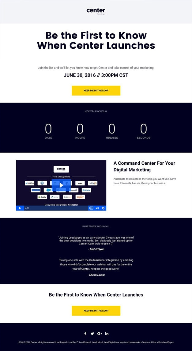
- Make your CTA visually prominent. You do not want your visitors to be left searching for the CTA. Keep it front and center, like this pre-launch landing page template.
4. Leverage FOMO (fear of missing out)
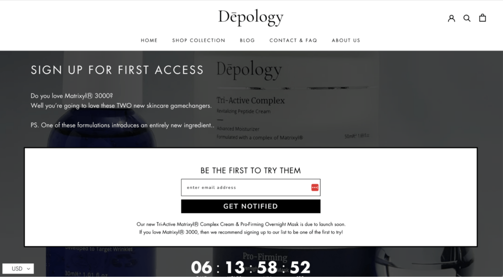
This might be among the oldest marketing tricks in the book, but it continues to be as relevant as ever, and hence must be incorporated in your pre-launch marketing strategy. Use your pre-launch landing page to tell your visitors about what they risk missing out on should they overlook your soon-to-be-released product.
To effectively generate this sentiment, you must shun salesy language in favor of a more storytelling one. I’m sure this is something you resonate with as well. How many times have you found yourself disenchanted with a brand’s offerings just because they are trying too aggressively to sell? Even if the product in question is genuinely good, you don’t think twice before walking away from it.
As we mentioned above, the value proposition is everything. If you want visitors to be invested in your upcoming offering, the email capture landing page must paint a vivid picture of how the said offering will improve their quality of life. At the same time, it must tell them what they stand to miss out on if they DON’T go after it. Execute the FOMO card successfully, and find yourself waking up to a serpentine queue in front of your store (physical or virtual) on the day of the product’s release.
Here’s a cool FOMO-leveraging pre-launch landing page by Depology.
5. Make Your Page Shareable
At present, there are multiple platforms through which audiences get exposed to your business. So, if you truly want to create a stir in the market, you need to take steps to make certain that you are equally talked about across all these platforms.
How do you facilitate this for your pre-launch landing page? By making it shareable, of course. Add social sharing buttons, so that it becomes incredibly convenient for visitors to share your page on their social handles (see example below). Any agency offering landing page design services will ask you to make sure of the same. Offer a reward to those sharing, so that more and more visitors feel encouraged to do the same.
Pre-Launch Landing Page Best Practices
Now that we’ve seen a number of pre-launch landing page examples, here are some best practices for you to consider:
- Communicate the value of your products/services in simple language. Be direct, concise, and solution-focused.
- Keep the pre-launch page uncluttered. Avoid fancy aesthetics if it distracts the viewer from the core message. Leverage white space.
- Test different versions of the pre-launch page. Choose your variables from the focus area of the page, which is: CTA button, headline, and banner image.
- Leverage digital marketing channels such as social media, email marketing, and SEO to generate awareness and drive quality traffic to the page. Make sure your content is aligned with your primary keywords to attract the right audience.
- Consider choosing landing page builders with a rich library of customizable templates. After all, you want to make sure that the pre-launch page captures your brand identity.
Wrapping It Up
A pre-launch landing page, above all, ensures that the hard yards put in by several departments of your business in giving shape to a product or service get the due recognition.
Hence, we recommend that you start planning your pre-launch landing page the minute your product enters development, rather than waiting to receive the finished output to put some thought into it. It can be quite tricky to master but is far from being an unassailable task.
We hope the insights shared above have helped you understand what goes into developing a cracking pre-launch landing page. Have you come across any interesting pre-launch pages of late? Do let us know as well; we’d love to check them out!




Susmit Panda
Latest posts by Susmit Panda (see all)
Our in-house experts share Holiday Email Design Trends To Make Your Emails More Impactful
How to Keep Subscribers in the Know with Notification Emails: A Detailed Guide to Doing it Right