Apple is surely the top email client but your list also includes subscribers using other email clients like Outlook and web versions like office365, outlook.com, Hotmail, live and other web version of outlook.
Needless to say, emails render differently on every email client and device. If your email is not optimized according to these parameters, your subscribers will not be able to see the email like you want them to.
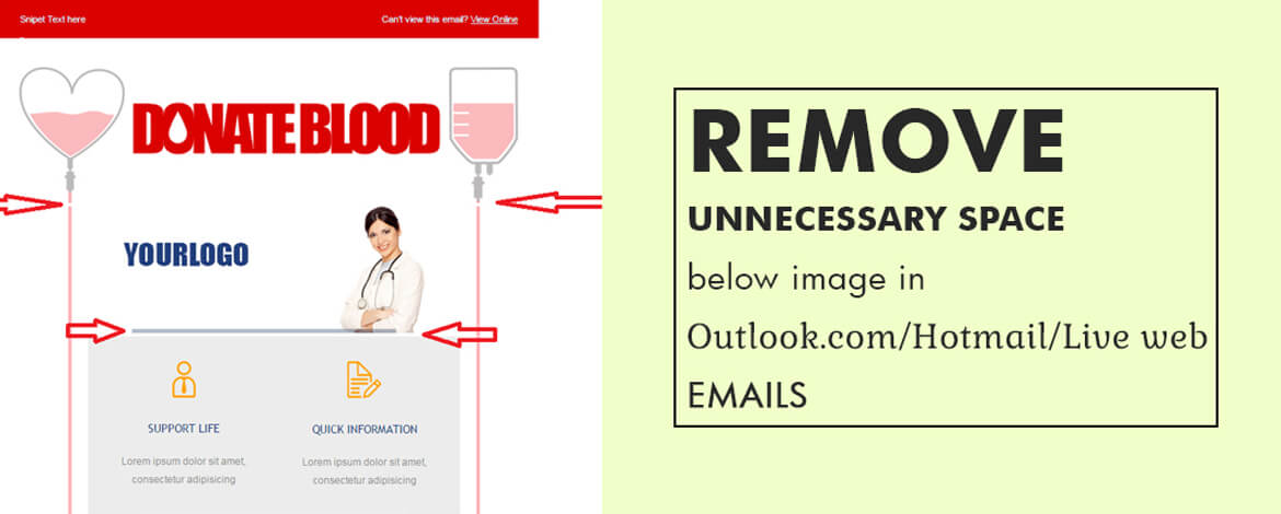
Outlook.com/live/hotmail, for example, put forth a peculiar challenge when it comes to rendering images in emails.
Let’s unveil the technicality and coding enigma underneath.
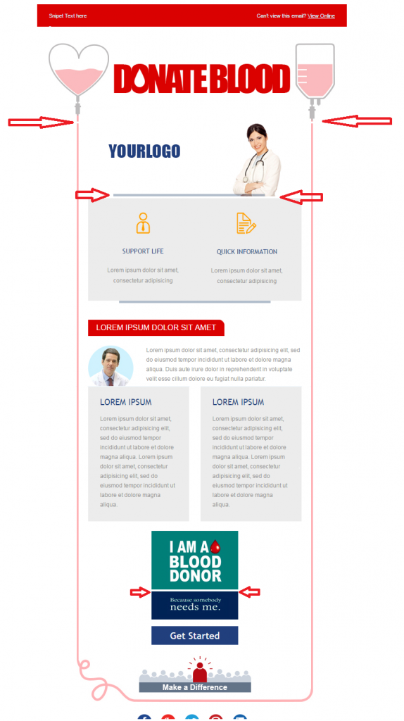
What these web mails do is that they automatically add <div> before the image. Adding this will lead to appearance of gap below the image. When the same background color as that of the image is used, it won’t be much of a problem as it won’t be visible enough. On the top of it, if text is followed by image, it again won’t be visible. However, when background color is different or when two images are sitting one above another, this problem is clearly visible.
Why does this happen?
This happens as the email clients add div on its own; Strange why they keep adding their own tag in emails. Moreover, it also adds display:in-block so you see some extra space (around 3 to 5px) getting added at the bottom of image.
Have a look at the below screenshots to understand what exactly happens.

This challenge is usually observed in latest apps, recently updated by them.
How to overcome this challenge?
Uplers have come up with an idea that can help you overcome this challenge.
All you need to do is add below style in your <head> and remove the unnecessary space under the image.
div{ display:block !important;}
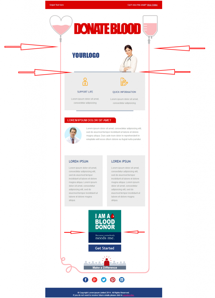
We obviously cannot remove the div which they are adding but then at least we can avoid adding extra space. So we overwrite the inline block with anotherblock to remove extra space.
Here’s how it looks after the workaround.

Our email experts can help you with ESP integration and migration across 50+ ESPs.
Wrapping Up
It surely feels like a huge accomplishment whenever we discover a workaround for the renderability issues of Outlook.
Have you faced similar challenges with any email client?
Share your ideas with us in the comment box below.


Kevin George
Latest posts by Kevin George (see all)
Surprise your Subscribers with Collapsible Carousel in Emails
Marketo Master Template: Uplers’ New Offering to make Email Design Easy