
One of the great benefits of seasonal marketing in relation to email design is that every season recommends itself to a peculiar aesthetic, giving designers a strong head start.
Whether it’s red-and-white for Christmas, mauve for International Women’s Day, or green for St. Patrick’s, designers know where to begin.
In this post, we will look at how designers can leverage St. Patrick’s Day. Every St. Patrick’s Day email in this curation crystallizes the essence of email design, giving a peek into how brands can profitably accommodate seasonal opportunities.
1. Rugs.com
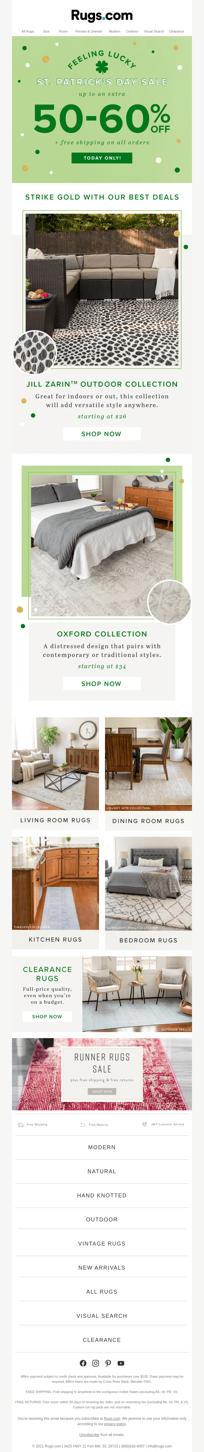
Our first email template begins with a shamrock-green hero banner, a perfect nod to St. Patrick’s Day. The interplay between light and dark green sets the tone for the rest of the email.
Note that having introduced the special offer, the email borrows its design components from the hero image. There is no additional motif. It’s green and beer fizz all the way down – a nice illustration of symmetry in email design.
2. Uber
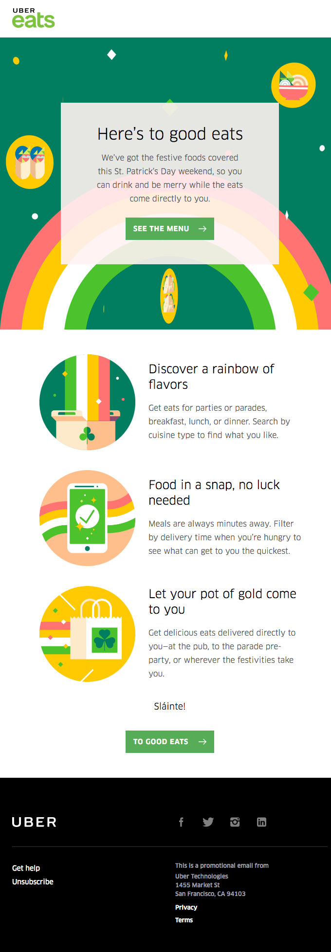
Uber’s email illustrates color mixing at its best. Unlike our previous example, Uber’s template is not green per se. Instead, it gives off a green vibe.
How does it manage to convert a concrete color into its abstract implication? By mixing the right colors. The hero image is predominantly sea-green. The next major contrasting color is yellow. Both colors lean toward green, achieving the effect of a vibe.
The CTA buttons are green. Much like Rugs.com, Uber utilizes beer bubbles across the template. Finally, let’s not ignore the excellent use of white space.
3. Email Uplers
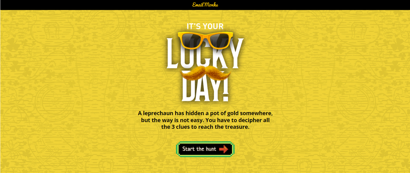
We excel at gamification. For our St. Patrick’s Day campaign, we designed a simple, Mario-like game.
One thing we like about gamification is that it liberates the designer. In this email, for instance, we went for a photomosaic effect – something that’s not possible with regular templates. Also, there was no burden to maintain brand consistency. Gamification is a whole new world where you are free to experiment with your creative shenanigans.
Our St. Patrick’s Day email was highly successful. Typically, we measure the engagement rate, and we saw that most of our subscribers played the game and liked it.
4. Athletic Brewing
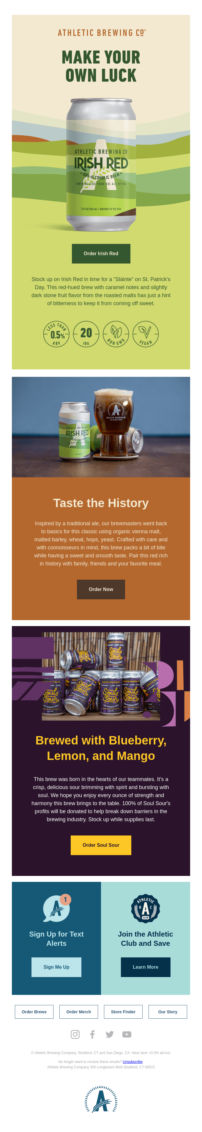
Our next email template is, well, “athletic.” With six colors across the template and a slick compartment-style layout, Athletic Brewing invites the viewer to explore their email.
The hero banner is winning in its camouflage-esque presentation of the product. The dominant color of the season disappears right after the first section. Going forward, it’s beige, purple, yellow, and blue. Each block makes brilliant use of negative space as well.
The single-column layout has allowed the designer to place all the elements along the spine of the template. As a result, you can sense the harmony amidst the multi-color spread.
5. Kahlua
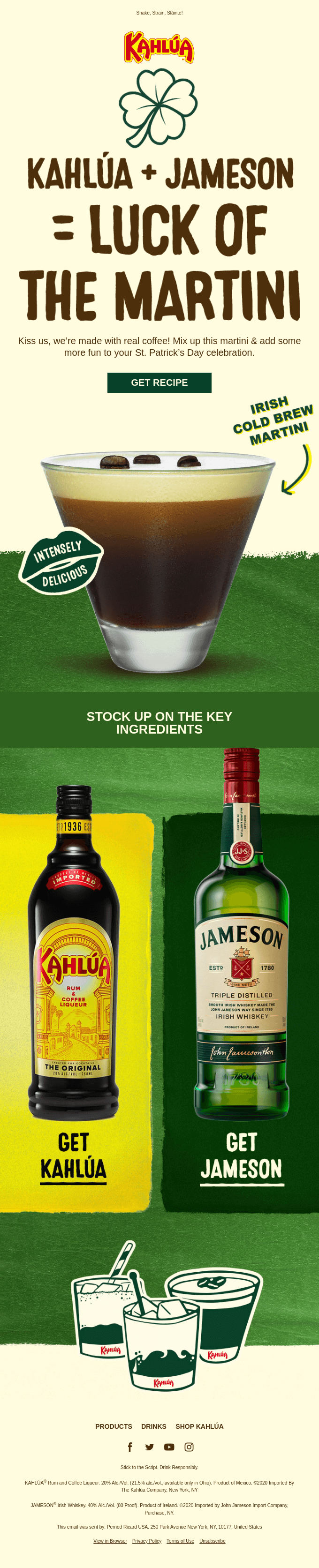
In terms of design, Kahlua’s St. Patrick’s Day email marketing campaign is a testament to the power of bold coloration and typography.
The whole template is thematically intense. It splits into a double-column layout toward the end. Note how the bottles overstep their nicely contrasting frames.
In fact, you can see the use of fluid boundaries throughout the email. The rim of the cocktail glass trespasses into the first block. Likewise, a portion of Kahlua’s beer mugs hog the footer. This subtle abandon infuses the template with drama.
6. Postmates
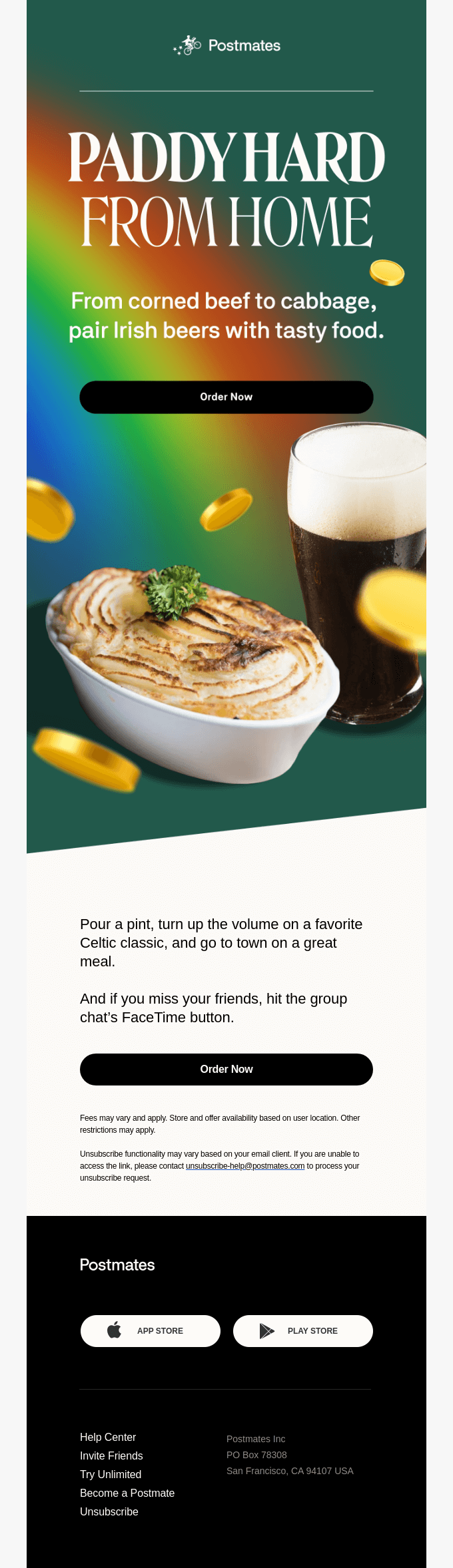
Like Uber, Postmates employs sea green in their St. Patrick’s Day email. However, the very first thing that catches the eye is the highly padded CTA button. The extra padding shows that the design is mobile-friendly. The black color also unifies the template.
We love how the first block transits to the next – no straight line, but the flourish of a slash. Incidentally, we adore Postmates’s quintessential St. Patrick’s Day email subject line.
7. Astro West
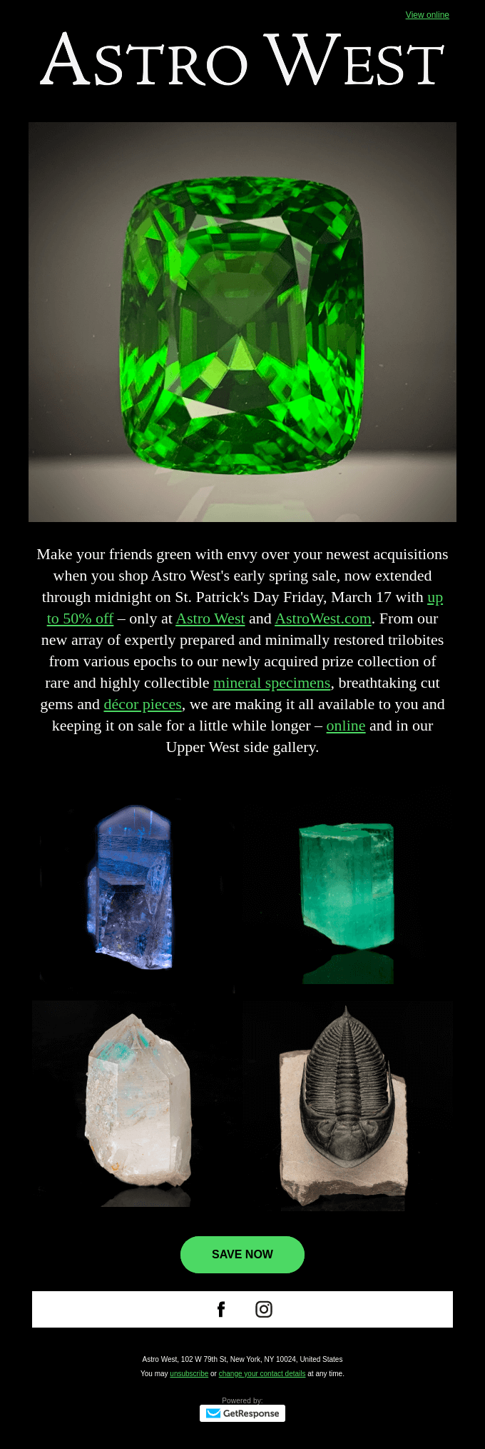
Our next template baffles expectations. We are not sure why Astro West went Dark in their St. Patrick’s Day email. In addition, the whole text is in serif.
One possible explanation for the choice of serif could be brand consistency because the brand name itself is in the serif. Another reason could be that it promotes mobile-friendliness because white-on-black appears larger in emissive displays.
Of course, the template is not devoid of seasonal ingredients. The hyperlinks are all green, as well as the round-edged CTA button. The hero image shows an emerald, too. The layout seems like an inverted pyramid; the whole email points to the CTA at the end.
8. Sauna House
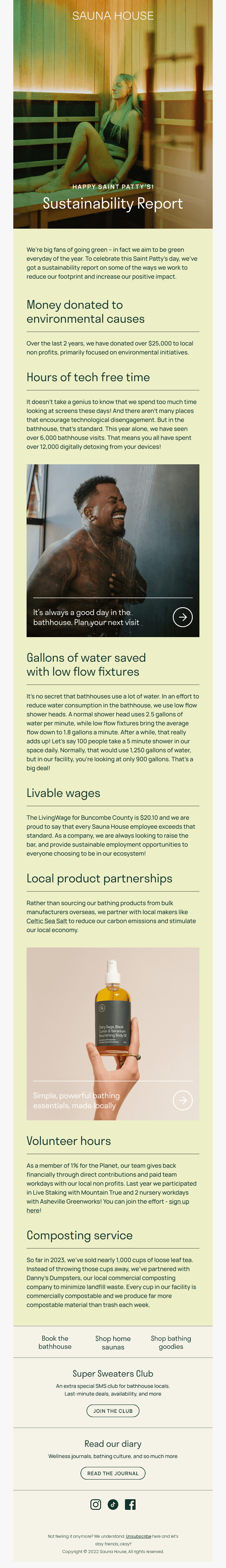
Because it’s a report, Sauna House depends on large chunks of text to communicate essential information. Where text density is high, minimal design is key.
Which is exactly what Sauna House has done in this email. Consistent, appropriate margins, sustainable content blocks, and optimum line spacing define the minimalist forte of the template. The email looks well-balanced after a quick squint test. Image and text alternate in regular intervals throughout the template.
The images seem quite alive. The light green-on-green schema is pleasant to the eyes, as well as relevant to the season.

9. Cotton Bureau
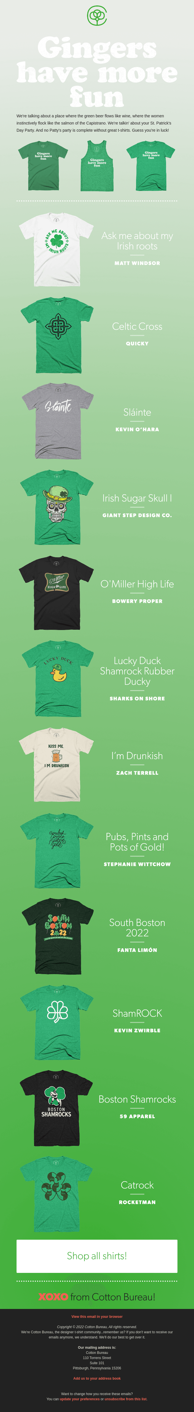
Our final St. Patrick’s Day email uses a gradient blend. The blend starts from silver blue and flows into shamrock-green toward the end of the spectrum. The blend adds depth, dimension, and movement to the email.
Note therein the symmetry of the spectrum: the email starts off white but ends in black. In fact, the T-shirts contribute to this flow as well, progressing from light to dark.
The CTA button is large and unmissable. It’s also well-padded, indicating mobile responsiveness. The email seems to be resting on the button, hinting at its purpose.
It’s a longish email, hence the design throughout is uniform. The focus is exclusively on the products; there is a minimum of distraction.
Wrapping Up!
From Uber to Kahlua to Sauna House, what binds these emails is their tasteful approach to design, a covert mixing of seasonal ingredients rather than loud jamborees of aesthetics. You have the key now – the Dasein of design in email lies in how effortlessly it lends itself to drama.
Susmit Panda
Latest posts by Susmit Panda (see all)
From Leads to Loyalists: Navigating Salesforce Lead Conversion Strategies
Expert Interview Series: Part 11