
[This post was originally published on May 2022. It has been updated on 5th July, 2024]
Developing an HTML email is like the metamorphosis of a tadpole into a frog, undergoing many changes from concept to final delivery. Once the email marketer defines the purpose, the copywriter drafts the email according to the wireframe. Then, the email designer creates the design based on the wireframe. After design approval, the email developer transforms the PSD, AI, or PDF file into a pixel-perfect HTML email. This file is uploaded to the ESP and deployed after thorough testing to ensure flawless rendering.
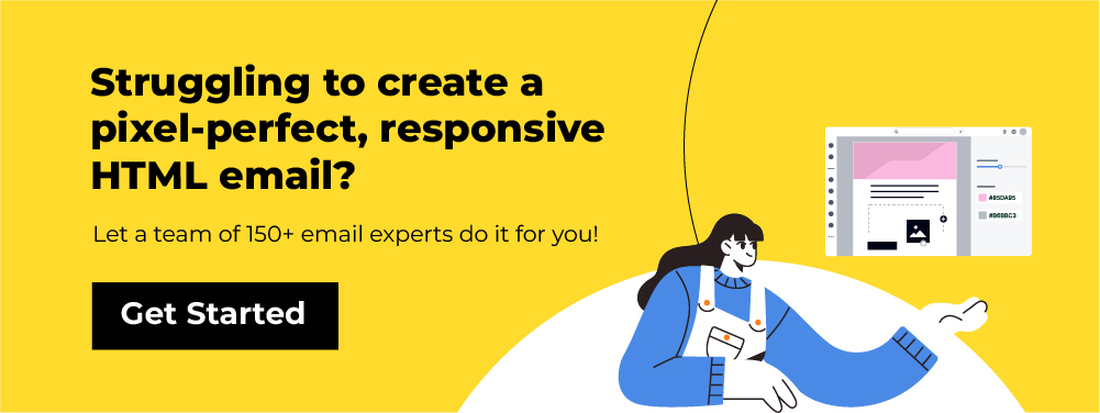
Since multiple people are involved in creating an HTML email, even minor changes can take a long time to resolve. It typically takes 4-6 hours to develop an email template, and the intricacies of the process add to this time. While free HTML email templates are available online, custom-made emails tend to perform better.
In this article, we will guide you on how to create an email template using simple email template HTML code, which you can use as a reference for basic troubleshooting of your email template HTML code.
HTML Basics: How to Create Simple HTML Email Template?
A basic HTML email template includes two parts:
- Header section: Any code placed between <head> and </head> is referred to as the header section. All the media queries, styling and CSS animations are specified in this section.
- Body: Any code placed between <body> and </body> is the body section and the rendering engine uses the code to create the HTML email structure.
Step 1: How To Prepare Your HTML <head> Template?
The head section of a simple HTML email template looks like this.
<!DOCTYPE html PUBLIC “-//W3C//DTD XHTML 1.0 Transitional//EN” “https://www.w3.org/TR/xhtml1/DTD/xhtml1-transitional.dtd”>
<html xmlns=“https://www.w3.org/1999/xhtml”>
<head>
<title>Test Email Sample</title>
<meta http–equiv=“Content-Type” content=“text/html; charset=UTF-8” />
<meta http–equiv=“X-UA-Compatible” content=“IE=edge” />
<meta name=“viewport” content=“width=device-width, initial-scale=1.0 “ />
<style>
<!— CSS code (if any) —>
</style>
</head>
The <!DOCTYPE> declaration informs the rendering engine about the HTML version and rules that the HTML and CSS follow. While some email clients (such as Gmail, Google Apps, Yahoo! Mail, and Outlook.com) strip away this code and apply their own, it’s still good practice to include it in your email template HTML code.
You can choose between XHTML 1.0 Transitional, XHTML 1.0 Strict, and HTML5, but most experienced email developers prefer XHTML 1.0 Transitional.
<meta http-equiv=”Content-Type” /> specifies how to process text and special characters in your email. The “text/html” instructs the rendering engine to consider the following strings of text as HTML.
<meta name=”viewport” /> instructs the device, on which the email is viewed, to set the viewable area of the email as per the screen width.
The title of the email is written between the <title> tag. When a subscriber clicks on “view online”, the title of the email is displayed on the browser tab.
Step 2: How To Style Your Email HTML?
Any styling you plan to implement in your email, such as text formatting, image sizes, and media queries, should be placed between the <style> tags as different classes. The basic format for adding a <style> tag is <style type=”text/css”>, where “text/css” specifies the media type as CSS. Placement of the <style> tag can be tricky because 6 out of 36 email clients do not support <style> tags in the <head>, and Gmail does not support them in the email body.
Text formatting
In case you need to add a centralized formatting condition for any text, you can specify the attributes in the specific class of the basic HTML email template.
For instance, you can disable text decoration in the following way.
.em_defaultlink a {
color: inherit !important;
text–decoration: none !important;
}
Media Queries
In case you are coding a responsive email template, the media queries need to be added in the following format.
@media only screen and (min–width: ___px) and (max–width: ___px)
{
.(class_name)
{
(attributes to be implemented)
}
}
For example, consider the following media query in the email HTML code:
@media only screen and (min–width:481px) and (max–width:699px) {
.em_main_table {
width: 100% !important;
}
.em_wrapper {
width: 100% !important;
}
.em_hide {
display: none !important;
}
.em_img {
width: 100% !important;
height: auto !important;
}
.em_h20 {
height: 20px !important;
}
.em_padd {
padding: 20px 10px !important;
}
}
When the HTML email design is viewed on a device with a screen width between 481 and 699px:
- The width of the email (em_main_table) is set to 100% due to the “width: 100% !important;” attribute.
- Sections with the em.hide class are hidden because of the “display: none !important;” attribute.
- Sections with the em.h20 class have a fixed height of 20px due to the “height: 20px !important;” attribute.
- Elements with the em_padd class have a fixed padding of 20px horizontally and 10px vertically.
P.S: !important forces the rendering engine to not make any alterations to the media query.
Interactivity in email
If you want to send an HTML email with interactive features, make sure to add the CSS code before closing the <head> section.
Coding interactivity in HTML emails is challenging and requires extensive testing to ensure perfect rendering across email clients. While you can find HTML code examples online, building interactive emails still demands significant coding expertise. For more information, check out our infographic on Interactive Email Design Elements.
Step 3: What does the Final <head> code look like?
So, our final <head> in the HTML email template code looks like this
<!DOCTYPE html PUBLIC “-//W3C//DTD XHTML 1.0 Transitional//EN” “https://www.w3.org/TR/xhtml1/DTD/xhtml1-transitional.dtd”>
<html xmlns=“https://www.w3.org/1999/xhtml”>
<head>
<title>Test Email Sample</title>
<meta http–equiv=“Content-Type” content=“text/html; charset=UTF-8” />
<meta http–equiv=“X-UA-Compatible” content=“IE=edge” />
<meta name=“viewport” content=“width=device-width, initial-scale=1.0 “ />
<style>
<!—Text decoration removed –>
.em_defaultlink a {
color: inherit !important;
text-decoration: none !important;
<!—Media Query for desktop layout –>
@media only screen and (min-width:481px) and (max-width:699px) {
.em_main_table {
width: 100% !important;
}
.em_wrapper {
width: 100% !important;
}
.em_hide {
display: none !important;
}
.em_img {
width: 100% !important;
height: auto !important;
{
.em_h20 {
height: 20px !important;
}
.em_padd {
padding: 20px 10px !important;
}
}
@media screen and (max-width: 480px) {
.em_main_table {
width: 100% !important;
}
.em_wrapper {
width: 100% !important;
}
em_hide {
display: none !important;
}
.em_img {
width: 100% !important;
height: auto !important;
}
.em_h20 {
height: 20px !important;
}
.em_padd {
padding: 20px 10px !important;
}
.em_text1 {
font-size: 16px !important;
line-height: 24px !important;
}
u + .em_body .em_full_wrap {
width: 100% !important;
width: 100vw !important;
}
}
</style>
</head>
Step 4: How To Build Your Email <body>?
The 600px width for HTML email design was originally based on Windows Outlook running on a 1024px desktop monitor, 10 years ago. Nowadays, devices with screen widths of at least 800px are common, allowing you to design HTML emails with a width of at least 700px and use background colors to create a widescreen effect.
To begin, use a body with a 100% width and a background color of #efefef.
<body class=“em_body” style=“margin:0px; padding:0px;” bgcolor=“#efefef”>Here, we add a table that is center-aligned and set to a width of 700px.
<table align=“center” width=“700” border=“0” cellspacing=“0” cellpadding=“0” class=“em_main_table” style=“width:700px;”>Now, we will include a pre-header text and “view online” as a part of a cell, made by nesting another table in the above-mentioned table.
<tr>
<td style=“padding:15px;” class=“em_padd” valign=“top” bgcolor=“#efefef” align=“center”><table width=“100%” cellspacing=“0” cellpadding=“0” border=“0” align=“center”>
<tbody><tr>
<td style=“font-family:’Open Sans’, Arial, sans-serif; font-size:12px; line-height:15px; color:#0d1121;” valign=“top” align=“center”>Test Email Sample | <a href=“#” target=“_blank” style=“color:#0d1121; text-decoration:underline;”>View Online</a></td>
</tr>
</tbody></table></td>
</tr>
Now, we add the hero image in the HTML email format.
<tr>
<td valign=“top” align=“center”><table width=“100%” cellspacing=“0” cellpadding=“0” border=“0” align=“center”>
<tbody><tr>
<td valign=“top” align=“center”><img class=“em_img” alt=“Welcome to EmailWeb Newsletter” style=“display:block; font-family:Arial, sans-serif; font-size:30px; line-height:34px; color:#000000; max-width:700px;” src=“Location of your image” width=“700” border=“0” height=“345”></td>
</tr>
</tbody></table></td>
</tr>
Now, we add a separate table for the email copy:
<tr>
<td valign=“top” align=“center” bgcolor=“#0d1121” style=“padding:35px 70px 30px;” class=“em_padd”><table align=“center” width=“100%” border=“0” cellspacing=“0” cellpadding=“0”>
<tr>
<td align=“center” valign=“top” style=“font-family:’Open Sans’, Arial, sans-serif; font-size:16px; line-height:30px; color:#ffffff;”>This is a sample email which shall be accommodated in a single paragraph</td>
</tr>
<tr>
<td height=“15” style=“font-size:0px; line-height:0px; height:15px;”> </td>
<!—this is space of 15px to separate two paragraphs —>
</tr>
<tr>
<td align=“center” valign=“top” style=“font-family:’Open Sans’, Arial, sans-serif; font-size:18px; line-height:22px; color:#fbeb59; letter-spacing:2px; padding-bottom:12px;”>This is paragraph 2 of font size 18px and #fbeb59 font color with a line spacing of 15px</td>
</tr>
<tr>
<td height=“25” class=“em_h20” style=“font-size:0px; line-height:0px; height:25px;”> </td>
<!—this is space of 25px to separate two paragraphs —>
</tr>
<tr>
<td align=“center” valign=“top” style=“font-family:’Open Sans’, Arial, sans-serif; font-size:18px; line-height:22px; color:#fbeb59; text-transform:uppercase; letter-spacing:2px; padding-bottom:12px;”> This is paragraph 3 of font size 18px and #fbeb59 font color with a line spacing of 25px and Uppercase</td>
</tr>
</table></td>
</tr>
Now, we add a CAN-SPAM compatible footer in the HTML email code:
<tr>
<td valign=“top” align=“center” bgcolor=“#f6f7f8” style=“padding:38px 30px;” class=“em_padd”><table align=“center” width=“100%” border=“0” cellspacing=“0” cellpadding=“0”>
<tr>
<td valign=“top” align=“center” style=“padding-bottom:16px;”><table align=“center” border=“0” cellspacing=“0” cellpadding=“0”>
<tr>
<td valign=“top” align=“center”><a href=“#” target=“_blank” style=“text-decoration:none;”><img src=“images/fb.png” alt=“fb” style=“display:block; font-family:Arial, sans-serif; font-size:14px; line-height:14px; color:#ffffff; max-width:26px;” border=“0” width=“26” height=“26” /></a></td>
<td width=“6” style=“width:6px;”> </td>
<td valign=“top” align=“center”><a href=“#” target=“_blank” style=“text-decoration:none;”><img src=“images/tw.png” alt=“tw” style=“display:block; font-family:Arial, sans-serif; font-size:14px; line-height:14px; color:#ffffff; max-width:27px;” border=“0” width=“27” height=“26” /></a></td>
<td width=“6” style=“width:6px;”> </td>
<td valign=“top” align=“center”><a href=“#” target=“_blank” style=“text-decoration:none;”><img src=“images/yt.png” alt=“yt” style=“display:block; font-family:Arial, sans-serif; font-size:14px; line-height:14px; color:#ffffff; max-width:26px;” border=“0” width=“26” height=“26” /></a></td>
</tr>
</table></td>
</tr>
<tr>
<td align=“center” valign=“top” style=“font-family:’Open Sans’, Arial, sans-serif; font-size:11px; line-height:18px; color:#999999;”><a href=“#” target=“_blank” style=“color:#999999; text-decoration:underline;”>PRIVACY STATEMENT</a> | <a href=“#” target=“_blank” style=“color:#999999; text-decoration:underline;”>TERMS OF SERVICE</a> | <a href=“#” target=“_blank” style=“color:#999999; text-decoration:underline;”>RETURNS</a><br />
© 2017 Companyname. All Rights Reserved.<br />
If you do not wish to receive any further emails from us, please <a href=“#” target=“_blank” style=“text-decoration:none; color:#999999;”>unsubscribe</a></td>
</tr>
</table></td>
</tr>
Now, before we close the HTML email body, we add the following code:
<div class=“em_hide” style=“white-space: nowrap; display: none; font-size:0px; line-height:0px;”> </div>This adds extra spacing to force the desktop layout in Gmail
So, your final email template HTML code should be:
<!DOCTYPE html PUBLIC “-//W3C//DTD XHTML 1.0 Transitional//EN” “https://www.w3.org/TR/xhtml1/DTD/xhtml1-transitional.dtd”>
<html xmlns=“https://www.w3.org/1999/xhtml” xmlns:v=“urn:schemas-microsoft-com:vml” xmlns:o=“urn:schemas-microsoft-com:office:office”><head>
<!—[if gte mso 9]><xml>
<o:OfficeDocumentSettings>
<o:AllowPNG/>
<o:PixelsPerInch>96</o:PixelsPerInch>
</o:OfficeDocumentSettings>
</xml><![endif]—>
<title>Christmas Email template</title>
<meta http–equiv=“Content-Type” content=“text/html; charset=utf-8”>
<meta http–equiv=“X-UA-Compatible” content=“IE=edge”>
<meta name=“viewport” content=“width=device-width, initial-scale=1.0 “>
<meta name=“format-detection” content=“telephone=no”>
<!—[if !mso]><!—>
<link href=“https://fonts.googleapis.com/css?family=Open+Sans:300,400,600,700,800” rel=“stylesheet”>
<!—<![endif]—>
<style type=”text/css”>
body {
margin: 0 !important;
padding: 0 !important;
-webkit-text-size-adjust: 100% !important;
-ms-text-size-adjust: 100% !important;
-webkit-font-smoothing: antialiased !important;
}
img {
border: 0 !important;
outline: none !important;
}
p {
Margin: 0px !important;
Padding: 0px !important;
}
table {
border-collapse: collapse;
mso-table-lspace: 0px;
mso-table-rspace: 0px;
}
td, a, span {
border-collapse: collapse;
mso-line-height-rule: exactly;
}
.ExternalClass * {
line-height: 100%;
}
.em_defaultlink a {
color: inherit !important;
text-decoration: none !important;
}
span.MsoHyperlink {
mso-style-priority: 99;
color: inherit;
}
span.MsoHyperlinkFollowed {
mso-style-priority: 99;
color: inherit;
}
@media only screen and (min-width:481px) and (max-width:699px) {
.em_main_table {
width: 100% !important;
}
.em_wrapper {
width: 100% !important;
}
.em_hide {
display: none !important;
}
.em_img {
width: 100% !important;
height: auto !important;
}
.em_h20 {
height: 20px !important;
}
.em_padd {
padding: 20px 10px !important;
}
}
@media screen and (max-width: 480px) {
.em_main_table {
width: 100% !important;
}
.em_wrapper {
width: 100% !important;
}
.em_hide {
display: none !important;
}
.em_img {
width: 100% !important;
height: auto !important;
}
.em_h20 {
height: 20px !important;
}
.em_padd {
padding: 20px 10px !important;
}
.em_text1 {
font-size: 16px !important;
line-height: 24px !important;
}
u + .em_body .em_full_wrap {
width: 100% !important;
width: 100vw !important;
}
}
</style>
</head>

<body class=“em_body” style=“margin:0px; padding:0px;” bgcolor=“#efefef”>
<table class=“em_full_wrap” valign=“top” width=“100%” cellspacing=“0” cellpadding=“0” border=“0” bgcolor=“#efefef” align=“center”>
<tbody><tr>
<td valign=“top” align=“center”><table class=“em_main_table” style=“width:700px;” width=“700” cellspacing=“0” cellpadding=“0” border=“0” align=“center”>
<!—Header section—>
<tbody><tr>
<td style=“padding:15px;” class=“em_padd” valign=“top” bgcolor=“#f6f7f8” align=“center”><table width=“100%” cellspacing=“0” cellpadding=“0” border=“0” align=“center”>
<tbody><tr>
<td style=“font-family:’Open Sans’, Arial, sans-serif; font-size:12px; line-height:15px; color:#0d1121;” valign=“top” align=“center”>Test Email Sample | <a href=“#” target=“_blank” style=“color:#0d1121; text-decoration:underline;”>View Online</a></td>
</tr>
</tbody></table></td>
</tr>
<!—//Header section–>
<!—Banner section—>
<tr>
<td valign=“top” align=“center”><table width=“100%” cellspacing=“0” cellpadding=“0” border=“0” align=“center”>
<tbody><tr>
<td valign=“top” align=“center”><img class=“em_img” alt=“merry Christmas” style=“display:block; font-family:Arial, sans-serif; font-size:30px; line-height:34px; color:#000000; max-width:700px;” src=“images/05be8b57-6b90-4ebd-ba17-4014c79f2e4b.jpg” width=“700” border=“0” height=“345”></td>
</tr>
</tbody></table></td>
</tr>
<!—//Banner section–>
<!—Content Text Section—>
<tr>
<td style=“padding:35px 70px 30px;” class=“em_padd” valign=“top” bgcolor=“#0d1121” align=“center”><table width=“100%” cellspacing=“0” cellpadding=“0” border=“0” align=“center”>
<tbody><tr>
<td style=“font-family:’Open Sans’, Arial, sans-serif; font-size:16px; line-height:30px; color:#ffffff;” valign=“top” align=“center”>This is a sample email which shall be accommodated in a single paragraph</td>
</tr>
<tr>
<td style=“font-size:0px; line-height:0px; height:15px;” height=“15”> </td>
<!——this is space of 15px to separate two paragraphs ——>
</tr>
<tr>
<td style=“font-family:’Open Sans’, Arial, sans-serif; font-size:18px; line-height:22px; color:#fbeb59; letter-spacing:2px; padding-bottom:12px;” valign=“top” align=“center”>This is paragraph 2 of font size 18px and #fbeb59 font color with a line spacing of 15px</td>
</tr>
<tr>
<td class=“em_h20” style=“font-size:0px; line-height:0px; height:25px;” height=“25”> </td>
<!——this is space of 25px to separate two paragraphs ——>
</tr>
<tr>
<td style=“font-family:’Open Sans’, Arial, sans-serif; font-size:18px; line-height:22px; color:#fbeb59; text-transform:uppercase; letter-spacing:2px; padding-bottom:12px;” valign=“top” align=“center”> This is paragraph 3 of font size 18px and #fbeb59 font color with a line spacing of 25px and Uppercase</td>
</tr>
</tbody></table></td>
</tr>

<!—//Content Text Section–>
<!—Footer Section—>
<tr>
<td style=“padding:38px 30px;” class=“em_padd” valign=“top” bgcolor=“#f6f7f8” align=“center”><table width=“100%” cellspacing=“0” cellpadding=“0” border=“0” align=“center”>
<tbody><tr>
<td style=“padding-bottom:16px;” valign=“top” align=“center”><table cellspacing=“0” cellpadding=“0” border=“0” align=“center”>
<tbody><tr>
<td valign=“top” align=“center”><a href=“#” target=“_blank” style=“text-decoration:none;”><img src=“images/fb.png” alt=“fb” style=“display:block; font-family:Arial, sans-serif; font-size:14px; line-height:14px; color:#ffffff; max-width:26px;” width=“26” border=“0” height=“26”></a></td>
<td style=“width:6px;” width=“6”> </td>
<td valign=“top” align=“center”><a href=“#” target=“_blank” style=“text-decoration:none;”><img src=“images/tw.png” alt=“tw” style=“display:block; font-family:Arial, sans-serif; font-size:14px; line-height:14px; color:#ffffff; max-width:27px;” width=“27” border=“0” height=“26”></a></td>
<td style=“width:6px;” width=“6”> </td>
<td valign=“top” align=“center”><a href=“#” target=“_blank” style=“text-decoration:none;”><img src=“images/yt.png” alt=“yt” style=“display:block; font-family:Arial, sans-serif; font-size:14px; line-height:14px; color:#ffffff; max-width:26px;” width=“26” border=“0” height=“26”></a></td>
</tr>
</tbody></table></td>
</tr>
<tr>
<td style=“font-family:’Open Sans’, Arial, sans-serif; font-size:11px; line-height:18px; color:#999999;” valign=“top” align=“center”><a href=“#” target=“_blank” style=“color:#999999; text-decoration:underline;”>PRIVACY STATEMENT</a> | <a href=“#” target=“_blank” style=“color:#999999; text-decoration:underline;”>TERMS OF SERVICE</a> | <a href=“#” target=“_blank” style=“color:#999999; text-decoration:underline;”>RETURNS</a><br>
© 2017 Companyname. All Rights Reserved.<br>
If you do not wish to receive any further emails from us, please <a href=“#” target=“_blank” style=“text-decoration:none; color:#999999;”>unsubscribe</a></td>
</tr>
</tbody></table></td>
</tr>
<tr>
<td class=“em_hide” style=“line-height:1px;min-width:700px;background-color:#ffffff;”><img alt=“” src=“images/spacer.gif” style=“max-height:1px; min-height:1px; display:block; width:700px; min-width:700px;” width=“700” border=“0” height=“1”></td>
</tr>
</tbody></table></td>
</tr>
</tbody></table>
<div class=“em_hide” style=“white-space: nowrap; display: none; font-size:0px; line-height:0px;”>                           </div>
</body></html>
There you go! You’ve successfully created an HTML Email! You can use this HTML Email Example and create your own.
Desktop Version

Mobile View
Points to Remember While Creating HTML Emails
Creating HTML emails is a technique-sensitive task, requiring careful attention to many dos and don’ts to ensure flawless rendering across various email clients and devices.
1. Avoid using JavaScript and complex CSS coding
Website developers heavily rely on JavaScript for interactivity and visual richness. However, email clients do not support JavaScript in the HTML email format. If you still want to incorporate interactivity in HTML email code, you can use AMP in HTML emails. Currently, AMP components in email are supported by Gmail, Yahoo!, and Mail.ru.
Sometimes, you can experiment with CSS3 and HTML5 in your HTML marketing emails but make sure you test the HTML email design with its complicated coding before hitting the “Send” button.
2. Make use of font stacks
While converting email to HTML, pay attention to the fonts used. Write an HTML email with proper font stacks, thereby ensuring proper readability and rendering across different email clients.
While creating HTML emails, use email-safe fonts like Arial, Times New Roman, and Courier New. Provide fallback fonts in your HTML email design regardless whether you choose web-safe fonts or not. It is always advisable to do so as all email clients do not have the same support for fonts.
How to create a font stack in the HTML code for an email template?
Font stack is a strategic compilation of fonts according to their priority in the HTML email format. You must place the font you want to use in your HTML email body at the top. Mention the email-safe alternatives and default font below that.
3. Monitor the loading time
If your email takes too long to load, it will turn off the subscribers and affect the performance of your HTML marketing emails. Therefore, you must use images and visual elements judiciously in your HTML email examples. When you build HTML email, make sure you do not add too many high-quality images. For every new image loaded in the HTML email body, a new request is generated to the server. Your loading time is directly proportional to the number of requests. So, how to design visually rich HTML email free from any rendering issues? The answer is to optimize your image size and set the content width to 600px. Also, add suitable alt-text with the images when you code HTML for email.
Use HTML minifier to remove unnecessary code from the HTML email format. Do not copy-paste from Microsoft Word when you code email to HTML. It will add too many additional codes.
4. Pay special attention to accessibility in the HTML code for email template
If you want to write an HTML email that reaches all subscribers, you must follow accessibility best practices. When you convert PSD email to HTML, choose the visuals, font size, color contrast, and CTA button size in such a way that everyone can access it. Send HTML email with proper lang attributes and semantic tags so that screen readers can interpret the email HTML formatting. Arrange the HTML email template code from left to right and top to bottom for better readability. Single column layouts are the best bet to create accessible HTML email examples.
Wrapping Up
With this step-by-step guide, you can create an HTML email template for your email marketing strategy. The methodology outlined above is one of many processes we use to train our developers and rigorously test email templates with tools like Email on Acid, ensuring pixel-perfect results that meet our clients’ requirements. This HTML email code can easily be adapted to create Mailchimp, Pardot, Marketo, Salesforce, and other ESP newsletter templates.
As an email marketer, you should be familiar with various aspects of email, including design, coding, and template testing. Many brands and agencies partner with us for their email template production needs to deliver high-converting email marketing campaigns.
https://titanexs.com/
Thanks for finally writing about > A Complete Guide To Create HTML Emails – Email Uplers < Loved it!