It’s that time of the year when grains of beach sand will find a permanent excuse to be entangled with your locks, when airy tiers of soft serves will melt sooner than you can lap them up, when sound itself will be found hopscotching the fiery columns of air which we will learn to embrace with a demeanor of playful reluctance; it’s summer, of course, I’m talking about!
As people get out of their dens to travel and socialize, it brings about a thawing of their wallets as well. And so, this presents an ideal opportunity for marketers to lure vast swathes of audiences toward their stalls and make merry amidst the ceaseless chimes of their cash counters! That said, making a compelling case for yourself is no walk in the park. An elegantly designed email campaign, however, can go a country mile toward strengthening your cause. That’s exactly what we are here to help you with today.
In this blog, we dissect a handful of pixel-perfect and enthralling summer email templates to help you zero in on aspects that will act as your North Star as you sit to design yours. Curious to see what we have in store? Dive right in, then!
Peloton
Subject line: Meet us outside

If your will to work out was frozen by the winters, and your spirits, damped down by the rains, then summer is the perfect time for you to double down upon your resolve and bring it to fruition. Helping you add more heft to your conviction is this brilliant summer email campaign by Peloton.
Right at the outset, the set of images curated for the hero section not only builds on the email’s subject line but also gives readers a lucid idea of what the rest of the email might hold for them; that’s the hallmark of an ideal hero section, really- setting the tone for the email. To foster greater readability, Peloton have made use of two colors in the foreground here- white for descriptions and purple for headings as well as the CTA. Both contrast superbly with the background and give the overall email a wonderfully sleek look. In the email footer, a host of useful links have been added that allow the readers to execute several actions ranging from unsubscribing to discovering ways of joining the Peloton community.
Great Jones
Subject line: Your summer checklist

The instant you open this email, the beguiling GIF in the hero section gives you all sorts of reasons to throw a sumptuous summer spread for your near and dear ones. And where can you go to gather just the right pots and pans to materialize it? Why, Great Jones, of course!
There are a number of enterprising summer email marketing ideas to glean from here. To begin with, let’s talk about the strikingly vibrant color palette that perfectly conveys the summer ethos to the readers. Next, the showcasing of the products; the approach is minimal yet highly effective. High-quality, attractive images of the offerings are accompanied by a crisp copy that communicates their USPs, as well as their price tags. In our books, disclosing the cost of products via the email is always a smart move. It spares subscribers from going to the page to discover it, thereby reducing the number of clicks at their end, ultimately improving the chances of them making a purchase. In the email’s bottom, the terms and conditions of the sale have been stated with great clarity for the reader’s convenience.
Asos
Subject line: 20% off everything! 💥

Asos’ summer emai campaign cuts straight to the chase by announcing the details of their special offer of the season bang at the top. As you scroll downwards there, a pair of wittily crafted CTAs pique your curiosity, inviting you to explore what lies behind them. On the design front, this email ticks all the right boxes. From the ice blue in the background setting the mood, to the splendid images of the products making a solid case for themselves, Asos leaves nothing to be desired.
The text-to-image ratio over here is ideal as well, which results in the email having a high readability quotient. Each product section is paired with copy that is casually delightful, further making it impossible for readers to shy away from filling up their virtual shopping carts. Don’t know about you, but we certainly feel quite compelled to revamp our summer wardrobes!
Four Sigmatic
Subject line: Cold Brew is back in stock 🙌

If you are coming up with a slate of offerings exclusively for the summer, this email from Four Sigmatic will teach you a trick or two about how you should go about marketing it (Four Sigmatic’s offering here is, of course, not a summer exclusive but rather one of their beloved bestsellers). The hero section gives you a princely, satisfying look at the email, and the rest of the email builds upon the curiosity generated here by sharing interesting tidbits about its core ingredients, as well as a 3-step friendly user manual.
The presentation in this email is absolutely impeccable. While the usage of different background colors for different sections facilitates readability (besides giving each unit the spotlight they deserve), the application of wavy lines as section dividers greatly reinforces the informal mood of the email. Even in the section where information regarding the product is shared, judicious line and paragraph spacing keep this copy-intensive segment from appearing cluttered.
My 1st Years
Subject line: Dive into summer fun with our beach-tastic selections!
It is quite safe to say that My 1st Years takes the cake for the most adorable summer email marketing idea in this particular list. But, the cute-as-a-button pictures are far from being the sole charm of this email. What we want to bring your attention to is how My 1st Years have cleverly adopted a design aesthetic that aptly represents the demographic for whom they are designing their offerings. Be it the choice of typography or the winsome annotations next to the product images, this email successfully manages to shed its skin as a mere device of communication, and instead comes across as an entry from a child’s scrapbook; this is exactly what gives it a sky-high appeal.
In the email footer, one can spot the links to the brand’s social media handles along with the “Unsubscribe,” “View in browser,” and “Manage preferences” links.
Olipop
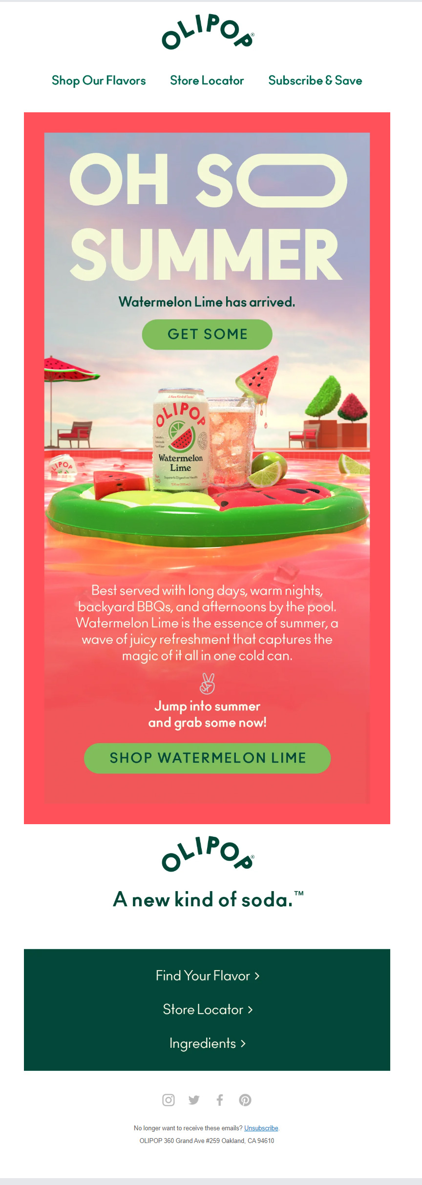
Subject line: The flavor of the Summer is here 🍉
One of the best ways to subtly underpin the appeal of the product you are showcasing is to paint the entire email in its shades; that’s pretty much what Olipop has done over here. It’s almost as if the sweetness, tanginess, and coolness of their Watermelon Lime has been made tangible for the readers; you’d agree?
The usage of a single-column layout further enhances the email’s appeal. Besides contributing to the aesthetic front, the single-column layout also makes this Olipop email template mobile-friendly and shields it from rendering issues often encountered with multi-column layouts, such as overlapping images, shifting columns, overflowing text, and the like. The email caps off with a host of important website links that are meant to give subscribers more information regarding both the product highlighted as well as the brand.
Uncommon Goods
Subject line: How to make summer more summer-y… summer-ish… summer-full…

Subscribers never appreciate emails that try to hard sell; it instantly puts them off, as a matter of fact. Instead, those that make an effort to deftly place their offerings against their customer’s USPs while also managing to justify their relevance to the season or occasion at hand always come up trumps. Uncommon Goods’ email is a pitch-perfect illustration of this.
Featuring one of the best summer email subject lines, this email never tries to sell; rather, it is crafted in the form of a how-to guide. Its main objective is to help its readers make the most of their summers. And with every tip shared, a product of theirs to help actualize the same has also been mentioned. This kind of subtle marketing always goes down well with customers. Uncommon Goods have relied on stunning images of their products here to do the talking rather than giving into verbose product descriptions; always a wise call. Although vertically indulgent, the clever use of white space makes this email extremely consumable and easy on the eyes.
For Love & Lemons
Subject line: SUMMER SOLSTICE VIBES
Style and substance drip from every single pore of this summer email by For Love & Lemons. An email that could easily qualify as a page of any avant-garde fashion magazine out there, For Love & Lemons leaves no stone unturned in luring their customers. The chic and suave design aesthetic is just one component of their appeal; we’d be absolutely remiss if we glossed over the ingenious manner of product showcasing here.
Presented in the form of testimonials, the offerings are displayed in all their glory, with their wearers putting forth persuasive use cases for them. If you want to make a style statement this summer but are not quite sure how to go about it, For Love & Lemons certainly projects themselves as an extremely capable guide for the same. The email footer contains the social media buttons and the unsubscribe link and encourages readers to sign up for the brand’s text communications.
Wrapping It Up
A hot pot of ideas brewing inside your head? Well, that’s certainly what we hoped to achieve through these stunning email inspirations. Goes without saying, of course, that this list is not exhaustive by any stretch of the imagination and that you should feel absolutely free to scour the internet to feed your imagination further. Stoke your creative tempers in every way possible and give rise to a campaign that will sweep your subscribers off their feet!


Rohan Kar
Latest posts by Rohan Kar (see all)
9 Vital Email Marketing KPIs You Must Track In 2023
Pocket Guide to Salesforce Einstein GPT: Everything You Wanted To Know About The World’s First Generative AI for CRM