Do you have a plan to ramp up your sales in the upcoming holiday buying season? People would be on a shopping spree in a couple of months and you have to make sure that you are ready with your promotional campaigns.
Uplers have come up with some really holy black Friday and cyber Monday email inspirations as a success mantra to develop a good email design for this holiday season.
1) Amazon
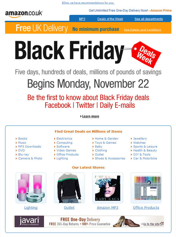 A neat looking Black Friday email by Amazon. The copy is loud and clear but the CTA could have been a bit more visible.
2) BBC America Shop
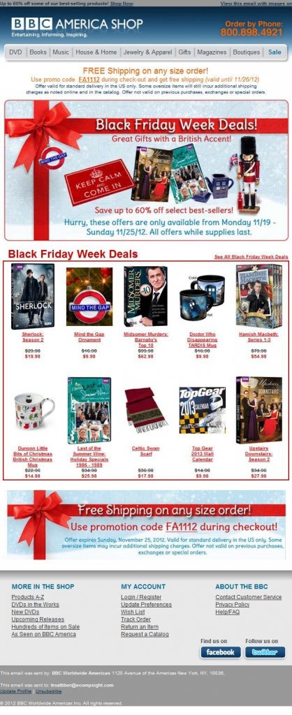 Red color ribbon has been used in the mailer by BBC America Shop to grab the reader’s attention backed with images and crisp CTAs.
3) Discovery Channel Store
 A chic design by Discovery Channel store with a nice blend of images and instigating copy to attract viewer’s attention.
4) H&M
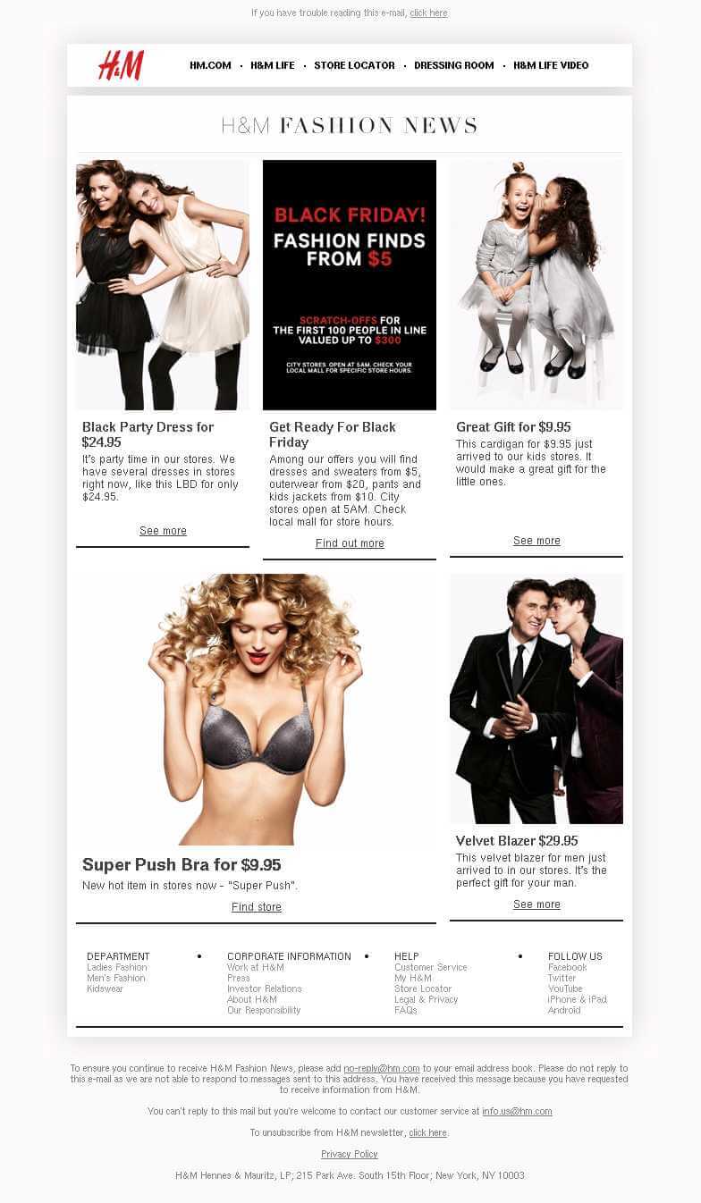 A good use of black and white theme in the Black Friday email by H&M. The offer is highlighted on a black background which will surely grab the eyeballs.
5) IKEA
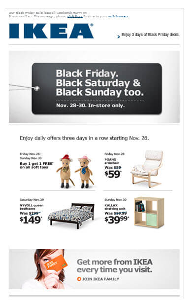 Simple email design by IKEA with a good use of white spaces. The Johnson box has been used well which will influence the receiver to open the email.
6) WayFair
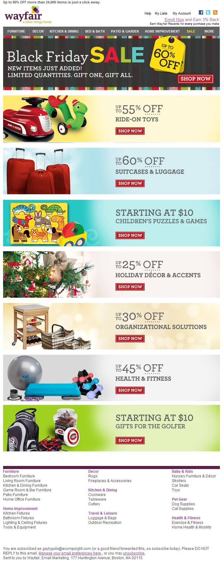 Good use of vibrant colors in the email by Wayfair supported with a crisp and precise copy. The CTAs are neat and to the point.
7) Best Buy
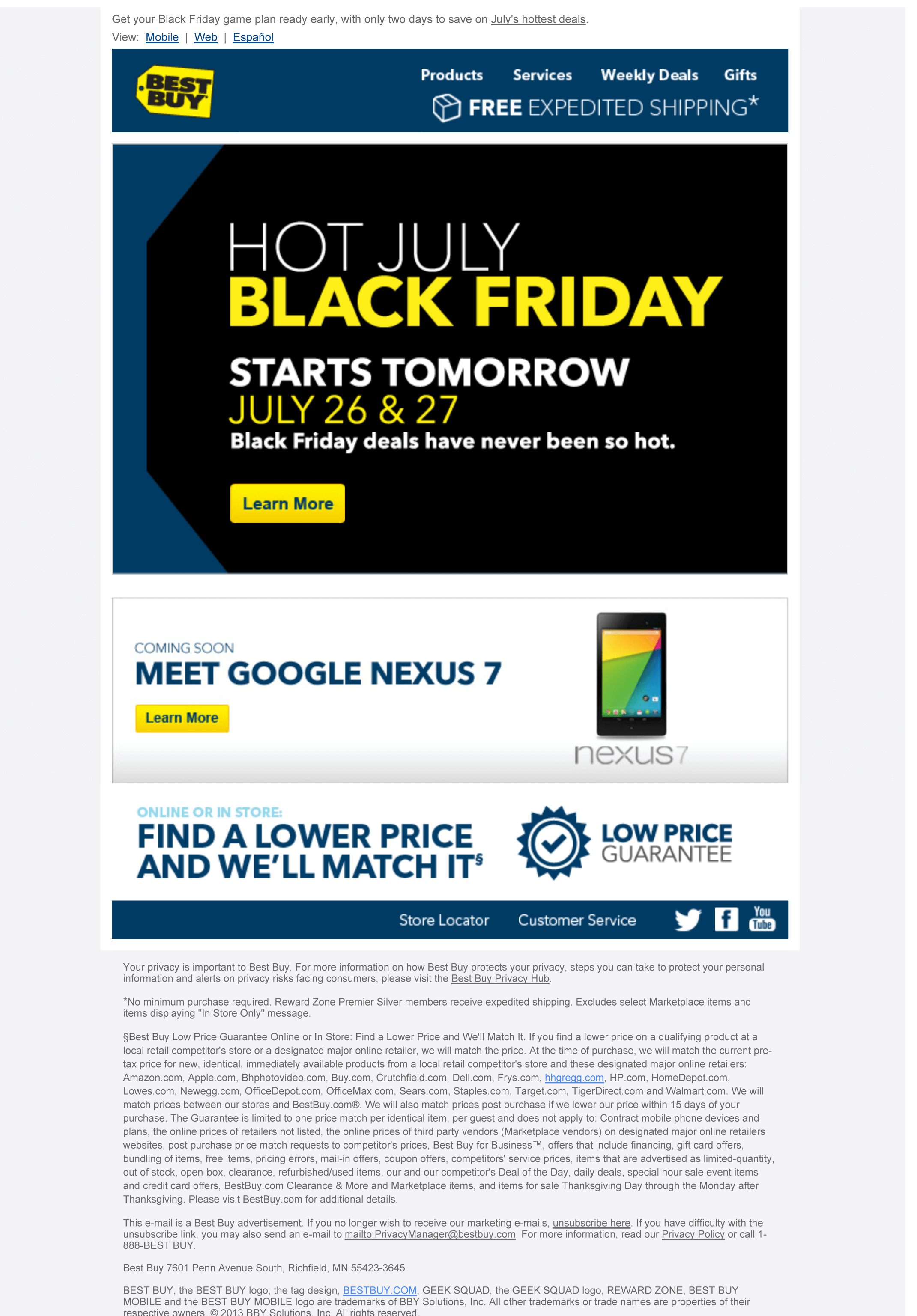 A perfect blend of black background and yellow fonts to highlight the offer backed with a simple yet effective CTA.
8) Samsung
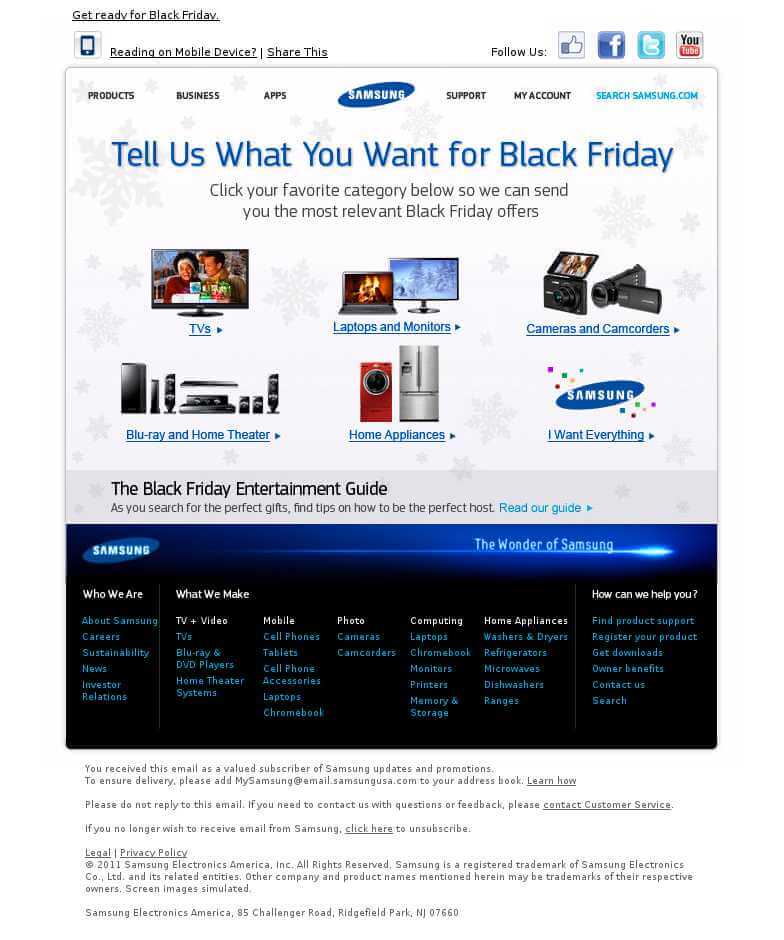 Samsung has stuck its color theme and a clean background to design the Black Friday email. The copy in the pre-header has been written wisely.
9) Sears
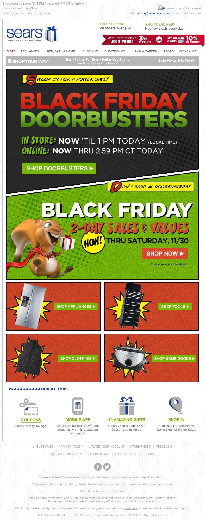 Composition of red and green color by Sears grabs attention instantly. Good use of white color to offer coupons and gifts.
10) Walmart
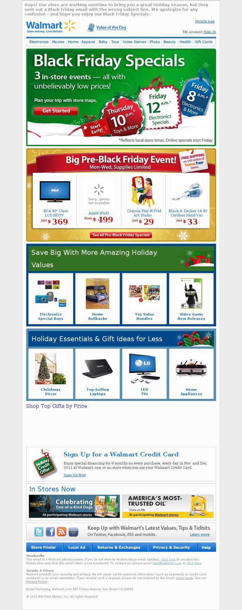 A well-thought-out email by Walmart for Black Friday. The copy is compelling, the CTA is crisp & specific, and self-explanatory.
11) Adidas
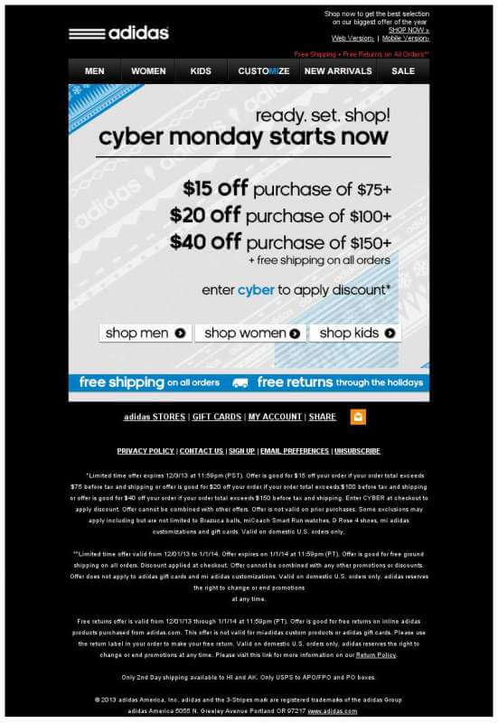 Adidas has wisely used the bright contrasting colors to design the Cyber Monday Email. A precise copy and a crisp CTA does the rest for them.
12) Amazon
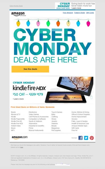
Amazon’s Cyber Monday email has a subtle yet effective design. White space has been used to perfection and the CTA is loud and clear.
13) Banana Republic
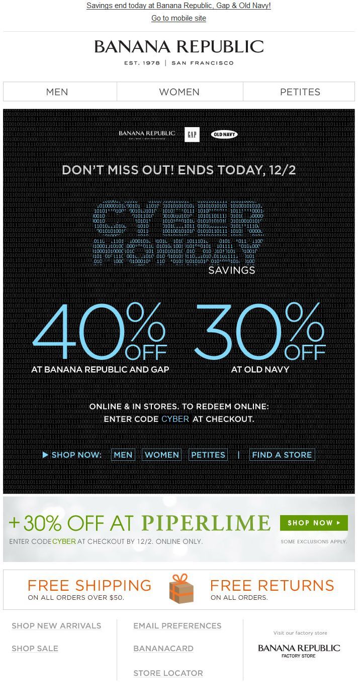 Loud and clear message about the discount with a black background by Banana Republic makes it impossible for the readers to miss.
14) Bloomingdale’s
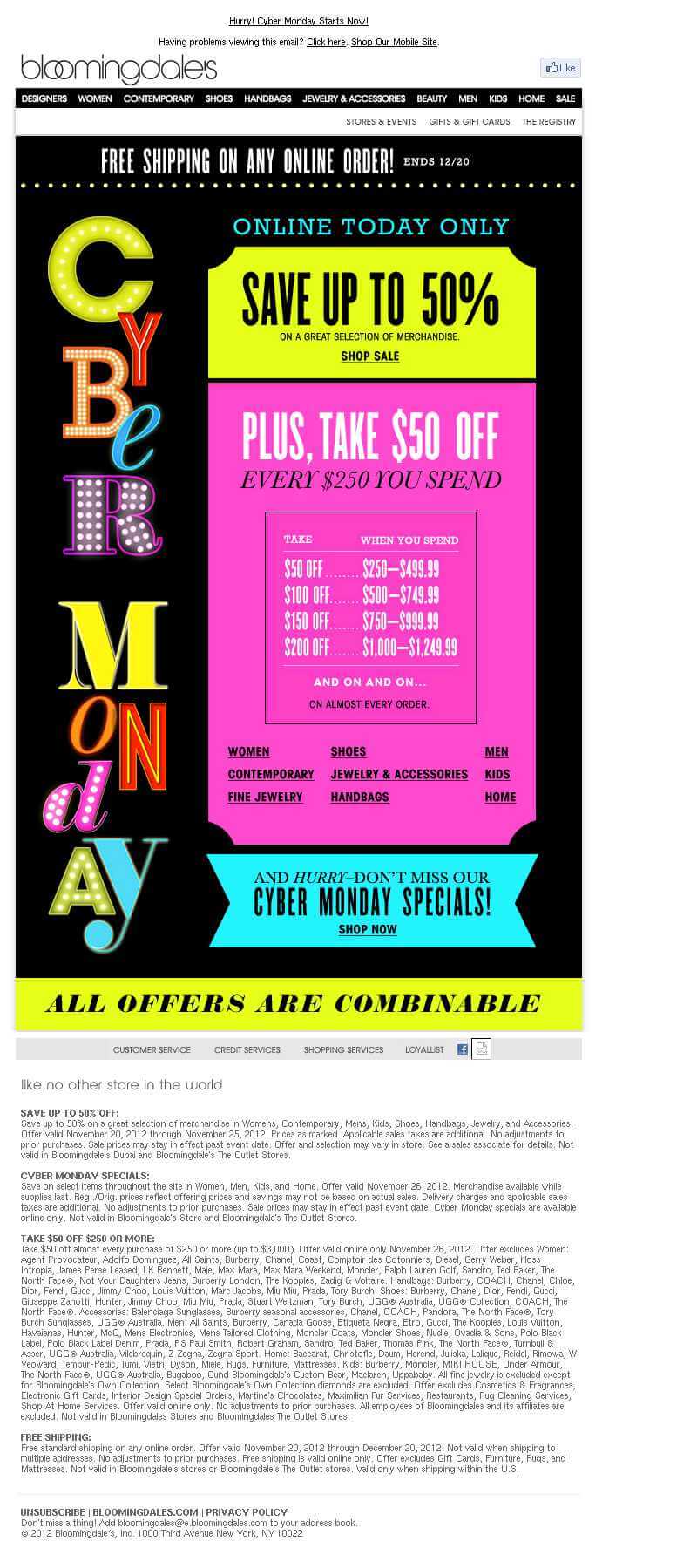 A chic email design by Bloomingdale’s backed with flamboyant colors. Perfectly placed CTA is an add-on.
15) Costco

Costco has designed Cyber Monday email with a different approach by showcasing a long list of products with their respective offers. The email looks too long and could have been shorter.
16) Dell
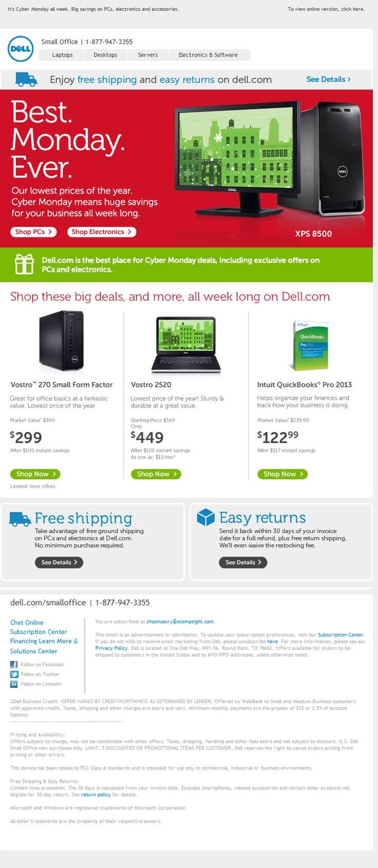
Good use of images and vibrant colors by Dell. The use of preview text has been done effectively and an accurate copy has been written.
17) Desigual
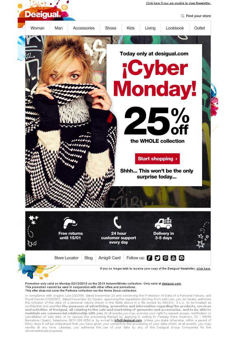
Desigual has used the background image to perfection by sticking to the theme of surprising the shoppers. The copy is short but effective for grabbing the readers’ attention.
18) Diesel

Diesel’s Cyber Monday email has been designed immaculately with a great implementation of animation. The offer has been placed right at the center and looks instigative and effective.
19) Macy’s
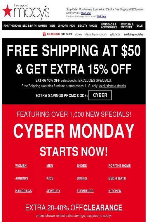
The Cyber Monday email by Macy’s has a simple design with an impressive use of white fonts on black & red background. The offer is loud to attain the CTRs.
20) Sears

A beautifully conceptualized email by SEARS surely grabs a lot of attention. Backed with a clean copy and CTA, the email gives the feel of a complete package.





Kevin George
Latest posts by Kevin George (see all)
Is “FOLD” hampering your design goals? Tips to consider!
Sending emails internationally? 6 tips to consider!