March 8th is right around the corner and it’s the perfect time to show the ‘women’ in your life how much they mean to you (apart from the other days that you do). Email marketers are gearing up in full swing to give you a grand experience this International Women’s Day, and they hope to gracefully flood your inbox with wonderful wishes and irresistible offers.
It’s been noted that, 88% of women say promotions have motivated them to subscribe for more email marketing updates, as compared to only 70% of men, and that women are more active when it comes to opening emails, clicking on links and subscribing for email updates.
No wonder, email marketers are so excited for this day!
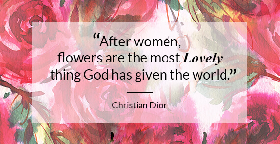
As the Uplers gear up to take you on a mythical tour through some of the best, inspirational email template examples on International Women’s Day, here’s a gorgeous quote to begin with.
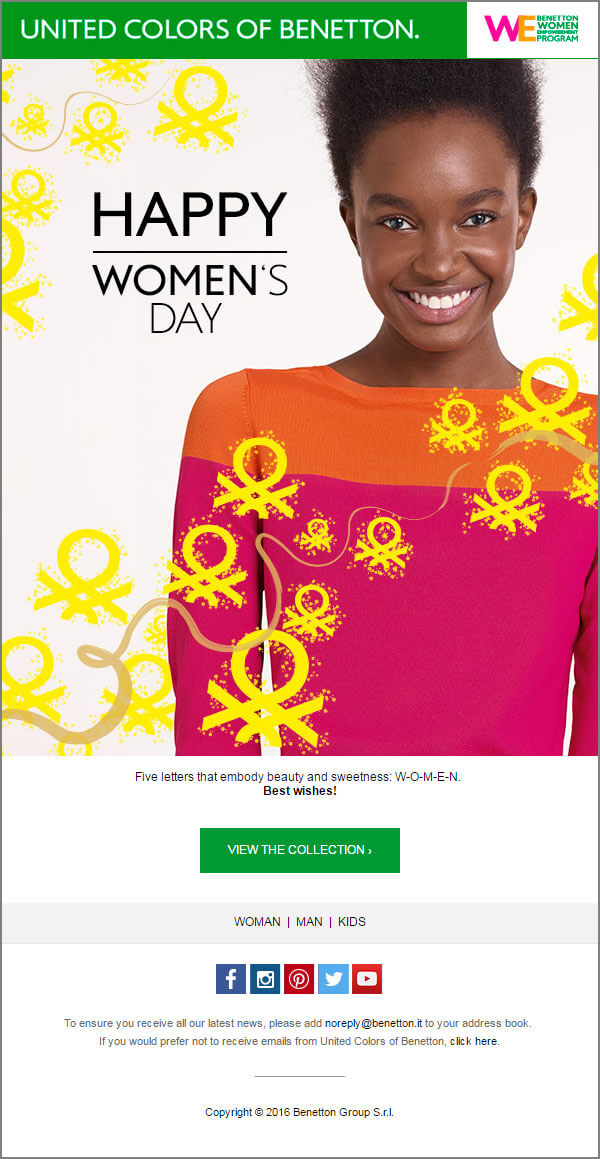
BRAND: UNITED COLORS OF BENETTON
- A simple and minimalistic email with a bright and peppy color theme.
- The CTA is standing out and is above the fold. So, it can be reached in a single
scroll. - Social sharing tabs are provided along with their email address.
- The ‘unsubscribe’ link is provided in a different way.
- A link to ‘view in browser’ is missing here, though having it is a safe bet.
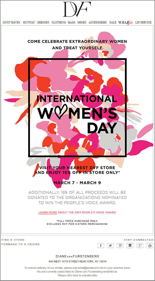
BRAND: DVF
- An offer is provided above the fold – right after the image wishing International Women’s Day.
- A smart CTA – inviting the customer to see the highlights of an event.
- The footer of the email is providing the social sharing tabs, the address and unsubscribe link.
- Social Icons are too small and could have been more attractive and bigger.
- Cross marketing by adding a link to find the physical store/s is provided.
- While custom fonts do enhance the appearance, it is advisable to provide an alt text in such cases. Because, if the images do not render, the campaign may fail.
- Navigation bar in the header is a plus point, It suits the theme.
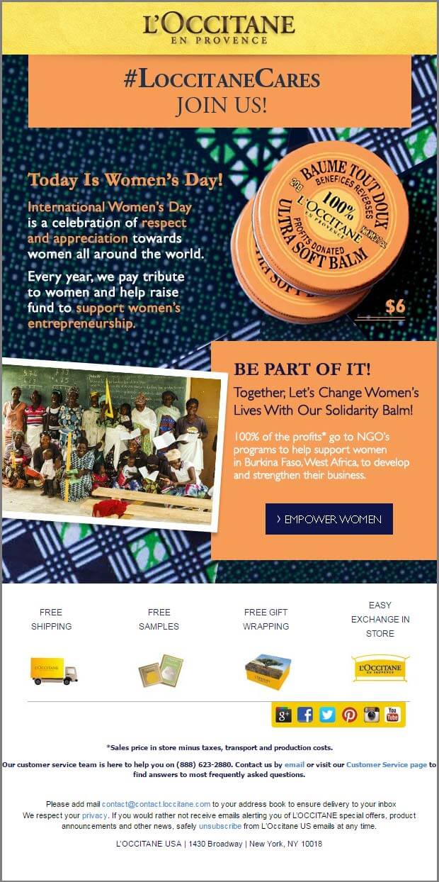
BRAND: L’OCCITANE
- The ‘view in browser’ link is missing, and in case the image is blocked the content won’t be visible.
- A clear bold CTA is provided
- Social Icons are clear and standing out.
- Email and Customer Service links at the bottom make it easier for the subscribers to reach out. Again, this improves click-through rates and enhances customer satisfaction.
BRAND: ZALORA
- There’s an attractive hero image with a catchy tagline.
- The CTA is provided above the fold along with a code enticing the customer to click.
- The email body has multiple CTAs directing to different landing pages.
- Social Icons at the bottom. (has a hashtag as well, which is #cool)
- Navigation Bar in the header is a good way to direct customers to different sections of the website.
- Unsubscribe link provided, which is a must in emails.
- Subscriber can access the account from within the email (My Account section).

BRAND: ZANDO
- The ‘view in browser’ link is provided right on the top of the email.
- The fonts and colors used along with the sketches are extremely appealing. It suits the theme, which here is the beauty of womanhood.
- The ‘15% off’ offer is right above the fold followed by a running CTA below the image.
- This improves the click-through rate, which in turn improves the overall email analytics.
- The USP of the website and its services is also provided in the header.
- Social icons in the footer help the subscribers reach out more easily.
- The ‘Discover More’ section can help generate leads.

Wrapping Up:
Women’s Day is one of the busiest times for marketers during March, and they would soon be swooning your inbox with captivating deals. It’s a great time for women around the world as they get brand perks and an awesome day dedicated just to them.




Kevin George
Latest posts by Kevin George (see all)
Mailchimp Editor's Advantage for Custom Templates
Avoid the (Spam) Trap! Things to look out in Email Design and Coding