Brands want their marketing campaigns to be the RMS Titanic, an engineering marvel, the very embodiment of sophistication, capable of arresting every gaze that is cast at it. But, thanks to history and James Cameron’s eponymous 1997 blockbuster, we all know how the story goes. A telling of the Titanic is incomplete without the mention of the baleful iceberg that brought about its unceremonious doom. Over time, the luxury ship and the iceberg have transcended their roles as historical entities to serve as metaphors- irrespective of how opulent your idea is, you must always take the effort to identify anything and everything that could potentially endanger it. Unless you do so, you’ll never be able to actualize it.
So, in the context of your marketing campaigns, who, or rather what, is the iceberg? Abandoned carts. At present, the average cart abandonment rate across industries stands at a headache-inducing 69.57%. Imagine the amount of lost sales that figure represents! And get this, among mobile users this figure shoots up to 85.65%. Wait, wait, don’t let that bead of sweat escape your forehead yet. These numbers are troubling, I know, but know that you can circumvent them. How, you ask? By crafting effective cart abandonment emails. Need help getting started with those? We’ve got you covered. Here, we round up some of the finest abandoned cart email examples out there to get your creative gears swinging in full flow. Eager to see what’s in store? Let’s go!
1. Hallenstein Brothers
Subject line: Need inspo? We’ve got a few suggestions.
One of the foremost things that experts will ask you to keep in mind while crafting cart abandonment emails is this: Make the abandoned product the hero of the email. Hallenstein Brothers, over here, have taken this directive to heart, which is what makes it rank among the most effective email template examples in this genre. Their cart abandonment email has just the one visual element- a resplendent image of the product accompanied by an equally dapper copy. If earlier you didn’t have any incentive to finish the purchase of this item, you certainly have one now. The overall minimalism of the email must be credited as well, for it helps the central message of the email come across, loud and clear.
2. Built for Athletes
Subject line: Are you still thinking about me?…
If your subject lines are effective, you can’t nudge your subscribers toward opening your emails, no matter how dazzling your content is. This holds true of all varieties of marketing emails, be it cart abandonment, product recommendation, re-engagement, or customer feedback. And if you’re wondering what a good abandoned cart email subject line sounds like, you don’t have to look further than this email by Built for Athletes.
Imagine, for a moment, that you are a visitor on their website. You browse through their products, shortlist a few, and add them to their cart. Then, for whatever reason, you fail to complete the purchase and eventually bounce from the page. A few hours later, you receive this email in your inbox, brandishing THIS subject line. Wouldn’t your curiosity be piqued?
Now, coming to the contents of the email. It contains a generous and quite an aesthetic visual of the abandoned product accompanied by a simple yet pretty compelling copy. Below this, the price has been highlighted too, lest the visitor should have forgotten it post exiting the site.
The CTA button hits all the right notes as well- the phrase is telling the readers what they’d accomplish upon clicking on it and its physical appearance curated as such to make it unambiguously prominent. I also like the fact that the “free shipping” nugget of information has also been clearly stated over here. It gives the buyer just that extra bit of incentive to go ahead with the purchase.
3. Vanity Planet
Subject line: Did this catch your eye?…👀
Right off the bat, one thing that I greatly appreciate about this cart abandonment email from Vanity Planet is that it hasn’t shed the brand’s design aesthetic, something that many brands do with their abandoned cart email campaigns. Businesses that tend to view these emails as mere reminders, and not an extension of their marketing or branding repertoire drive unenviable results from them.
What makes this particular cart abandonment email super effective is Vanity Planet’s decision to add social proof in it. As a buyer, few things are as incentivizing as a glowing review from another fellow buyer, you’d agree? The email also invites the readers to check out the brand’s best sellers and other special offerings. Additionally this email has that trait that all responsive email html templates do- a single-column layout.
4. Animed Direct
Subject line: Did you forget something?
Including an animation, even if it’s as simple as the one in this cart abandonment email by Animed Direct, in your hero section is an excellent means of grabbing customer attention. Any agency dabbling with professional email template design services will give you this bit of advice. Pair it with an incontestably adorable image as is the case here and you’re sure to attract your audience’s eyeballs left, right, and center.
In this case, Animed Direct hasn’t just reminded the customer of their abandoned cart. They have also extended a helping hand in an attempt to understand if there are any obstacles in their checkout experience which is potentially keeping their visitors from finishing their transactions. Quite a clever move, if you ask me.
5. Pottery Barn
Subject line: ✨ A reminder about what you left in your cart ✨ (Plus, up to 40% off inside.)
Besides doing the obvious, Pottery Barn’s cart abandonment subject line contains additional information regarding the email’s content too. Now, some might deem it unnecessary, citing that this manoeuvre could end up distracting the readers, but I’m quite in favor of this. I’m a huge fan of setting expectations and that’s all Pottery Barn have done over here. If the cart abandonment email has a sale announcement, I’d much rather you apprise me of it in the subject line itself than spring it on me, first thing, as I open the email.
Now, let’s shift our attention to what’s inside the email. The contents check all the right boxes- the spotlight is on the abandoned products, the copy is crisp and compelling, and there’s also an attempt at instilling an emergency in the subscriber’s mind.
6. The Great Jones
Subject line: This The Starting Lineup belongs in your kitchen

There’s just something irresistibly charming about good wordplay, isn’t it? The header in The Great Jones’ abandoned cart email is a perfect testimony of that. Other than this, there are two other features here that are absolute standouts for me.
1. There’s an explicit mention of the business no-return’s policy. This is priceless messaging and goes a long way toward earning the trust of your customers.
2.The social proof section here doesn’t use reviews by customers but those by reputable publications, thereby boosting the brand’s credibility by leaps and bounds.
7. Uncommon Goods
Subject line: I’m almost yours…

The faux-emotional question posed by Uncommon Goods here is just the kind of simplistic humor you’d want to incorporate into your cart abandonment email to earn some very handy brownie points from your subscribers. Apart from highlighting the item in the abandoned cart, Uncommon Goods has also served up some product recommendations based on it. Pretty smart, right?
8. taylorstitch
Subject line: Leave something behind?
If you had temporarily lost sight of just how vital email list segmentation is, let this email from taylorstitch serve as a timely reminder. The first line of this email is sufficient to tell you that this cart abandonment email is crafted explicitly for first-time visitors. The subsequent content of the email is crafted accordingly, aimed at demystifying features that could confuse new buyers. Here, too, the email contains recommendations centred around the item in the customer’s cart.
Even though this email has relatively more text compared to the other entries on this list, it’s still not tiring to look at because the spacing between consecutive paragraphs is on-point. Besides that, every element in this email has ample breathing space around it, further enhancing its appeal. The font used here is Arial- a bonafide web-safe font. Both the manage preferences and unsubscribe links have been clearly highlighted in the email footer.
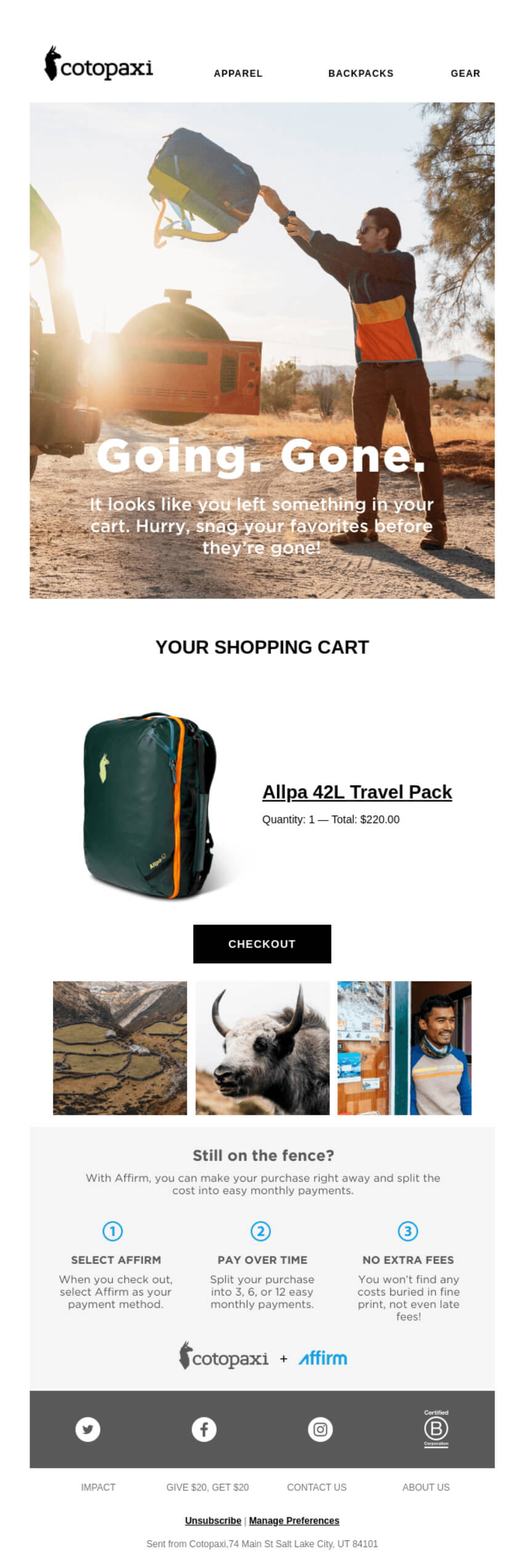
9. Cotopaxi
Subject line: Don’t Leave A Good Cart Behind…
Wondering what you can do with your cart abandonment email’s hero section to drive maximum impact? Create a sense of emergency, much like Cotopaxi has done over here (special props to the photograph as well, it’s just so arrestingly chic, isn’t it?). One of my favorite parts of this email is how deftly Cotopaxi has leveraged their brand partnership. In succinct steps, they’ve illustrated to their buyers how using “Affirm” can significantly easen their purchasing.
10. The Sunday Collective
Subject line: Quality Over Quantity
Brands adopt various measures when it comes to offering incentives in their cart abandonment emails- free shipping, social proof, or monetary discount. But, I quite like the route The Sunday Collective has taken over here- establishing the brand vision. After all, if you don’t endorse the brand’s value system, would you ever consider engaging with them? By casting the spotlight on their mission statement, The Sunday Collective is effectively giving their subscribers a glimpse of the kind of community that awaits them should they choose to hop on their bandwagon.
On the design front, the layout is absolutely clutter-free. This is on account of The Sunday Collective making ample use of white space. That, coupled with the superb text-to-image ratio of this email makes it visually pleasing and highly engaging. The unsubscribe link in the email can be easily spotted too.
Wrapping It Up
Designing the ideal abandoned cart email is no child’s play, certainly. However, I hope the email template examples shared above will fill you with ideas aplenty to recover your lost sales!


Rohan Kar
Latest posts by Rohan Kar (see all)
5 Powerful Reasons to Outsource your SFMC Campaigns in 2023
6 Factors to Consider While Hiring Dedicated Email Resources