
As an email designer, you’d agree there’s plenty to learn from the various disciplines that work closely with email. One such field is that of web development. When it came to adapting to the incredibly dynamic world of digital design, the lot of web designers were much more proactive than their email counterparts. Especially when the matter of responsive design was concerned, email lagged eons behind web. It wasn’t until 2016 when Gmail announced that it would now support embedded CSS and media queries that email contributed to the dialog for the first time.
Now, email folks might be late to the party, but that doesn’t mean they have to miss out. Come to think of it, we now have two decades worth of precious insights, mined by web developers, at our disposal to create ripples in the email landscape. In this article, we will discuss a host of modern design ideas and lessons that email designers can pick up from web developers. Curious already? Read on to find out!
Creating Responsive Email Design For Mobile
As many as 41.6% of all emails are read on a mobile device. Therefore, it has become imperative for businesses to focus as much on getting their emails and newsletters to display optimally on mobile devices as they would for webmail and desktop platforms. In fact, most industry experts will ask you to adopt a mobile-first approach when sitting down to design your emails. This is because if your messages look good in a mobile view, they will most certainly hold their own on desktop and tablets.
Earlier, email design used to be increasingly content-centric. And while design still revolves a lot around content, the advent of responsive design has resulted in the experience of the reader being factored into the equation as well. The goal, now, is to make the content both presentable and accessible. Responsive design requires email designers to resolve issues pertaining to aspect ratios, optimize contact buttons and links for engagement, and ensure that no element and module of the email gets warped or cut off, irrespective of the device.
By practicing responsive email design, brands can ensure that their communication adapts appropriately to the screen sizes and the resolutions of all the devices it is going to be potentially read on. This is where email designers need to pick up a trick or two from the book of web folks.
What most web developers do, is create three different wireframes for a particular website- one each for mobile, desktop, and tablets. Email designers can do the same for each of their email templates. Once they have the different wireframes in place, the next thing would be to dictate the rendering of the layout based on features such as screen size. This they can do with the help of media queries. But, not all email clients support media queries. For such clients, you’ll have to make certain adjustments to your code to obtain a centered and responsive design.
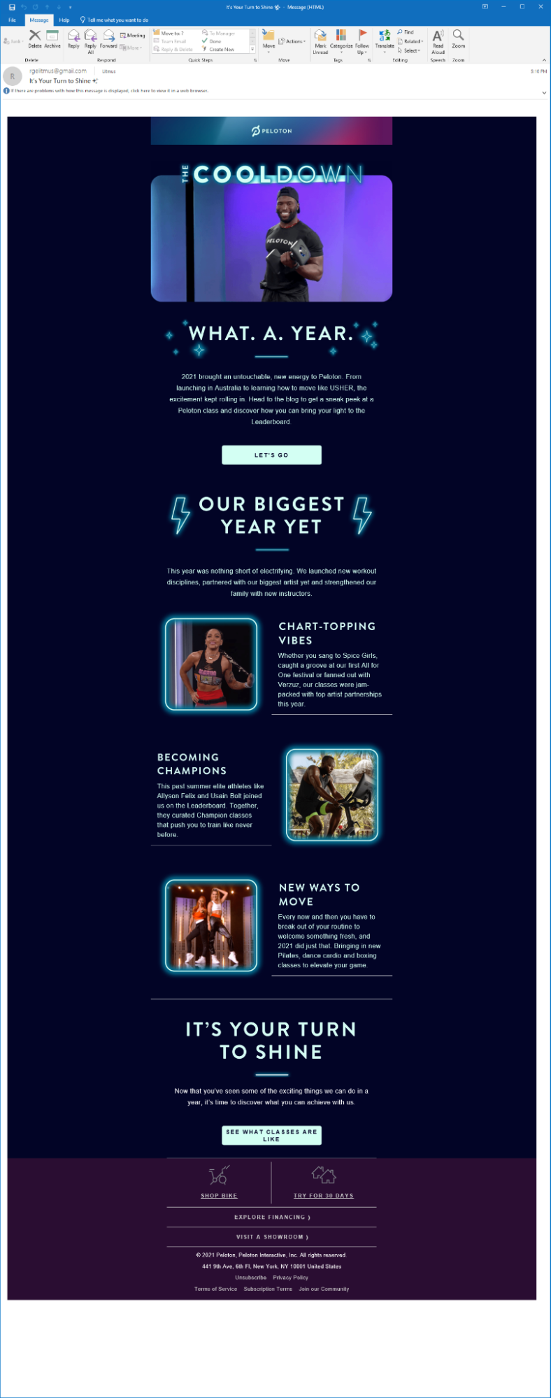
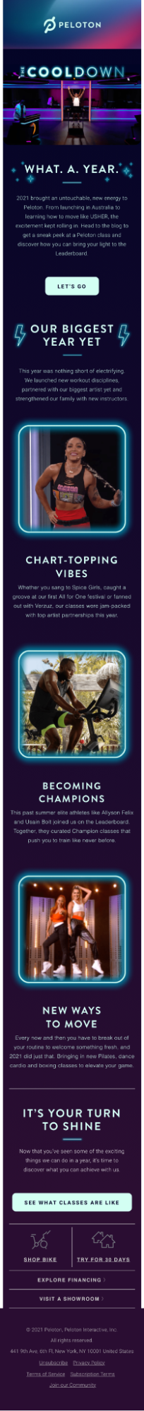
This email from Peloton illustrates how a responsive email design renders across desktop and mobile.
Desktop view:
Mobile view:
Prioritizing Readability
The first thing that web developers prioritize when creating the mobile version of a website is readability. And they do so by attempting to keep the design as simple as possible.
While multiple columns, design elements, and creative fonts indeed elevate a website’s visual appeal, they can also prove to be uncomfortable for users who are navigating it on the smaller screen of their mobile devices. The same goes for emails as well. So, what can you do to keep the design simple yet effective? Take a look.
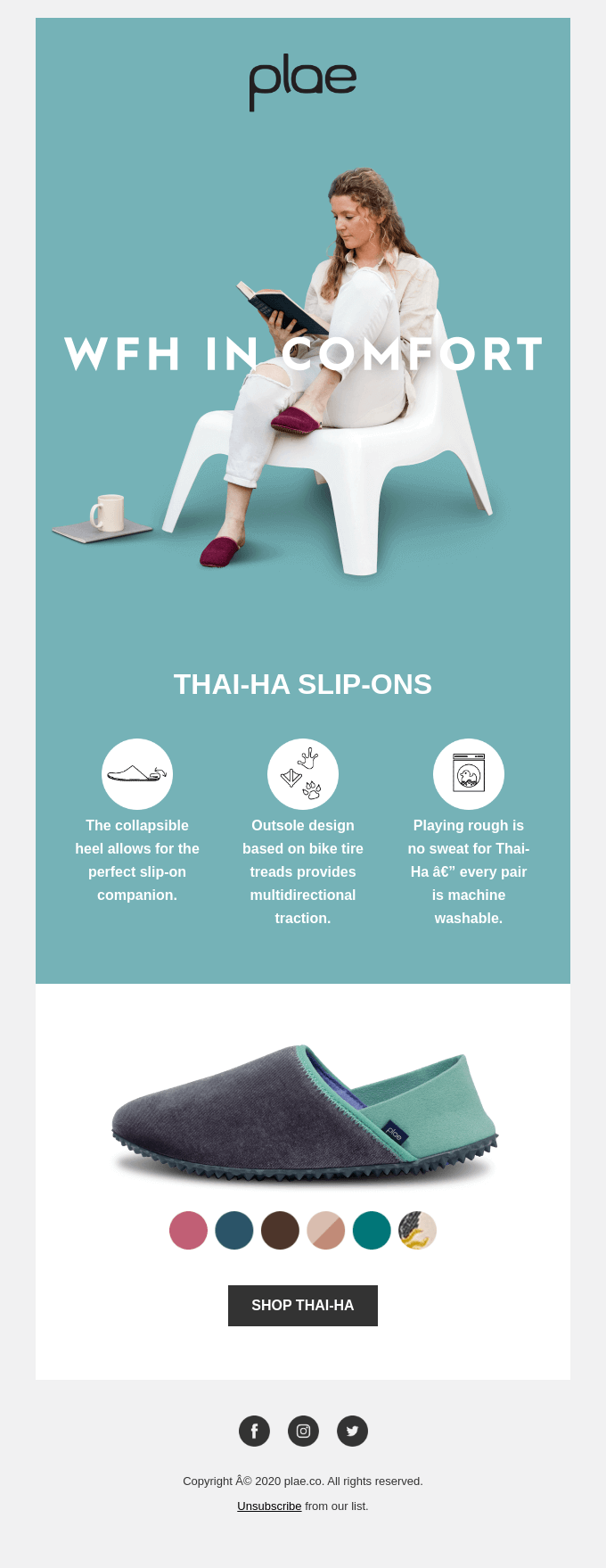
- Use single-column layouts: A surefire way of improving the readability of your email template on mobile devices is by using single-column layouts. Since they use a solitary table in HTML code, the email content optimizes itself for all screen sizes. Additionally, these layouts have a fixed order and hierarchy, which lets designers guide readers toward taking a specific action. Besides, the singular flow of information in a single-column layout eliminates the need for zooming in or scrolling side-to-side on a mobile device, thereby delivering a better user experience. What’s more, using single-column layouts is an email accessibility best practice as well. They limit the possibility of assistive tools such as screen readers interpreting the content in the wrong order.
Take a look at this example from PLAE.
- Keep the design neat: Given that the viewable area of mobile screens is limited, to begin with, try to keep your email designs free from visual clutter to the best of your abilities. Remove any image, illustration, and design element that you feel does not complement the text or add to your email’s overall message. Another design maneuver that can render a neat appearance to your emails is the smart usage of negative space. For instance, you could use negative space to separate the various segments in your email than dividers. The use of negative space provides visual relief, thereby enhancing readability. Similarly, typography also goes a long way towards reducing visual clutter. Using various font styles and typefaces with no good reason is strongly discouraged. Select a font that goes well with your brand image and ensure that it renders well across all clients.
Ritual’s email designs are as neat as they get.

- Be wise with colors: Colors make your emails livelier, no doubt, but in the absence of caution, they can make your emails very difficult to engage with. No, we’re not asking you to shun bright and funky shades in favor of a monochrome palette; we’re simply asking you not to go overboard with your colors. Besides spoiling the visual aesthetic of your template, unpleasant color combinations can also cause difficulties for your visually impaired subscribers. Colors are a great medium of subliminal messaging, and different colors evoke different emotions in the readers- purple for royalty, blue for reliability, green for tranquility, yellow for creativity and positivity, black for authority and elegance, and the like. Hence, choose a color you think best encapsulates your brand identity and use it to heighten the appeal of your messages
Take a look at how Headspace uses the color yellow to their advantage in their emails.

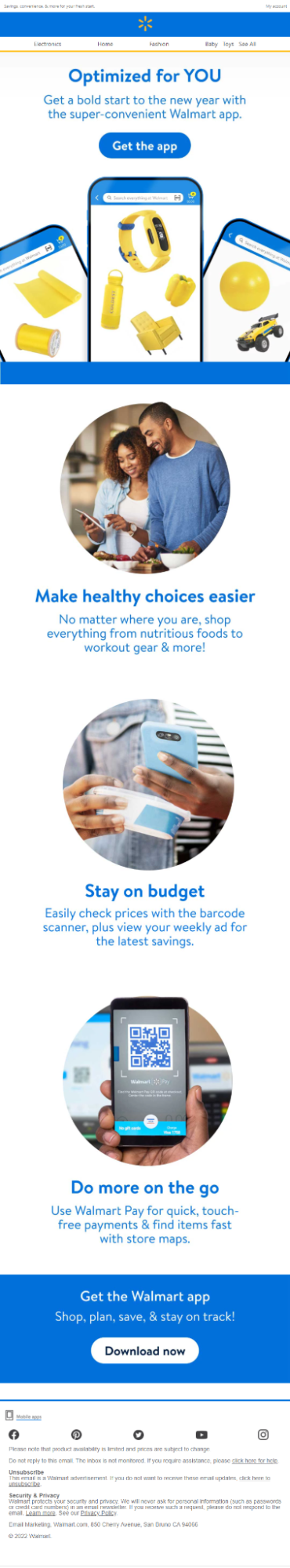
- Use a single CTA (call-to-action) button: If you want your design to amplify your conversions, it is important that you provide clarity to your readers by including only a single CTA button in your emails. Asking the readers to choose from multiple buttons can create confusion in their minds; this way, they know exactly what to do once they’re finished parsing through your email content. Additionally, ensure that the button is large and prominent and that it contrasts sharply against the background. Never keep a hyperlinked text as your CTA. On a mobile device, a button is, any day, easier to interact with compared to hyperlinked text.
This email from Walmart perfectly illustrates how you should go about your CTA button.
Sticking to Conventionality
Although web developers are continuously brainstorming to make their websites look and feel as original as possible, you would observe that there are certain conventional elements they don’t tamper with under any circumstances. These elements include placing the logo at the top, ensuring that clicking on the logo redirects to the home page, including buttons that change colors when the cursor is placed upon them, and the like. Sticking to such conventionality is important because it makes visitors feel comfortable while navigating the website. Subsequently, this lends credibility to the business. Even in email, certain conventional practices such as placing the logo at the top, providing contact information in the email footer, and keeping the social media icons clickable must be observed at all times.
Implementing visual hierarchy
The best web developers out there focus religiously on incorporating visual hierarchy- arranging their website elements in a manner such that the visitor’s attention automatically gets drawn towards the most important portions. Along with delivering a smooth navigation experience, websites that contain visual hierarchy are successful in leading the users to take a desired action. Likewise, implementing visual hierarchy in emails can help your CTAs grab eyeballs more effectively and amplify your conversions in the process.

Tackling with text-heavy emails
While the attempt always is to keep emails as economical on words as possible, it becomes rather impossible to do so on a few occasions. So, what can you do? Use a technique known as “progressive disclosure” among web folks. It is the practice of hiding certain text segments under interactive elements. As a result, you’re able to both prevent visual clutter and convey all the information you want to.
Using text overlay on images
Typical, when email designers have to overlay text on images, what they do is create a separate graphic of the image and the overlaid text and put that in the template. The con with this approach is that the designer has to create different graphics for each device wireframe. A good workaround, and one practiced by web developers, is creating text overlays using live text and a background image. This way, the overlaid text scales and automatically fits for each device, eliminating rendering issues in the process.
Using heatmaps
Web designers use heatmaps to understand the manner in which visitors are navigating the website. Since heatmaps track the user’s mouse movements, they help you identify the areas on your website that are garnering the most attention. Subsequently, these insights help the designers to optimize the placement of the CTA button, remove design elements that are attracting no interest, and make the navigation more intuitive for the user. Similarly, heatmaps in email could help email designers visualize where readers are clicking on their email. As a result, you can identify your most popular links and take cues from their positioning to accordingly place important information in your future campaigns.
Wrapping It Up
Email designers only stand to enrichen their design capabilities by walking in the footsteps of their web counterparts. With the above tricks in your kitty now, we are sure that all of your future email campaigns will become responsive and more breathtaking and conversion-friendly than what they already were!
Rohan Kar
Latest posts by Rohan Kar (see all)
The Metamorphosis of Banner Ads and Trends to Look For in 2022
B2C Email Marketing Tips For Standout Success