Email designers and coders put their heart and soul to build and create a beautiful email design that looks wonderful in the inboxes and appeal to the subscribers too. However, in this process of wooing subscribers email designers and coders face several technical and non-technical issues. One of the technical issues faced by the email coders is adjusting 3 columns in mobile.
The Problem….
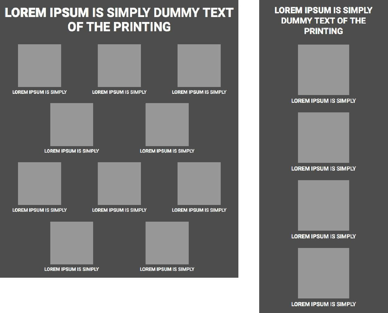
In this article, Uplers will show you a simple way of overcoming the hassle of arranging 3 column designs on mobile. We are aware that columns are created in the desktop design so the height of the email can be reduced. But the same has negative effect for the mobile users. On mobile, all the columns stack one after another, and the 3 columns become bunch of big blocks arranged one after another increasing the height of the email. An example of that can be seen below:

Whenever there are 3 columns in an email, and are as coded using tables, stacking them one below another is the option. Normally three columns (3×1) are stacked into one column (1×3). This increases the length of your email in mobile leading to more scroll for viewing all three images too.
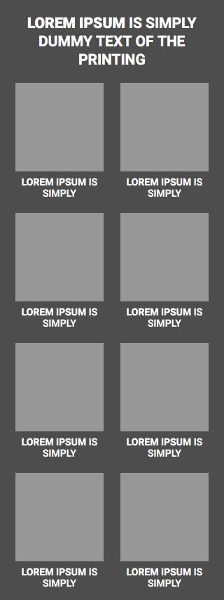
If the numbers of products are more like 6 products or 9 products stacking one product per column, in mobile it is too lengthy and not recommendable. Alternative is that we create 2×3 block in mobile that would still keep all text and images readable. But then creating 2×3 blocks usually lead to coding the 3rd block twice, one for mobile and one for desktop.
Thereby dual coding has to be applied, considering tables coding in line would lead to create problems in some of the older email clients like Lotus, Outlook 2003 etc.
To remove this limitation we have come up with the solution of arranging the 3 columns layout for desktop to 2 columns layout for mobile with 100% compatibility. Though this will not save the length of the email, it will eliminate the reasons of hiding the content on mobile.
Solution:
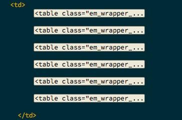
To accomplish this, we must code all the columns within one single TD with left alignment.

All the columns must be coded as TABLE with left align of each other, with the required width. Then, all the columns must be set to 50% width for smaller devices within the media-queries. This will allow the two tables with 50% width to automatically set after each other.

Coding the columns side-by-side will however create an alignment issue with Outlook 2007, 10, 13 and Lotus. You are here required to have the hack for these two. Creating the layout structure of this way would save up many scrolls on smaller screens.
By applying this solution, three columns in email for mobile users can be achieved without any hassle. However, many email marketers struggle while applying this optimum solution. This is when Uplers can come to your rescue. Contact us to gain more insights about it.


Kevin George
Latest posts by Kevin George (see all)
Top 10 Awe-inspiring Transactional Emails Subscribers Love
Email Marketing – Enhancing Your Omnichannel Experience