
If there is one metric that can single-handedly dictate the success of an email marketing campaign, it is conversions. And nothing impacts conversions more than CTAs. Whether you believe it or not, colors play an indispensable role in the email body. And when it comes to CTAs, colors can highly influence the number of clicks an email gathers.
The click-through rate of emails is inversely proportional to the average time it takes for a visitor to understand and take action. It means that the more confused they get, the lesser your click-through rates will be. That is why you need to ensure that your email’s CTA buttons are adequately accessible so that you can cater to the maximum possible traffic.
Here’s a look at 7 essential color elements you need to look into when designing your CTA button:
1. Lightness and Saturation
A lighter color is usually less effective than a darker one, but it’s not the only thing that counts. When you go too much on the lighter side, there’s a chance that prospects will have a hard time spotting your buttons. Too much saturation will likely make your CTA blend with the rest of the template, potentially decreasing its visibility.
In general, it’s a safe bet to take the saturation down a notch or two from what you might think is “best” for this button color.
2. Contrast
The Go-to Theory: You want to have your CTAs stand out against the rest of your email body. It usually translates to opting for a darker CTA on a lighter background, or vice versa.
The Reality: It’s not quite as simple as that. While you’ll often have no problem picking contrasting colors that are attention-grabbing, they can sometimes come off as abrasive and annoying – not inviting at all.
What you should do instead: A/B test out your email CTAs against its surroundings, but avoid making them too jarring. What’s more effective is picking colors in the same color scheme as your template – just with different brightness and saturation levels.
3. Intrinsic Coolness or Warmth
Cool colors are generally associated with depth, while warm ones are linked to energy. This means that cool colors will bring a sense of calmness and tranquillity, while warmer ones tend to be more invigorating. Your choice should depend on your:
- product or service
- email marketing message
- the goal of the CTA (or campaign)
For example, you might want to go with the warm ones if your product or service is aimed at businessmen with lots of energy. But if you cater primarily to women, you’ll likely want to go for the calming colors.
4. Natural vs. Unnatural
Color theory is a science, but some aspects of it can’t be fully explained by science yet.
One known aspect is the “most natural” choice for specific colors or situations – what people tend to go with when they have no other basis for their decision-making process. All you can do is go by instinct here, and that’s probably the best advice we can give you.
There are also times when certain colors or situations will make people feel like they’re in a dreamlike state, or even have them recall their childhood memories. If you wish to create an emotional connection with your email prospects, this is something you’ll want to consider.
5. Cultural Associations
In most cultures, warm colors are more noticeable and tend to pop out against a white backdrop – which is the case for most websites. However, some cultures value different color schemes. For instance, in China, warm/red colors tend to be prominent and used to draw attention. If your email CTA is global, ensure that you understand how varying cultures perceive colors differently.
6. Personal Preferences
Some people are drawn to colors commonly associated with their personalities – for instance, someone who’s lively is also more likely to hop on the bandwagon of warmer colors. You can run several tests to know which color is best suited for your CTA button. Don’t be surprised if it changes constantly depending on your email campaign.
7. First- and Second-Level Contrast
You also want to make sure that your primary CTA stands out from other CTAs in the email body. In other words, it needs to have a different color from the other calls to action in order not to be confused with them. Otherwise, this can decrease conversions.
Many times, the only way to ensure unique CTAs will be to use complete contrast – which can become annoying and distracting.
If your email has multiple CTAs, try and keep them in the same color scheme and give each one a distinguishing element (such as text). For example, if most buttons are blue, make your CTA red with something like “Free Shipping” in white text.

Impact of Individual Colors In CTAs
Many colors can be used with a call-to-action, but not all individual colors have the same impact.
Your choice of color for your CTA button will have an impact on conversions because of three main factors:
- How it matches with other design elements
- How your target audience perceives it
- How it differentiates itself from other buttons on the email template
Let’s look at the different colors that you can use and what they psychologically represent:
1. Blue
Blue is associated with stability, trustworthiness, confidence, intelligence, faithfulness, and coldness.
Blue can help convey a sense of professionalism or luxury in marketing since it is strongly associated with the corporate market. It’s also used for financial services because it represents wealth. In the same way, it can be used for eCommerce emails or any other service that people perceive as ‘high-class’.
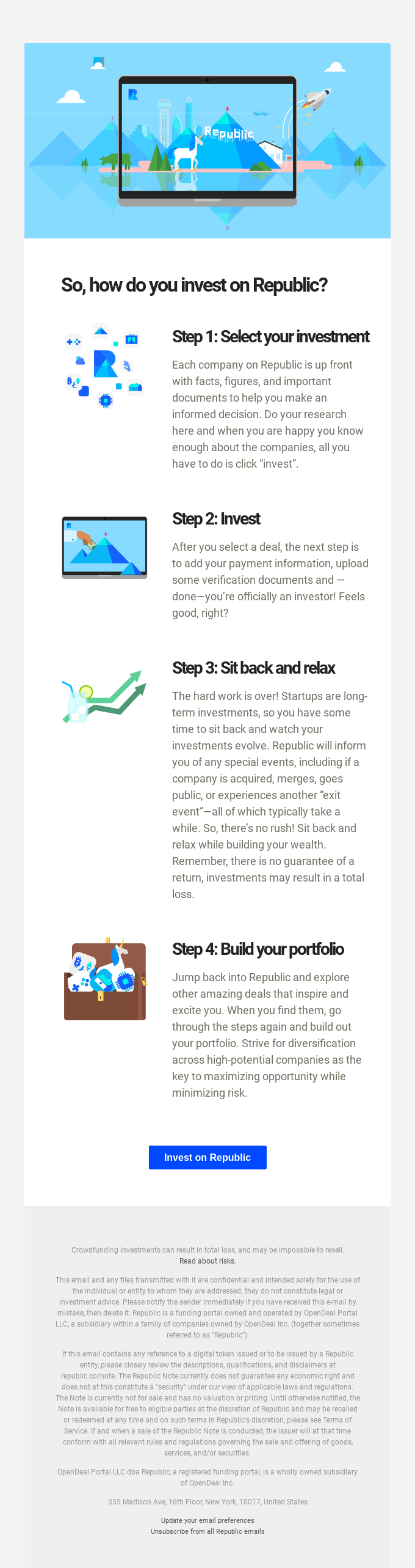
Republic showcases an excellent example of how to deploy blue CTAs. They use a single blue CTA in the email body in a way that does not feel intrusive, blends well with the email template, but still stands apart.
2. Green
Green is associated with growth, nature, fertility, freshness, luck, springtime, and environmental awareness and responsibility.
It is very popular in eCommerce because it’s associated with money. It can also be used to represent health and wellness, so green is often seen for food or dieting products.

For example, Product Disrupt uses green CTAs to impart trust and cut through a relatively loud design template. As you can see, the Green CTAs stand out, enticing users towards more clicks.
3. Orange
Orange is associated with energy, happiness, cheerfulness, sunshine, autumn, creativity, and determination.
This color works well for call-to-action buttons because of its association with warmth. It is also used for marketing services because it has a young, fresh feel to it.

The best example here is that of Hestan, who uses orange CTAs extensively in his emails. Notice how the orange color blends naturally with the backdrop while also imparting a vibrant, premium aura.
4. Pink
Pink is associated with love, romance, joyfulness, and the feminine side. For this reason, it is often used to convey a sense of sweetness and feminine strength.
It’s suitable for call-to-action buttons because it also has a gentle association with being approachable. If you’re targeting female shoppers for an eCommerce shop, pink can be great to use as your CTA button color because it will be seen as more inviting to women.

HUM Nutrition prefers using a pink CTA in almost all their emails. It is their brand color, and it also brings a sense of joy and sweetness, pushing the subscriber to take action.
5. Purple
Purple is generally associated with luxury, royalty, wisdom, and the supernatural. This color works well in eCommerce emails because of its association with quality goods and sophistication – it’s a pricey color in clothing stores. In the same way, purple can be used if you’re offering a product or service that your customers want to feel exclusive about.

For example, Headspace uses purple CTAs in its email quite well. They stand out from the other elements on the page, and the overall color philosophy leverages purple to reinforce that it is a high-value tool.
6. Black
Black is associated with power, elegance, and formality – making it a good choice for your CTA if you’re targeting professionals or in a B2B scenario. It’s also the color of luxury goods because black makes things appear more valuable.

Flodesk does this well in their email with a secondary Black CTA at the end that provides a perfect contrast to the background. It also compliments the power statement that missing out on the offer can be detrimental to marketing revenues.

Conclusion
Now that you know the different colors that can be used with a call-to-action, it’s important to consider which will impact your target audience the most. First, keep in mind how each color is associated with different emotions and feelings, then use this information to create a CTA button that stands out in your email and encourages conversions.
Kevin George
Latest posts by Kevin George (see all)
Benefits of Outsourcing Email Template Production vs. Hiring In-house Developers
Four SFMC Email Marketing Trends to Look Out for in 2022