As an email marketing agency, we design and code hundreds of, and almost all kinds of, templates for our clients throughout the year.
But it’s one thing to fetch ideas off a furnished vision board, quite another to come up with a vision yourself, for your own brand, and quickly, too. We face this challenge every year. Because, let’s be honest, it’s hard to come up with good ideas all the time.
Brainstorming sessions? Check. Coffee? Check. And you still got nothing. Blanking out is not an option. In crisis moments such as these, the best thing often is to look outside.
For ideas, for inspiration, and for motivation. It has been one of our go-to approaches, and we’re delighted to inform you it works.
Why? Well, originality is rarely not derived. Being inspired is just being reminded and informed on a higher level. Once we have the necessary, relevant information, we can put it to great use to create fascinating, original templates.
So, if you’re facing the same challenges, it should work for you as well. Easter’s around the corner. To help you get started with Easter marketing campaigns this year, we’re sharing 9 truly inspiring Easter templates.
1. BakeDeco/Kerekes
If you have great products, you have all the inspiration you need. BakeDeco’s truly beautiful Easter email is hard to take your eyes off.
The viewer is only too happy to scroll through the email since it’s great photography. Because of the simple, restrained text, virtually nothing distracts you from enjoying the pics.
You also don’t need fancy CTA buttons if you are offering such a nice experience through images. Only make sure they are clickable and functional.
Pro Tip: Prioritize good photography. It’s non-negotiable for image-based emails.
2. Candy Funhouse
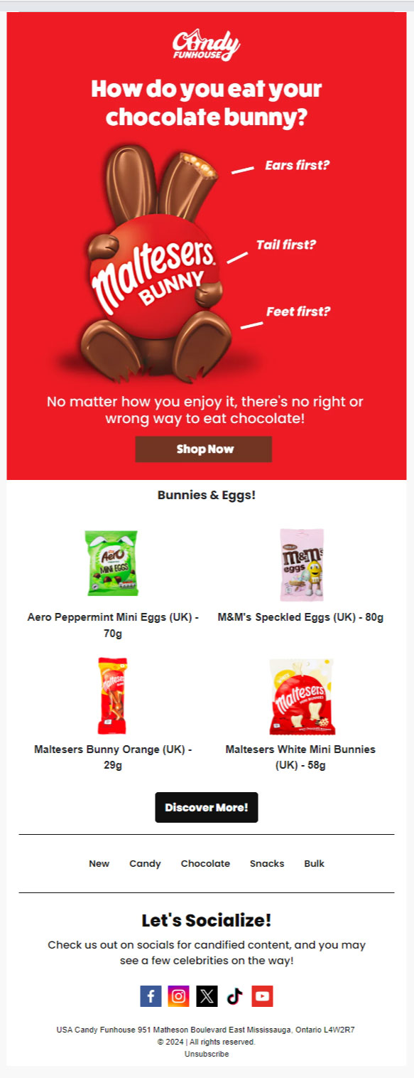
There’s no right or wrong way to eat chocolate — is a familiar statement. But when you read it in Candy Funhouse’s Easter email, you nod as if you heard it for the first time.
The hero image does all the magic. It’s smart, funny, and convincing. It’s not at all in the face while being promotional.
One might argue that the chocolate bunny itself proves it. Having the bunny hide its face is clever as well as adorable. To sum it up, it’s all very well done!
Pro Tip: Don’t avoid cliches by default. Capitalize on them smartly to defamiliarize your audience. Incidentally, it’s a well-known technique in literary fiction, too.
3. Riverbend Home
Angular layouts are not going out of style. The zig-zag pattern is not only nice to look at, but it makes room for lots of information and images without cluttering up the email.
Functional and beautiful – that’s a pretty solid deal! As you can see, Riverbend Home’s Easter email packs a lot of bite-sized product details alongside every image.
Pro Tip: If you want to inform as well as entertain without needing to overwhelm your subscribers, go for an angular layout.
4. Ticket Chocolate
If you think that you are done with zig-zags, think again. This Easter email from Ticket Chocolate uses the zig-zag pattern twice over. So, more products, more images, more information, and zero clutter. This is how you walk the same route in different shoes.
Ticket Chocolate’s email is not too long, either. Tighter layouts also minimize the length of emails. You get to do more with less. We also love the light colors and the floral background.
Pro Tip: You could be a stick in the mud even while looking for new styles. Sometimes, the pearls are right in your knowledge base, hiding in plain sight.
5. Ibsdirect.com
Easter is first religious, then secular. So, the more religious folks in your audience won’t prefer puckish eggs and bunnies in your Easter email marketing.
As a designer, you want to keep it simple and sober. Just like ibsdirect.com does it. Sharing customer testimonials is critical since you’re reaching out to a like-minded community.
You may want the text to dominate. Information takes precedence over entertainment. Use a light or an all-white background to avoid distractions. Stick to your brand colors.
Pro Tip: Always have a few traditional go-to templates in place. Don’t start stripping down your current ideas for simplification.
6. Mewaii
Mewaii’s Easter email holds a very important lesson. Staying on-brand is not just about sticking to your palette. It’s about perennially re-creating the vibe of your brand.
You don’t have to be an expert to see how on-brand Mewaii’s email is. It also simultaneously captures the temperament of the target audience.
The whole email is fun, light, and really full of stuff to pause on and look at. We also love how the CTA buttons look so ‘at home’. It’s all about the vibe.
Pro Tip: To stay on-brand, re-create the vibe. Be your brand; don’t just show it.
7. Email Uplers
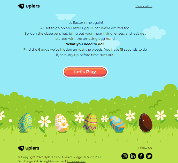
We designed this game for our last Easter marketing campaign. Email gamification has been one of our core strengths.
It doesn’t have to be something very complex. Simple games go a long way in email. The point is to entertain the audience and boost engagement. Feel free to play it here.
Pro Tip: Don’t try gamification if you’re just game for it but not good at it. But if you’re confident, three rules: set an achievable goal, design it really well, and ensure user-friendliness.
8. Giadzy
Giadzy’s Easter email grabs you by the throat! It’s out-and-out, roof-blowing bold. Bold colors, bold typography, bold, detailed pictures.
The hero image is staggering. You can almost hear the wrappers’ crunch. Take a good look at the CTA buttons too. They’re huge, robust, and apparently nailed to the template.
Pro Tip: Bold is not the opposite of graceful. If you want to create bold templates, strike a balance between all the elements, such as between visual typography and normal text.
9. Natural Life
Spillage alert! Because our final Easter email overflows with colors. You’d imagine an email so riotous to appear cluttered. But it’s just the opposite. What’s the secret?
It’s the floral theme, Natural Life’s hallmark, that binds the entire email together. It’s the common thread running through the various elements of the design.
It’s another instance of re-creating the vibe. Plus, we simply adore the watercolor concept of Natural Life.
Pro Tip: Never lose hold of consistent design while trying to be extravagant. Identify a pillar element to base your concept on.
Wrapping Up!
We’re already in March. There isn’t much time to lose. If you want to create a foolproof Easter campaign, start now! Don’t try too hard to be “new.” Newness is more often a result than an aim. Take inspiration from the emails we shared. Start with what you see.
Or, if you need, get in touch with our email designers. We’re great at adding flesh to our clients’ vision. Let us know your idea for this Easter, and watch it come alive.


Susmit Panda
Latest posts by Susmit Panda (see all)
How to Leverage Email Marketing to Improve Patient Adherence And Health Outcomes
How to Deliver A Connected Marketing Experience Using Salesforce Marketing Cloud AI