Are your email marketing campaigns falling short of converting prospects into customers?
Do you wonder why your emails, despite their exceptional copy and design, struggle to generate enough clicks?
As the saying goes, “Very little is needed to make a happy life, and that little can have the greatest impact.” And in the realm of emails, that impactful little detail is your call to action (CTA).
That being said, a call to action is something very serious, not just a little detail. It has its origins in the battlefield. It’s a call to commitment, really. Call it crazy, but emails with a single CTA can increase sales by a gobsmacking 1,617%.
Well, if it seems like a battle to you, no wonder you’re here, eager to learn from a brand that delivers 3,000 templates every month. Let’s get going then!
What Is A Call To Action (CTA) In An Email?
A call to action is a button or link that prompts readers to take a desired action, e.g. making a purchase, signing up for a service, or subscribing to a mailing list.
So, variously, it can be a call to sign up, a call to buy, or a call to read, and so on. In email, it’s essentially a call to click through to your website/landing page. Hold that thought.
How Does An Email CTA Work?
The ideal email CTA works “climactically.” It follows the simple persuasion-action sequence. It’s an irrevocable climax to an argument. Which is why CTA placement is such a crucial aspect.
Here’s how Jeane Jennings, CEO of All About Email Marketing, paints it: “An effective CTA can turn casual readers into active participants, prospects into customers, and customers into repeat buyers. It’s your ‘pitch,’ the part of the email where you persuade the reader to take that next crucial step.” [Emphasis ours.]
Indeed, that’s what the best email CTAs do, they initiate a chain of micro-transformations. Let’s catch a few examples.
10 Best Email CTA Examples & Ideas
Here are some of the best CTAs for email, straight from our own collection. Let’s kick off with Hawthorne’s email.
1. “Join the Takeover”
Hawthorne’s CTA is thematic. It is consistent with the story of the email. So, here’s a portion of the email.
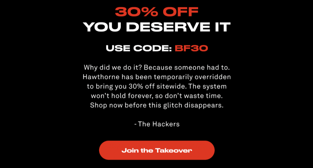
The story goes that hackers have hacked into, or “taken over” Hawthorne’s emails. The CTA is from the hacker’s POV. Now that’s a heck of a hack!
2. “Be the First to Know”
This CTA from Bombas is a masterpiece in contextuality. The email is a teaser for a new product, hence the CTA.
3. “Shop the Drop”
That’s the perfect CTA for your product drops, isn’t it? This one’s from Goldbelly. Here’s the grab.

Note the CTA placements. That’s the point of these image grabs.
4. “Start the Good Habit”
One of the best email CTAs, this one from FUM is well-padded, positive, and direct.
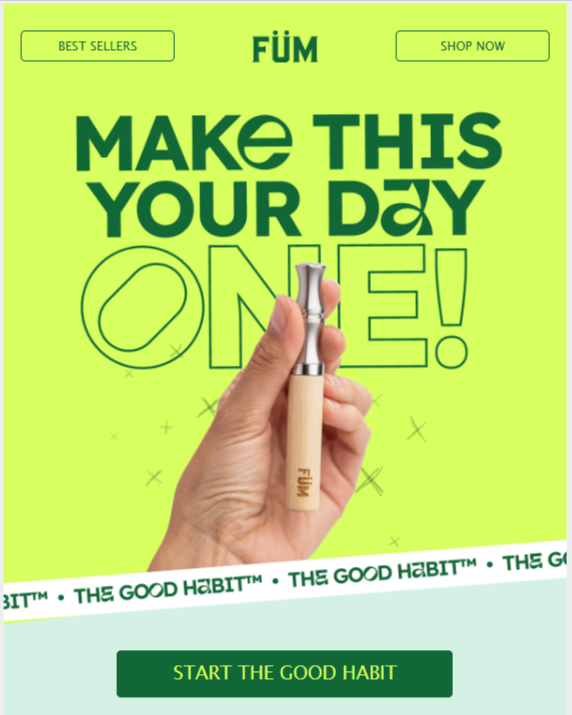
Note how contextual the CTA is. In fact, the best CTAs for email are contextual. Email, being email, allows that.
5. “Happy New Year”
But where’s the call to act? No, this CTA by Fly By Jing is not a call as such, but it still acts like one, in that it prompts a click.

Such relevant CTAs, we’d say, are worth a try. But of course, you don’t want to do this habitually. Stick to action verbs as usual.
6. “9.00 AM, 1.00 PM, 3.00 PM…”
True, but strange? Not at all. We love how Billie has transformed the time slots of skin-care routine into actionable CTAs. It starts at 9.00 AM and ends at 10.00 PM. This is genius!
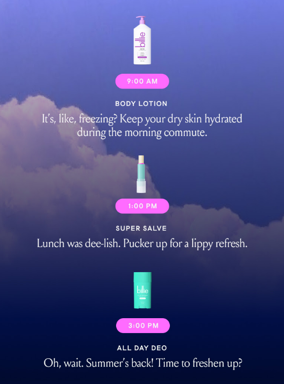
Note that Billie has already used a simple “Shop Now” CTA prior to the skincare routine flow. It all adds up.
7. “Start My Huel Journey”
Huel’s powerful, first-person CTA is right on the money. Check it out. Using first-person narration is a key email CTA best practice.
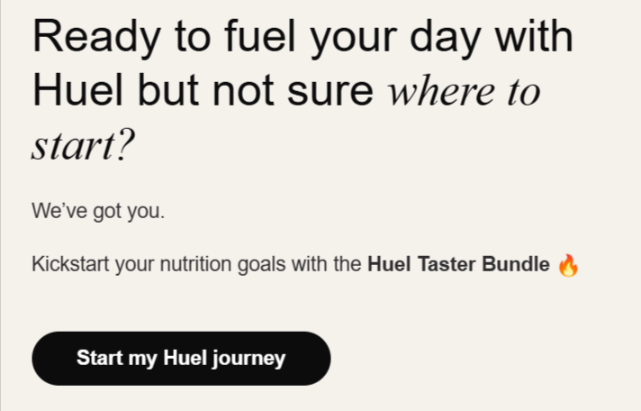
If you want to include unique CTAs in email, your blog can be of great help here. Check out the next example.
8. “Read All Names >”
This one, from The Spoiled Mama, is inspired by their blog post on baby name inspirations. Context and relevance help you craft spontaneous CTAs, as we’ve already mentioned. See below.
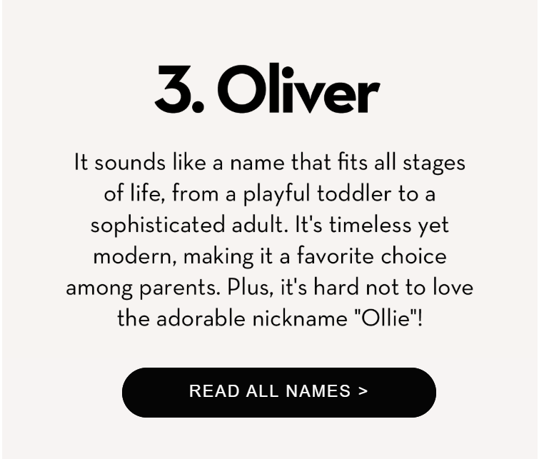
Plus, the CTA button is rounded, and the pointer is effective.
Speaking of, did you know that the celebrated jewelry retailer, Helzberg Diamonds, upon adding a pointer in their CTA button, saw a 26% uptick in the click-through rate? Small things!
9. “Eat Me”
By now you can guess the best email CTAs, can’t you? This one from Surreal’s welcome email is a 7-starrer.

Again, it’s well-padded, prominent, and well-placed, right below the main content, at the inverted pyramid’s apex.
10. “Shop Better”
Following a neat comparison table, in which 1906 compares their products with others, you get this CTA almost reflexively.
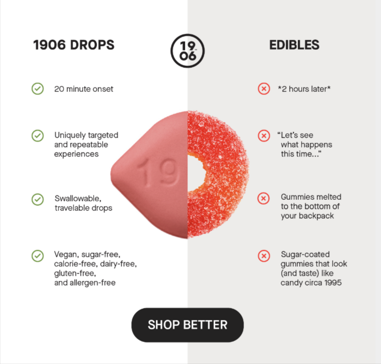
The moral of the story? Keep it as natural as you can. Remember we said that the CTA works climactically? It’s an irrevocable climax to an argument, is what we said. Now you’ve got proof. In the above example, the content could not have culminated in a better CTA.
Types of Email CTAs
Speaking generally, there are two types of email CTAs: primary and secondary. The primary CTA, as the name suggests, is the main call to action, placed above the fold, usually larger than the secondary buttons, and often more prominent. The secondary button, on the other hand, is more specific, contextual, and more diverse. For example, in the following email from Imperfects, the primary CTA is “Shop Now,” and the secondary CTA is “Score.”

Now, there are various ways of designing the CTAs for email. You have ghost buttons, solid buttons, styled CTAs, bulletproof buttons, rollover buttons, and so on.
It’s a matter of taste as to which one you want to use. Only keep in mind that the CTA is functional, leading the user to the right, expected destination post click.
More Examples of the Best CTAs in Email
We’ve explored 10 examples, let’s explore a few more. When it comes to little details, the more you explore, the better.
So this time, we’re just listing the CTAs. Here they are:
- Shop New In – A cool new arrivals email CTA.
- Shop New Cotton – Cooler, because it’s more specific.
- Steal It – Talk about on-brand CTAs! It’s from Decor Steals.
- Frame Your Favorites – Another on-brand CTA, this time from Framebridge
- Available at ⭕ – A fine CTA to climax a retail partnership campaign. The symbol represents the brand, Target.
- Subscribe & Save – Clear, specific, purpose-backed.
- Match Your Mate – Another contextual CTA from Shinesty.
- Relaxation Starts Here – On-point, and super-clear.
- Bug Free Zone – Not action-based, but it works. It’s like one of those road signs. The call is clear.
- Get 10% Off – code: THIRDWAY – Highly informative, clear.
- Level Up Your Routine – Action-based, proactive, as prompt as a pat on the shoulder.
- Shop What’s Hot – A well-rhymed, short CTA.
- Give Us Your Digits – A superb CTA for text notifications.
- Hell Yes – First-person, dynamic, and affirmative.
- Shop The Breakthroughs – Campaign-aligned, and clear.
- Shall We Recap? – A perfect New Year’s Eve CTA.
- I Want One – First-person (always special!), and affirmative.
- Stock Up Now – Urgent and clear.
- Start Sending with Selzy – Goal-oriented, alliterative (poetics always a plus), and unambiguous.
- Become A VIP → – The pointer aces it.
- Proactively Unsubscribe Here – A brilliant CTA for an apology email, from Shinesty, once again.
- In Honor of Betty, This Button Will Give You 15% Off Any Order – Another Shinesty gem. Long, and lasting. Talk about CTA buttons being memorable! Wildly funny, too.
As you can see, these CTAs are all contextual. That’s why they’re so effective, so out-of-the-box, and so upfront.
You want to create CTAs that are connected intimately to your email content, campaign, or offer. The more specific, the better. Don’t worry about long CTAs. It’s all part of the gig.
This is not to imply that you shouldn’t use traditional CTAs. You may. But these are so much better. Most notably, no other channel gives the opportunity to play around with your CTAs.
Try differentiating your brand through CTAs as well as through your products and services. That’s the point.
Think about hawkers and peddlers, each one having a unique style of hawking their wares. No two voices are alike. In the Middle East, hawkers might resort to rhythmic chants to attract passers-by, whereas in Africa, a mix of music, dance, and storytelling is the way. Same with email CTAs. But there’s still a question: How many CTAs in an email is the right amount?
How Many CTAs in An Email Is Just Right?
It depends. But let’s hear what others have to say about it first:
- Arguing against single CTAs, Natalie Jackson at emfluence points out, “…sometimes, one call-to-action can have the opposite effect: it can turn off recipients who would like to do something, but not necessarily that thing (or at least not yet).” Quite true. Let’s put a pin in it.
- Campaign Monitor puts it this way, “In most cases, it’s best to stick to a single CTA. Doing this helps to reduce your email clutter and makes the next step easier for your readers”
- Kimberly Huang, Content Marketing Manager at Litmus, also subscribes to the relative nature of the question, “Including a ton of links can appeal to a wide variety of subscribers but can dilute your message. One CTA can hone your message, but may exclude a large number of subscribers that aren’t interested in that particular message.”
- According to Email on Acid, it ought to be just one. “A CTA that’s going to encourage clicks should be as focused as possible on a specific action – and the ideal number of CTAs is just one. Yes, one! Consider sending a separate email if you have more than two calls to action. Otherwise, you’re asking too much of your subscribers. You’ll dilute your effort and make it difficult for them to understand what it is they should do or click. This is even more important for mobile readers, who can have trouble with tap targets or multiple links and may give up altogether.”
- Mike Nelson from Really Good Emails reports from the ground, “The average email contains 2.1 CTA buttons.” Not sure what .1 is supposed to mean. But he goes on, “The maximum number of CTAs in an email is 11. 56% of all emails contain 1 CTA, 24% contain 2, and 20% contain 3 or more. And of those that contain more than 3, 50% of those contain more than 5.”
- Alexa Engelhart, Vice President at Power Digital, has this to say, “Don’t have more than 3 CTAs in your email. Not only does this tend to make the email very long, it also increases the likelihood of users actually not clicking anything at all.”
- Next is Hanna Kuznietsova from Stripo, who believes “There is no right answer to this question as it depends on many factors: The goal of your email, the length of your email, and the type of your email.” Fair enough, Hanna!
So there you have it. Insights from 7 email experts. Clearly, it’s a controversial question.
Where do we stand on this? As we said, it depends, it depends, to reiterate, on the following factors:
- Purpose of the email
- Length
- Type of email
- Urgency of the email
The question of CTA frequency, we’d contend, is best left to the marketer’s intuitive understanding, and testing. Irrespective of such diverse opinions, it shouldn’t be something you’re stuck in at the cost of more immediate tasks. This is not to underestimate the precious CTA, but don’t spend inordinate amounts of time and energy straddling the fence on this.
Testing Your Call-to-Action
Enhancing your email marketing strategy hinges on testing and evaluating the performance of your CTAs. AI-powered A/B testing helps identify which CTAs drive the most engagement, enabling you to optimize future campaigns effectively.
Keep the following things in mind:
- Test one element at a time: Use tools like Google Analytics to track and analyze specific elements of your CTA’s performance.
- Leverage A/B testing: Platforms such as Optimizely, VWO, and Unbounce simplify the setup process and provide comprehensive reports for analysis.
- Analyze user behavior with heatmaps: Tools like Crazy Egg and Hotjar help visualize how users interact with your CTAs.
- Measure success with relevant metrics: Use built-in analytics tools from your ESP to monitor key performance indicators and refine your strategy.
- Run tests over a sufficient duration: Platforms like UserTesting and Userlytics offer real-time feedback from users, helping you gather actionable insights.
By incorporating AI to analyze data and make data-driven decisions, you can maximize the effectiveness of your CTAs and achieve your email marketing goals.
Let us now consider some email CTA best practices.
7 Email CTA Best Practices
1. Understand Your Audience
To achieve maximum results in email marketing, start by identifying your target demographic and honing in on your ideal customer. With this understanding, you can leverage AI algorithms to craft highly personalized email messages.
AI-powered personalization enables you to deliver relevant content that resonates with your audience, increasing the likelihood of converting them into loyal customers. By tailoring CTAs to address their specific pain points and desires, you create a more impactful and engaging experience.
2. Focus on Key CTA Principles
Effective email marketing campaigns are built on the foundation of compelling CTAs. While there isn’t a one-size-fits-all formula for crafting the perfect CTA, following certain general principles can make a significant difference.
For instance, AI can analyze real-time data, such as click-through and conversion rates, to identify the most effective CTA language and design. Additionally, A/B testing allows you to fine-tune your CTAs, increasing the likelihood of achieving the desired response.
When creating a CTA, focus on these key elements:
- Clarity
- Visibility
- Urgency
- Relevance
- Action-Oriented Language
A clear and concise copy is both engaging and effective. It should be easy to understand, relevant to the email’s purpose, and compelling enough to drive the reader to take action.
Additionally, the tone of the copy should align seamlessly with your brand’s voice.
Design elements also play a critical role in the visibility and effectiveness of your CTA. Factors like color, contrast, shape, and placement can significantly impact its performance. For instance, using a contrasting color for the CTA button can make it stand out and increase its effectiveness.
To ensure your CTA buttons are visually striking and well-designed, consider utilizing professional email design services. This allows you to focus on crafting impactful CTA copy while leaving the design to experts.
3. Pay Attention to Button Shapes
CTAs come in various shapes, such as rectangular, rounded, circular, and more. While there’s no definitive rule about which shape performs best, studies have found that horizontal rectangular buttons with rounded corners often yield better results, making them a popular choice.
However, the effectiveness of a CTA shape ultimately depends on your overall design. It’s essential to experiment with different shapes and determine which resonates most with your target audience. A/B testing can help identify the best fit for your specific campaign.
4. Pay Attention to CTA Color
Colors communicate without words, carrying the power to influence moods and emotions directly—a principle that applies equally to email call-to-action buttons.
When selecting a color for your CTA, it’s essential to ensure it aligns with your overall design and remains consistent with your branding. Striking the right balance between visibility and brand coherence is key.
All that said, certain colors do tend to work well across various designs:
a) Black and White: When in doubt, opt for a black or white CTA based on your user interface. These neutral tones are versatile and particularly effective for designing dark-mode emails.
b) Bright Colors: Shades like red, green, and orange often deliver better results due to their high contrast and ability to stand out against the background, making them more noticeable and engaging.
5. Analyze Your Email CTAs
Persuasive language, a sense of urgency, and social proof are all vital elements of successful CTAs. But what truly made that email perform so well for you?
Since we can’t directly analyze the success rates of others’ emails, we can focus on our best-performing, visually appealing email and break down the factors that contributed to its success.
By identifying what worked, we can refine our strategies and enhance our CTAs. Here’s how to conduct a thorough analysis of an email CTA example:
- CTA Placement: Where is it located within the email?
- Language: Does the CTA communicate the message clearly and compellingly?
- Design Elements: Are the visuals attractive and attention-grabbing?
- Message Alignment: Does the CTA align seamlessly with the email’s overall message?
- Conversion Rates: Is the CTA generating significant clicks and conversions?
Analyzing these aspects provides valuable insights into what makes a CTA effective. This iterative process helps you continuously optimize your email campaigns for maximum impact and conversions.
6. Optimize CTAs for Mobile
Optimizing email marketing campaigns for mobile devices is increasingly essential in today’s digital landscape. A 2019 report by Aedestra found that nearly 62% of email opens now occur on mobile devices. This makes it critical to design CTAs that are not only engaging but also easy to interact with on smaller screens.
AI-powered optimization tools can assist in identifying the ideal CTA design and placement for mobile devices by analyzing user behavior and engagement patterns. By tailoring CTAs for mobile users, you can enhance their experience and significantly increase the likelihood of conversions.
Once you’ve crafted call-to-action buttons that align perfectly with your brand, the next step is to test and refine them to determine which performs best.
7. Triple-check CTA Links
Each CTA is designed to direct visitors to a specific landing page upon clicking. For instance, in a welcome email, you might encourage subscribers to learn more about your business by using a CTA that leads them to your website or an exclusive offer. In contrast, a promotional email”s CTA could guide recipients to a landing page with more detailed information about the product or service being highlighted.
To sum up, here’s what we’re driving at in a nutshell:
- Define the goal of your email campaign and tailor your CTA to support that objective.
- Position the CTA prominently, such as at the end of the email or in a contrasting color, to increase visibility.
- Use urgent, action language to encourage immediate action.
- Personalize the CTA to speak directly to your audience’s interests and needs through segmentation.
- Regularly test and analyze CTA performance to refine and improve your approach.
- Utilize dynamic content and AI-powered recommendations to optimize CTA effectiveness in real-time.
Wrapping Up!
Now that you’ve seen some of the best email CTAs, and faithfully copied down the email CTA best practices, put that mug down, clear your throat, and get in touch with our email experts already. IF you need those emails designed and delivered, that is!




Susmit Panda
Latest posts by Susmit Panda (see all)
How to Use Mailchimp Merge Tags: The Complete Guide
Unsellably Yours: How to Write/Create A Persuasive Email Template