From unsupported background images to alignment issues to those frustrating white lines to unnecessary borders, Outlook is crammed with issues, making it one of the most challenging email environments to work in.
Outlook might be infamous for leading the loudest, busiest community forums online, kindling never-ending discussion threads among frustrated email developers with sackfuls of stumpers.
In one of our earlier posts on the problem of rendering in Outlook, we discussed a number of similar bugs and corresponding workarounds.
But no matter how many bugs you’ve already encountered and crushed, Outlook always seems to have a new one waiting for you.
The latest? Truncated padding.
Now, you might have faced this problem too, or are currently struggling with it.
But if you’ve never had to deal with it before, you’re going to have to sooner or later. It’s Outlook, after all; and you can’t be too careful with how you develop your marketing emails to look perfect on this email client.
For now, let’s explore the problem of truncated padding.
What Was The Issue?
In recent email communications, several email clients have experienced a problem where the email content is being cut off on the right-hand side when viewed in Outlook.
We have come across this issue with some of our clients and observed that it seems to be isolated to specific devices. In this scenario, the content is slightly truncated on the right side of the email, while the overall width of the email is preserved.
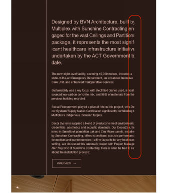
Here is the screenshot displaying the problem encountered by our client.

As you can see, the content is being cut off.
This raises a significant question as only the inner part of the email is affected, while the outer body remains intact. Upon conducting additional tests, we observed that this problem is not experienced by all users, but only a few have reported concerns about it.
“It’s [Outlook] a playground where a perfectly aligned button becomes a badge of honor, and a table that refuses to cooperate transforms into a testament of our problem-solving skills.”
– Alex Ilhan, email developer, on Email Acid
How We Solved It
We tried to increase the appropriate spacing in the email to see if the content would still be cut off. Interestingly, it turned out that in those email clients or devices, the problem was solely related to the padding.
Currently, the most effective solution that resolved the issue was to increase the right-side spacing by approximately 10-15px, or according to the cropped part, which ensured that the content displayed correctly.
Since only a few of our clients raised this issue and the padding solution proved effective, we implemented this solution and have not received any further inquiries about it.
However, this frequently causes the word-break problem where the words in the emails are split across lines with a hyphen (-) appearing in between, which is not always desirable. The screenshot below illustrates this issue.

To fix this issue, we included a CSS style “word-break: keep-all;” which prevented the words from breaking, resulting in the proper appearance of the email. The template looked correct after implementing these solutions, and our client approved it.
<td class="em_defaultlink" valign="top" align="center" style="font-family: Arial, sans-serif; color: #808080; font-size: 16px; line-height: 20px; font-weight: 400; padding-top: 16px; word-break: keep-all;">
    Body copy text goes here where you can edit your content and test it.
</td>
Below is the screenshot from the file after making these changes.

“Think of coding for Outlook as a puzzle waiting to be solved, and you may find yourself loving Outlook and all of its quirks.”
– Carin Slater, Email and Content Growth Marketing Manager at Litmus
Unlock More Insights into Outlook
If you need help with Outlook, visit our Outlook section where we cover a wide range of common and not-so-common challenges in Outlook.


Shalini Mathur
Shalini is a senior developer with over four years of experience working with Mavler's email development team. She is well-known for her acute attention to detail and comprehensive understanding of coding best practices. Her expertise includes HTML, CSS, and a range of Email Service Providers (ESPs), so every email is optimized for all platforms and devices and looks great. In order to support the clients during their email journey, she also handles the after-delivery tasks, making sure every ESP functions properly with the HTML layouts.
Nikunj Butani
Nikunj, a seasoned Team Lead for the Email Development team at Mavlers, brings over a decade of industry experience. Renowned for his keen attention to detail and mastery of coding best practices, he excels in Email Development. His expertise spans HTML, CSS, and multiple Email Service Providers (ESPs), ensuring that each email not only looks visually stunning but also functions seamlessly across all devices and platforms.
Susmit Panda
A realist at heart and an idealist at head, Susmit is a content writer at Email Uplers. He has been in the digital marketing industry for half a decade. When not writing, he can be seen squinting at his Kindle, awestruck.
Understanding User Experience in Email Marketing — A Guide Like No Other
Halloween Email Marketing: 10 Email Inspirations & Strategies