 The world is going mobile. Handheld devices of varying screen dimensions are slowly flooding the market and loyalists are already making their move on getting their hands on each one of them. Moreover, considering the fact that almost 55% of email opens occur on mobile devices, email design needs to accommodate the message within the first fold or at least within the 50-75px margin from the top.
When a subscriber opens your emails, it should be devoid of any distractions. You can include a Fixed CTA in your email, but tucking your navigation behind a hamburger menu is a more viable option compatibility-wise.
Why do brands include navigation menu?
Most clothing retailers and home furnishing brands began including navigation menu in their promotional email templates to enhance the scope of the subscribers visiting their website. This way, marketers don’t need to rely on the subscriber to click on the CTA in order to convert. Based on the subscriber’s’ choice and brand’s product categories, the subscriber can click on the relevant option in the navigation menu and get redirected to the appropriate section of the website and make a purchase.
Check out this email from Yandy.com.

Why is hamburger menu or any other navigation menu needed?
When the above email is viewed in a handheld device, owing to the responsive email design, the navigation menu shrinks to be accommodated in the limited space. This defeats the utility of the menu to be tappable by the subscriber’s thumb.

Even scarier, if the navigation menu stacks on each other, the overall length of the email increases and the information intended to be visible in the first fold gets shifted downwards. A workaround is to have the navigation menu stacked in the footer of the email so that it doesn’t affect the first fold.

Desktop version of the email by Footwear etc.

In the mobile version, the navigation gets readjusted to the bottom
Examples of brand emails to look up to
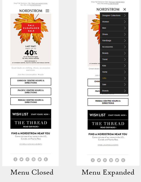
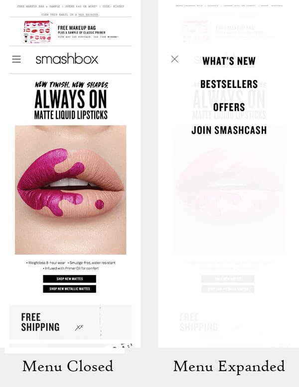
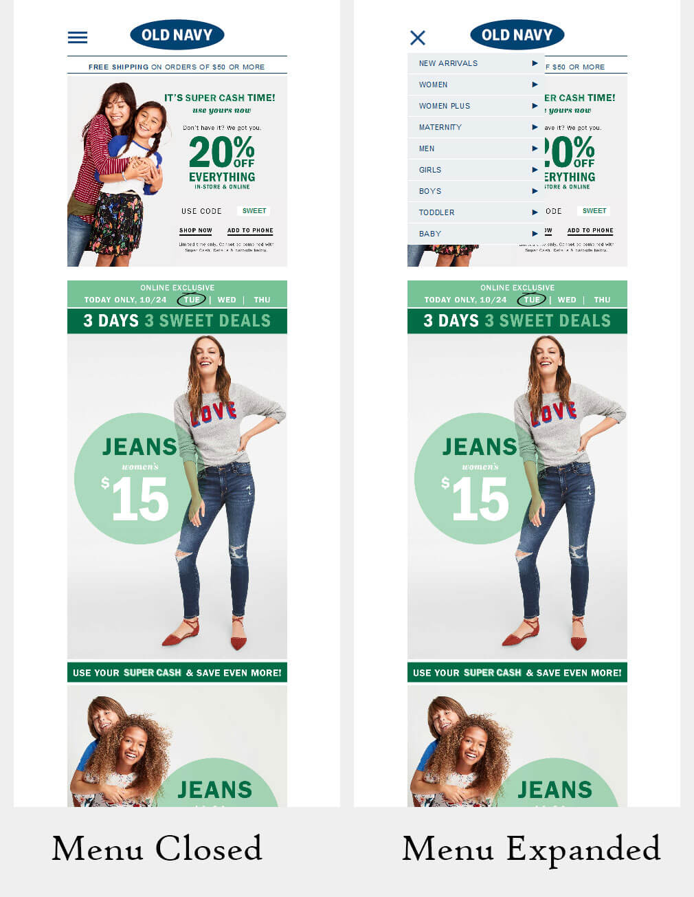
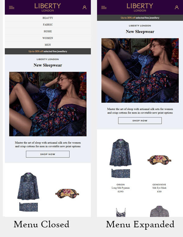
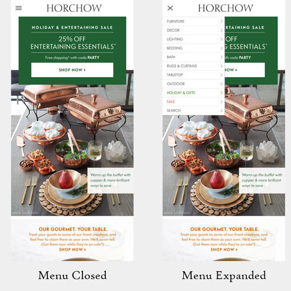
Uplers present to you some brands that have nailed the design game with Hamburger Menu. As you can observe, the menu in the following emails either pops over the email copy or expands (as in case of Liberty London) to push the email content down.
1. Nordstrom
2. Smashbox
3. Old Navy
4. Liberty London
5. HorChow
6. Pier1 Imports
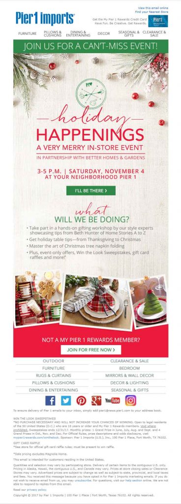
Going in the opposite direction Pier1 Imports hides the navigation menu when viewed in mobile layout. Those interested can scroll down to click relevant links and get redirected to corresponding landing page.

Wrapping Up
Impressed by the showcased emails? Wish to include a navigation menu in your holiday email design? Get in touch with Uplers. Feel free to give your suggestion in the comments below.


Kevin George
Latest posts by Kevin George (see all)
Envisioning Top 7 Email Design Trends for 2018
Ready-to-use vs Custom Email Template – Decoding the Pros and Cons