
The Web is full of display ads; they’re everywhere. You just can’t miss them, not even when you are not looking directly at your screen.
Google’s Display Ad Network single-handedly reaches 90% of Web surfers across the world. And most of the time, it’s HTML5 banners displayed on your desktop and mobile screens. Small wonder why digital marketers love banner ads!
Given that every marketer appears to be using it, how do you make your ads stand out? Since everyone is always looking at an HTML5 banner, what can you do to spark a deeper engagement with your ad? Let’s find out through these HTML5 display banner ad best practices!
1. Choose Banner Size Wisely
The HTML5 banner ad should be both desktop- and mobile-optimized. It should equally be compatible with publishers and ad networks.
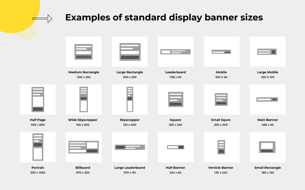
The best-performing HTML5 banner sizes include:
- Medium Rectangle: 300 X 250
- Leaderboard: 728 X 90
- Mobile Leaderboard: 320 X 50
- Wide Skyscraper: 160 X 600
Consider using the above sizes when creating your next display ad campaign. Note, however, that you choose a size depending on where you want your HTML5 banner displayed.
As per Google’s recommendations, if you want a display ad in the middle or at the end of an article or blog post, medium-rectangle is the standard pick. For ads above your main content or on forum sites, the leaderboard is your go-to size.
While not mentioned in the above listicle, the half-page HTML5 banner size (300 X 600) is quickly becoming advertisers’ favorite. Depending on your advertising priorities, you can consider a half-page display for your ad. It’s unmissable and, if done correctly, can make an impact.
If you want to explore other HTML5 banner sizes, feel free to go through the following collection.
2. Display Products On Your Banner
Including your product picture on your banner is a great way to pique audience interest and trigger conversions.
Consider the following HTML5 banner ad by Astaberry.

Minimal, good use of white space, zero distractions, and focused messaging – these are what make the above ad stand out.
Minimalism, especially, is an asset when displaying products on HTML banners. After all, you want the viewer to look at just two components: the product and the call to action.
Furthermore, the use of adequate white space accentuates the product image. It also enhances the readability of the ad.
Take a closer look at the call to action in the above ad: the micro white space between the letters and the macro white space around the text at large make it so easy to read.
3. Create Multiple Versions Of Your Ad
Consider creating multiple versions of your HTML5 banner. The more, the merrier.
You can use different variants for different days at different times. This way, you are maximizing your reach, precluding any possibility of your ad being missed.
In order to run your campaign smoothly and in a timely manner, you may want to take the help of creative management platforms online. It will ensure your ads are being scaled out efficiently.
4. Stick To Short Banner Lengths
HTML5 banner ads that are longer than 15 seconds are not recommended.
Understand that you only have a few seconds to capture a user’s attention. Your ad must do it successfully within five or seven seconds of being viewed. This means your message and branding must come across within that time frame.
Make it short, to the point, and impressionable. The entire feel of your brand should be immediately perceptible.

For instance, the above ad by Vogue blends information and branding in just over three seconds. It uses only two loops of animation, which is enough, in this case, to send the message across. In addition, the ad is concise, scores high on visuals, and uses a vivid, static call-to-action (more on that below.)

5. Be Careful With Expandable Banners
Expandable HTML5 ads immediately capture the attention of the viewer. Compared to traditional banner ads, expandable ads tend to encourage more clicks. You can “expand” the focus of your brand by providing more details to your target audience.
That said, expandable banners, if implemented without finesse, can be annoying to viewers.
First off, you want your ads to expand only when a visitor wants to see them. Don’t force your banner upon the viewer. That’s just cheap, antiquated salesmanship gone digital.
Second, enable the viewer to exit your ad whenever they want to. Include a vivid Close or Exit tab in your banner.
This is especially important when someone is viewing the ad on your website. In the absence of an exit button, the viewer will be frustrated to the point of exiting your website and never bother to return.
As a rule of thumb, your ad should not expand more than twice its original size. Also, don’t clutter your website with too many expandable banners. That’s a big turn-off. Besides, it will reduce the website’s page load time, further hurting the user experience.
6. Use RM Ads Soberly
Rich media or RM HTML5 ads employ animation, video, audio, links, and high-quality graphics.
Obviously, rich media is attractive. Viewers typically engage with such dynamic, interactive content. But there’s a catch. Such ads often tend to load slower than other types of banner ads.
Generally speaking, a rich media banner takes up over 1 Mb of storage space. In addition, RM ads are harder to place than standard HTML5 banners.
It’s true that RM ads can be measured using a number of performance metrics, leading to more valuable, actionable data. However, it is equally true that most RM ads are dependent on plugins, which affects viewing.
Unless your ad campaign has a strong budget and is very well-thought-out, running RM banners may be a bit risky.
Also, do consult the RM-specific guidelines laid out by the Interactive Advertising Bureau.
7. Pick A Gold-Standard CTA
The right CTA is well-placed, clearly visible, clickable, pithy, and urgent.
We read text from left to right and from top to bottom. So the bottom area of your HTML banner, known as the terminal area, where most viewers will end up, is the right place for your CTA.
Note, though, that CTA placement is subject to exceptions from time to time.
Next, make sure your CTA button seems clickable. The viewer should not be confused by the fonts. Differentiate the button. Consider the following HTML5 ad example.

But don’t make the button too large. It may trigger a drop in conversions.
Lastly, the CTA copy should be clear and reflective of the intent of the ad. Often, HTML banner ads use a vague CTA, leaving the viewer guessing. Always clarify where the viewer will be led on clicking the button.
8. Try A Banner Exchange Program
A banner exchange takes place when you get to display your HTML ad on another website in exchange for the latter’s ad being displayed on yours.
Banner exchange is not the same as link swapping, except conceptually. In the latter case, the links direct to a particular page, whereas banner exchange networks allow ads to be rotated across multiple websites. This way, your ad gets to be viewed by more people across the Web.
For every two banner ads displayed on your website, you earn a credit to have your own ad displayed on another website. Note that the ratio may vary depending on the service provider.
Now, remember that you have little to no control over where your HTML5 banners will be posted. Ditto when ads from other websites are posted on yours. But don’t worry. More often than not, banner exchange programs match sites quite judiciously.
Wrapping Up
As implied at the outset, the fact that HTML5 banner ads go a long way in enhancing brand awareness and bringing visitors to your website is not lost on your competitors. Given that every digital marketer has bannered up, so to speak, what’s your best bet?
We hope that the above post has answered the question for you.
Susmit Panda
Latest posts by Susmit Panda (see all)
The Complete Guide to follow up Emails: Build Trust and Increase Conversions!
9 Vital Email Marketing KPIs You Must Track In 2023