
As email marketers around the world explore different ways of engaging recipients, interactive email design is emerging as the most bankable one – Navigation menus in emails being one of the most popular amongst them.
Instead of sending out the same long, boring, old-fashioned email templates to your subscribers, try sending out emails with Menus deciphering complete navigation.

So, What Are The Advantages Of Sending Out Emails With Menus?
– Multi-industry application
Various industries follow the trend of linking their landing page to email for more browsing options. While some recipients browse for more information, some skip clicking through the associated landing page. By having menus within emails, your customers or prospects can easily navigate through various options right in the email. Very much helpful for technology companies, e-commerce companies, shared economy business models like AirBNB or Uber and many other companies.
– Improved UX and UI
Compared to emails without navigation, sending out emails with navigation will not only improve the overall user experience, but also improve the UI aspect of the email. Such emails turns out to be in fact mailable microsites.
– Quick action and boost in conversion
With the right kind of navigation in email, you will surely observe a boost in the conversion – How? Well, if you are including Menus in your emails, make sure to integrate other tools that allow recipients to checkout within their inbox.
This way 3 things can happen hand-in-hand
(a.) Your recipients browse within the email.
(b.) They select the products and services.
(c.) Pay and checkout right in the email.
– Optimized for on the go viewers
Research shows that human attention span has reduced from 12 secs to 8 secs – making it all the more necessary for your email to convey the message in a concise manner. With menus and dropdown options, instead of hiding the unwanted content, you can now transform it into a dropdown menu. This will not only save space, but will as well provide relevant information to whosoever needs it.
Real World Implementation
- E-commerce websites for new product launches, recommendations and cross selling.
- Technology websites for more tabbed information sharing within their newsletters or promotional services emails.
- News and media websites that wants to share a huge piece of information stacked up into various menus.
- Travel and hospitality services that wants to share various tour options with their prospects or customers using emails.
- Manufacturing companies who wants to send out processes to their stakeholders can also use menus in email.
- And, there are so many more industries that can use menus in email for effective content spanning.
Hamburger Menu in Real World
Our own Uplers Sample emails
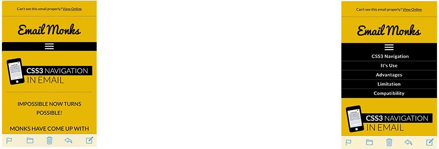
Mobile View
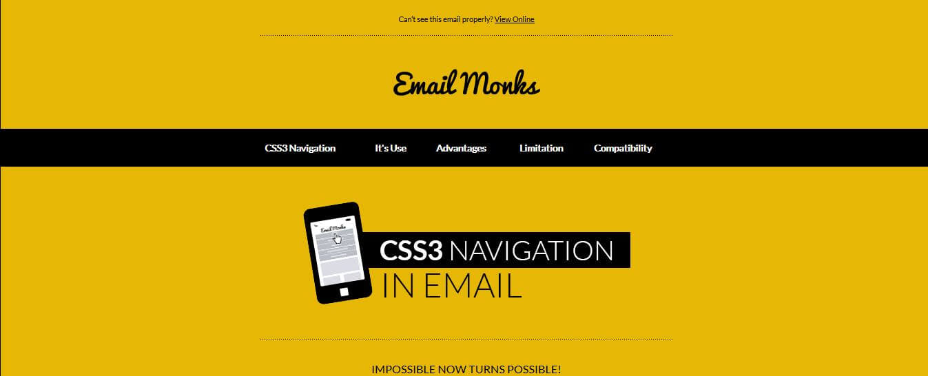
Desktop View

Image Credit :James Martinez
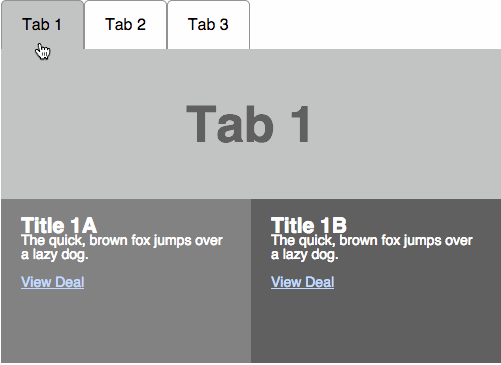
Another variation that can be achieved with this form of interactivity is tab browsing within the email body.
Compatibility
Using interactive menus in mobile is mostly compatible with all the major email clients. However, Windows-based clients might not support such menus well. In our third sample, you can find animation will only work as simple menu in the desktop view; however, will work well in the mobile. The navigation might however, work as different links when viewed on desktop. To check the detailed compatibility.
Other Limitations
- These Menus will however, only work with email systems that support external CSS. Those of you who would like to implement something like our 3rd sample will need to ensure their ESP provides VML coding support for navigation to render well, especially Outlook client in desktop view.
- For iOS devices, this navigation will be closed only when someone taps on any of the link provided in email body. For Android though, it allows you to close the dropdown by clicking anywhere or tapping anywhere outside the navigation module.
- However, the best part is that readers willing to explore navigation would certainly be interested in having a look into it when the navigation is open.

Few Best Practices
- Make the right decision for responsive navigation bars with regard to stacking content, placement (center, left or right) etc.
- Don’t overload creative with too many categories. It will create a clutter and make it hard to act upon.
- Make sure there is lot of padding around the text with minimum 14 px. Font size making it easily tappable.
- Make them dynamic so that when you change a menu on your website it could automatically change within emails.
- Check and test your code’s compatibility.
Kevin George
Latest posts by Kevin George (see all)
Boost Email Marketing ROI with Data Cleansing & Data Appending
Witty Email Personalization Examples For Brands To Boost Sales