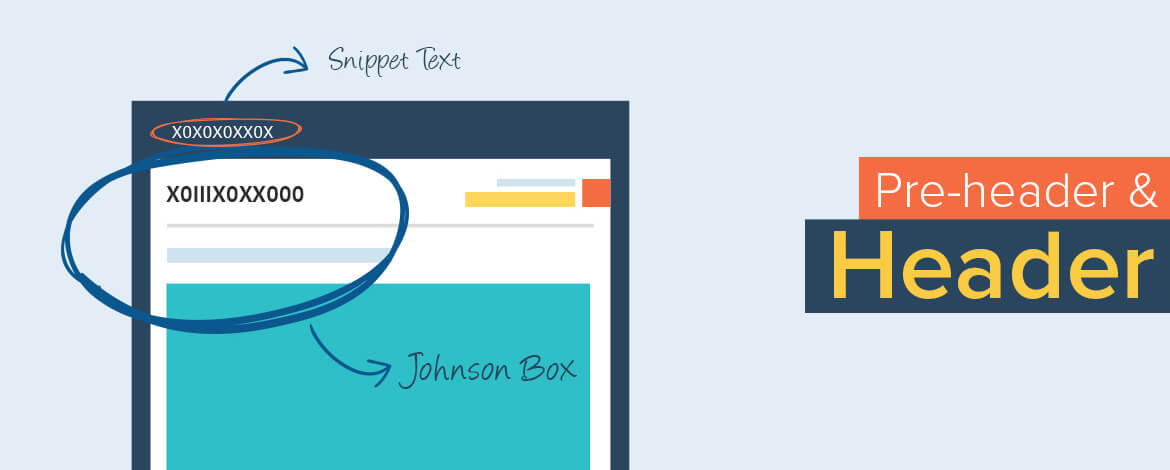
Have you heard about the word Johnson Box? Johnson box is an interesting term used to describe the top part of email letters, containing the main message or succinct of an email.
Johnson Box catches the most eye balls as it is the first part of the email. The main purpose of the Johnson box is to catch the reader’s attention and engage them to read the rest of the email communication. The preview pane of most email clients show Johnson box first on the receipt of an email.
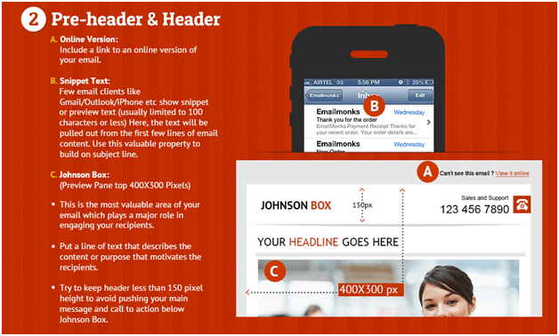
This small area is really pivotal in determining the rest of your email stats. Missing out on the quality content for Johnson box might even lead to a complete disaster of your email campaign. Likewise, few email clients like Gmail, Outlook etc show preview or snippet text usually limited to 100 characters or less where the text is pulled out from the first few lines of the email content.
While taking care of Johnson box, also consider having the snippet text meticulously crafted or else subscribers might lose the interest just reading those 100 characters. To prevent this mishap, Uplers has already shared the best practices guidelines on Johnbox and Snippet Text with our disciples in our email design best practices infographic.
Johnson Box and Snippet Text preview from the infographic:
 However, going a step further we share with you 7 easy steps that will make the Johnson box work wonders for your campaign.
1. Keep in mind the darn 5:30 Rule: Audience is bombarded with many email communications per day. That said, the audience gives 5 second to read the preview pane and decide whether to engage further or not. To make them read the email in next 30 seconds grab the attention in first 5 seconds. Remember the rule while framing the Johnson box.
2. Ideal Johnson box must have enticing calls to action. Describe whether you want to make the readers Click to Download, Buy Now, Fill the Survey etc!
3. In case you have the proposition straight in your email, describe a line in your Johnson box with a link that connects directly to the body part of email.
4. Personalizing email has already shown bright colours. Try personalizing the Johnson box as well. Make sure every reader finds something in store for him or her while giving away 5 seconds on the box.
5. People tend to disable images in their email preferences and thus avoid image only banners. Preview pane top is 400X300 Pixels. Try to keep header less than 150 pixel height. We have proposed this in our design best practices already.
6. Include the link to an online version of your email within the top left corner of Johnson box. PDA users tend to use this link quite more than those with technical difficulties.
7. In newsletters it’s wise to include bookmarks in your Johnson box, referring to the actual content of the email.
Takeaway: The power of a well-constructed Johnson box to pull your readers into the content of your email is just immaculate. Best content for Johnson box will keep their attention of readers fixed and they do what you expect them to do.


Kevin George
Latest posts by Kevin George (see all)
7 Email Networking Mantras - by Uplers
10 subject line secrets - A sure shot ladder to Success!