Update: This article was originally posted on Jul 12, 2017 and has been updated to add new kinetic email examples.
Email marketing has evolved over the years, thanks to the advent of mobile devices and more and more email clients. Subscribers’ inboxes are packed with emails; to STAND OUT among the crowd is a challenge for email marketers these days. Grabbing the customers’ attention and getting them to open and click your emails calls for a lot of innovation and super cool interactive design elements than what it used to earlier.
Adding interactivity in emails not only helps in increasing user engagement, but also helps in improving the conversion rates by creating highly impactful marketing campaigns. One way to do this is by using kinetic design for your emails.
Kinetic Email: A sneak peek into the interactive world
Kinetic emails are designed around the concept of offering the users a visual experience through emails within the inbox itself. Kinetic templates use a coding technique that enables the creation and rendering of high-impact interactive emails. Designed around the concept of providing the audience with information in an interactive and informative way, these emails stimulate a website experience without forcing the reader to leave the inbox.
Previously, when email clients such as Apple Mail had robust modern HTML and CSS support and the majority of other email clients didn’t, designers had to code emails for the lowest common denominator. With the launch of the iPhone, more email clients started to support modern HTML5 and CSS3. This gave designers and email marketers a reason to create mobile-optimized advanced layouts for HTML email templates.
Kinetic email design works with Yahoo Mail, Gmail, Outlook 2003, Outlook.com, AOL, iPad, and few other Android clients |
As these email clients represent a large portion of the audience, for most marketers, kinetic emails help in improving user engagement. Interactive display in emails encourages quick subscriber interaction which reduces the time spent on scrolling through the email searching for relevant content. Subsequently, this results in improved unique click rates and click-to-open rates for your emails.
Kinetic emails primarily include interactive email design elements like Sliders, Carousels, Search in email, GIF, Graphs, Menus, Rotational Banners, Scratch and Flip, and Hover-over animation.
Ideas to Implement Kinetic email design
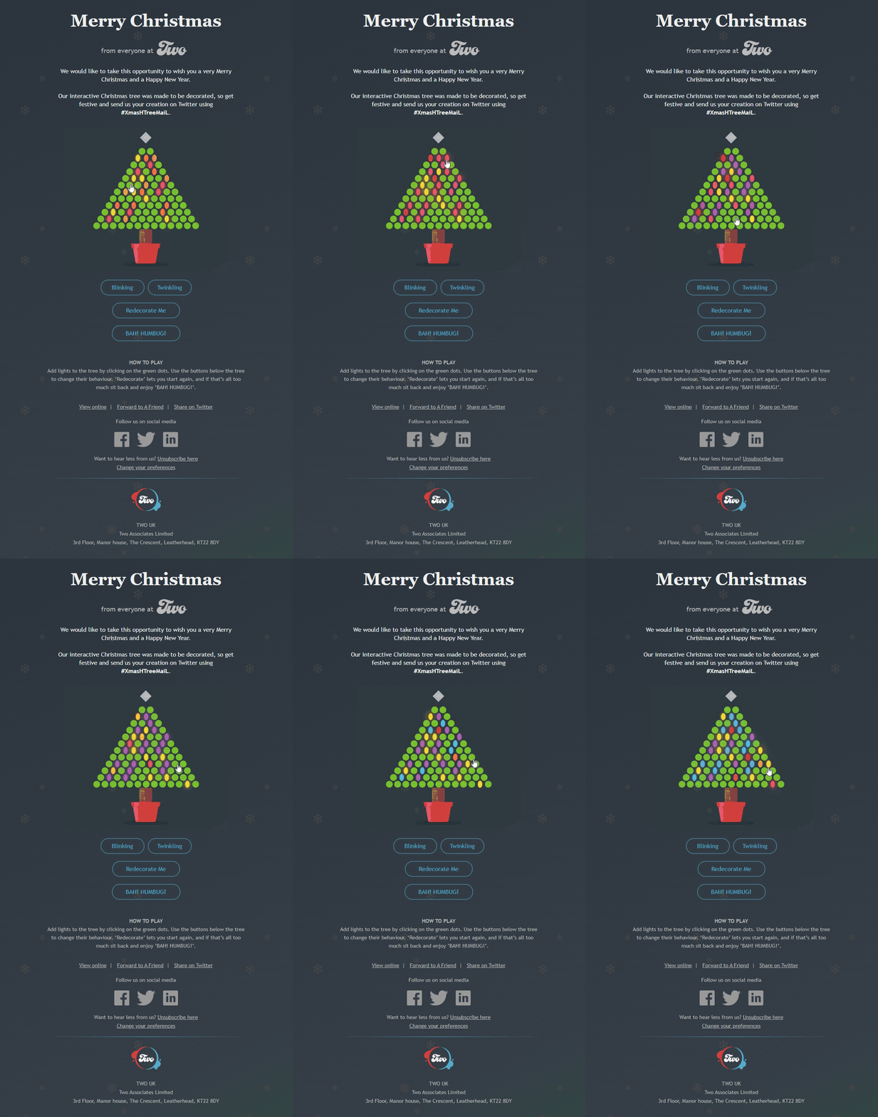
Check out this ‘kinetic interactivity’ email template by TWO UK. The elements used in this email are user-driven i.e. involve user engagement. Holiday emails, especially Christmas emails come thick and fast and in many shapes and sizes; the only way to make them stand out is by adding interactivity to them. However, including interactive elements in kinetic templates requires extensive testing which involves the allocation of more team resources. Unfortunately, their availability is thin, especially during Holidays. Email Uplers can help you during such times of resource crunch.
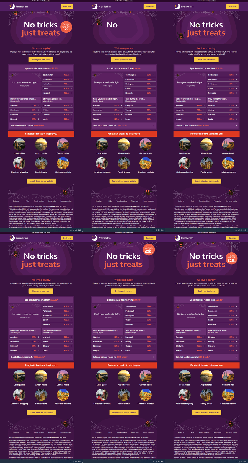
Premier Inn Hotels have made smart use of interactive elements in this kinetic Halloween email template over here. As soon as you open the email, two things catch your attention- the header GIF and the buzzing CTA button. That is enough to make you scroll through the rest of the email, if you ask us.
Wish to have a similar email designed for your brand? Get in touch with Email Uplers
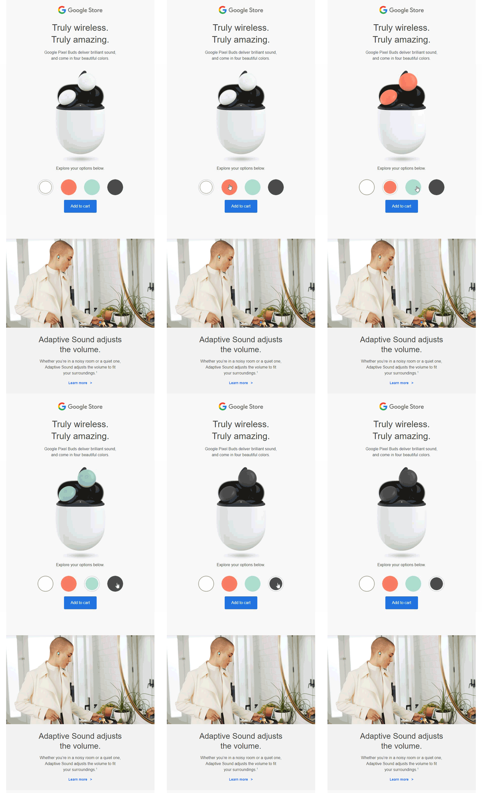
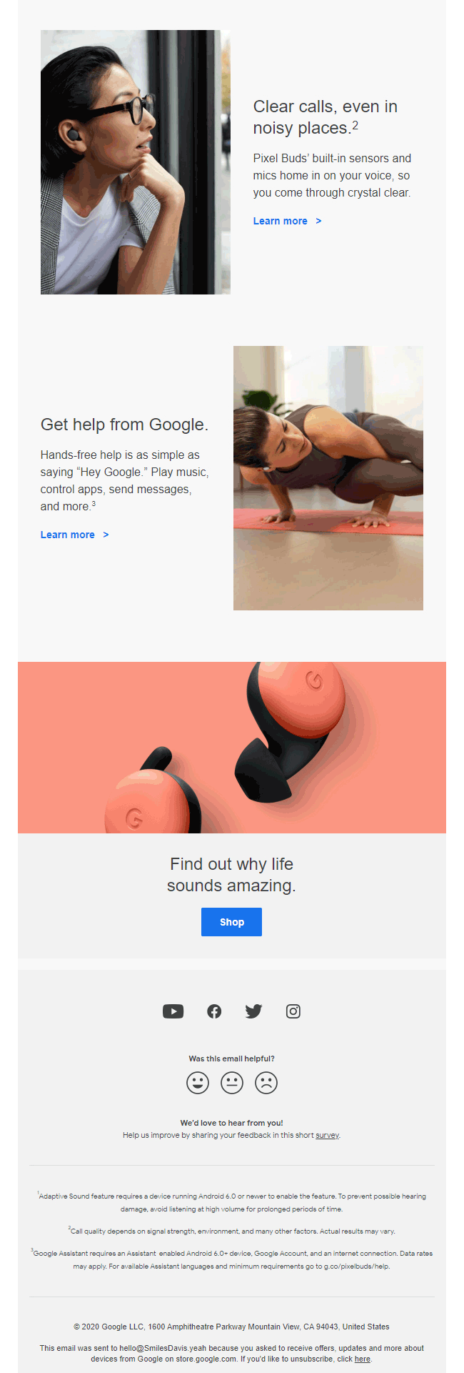
Wouldn’t it be great if you can add the product featured in the email to the shopping cart from there itself? That’s exactly what Google has done over here. Besides allowing readers to visualize the product in all the different shades, they have also made way for a hassle-free shopping experience by linking the cart functionality in their email.
On checking out, they will be directed to their store at a single click, thereby saving the valuable time of their customers during the holiday season.
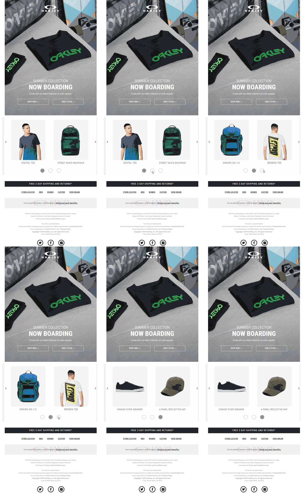
Emails that use animation and CSS transitions to highlight the key content in an email are kinetic emails. Usually, these templates are characterised by automatic sliding carousels where each slide displays a different set of content. Take a look at this example from Oakley.
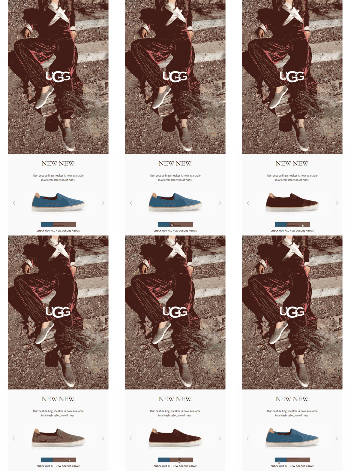
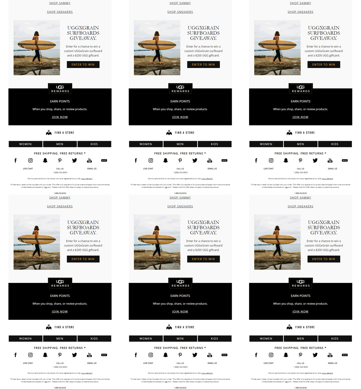
These are emails that have additional elements that respond to the user’s actions. They involve the use of the “:hover”, “:active”, “:focus” or “:checked” CSS selectors. The elements used in these emails are user-driven carousels containing navigation buttons and collapsible menus. This email from UGG is a perfect example of a kinetic email design.
Kinetic effects in emails can embellish the email content by adding hover-over animations and attention focusing effects. Take a look at this email from the brand Tom Raffield that has used hover-over animation in their email.
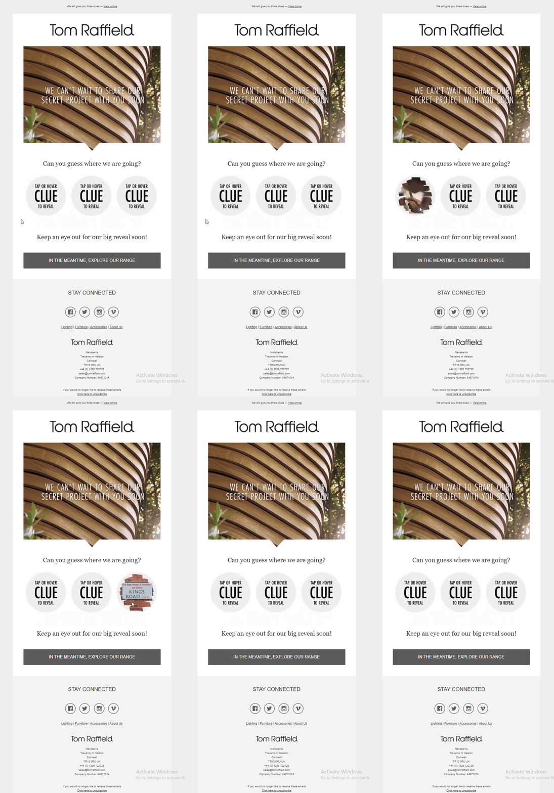
Click on the image to view the hover-based interactivity.
Wrapping up
Kinetic emails also integrate fallback techniques to ensure that these emails do not render poorly on email clients that don’t support kinetic content and design. If you haven’t started using Kinetic design for your emails then this holiday calls for it. This holiday season, increase user engagement by incorporating kinetic email interactivity in your email campaign!
Rely on the expert team of email coders at Uplers this holiday for a quick turnaround of hand-coded, high performing email templates with kinetic design that enthrals and fuels sales for your business. Contact us NOW!



Kevin George
Latest posts by Kevin George (see all)
Boost Deliverability with Optimal Text-to-Image Ratio in Emails
Email Phishing: Detailed Guide to a Common and Dangerous Cybercrime