With fall right around the corner and students across the country all pepped up to go back to school, it’s one of the highest grossing retail holidays for businesses- it’s back to school shopping time!
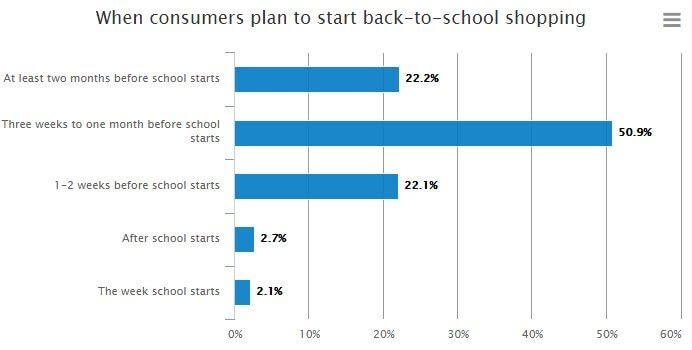
As per a research conducted by National Retail Federation, consumers spent $24.98 Billion in 2015 for back-to-school shopping. No matter you own a brick and mortar store or a digital store, a carefully planned back-to-school promotional email campaign can help you boost sale. But timing is of essence here, since most people plan to start their shopping at least a month early
Generate your Customer Persona:
Shoppers with kids who are heading off to college aren’t looking for crayons, nap mats and lunch boxes. Segment your lists and match your subject line and product hyperlinks within the email campaign to what the subscriber is most likely to buy.
Personalize your emails:
Don’t consider your customer as face-less people. Your email content should reflect the fact that they are your valuable customer and not just a name in your emailing list.
Cheerful Tone:
Nowadays children are the major decision maker while shopping for products. Make sure your email template reflect the pep and colorful theme that children are attracted to.
Attention to Detail:
Based on your customer previous purchase history, you should showcase relevant products to your customers.
Back to School Email Examples that have passed with Flying colors:
Serengetee:
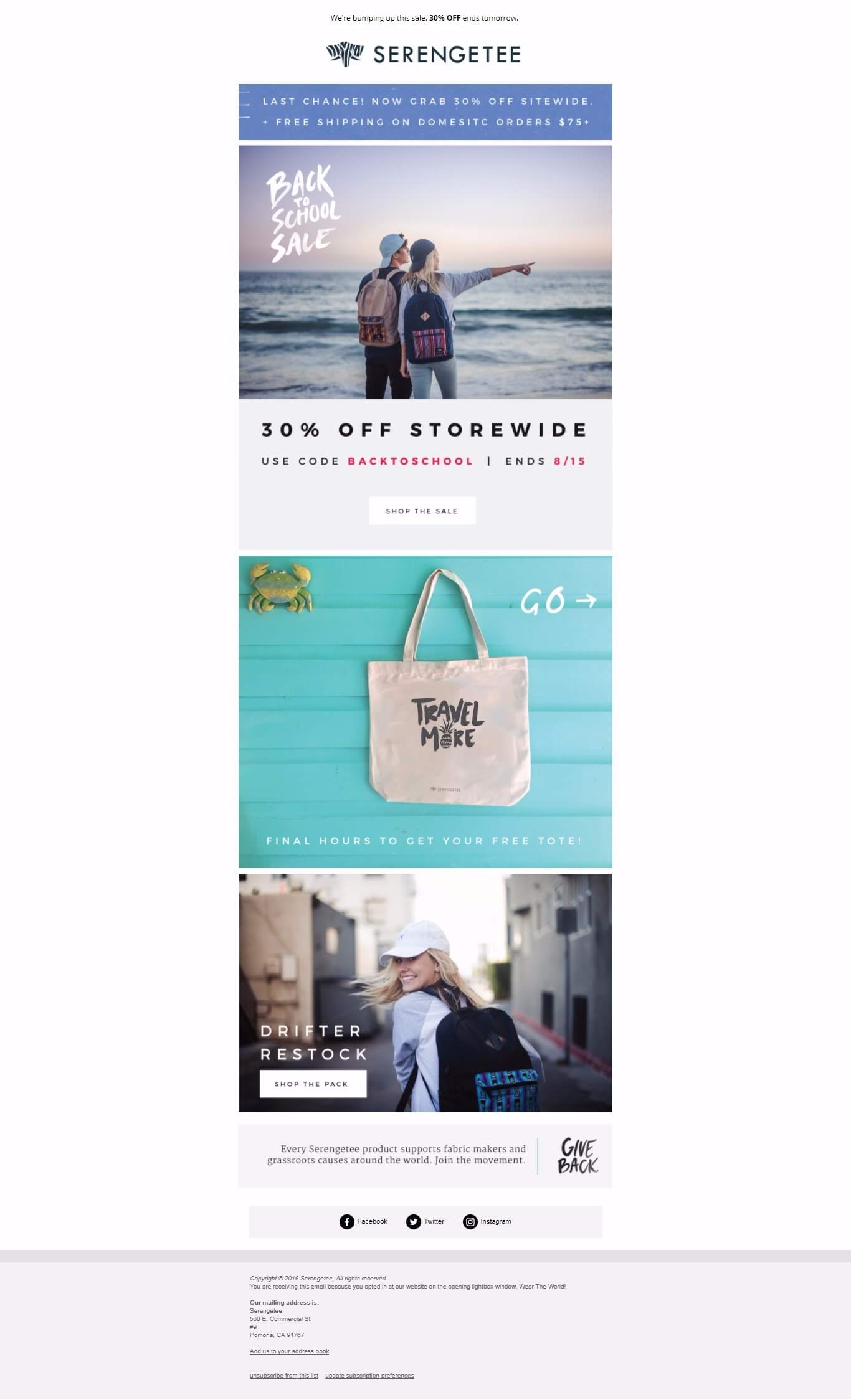
Here’s an interesting back to school email from Serengetee. The highlights- discount and free shipping- have been mentioned right at the top of the email.
Pottery Barn Kids
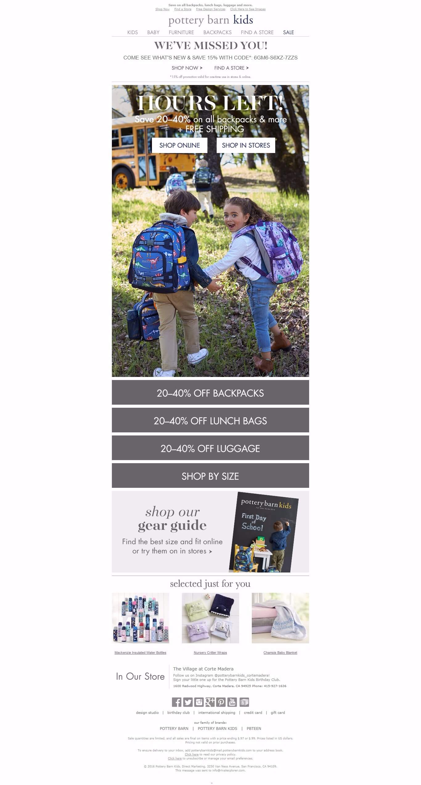
The following email is a re-engagement email sent by Pottery Barn around the back to school time. A great way to re-engage at the right time. With all discounts mentioned and prominent CTAs to go with them, this email is quite impressive.
Retail Me Not
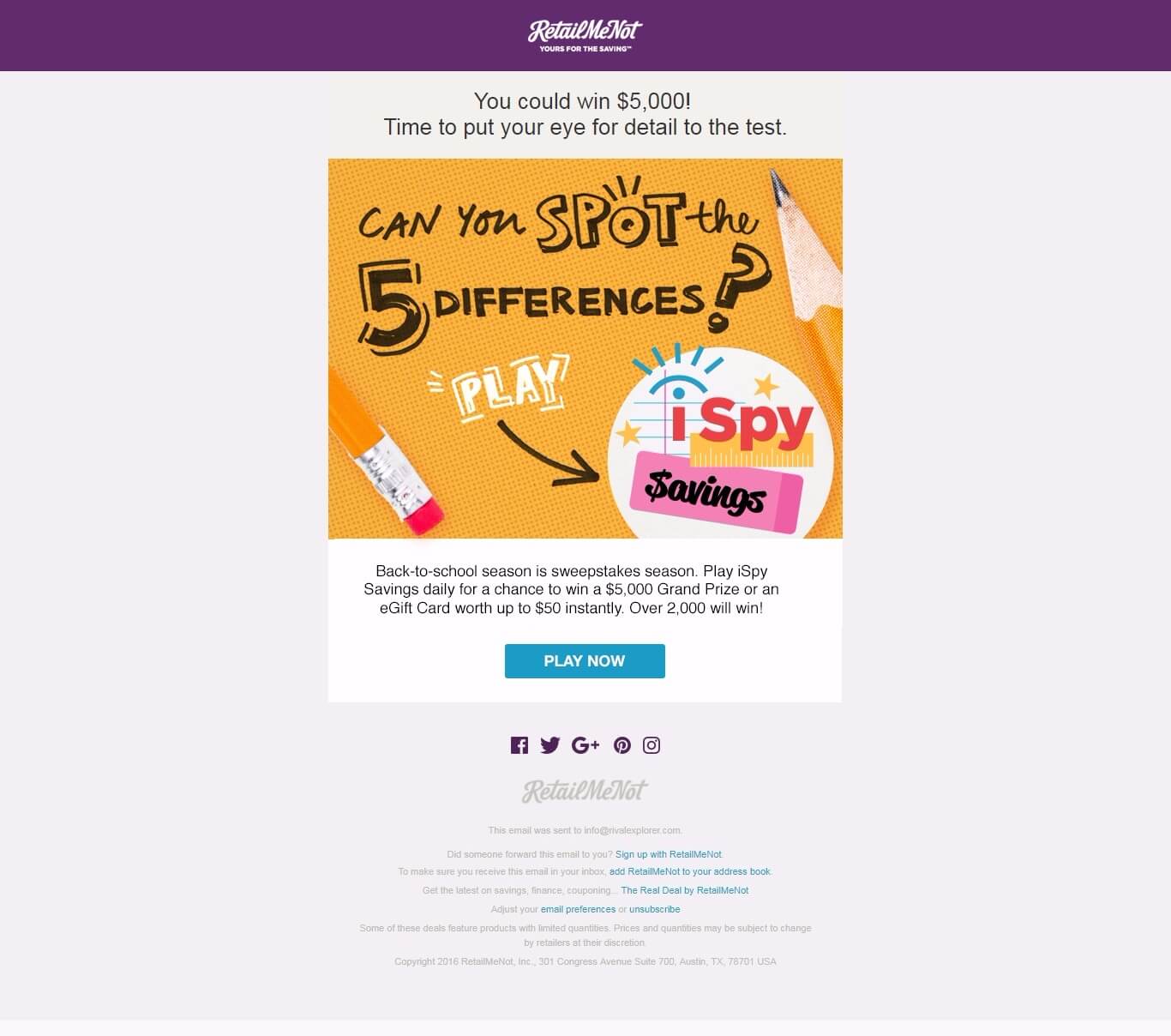
A very innovative email template by the brand. They have created a game, playing and winning which can help the subscriber win grand prizes, daily. The game cannot be played in the email itself but the CTA takes the subscriber to a landing page for the same.
Crayola
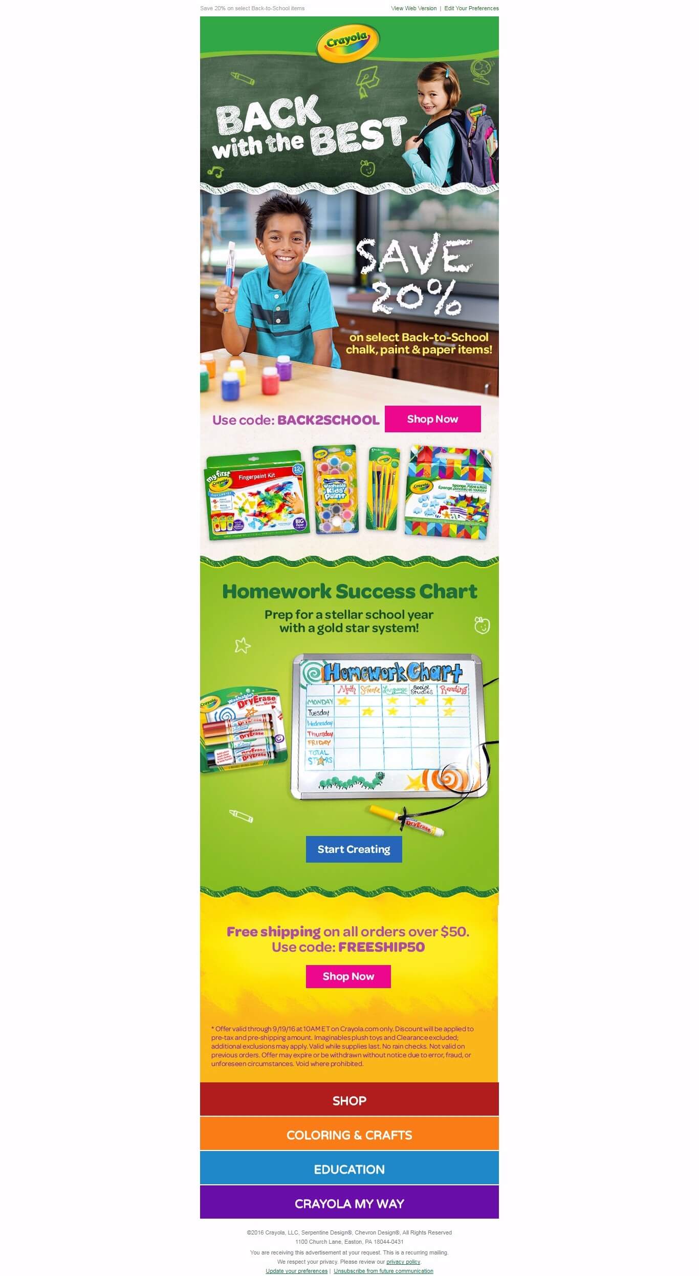
The email from Crayola has used the theme of a board with chalk illustrations all over the email design. Another interesting part is the ‘Homework Success Chart’ which calls for interactivity from the subscriber, keeping them engaged with the email.
Abercrombie:
This email has sections divided with accurate titles with apparels showcased as per the sections. Overall, it’s a neat layout.

Nordstrom:
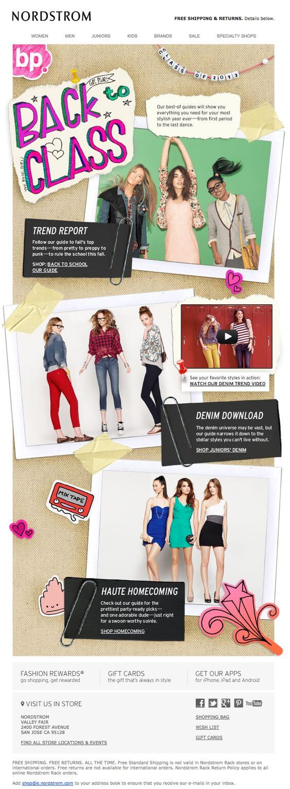
Clothing Retailer Nordstrom has a really good back to school email up its sleeves. Overall school theme is reflected in the image as well as the email body.
Grammarly:
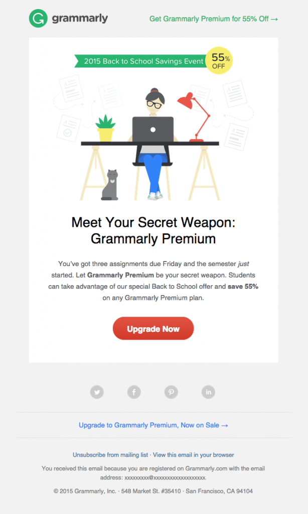
Online spell check service, Grammarly made optimum usage of the opportunity to sell their premium product to tackle assignment submissions. The email layout has an overall clean look and the main focus rests on the illustration.
As the back to school season is back in full swing, as a marketer, you must be ready with a good strategy. Incorporating the tips mentioned above will certainly help you make a mark this year.
Need some more inspirations? Visit our Inspirations Page. And if you have some amazing back to school inspirations to share, please do so in the comments below.





Kevin George
Latest posts by Kevin George (see all)
Yahoo! Mail Update: What’s New in Yahoo! Mail Pro?
Uplers in conversation with Andrea Kayal from Signpost