[This post was originally published on Oct 2022. It has been updated on 7th Oct 2024.]
Dark Mode (also Night Mode) is here to stay, and for all the right reasons:
- It is easier on the eye and more visually appealing
- It saves battery life
- It increases the lifespan of certain displays by using minimal power to light up individual pixels
In fact, in 2022, 35% of consumers opened their emails in Dark Mode.
It’s almost 2025, and you can’t delay optimizing your email campaigns for Dark Mode any longer.
Note that among Apple iOS users, Dark Mode adoption is as high as 70%. Plus, in terms of market share, Apple Mail is way ahead of Gmail, Yahoo, and Outlook, accounting for 56% of the consumption pie.
Clearly, you can’t afford to build myopic email campaigns anymore. Light and Dark is the way forward.
In this blog post, you’ll learn how to optimize Apple Mail for Dark Mode.
We’ve been doing this for the past 5 years, and we know how so many things can misfire, resulting in unexpected faux pas.
One can’t be too careful when it comes to Dark Mode!
But that’s enough by way of introduction. Let’s get started in the following order:
- Optimizing for Dark Mode: Preliminary Remarks
- Create The Basic HTML Structure
- Define Light Mode Styles
- Add Media Queries for Dark Mode
- Optimize Images for Dark Mode
- The Final HTML Code for Dark Mode
- Dark Mode Code Snippets for Developers
Optimizing for Dark Mode: Preliminary Remarks
Apple Mail does not automatically change colors in the absence of Dark Mode meta tags, unlike Yahoo, AOL, and Gmail (Desktop).
However, including the Dark Mode meta tags without the appropriate styles can result in a partial invert, where light backgrounds become dark and dark text becomes light.
Secondly, plain text emails in Apple Mail, even without HTML elements, can trigger Dark Mode themes. A convenient workaround is to use a 2×1 image instead of a 1×1 image. The slightly larger image can block the Dark Mode theme while maintaining the overall plain text vibe of the email. During testing, if your Mac unexpectedly shuts down or restarts, it can disrupt Dark Mode rendering checks — here’s a useful resource from CleanMyMac that explains how to diagnose and fix those shutdown issues
Here are five best practices for optimizing Apple Mail for Dark Mode:
1. Experiment with Background Colors
To enhance your subscribers’ Mac Mail dark mode reading experience, try adjusting the background colors of your emails.
Consider using background colors other than white that are visually appealing and work well in both light and dark environments.
2. Use An Accessibility Switcher
Another effective method for optimizing dark mode is to utilize an accessibility switcher. This feature leverages web kit targeting to enable users to easily switch between light and dark designs.
By implementing a checkbox, the user can dynamically change the text color and background style based on the toggle state. This interaction is not only supported in Apple Mail but in iOS Mail and Outlook for Mac as well. Here’s a sneak peek at the Dark Mode Colors of Mac OS Mojave:
- Background: #2d2d2d
- Text Color: #dfdfdf
- Link Color: #1b89ef
These values assist in creating an interactive switcher that transforms your design to use the background color #2d2d2d, matching the dark mode design of Mac Mail. Additionally, it enables the use of standard text colors that dark mode uses, providing your subscribers with a seamless reading experience.
3. Optimizing Images for Dark Mode
When incorporating an image into a dark mode HTML email template, consider using separators and dividers extensively to maintain a consistent design language. This helps avoid templates with an inconsistent design. Also, avoid adding images that match the background color and opt for transparent PNGs instead.
4. Designing Logos for Dark Mode
If you want your logos to be compatible with both dark and light modes, it’s best to create two versions of it.
For the version meant for light mode, add a stroke so that the image merges perfectly with the background color and stands out if the email client fails to support Dark Mode.
When designing specifically for Mac mail dark mode, opt for a color that contrasts well against a dark background, or consider keeping the dark version logo all-white to avoid complications.
5. Optimizing Text for Dark Mode
When creating designs for dark mode in emails, it’s best to use live text instead of text within images. This approach can significantly enhance email deliverability and accessibility.
If you’re thinking of overlaying black text on a white background as an image, we suggest using a transparent PNG with a stroke around the text to ensure it blends seamlessly with the background in the default light mode.
Now, let’s look at the steps involved in creating a Dark Mode-optimized email template for Apple Mail.
Step I: Create The Basic HTML Structure
First, we’ll start with the basic HTML structure with all the necessary tags such as DOCTYPE, head, html, and body tags.
<!DOCTYPE html>
<html lang="en">
<head>
    <meta charset="UTF-8">
    <meta name="viewport" content="width=device-width, initial-scale=1.0">
    <title>Email Template</title>
    <style>
        /* Basic styles will go here */
    </style>
</head>
<body>
    <div class="container">
        <h1>Welcome to Our Newsletter</h1>
        <p>Thank you for subscribing!</p>
        <a href="#">Read More</a>
    </div>
</body>
</html>
Step II: Define Light Mode Styles
We next define the Light Mode styles in the style section as shown.
<style>
    /* Light Mode Styles */
    body {
        background-color: #ffffff; /* Light background */
        color: #000000; /* Dark text */
        font-family: Arial, sans-serif;
        margin: 0;
        padding: 0;
    }

    .container {
        padding: 20px;
    }

    a {
        color: #1e90ff; /* Bright link color */
        text-decoration: none;
    }

    h1, h2, h3 {
        margin: 0;
    }
</style>
Step III: Add Media Queries for Dark Mode
For adding Dark Mode styles, we use media queries so that the background and text colors change if the user enables Dark Mode viewing.
<style>
    /* Light Mode Styles */
    body {
        background-color: #ffffff; /* Light background */
        color: #000000; /* Dark text */
        font-family: Arial, sans-serif;
        margin: 0;
        padding: 0;
    }

    .container {
        padding: 20px;
    }

    a {
        color: #1e90ff; /* Bright link color */
        text-decoration: none;
    }

    h1, h2, h3 {
        margin: 0;
    }

    /* Dark Mode Styles */
    @media (prefers-color-scheme: dark) {
        body {
            background-color: #000000; /* Dark background */
            color: #ffffff; /* Light text */
        }

        a {
            color: #1e90ff; /* Bright link color for dark mode */
        }
    }
</style>
Step IV: Optimize Images for Dark Mode
Now we optimize the images by using CSS filters to invert them for Dark Mode.
<style>
    /* Dark Mode Styles */
    @media (prefers-color-scheme: dark) {
        body {
            background-color: #000000; /* Dark background */
            color: #ffffff; /* Light text */
        }

        a {
            color: #1e90ff; /* Bright link color for dark mode */
        }

        img {
            filter: brightness(0) invert(1); /* Invert images for dark mode */
        }
    }
</style>
Step V: The Final HTML Code
Here’s the final code for our Dark Mode-optimized email.
<!DOCTYPE html>
<html lang="en">
<head>
    <meta charset="UTF-8">
    <meta name="viewport" content="width=device-width, initial-scale=1.0">
    <title>Email Template</title>
    <style>
        /* Light Mode Styles */
        body {
            background-color: #ffffff; /* Light background */
            color: #000000; /* Dark text */
            font-family: Arial, sans-serif;
            margin: 0;
            padding: 0;
        }

        .container {
            padding: 20px;
        }

        a {
            color: #1e90ff; /* Bright link color */
            text-decoration: none;
        }

        h1, h2, h3 {
            margin: 0;
        }

        /* Dark Mode Styles */
        @media (prefers-color-scheme: dark) {
            body {
                background-color: #000000; /* Dark background */
                color: #ffffff; /* Light text */
            }

            a {
                color: #1e90ff; /* Bright link color for dark mode */
            }

            img {
                filter: brightness(0) invert(1); /* Invert images for dark mode */
            }
        }
    </style>
</head>
<body>
    <div class="container">
        <h1>Welcome to Our Newsletter</h1>
        <p>Thank you for subscribing!</p>
        <a href="#">Read More</a>
        <img src="example-image.jpg" alt="Example Image" />
    </div>
</body>
</html>
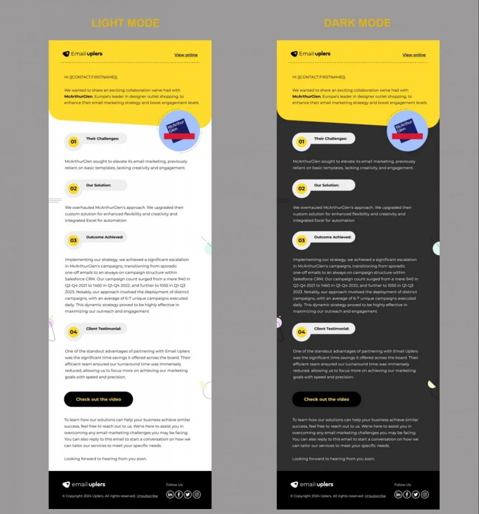
Here is an example of a Dark Mode-optimized pre-live email that we designed.

Dark Mode Code Snippets for Developers
Here’s a list of all Dark Mode-related code snippets.
Media Query for Dark Mode
@media (prefers-color-scheme: dark) {
    /* Dark Mode styles go here */
}
Background And Text Colors
@media (prefers-color-scheme: dark) {
    body {
        background-color: #000000; /* Dark background */
        color: #ffffff; /* Light text */
    }
}
Link Colors
@media (prefers-color-scheme: dark) {
    a {
        color: #1e90ff; /* Bright link color for dark mode */
    }
}
Image Handling
@media (prefers-color-scheme: dark) {
    img {
        filter: brightness(0) invert(1); /* Invert images for dark mode */
    }
}
Specific Class Styles for Dark Mode
@media (prefers-color-scheme: dark) {
    .your-class {
        background-color: #333333; /* Darker background for specific element */
        color: #ffffff; /* Light text for specific element */
    }
}
Button Styles
@media (prefers-color-scheme: dark) {
    .button {
        background-color: #1e90ff; /* Bright button background */
        color: #ffffff; /* Light text color */
    }
}
Border And Shadow Adjustments
@media (prefers-color-scheme: dark) {
    .card {
        border: 1px solid #444444; /* Lighter border for visibility */
        box-shadow: 0 2px 5px rgba(255, 255, 255, 0.1); /* Subtle shadow */
    }
}
Fallback Colors
@media (prefers-color-scheme: dark) {
    .fallback {
        background-color: #222222; /* Fallback dark color */
        color: #cccccc; /* Fallback light text color */
    }
}
Card And Container Styles
@media (prefers-color-scheme: dark) {
    .container {
        background-color: #1a1a1a; /* Dark container */
        color: #e0e0e0; /* Light text for container */
    }
}
Text Shadow for Better Readability
@media (prefers-color-scheme: dark) {
    h1, h2, h3, p {
        text-shadow: 0 1px 2px rgba(0, 0, 0, 0.5); /* Subtle shadow for text */
    }
}
Header And Footer Styles
@media (prefers-color-scheme: dark) {
    header, footer {
        background-color: #1c1c1c; /* Dark header/footer */
        color: #ffffff; /* Light text */
    }
}
Avoiding Color Clashes
@media (prefers-color-scheme: dark) {
    .highlight {
        background-color: #555555; /* Highlight color for elements */
        color: #ffffff; /* Light text for highlights */
    }
}
Email Dark Mode Client Support
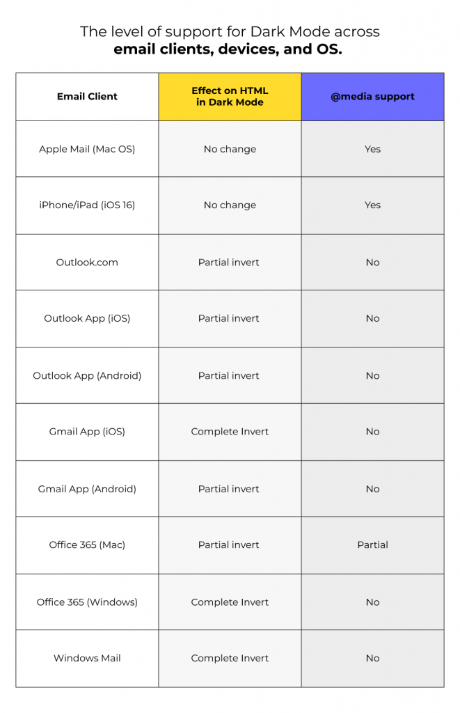
Email clients are always evolving. And when it comes to Dark Mode, the level of support varies widely among different clients. Not to mention that device and operating system can also affect Dark Mode implementation.
The following table, inspired by Litmus’s support chart, shows the level of support for Dark Mode across email clients, devices, and OS.

More Insights on Dark Mode in Emails
Catch more comprehensive insights into Dark Mode in emails on our blog:
- Dark Mode Designs: The Future of Email
- Dark Mode in Emails: The Technology that’s Here to Stay
- The Email Marketer’s Guide to Optimize Images for Enhanced Dark Mode Viewing Experience
Need help with designing Dark Mode-optimized emails? Get in touch with our email marketing team.


Susmit Panda
Latest posts by Susmit Panda (see all)
Email Marketing Facts And Statistics in 2024-25: A Comprehensive Report
How to Upload Emails to Your HubSpot Account: A Step-by-Step Guide